In case you’ve been under a rock or in a coma, it’s March and the madness is so real. The opening weekend of the NCAA Tournament is behind us, though we won’t soon forget it thanks to all the upsets and wild, heart-pounding finishes. Seriously, it was unreal.
But now it’s time to look ahead, and the Sweet 16 is set with a lot of intriguing matchups to keep an eye on. Sure, the basketball aspect is probably what most people are paying attention to, but if your bracket is already shot to hell and you lost a bunch of money gambling on the first few rounds of games, you may be looking to appreciate some of the other finer points of the tourney — such as the uniforms.
Outfitters will often come up with special looks specifically for the tournament — and college programs rarely stick with the same uniforms for very long anyway — so it’s always interesting to keep an eye on who is wearing what each and every year. There’s a wide variety to be had this year, especially among the remaining 16 teams, so let’s break them down from badness to goodness.
Texas A&M
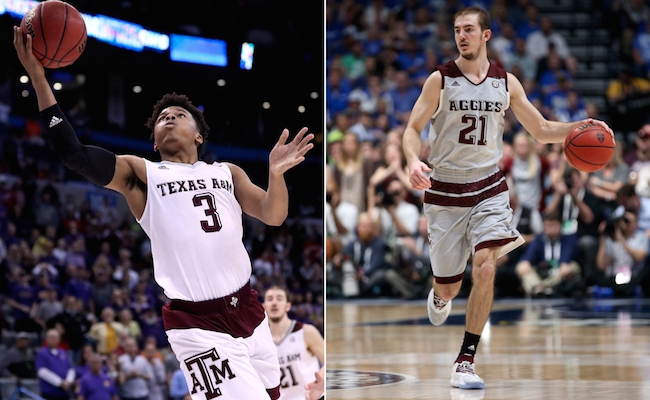
There’s not much to like about this Texas A&M look. If you pay attention, you’ll notice more than a few adidas schools coming in super low on this list, and that’s not a coincidence. Does anyone like the bold crotch striping & blocking at the top of the shorts? No? Didn’t think so. The Aggies suffer more because they’re stuck with a pretty boring color scheme. And gray uniforms? Gross.
Miami
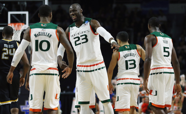
Miami has a great color scheme, but, again, they’re outfitted by adidas, so there are fatal flaws. The shoulder blocking is terrible and the stripes on the shorts — though not as bold and obnoxious as some of the other schools like Texas A&M — is still more awkward than traditional waistband striping.
Notre Dame
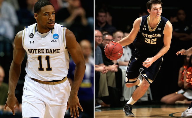
Boooooooring. Seriously, Notre Dame probably has the most boring uniforms left in the field. Even worse, it seems like the few aspects that are noteworthy — the collar and shorts striping — are poorly executed and awkward. Their gold alternate adds a little bit of flavor, but they still fall flat.
Wisconsin
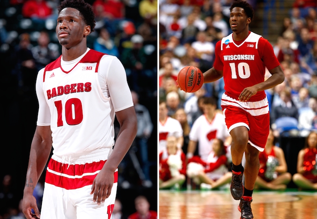
Hate to sound like a broken record, but the shoulder blocking and shorts striping stink. Wisconsin is one of those schools that would benefit from just sticking to a simple look more times than not, but unfortunately adidas isn’t great at that.
Iowa State
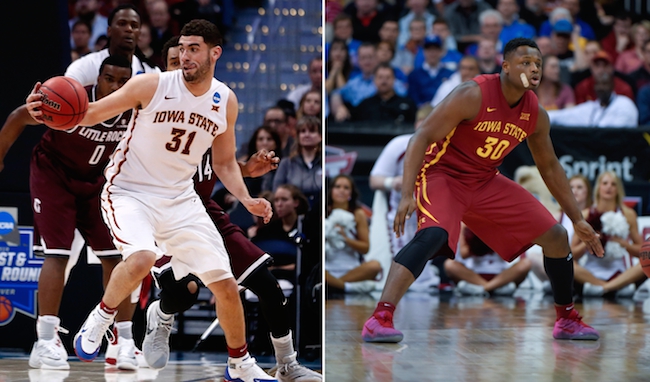
This is where we get to the “fine, but nothing special” portion of the field. The striping down the side of the jerseys and shorts is pretty neat, but the Cyclones’ uniforms are nothing to write home about. That being said, there’s also nothing really wrong with them. They could be better, they could be worse.
Villanova
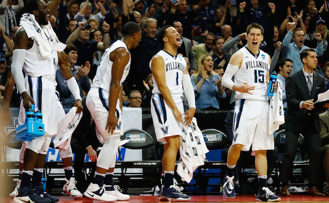
Villanova’s shorts are cool, but the simple jersey leaves a bit to be desired. They’d benefit from incorporating the baby blue more into the design to complement the navy; it’s a combo that works super well when done right. I also like their retro alternate look.
Duke
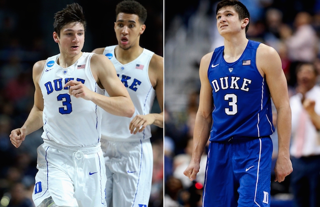
I like this look more than its spot on the list probably gives it credit for. My only real complaint is that the lack of any waistband design fails to separate the jersey and the shorts. But, as a school with a rich history and tradition of excellence, I’d rather see the Dukies go with a more traditional look, like this one. That being said, Nike did a fairly good job with this modernized set.
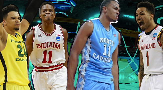
Oregon
Again, these are fine, but nothing special. The thing about Oregon is that they’ve set the bar so high for themselves with how many fantastic, innovative looks they’ve rolled out with Nike over the years, across all their athletics. So, when they go with a uniform as basic and mundane as these, it’s really disappointing.
Oklahoma
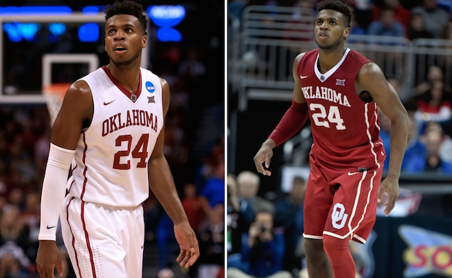
This is a really great example of a team going simple, but doing it really, really well. Both uniforms are really clean and hold a good mix of traditional and modern aspects. The side striping is awesome — even if the shorts look like they’re bedazzled around the piping — and the OU logo on the shorts is a nice touch.
Virginia
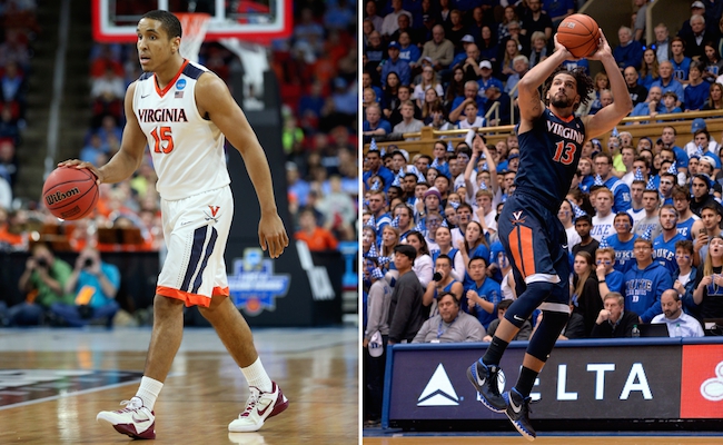
This is a pretty good example of where Nike and adidas are so different in college basketball. These uniforms feature bold blocking/stripes on both the jersey and shorts, but they do so without being obnoxious and awkward. This look does a good job of showcasing Virginia’s great color scheme with a great mix of the orange and blue. The shorts are great.
Gonzaga
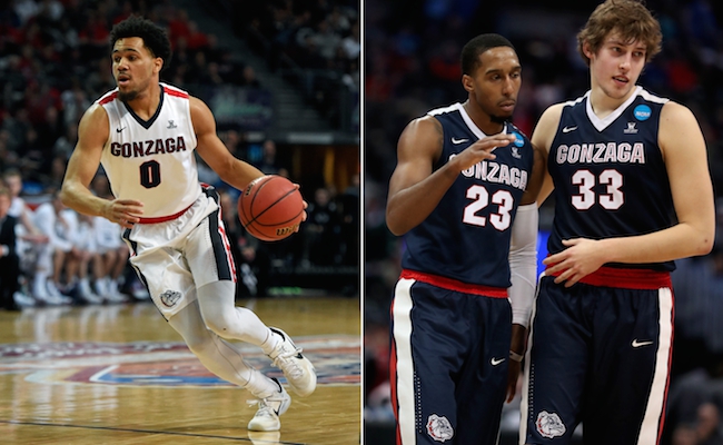
Gonzaga, also a Nike school, delivers similarly to Virginia. It’s a bold design, but it’s packaged well and comes with a good color scheme. The home uniform is awesome, and my only complaint about the roadie is that the shoulder stripe on the navy jersey should be red instead of white.
Maryland

Nobody loves anything more than the people of Maryland love their state flag. Under Armour has often gone overboard incorporating the flag’s design into the Terrapins’ uniforms, but this is not one of those examples. Using it as the striping for the jerseys and shorts is a great idea, and it’s executed well.
Syracuse
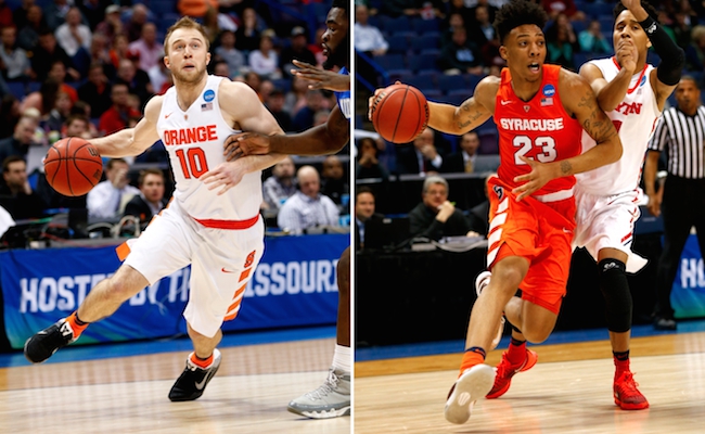
This is one of my favorite looks from Syracuse in recent years. There’s a fine line between being boring and not trying to do too much, and I think this design expertly toes the line. The selling point is the bold waistband combined with the cool, progressive blocking on the shorts. The ensemble might need a bit more navy blue to fully encapsulate the Syracuse feel, but it’s pretty fantastic as is.
North Carolina
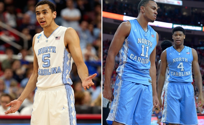
Any college basketball uniform ranking that has UNC outside of the top three is usually rendered invalid, so here we are. I’m not sure if I’ll ever be sold on the argyle — it just comes down to personal taste — but it’s different and it’s done about as well as one could hope. For the most part, North Carolina knows not to mess with success and they’ve had great jerseys pretty much forever.
Kansas
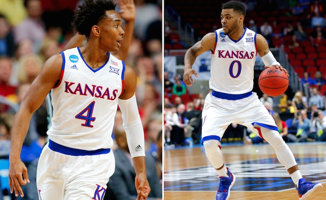
By god, that’s adidas’ music! For as much as I’ve trashed them above, here is where redemption begins. This Kansas look is amazing. This ensemble does a hell of a job playing the crimson and blue off of each other, whether it’s on the typeface across the front, the piping around the arms, or the bold bottom striping on the shorts. They kept it simple, and it all works. (Side note: The Jayhawks have also had amazing retro alternates the past few years, see here and here.)
Indiana
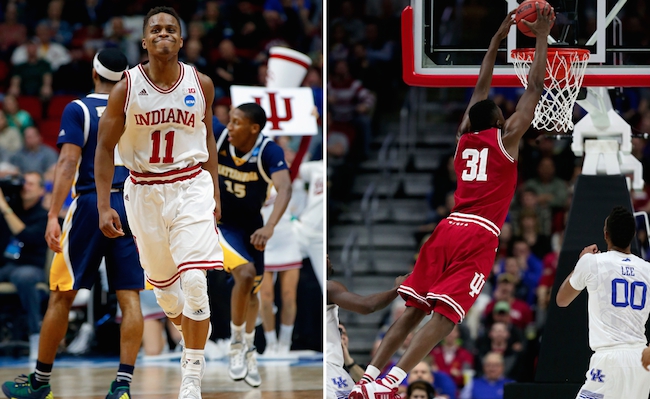
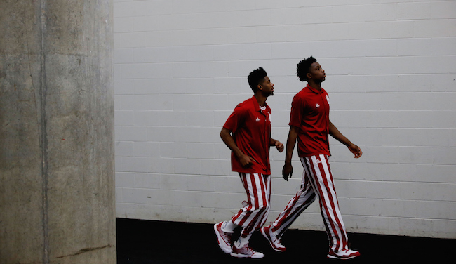
Adidas has tinkered with Indiana’s classic look multiple times in recent years, and it never ends well. You can’t mess with the best, and these Hoosiers uniforms are as good as they get. Simple, clean, perfect. The crimson and white striping on the jersey piping, waistband, and shorts looks amazing, as do the stars on the back of the shorts and the IU logo on the side. The classic look is complete with the absence of names on the back. This is a look that should never, ever change. Ever. Even the warmups with the candy stripe pants are incredible.
Time for you to make the call; Who’s got the best look of the remaining group?