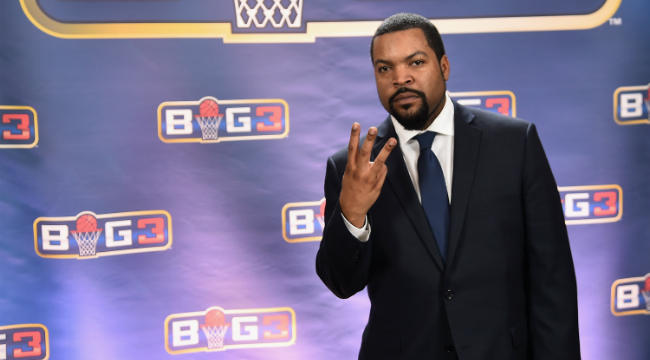
The much-anticipated start of Ice Cube’s BIG3 3-on-3 league is growing closer every day. The teams are drafted, the schedule is set and now we know some of the merchandise the NBA legends will wear before they take the court.
Ice Cube showed off each team’s hat on Twitter on Friday, so let’s take a look at each logo and rank them from worst to first.
You asked for them! @thebig3 team hats are now available at https://t.co/8PxusdK2fQ. pic.twitter.com/FmPVtZC7MZ
— Ice Cube (@icecube) May 19, 2017
It’s a pretty good selection overall. But we have to pick a winner. And because this world is chaos unless we have rules, the hats judged here are the team’s colored variety, unless they only had a black option. 8) 3’s Company
This is a shame because Allen Iverson’s the captain of this team, and it just has zero style at all. The logo they’re using on the team shirt is much better. This hat looks like you’d win it after spinning a wheel at a county fair, but only because all the other prizes on the table were already taken.
7) Tri-State
It’s a ball! It’s a shield! It’s … a pretty uninspiring logo and cap. Remember when Under Armour signed a deal to have a bunch of superhero stuff on their workout gear? This looks like if Big Baller Brand tried to make its own knockoff Captain America swag. Watch LaVar Ball bluster his way past red-faced Nazis and help Shield with his ability to fluster Stephen A. Smith on television? No thanks. Good color palate, though.
6) Power
It’s a buzzsaw and a basketball and a P. Like a power saw, I guess. Listen, just because I get it doesn’t mean I have to love it. This looks like the kind of hat an authoritarian state government gives its security officials to wear indoors because the battle armor gets a bit warm in the brutalist high-rises in mid-summer. The logo’s crisp, but it also looks like too-handsome teenagers are trying to destroy this brand with some sort of secret revolution.
5) Trilogy
This is the one logo that totally eschews its team name, which is good because the team name is boring. It’s a 3-on-3 league. Nearly every team name reflects this in some way. You team name is just another way to group things into threes. It’s shamefully uncreative, but at least this basketball cyclops thing you have going on here looks good on a hat. Though it is a considerable creative leap forward, it definitely still gives off a create-a-franchise in a video game vibe.
4) Killer 3s
This is good alliteration, which always gets points in my book. Killer threes. Killer bees. Do you get it? Nice, right? I’m not entirely sold on what’s going on here other than this bee’s abdomen. Are his antennae putting holes in the basketball? Are the limbs lightning bolts? It just seems like a mishmash of concepts that weren’t completely smoothed out past the mockup stage. I like it, Chauncy Billups, but I want to love it.
3) Ghost Ballers
I laugh every time I see this logo. The ghost is just so Scooby Doo-esque, it’s perfect. And the illustrator did a good job here, because it somehow looks like that ghost has some decent handles. I think the blue brim on the cap isn’t as great as the all-black one, but rules are rules and I must follow the arbitrary choices I made for a blog post. You know how these things are.
2) 3-Headed Monsters
This is a great logo. Sort of looks like what the New Jersey Swamp Dragons would have looked like if that wasn’t tragically killed by David Stern. This is a good extension of the team name, and a great logo. I would wear this hat and, admit it, so would you. But if I’m nitpicking, it’s still a bit too busy. Which is why my winner is …
1) Ball Hogs
I really love this logo. Everything about it, from the angry look on the swine’s face to the headband and subtle hints of basketball apparel on its anthropomorphic body. This looks a lot like the slightly too-short guy you hate in your pickup league because he takes it too serious compared to his level of skill. It’s really good branding, and it looks great on a cap. Green or black, too. Sign me up for one of these when the league finally tips off. Go hogs.