To this point, the majority of the NBA’s new Nike uniform releases have featured minor tweaks to already existing uniform designs. The biggest exceptions have been the Pacers and the Cavaliers, which each made at least one significant change to what used to be the Home and Away uniforms.
We’ve known that the Timberwolves would be among the teams to make big changes to their uniforms this season after unveiling a new logo and color scheme earlier this summer. On Thursday we finally got our first look at two of their new look uniforms, and the results were fairly underwhelming.
To this point, most of the new Nike uniforms would have been considered minor improvements — depending on your feelings towards circular lettering in Indiana or wine color unis in Cleveland — but the new Minnesota threads leave something to be desired.
The new threads have dropped. Bring on the New Era. #NewEraNewThreads https://t.co/t0PjCcp8II
— Minnesota Timberwolves (@Timberwolves) August 10, 2017
For me, these look like soccer uniforms for some reason. They’re very plain, without much pop of color — although it’s rumored that we’ll be getting plenty of color with their alternate uniforms that will be a bright green. The straight lines feel very minimalist and part of the problem is that, historically, Minnesota has had great uniform designs because of how unique they have been. Now, these feel exceedingly bland compared to the glory days of the Kevin Garnett years when they had arguably the league’s best uniform set.
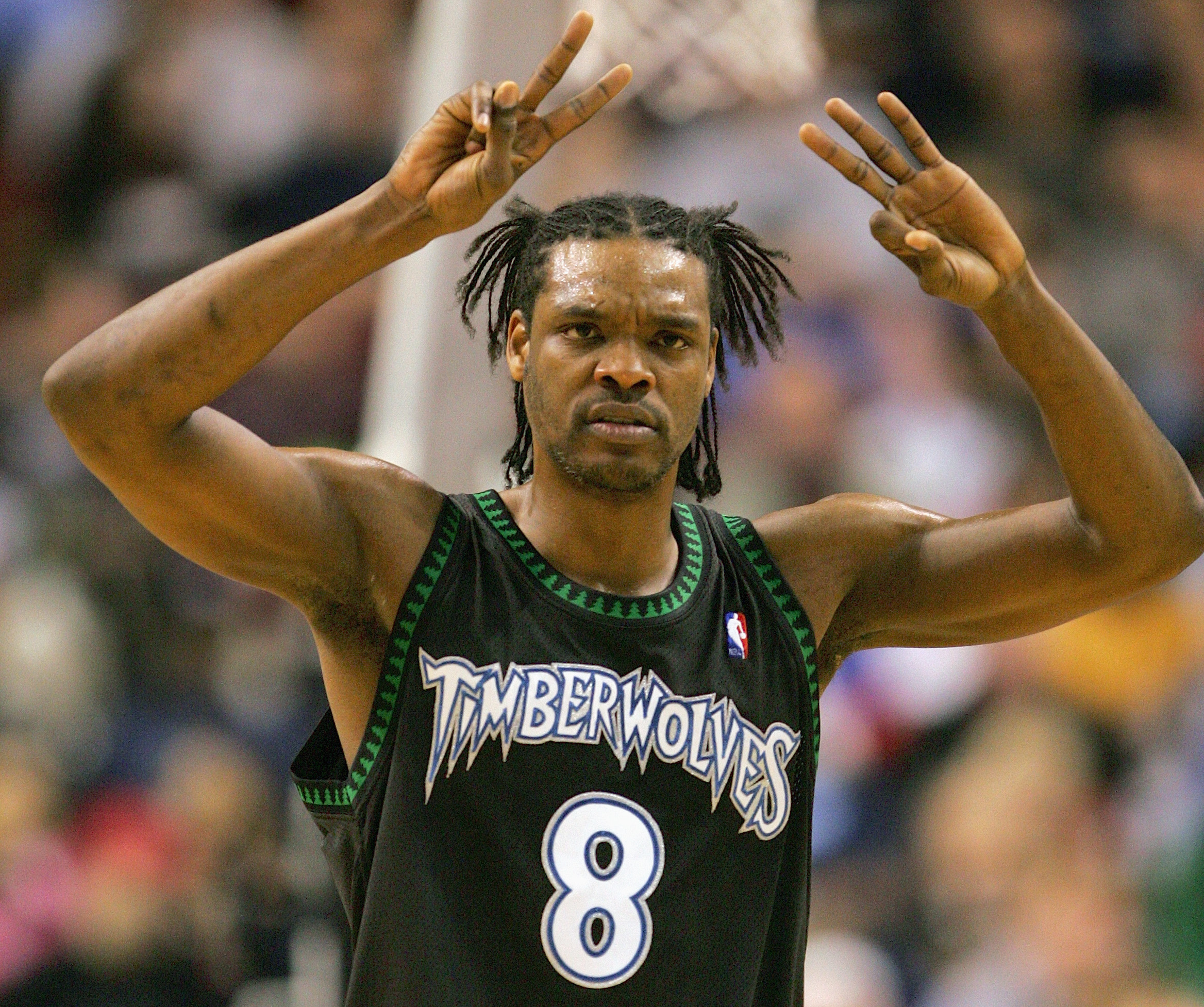
The black Timberwolves uniforms circa 2004 are some of the best ever and these latest uniforms feel like such a dramatic departure from those that it’s a bit disappointing. The new uniforms are fine. They don’t look awful, but for a franchise that’s had such great uniforms of the past, these feel like a letdown.