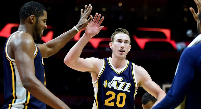
The Utah Jazz are one of the most talented young teams in basketball. Gordon Hayward, Derrick Favors, Rudy Gobert, and Rodney Hood comprise a talented, versatile core. Danté Exum and Trey Lyles have the chance to become legitimate impact players, and Alec Burks has the makings of a dynamic sixth man. Head coach Quin Snyder, who just signed a multi-year extension, might be the league’s most underrated coach, too.
These are good times for the Jazz, basically, and the future is bound to be more prosperous. The only thing that kept them from the playoffs in 2015-16 was a nagging, team-wide injury bug, a reality that gleans even more optimism considering Exum – who’s the only top-five pick on the roster drafted by Utah, by the way – missed the entire season with a torn ACL.
Will these Jazz reach heights of the organization’s 1990s peak? That remains to be seen. Whether Hayward, Favors, and company make good on all of that promise, though, they’ll soon wear logos that harken back to those über-successful days of yore.
According to Paul Lukas of UniWatch, Utah’s revamped look for next season – which will supposedly be unveiled next season – includes these primary and secondary emblems.
https://pbs.twimg.com/media/CiMBSVaW0AAzGsV.jpg
The logo on the left probably doesn’t look much different than the one you’ve seen over the past few years, and rightfully so.
The Jazz finally re-incorporated the classic musical note in 2010-11 and have worn it on their jerseys ever since. But the slanted “UTAH” in the empty space above the the ‘z’s is a completely new addition, as is the ever-popular secondary circular logo on the right.
The biggest change to Utah’s look is the lack of any mountains whatsoever. The Jazz added a topographic backdrop to their logo in the late 1990s, a design still featured in their official primary logo the last five seasons despite its obvious and gradual deemphasis.
We’re normally a fan of the cartoon-inspired designs of the 1990s. Those throwback looks of the Toronto Raptors and Detroit Pistons hold an extra soft spot in our basketball heart. But Utah’s changeup in the last few years of the John Stockton-Karl Malone era never quite worked, and was made even worse when the organization ditched purple and green for various shades of blue in the mid-2000s.
The Jazz, thankfully, brought their old colors and that iconic ‘J’ back with their latest redesign. And for this new one, they’ve definitely made the right decision by eschewing the mountains altogether, embracing their history, and looking forward to their future.
(h/t UniWatch)
