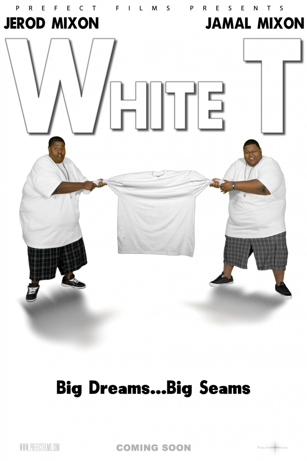
This week, I was planning to lead with Guy Pearce’s new Iron Man 3 poster, where he’s dramatically pulling off his sunglasses like David Caruso in CSI Miami. I like to lead with a movie people have heard of so they’ll click through, and that seemed like the obvious choice. But then I saw White T here, and it simply could not be denied. Just look at this goddamned masterpiece. Do I know what it’s about? Not really. But I know it’s got Weensie from Old School and his similarly portly brother dressed in matching, sockless plaid shants ensembles fighting over a t-shirt with the tagline “Big Dreams…Big Seams.” What does this white t represent? Why would they be fighting over the same white t when they’re both already wearing identical white tees? Is it a battle over who gets a change of clothes? A metaphorical struggle for identity? I can’t say. Point being, this poster is practically bloated with ambiguity, which doesn’t soften my desire to see it one bit. This, my friend, is how you sell the sizzle, not the steak.
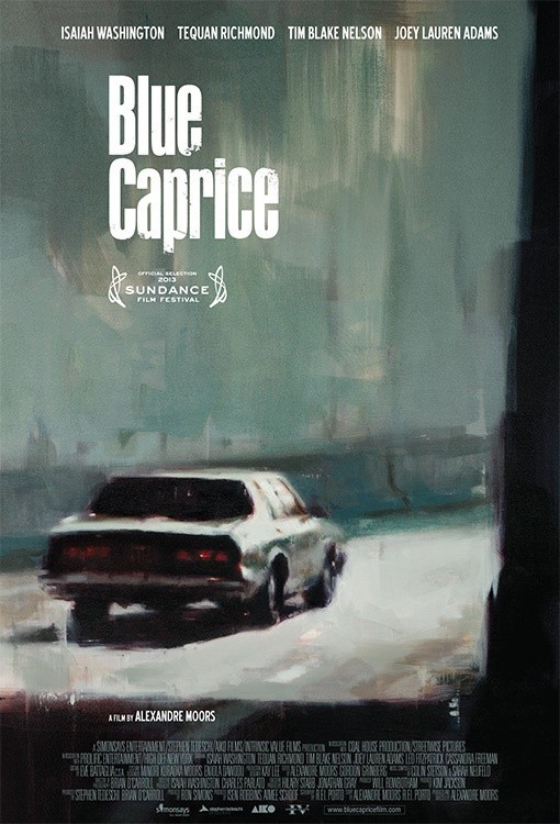
Well this looks… uh… Sundancey.
A narrative feature film inspired by the events known as the Beltway sniper attacks. [IMDB]
Ahhh, well now it makes sense. In any case, it’s nice to see Joey Lauren Adams is still alive. As long as I never have to see Chasing Amy again.
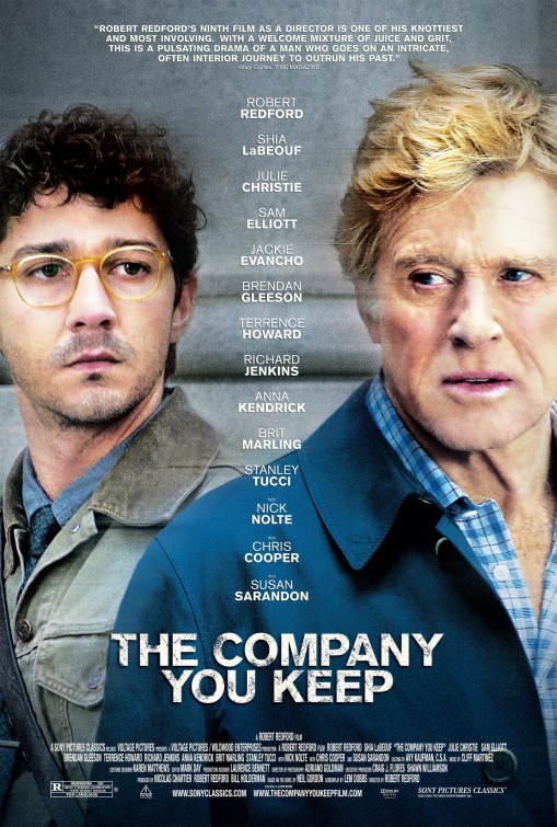
My God, that is the longest poster blockquote I’ve ever seen. Usually you just get “EXCELLENT,” from some guy you’ve never heard of, and who knows if his full quote was “God, what a terrible movie, but on the plus side, the popcorn was excellent”? It’s nice to have a little more context.
But as for the quote itself… “A welcome mixture of juice and grit…” What do you suppose “juice” would mean in that context? I honestly have no idea. It’s basically meaningless. Between the juice and the knots and the grit and the pulsating, I think Corliss might’ve been reading 50 Shades of Grey right before this and was still thinking in boner prose.
Also, Shia Labeouf dressed like an intellectual looks about as convincing as a baseball hat on my dog.
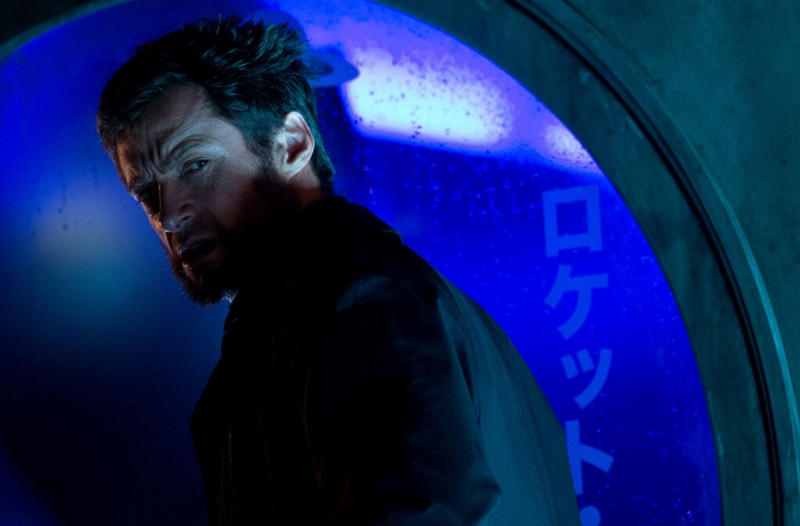
And here’s Hugh Jackman looking kind of haggard in a new still from “The Wolverine,” which Fox is still making, even though X-Men started a totally different timeline. I wonder if Hugh Jackman used “Frank” or “Charles” to shoot this one. God, why would he ever tell people about that? It’s impossible to know someone has named his alter-egos and not joke about it.
[Empire]
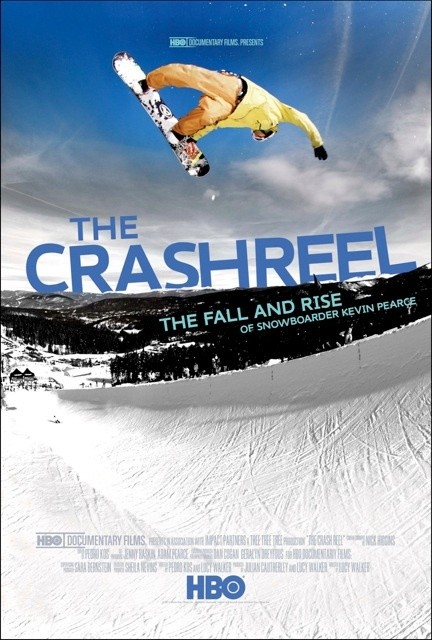
I like the way the guy is in midair and the movie has “CRASH” right there in the title. It places you in the mindset where you’re just counting down the seconds until the inevitable faceplant like a parkour video.
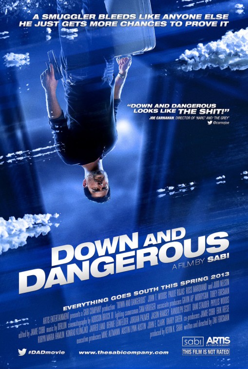
Well you intrigued me with the upside down subject, drew me in with the swear-wordy quote from Joe Carnahan, and sealed the deal with the one-named director. He must be a big deal! Why else would he have one name, like Madonna? Only big stars like Prince and Sade and Sapphire go by one name.
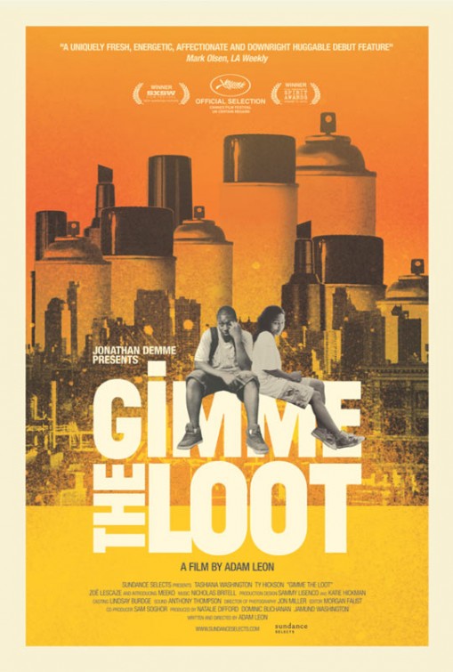
This seems to be about tagging, judging by the paint-can cityscape back there, but then it’s called “Gimme the Loot.” Maybe graffiti art is just that lucrative now? Thanks, Banksy. I also enjoy the In Living Color typography.
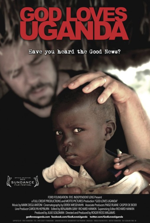
A movie about crazy Christians in Uganda? I’ll go for that. As long as the “eat the poo poo” guy features prominently. Ahh ahhh hustagafulizaha. Funniest hate video ever.
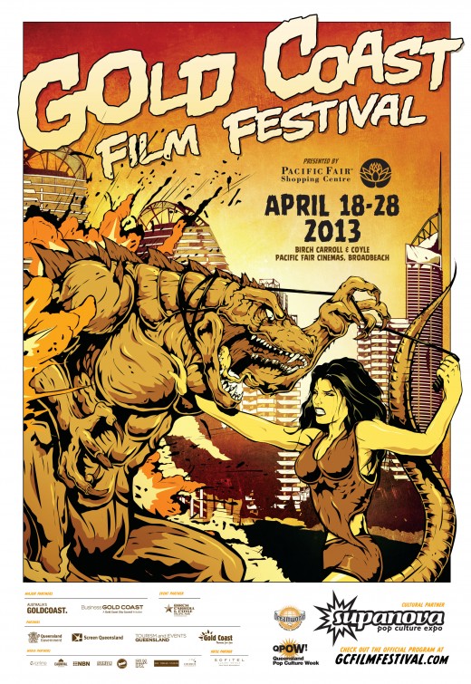
Oh wow, A+ for poster design there, Australia. I like how the dragon has buff pecs. Can’t have a dragon without pecs, I always say. And the girl just sort of has her hand on one, like she wants to control him because he’s such a scary beast, but she can’t help but be turned on at the same time. My sex life is exactly like this.
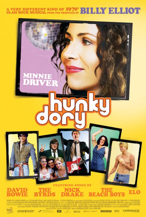
Minnie Driver! Where has she been? Anyway, they really shouldn’t have put Billy Elliot above the title. I remember watching that, getting about 25 minutes in and thinking, “wow, so it’s just going to be exactly the movie I was expecting it to be without the slightest variation, huh?” Billy Elliot was the kind of movie that trains you never to bother seeing those kinds of movies.
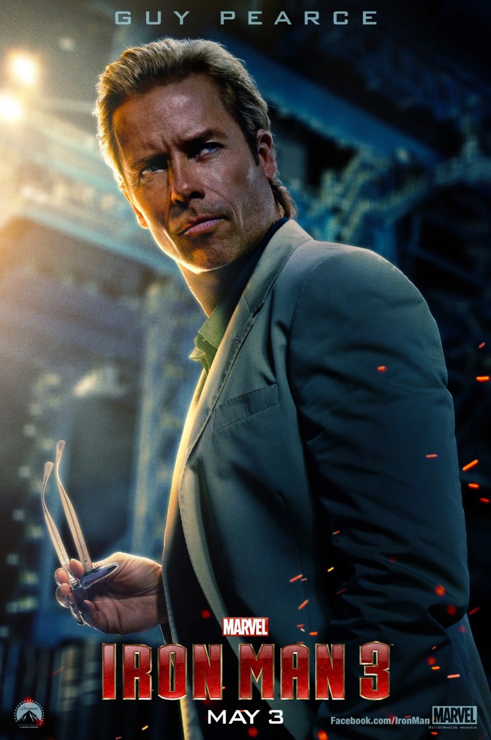
Speaking of hunks, here’s Guy Pearce in his character poster for Iron Man 3, in which he plays Aldrich Killian. It’s like he’s trying to steal Don Johnson’s wardrobe and David Caruso’s acting style. Not that there’s anything wrong with that. Based on this, I like to imagine that after he delivers a Caruso-esque one liner, instead of the traditional “YEEEEEEEEAH” he gets a cloud of sparks.
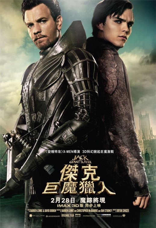
What the hell is on your neck, Ewan McGregor? From this angle, his armor looks like one of those shoes with wings on it.
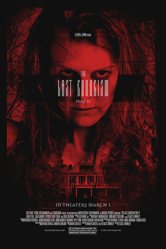
Cool poster for The Last Exorcism II, and I applaud the use of the ornate font to disguise the inherent ridiculousness of the title.
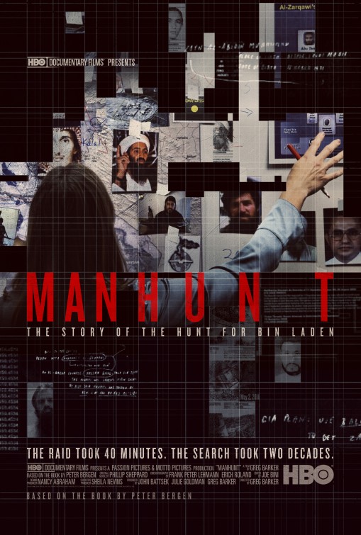
Do they use a lot of graph paper in the anti-terrorism unit? “We’ve got to catch Osama Bin Laden! Quick, who here can use a straight edge?”
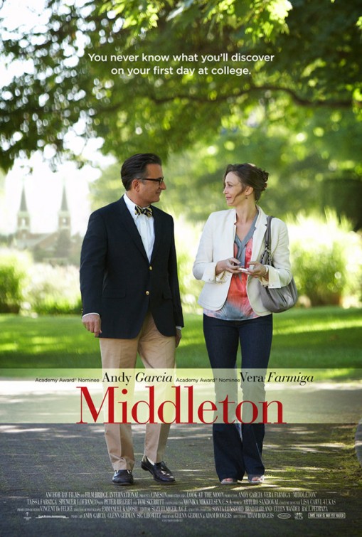
Andy Garcia is the fanciest! Also, this is the blandest poster I’ve ever seen. This poster makes unsweetened oatmeal look zesty.
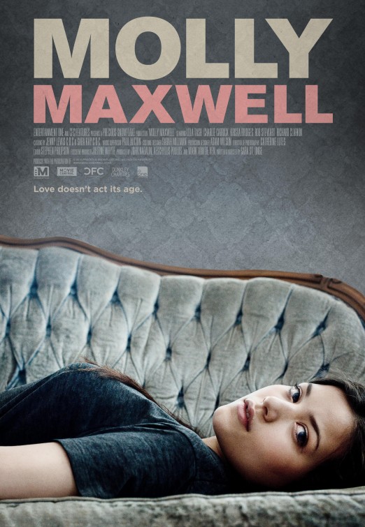
Well hello there, miss, I’m enjoying this topographical map of your breast. The IMDB page doesn’t say what it’s about, but the director’s name is “Sarah St. Onge,” which sounds kinda porny, so I have high hopes.
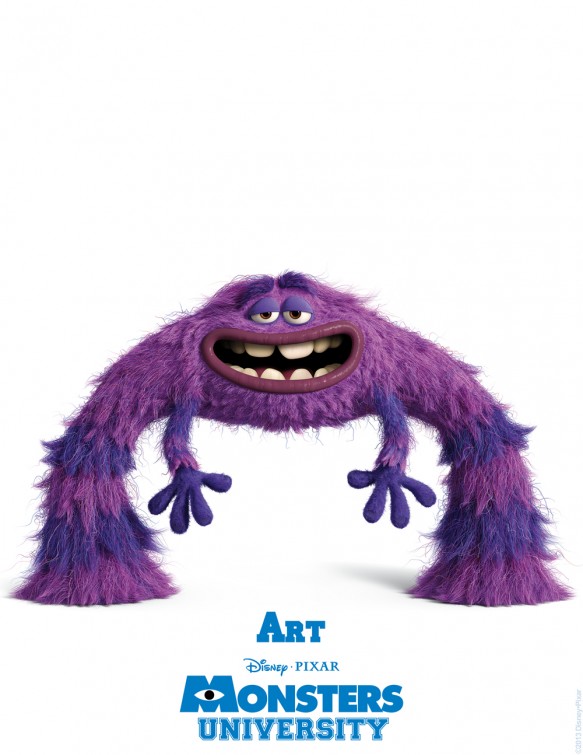
This is from a big batch of new Monsters University posters. I don’t even really need to see the movie, I just enjoy the character design. I could read a coffee table book of Monsters U character design. There’s an inherent cuteness to it. Contrast this with something like, say, The Hobbit, which is just gross piled on top of gross. I’m telling you, Peter Jackson missed his calling as a fake vomit designer.
This guy up here kinda reminds me of one of those African dudes with the giant testicle disease.
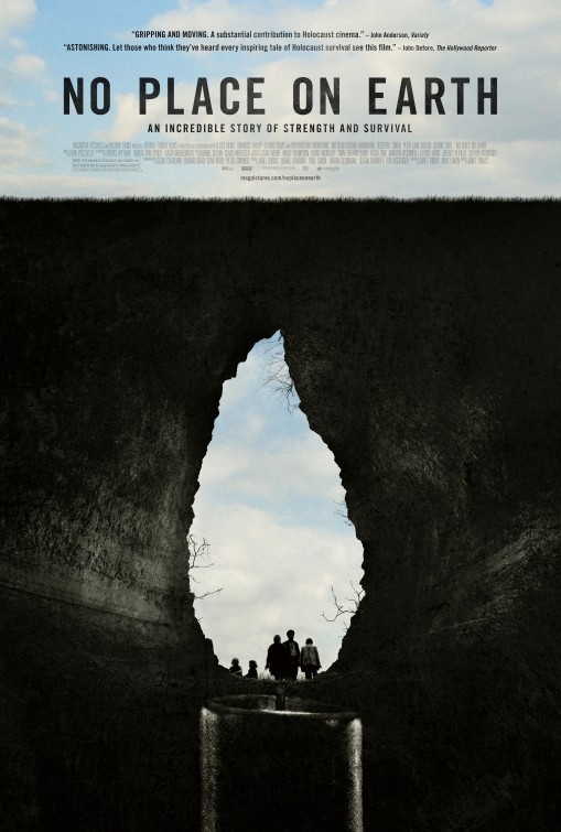
Well that’s a clever poster design. And the quote says something about “Holocaust cinema.” You think this is about some kind of secret Jew tunnels? I’m so there.
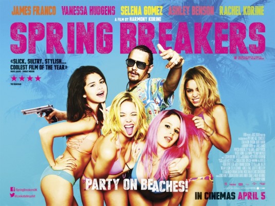
I’m a sophisticated man with complex tastes acquired over the course of many years of debonairness, and as such, I’m a total sucker for young girls in bikinis. And taglines like “Party on Beaches.” I love a literal tagline.
I hope they didn’t airbrush Selena Gomez’s butt to make it smaller, because she could use the opposite.
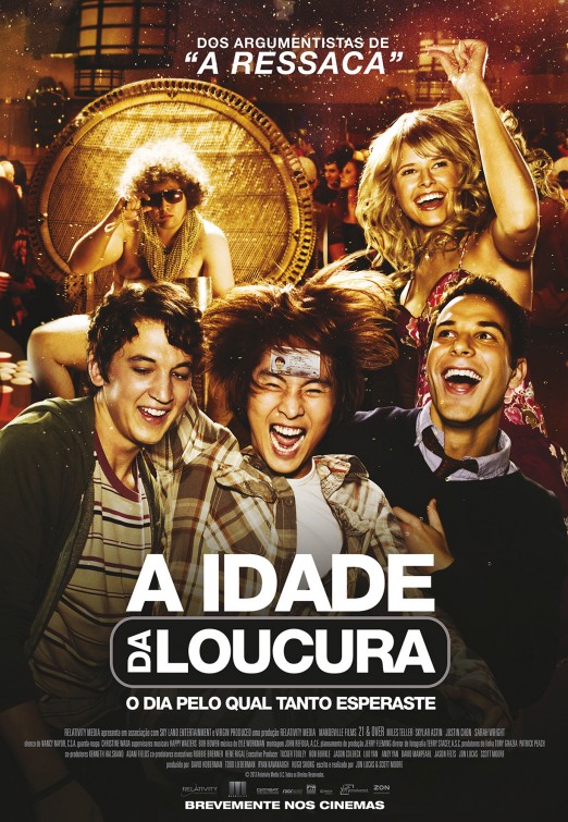
Here’s a Portuguese poster for 21 and Over. Jeez, guys, The Hangover much?
Asian dudes gonna med school, y’all.
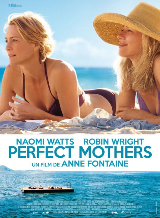
Oh Jesus. I know I complain a lot about faces not matching up with names on posters (just make them match! how much easier could it be?), but it’s even worse when the actresses are two blonde chicks who look exactly the same. This might be the most obnoxiously mis-matched poster I’ve seen.
Simple yet effective. And I enjoy that they didn’t go with the more obvious red background. The blue is all classy.
[posters via IMPA]