This week in This Week In Posters we begin with… DAMMIT WHAT IS THAT FONT! It’s the same one from the Thoroughbreds poster. Initially I thought it came from Gone Girl, but it’s not that. Then I thought, Girl On The Train? Girl With The Dragon Tatoo? It looks like the font from a movie with “girl” in the title, doesn’t it? Ugh, it’s killing me. It’s the edge-of-your-seat thriller font.
Anyway, someone get this girl some Gore Tex, she’s going to be soaked.
THERE IT IS AGAIN! Was it Fifty Shades that started this font trend? It’s a good font, because you can tease an ejaculation scene and it still seems upscale. This movie looks like it’s going to be the Zales diamond commercial of jizz shots.
Cock blockers, eh? Real subtle. Maybe they should’ve used that Fifty Shades jizz font.
Christ, look at all those CalArts faces. I liked Coco better when I thought the goofy doggy was the main character.
Sherlock Gnomes! In case you didn’t know, it’s the sequel to Gnomeo And Juliet, which is weird, because I would’ve assumed Gnomeo and Juliet killed themselves at the end.
So Gnomeo and Juliet both lived? What kind of bullshit gnome-based retcon is that? Whatever, these posters are fine, I guess. I get a thrill every time an animated producer takes on existing Intellectual Property without paying royalties. My brand appreciates solid business strat.
There are a few of these Greatest Showman posters, which are mostly great, except I can’t understand why the backgrounds are all tilted.
Is she swinging through the air holding herself up by one arm? That lady has a strong upper body. She must be very wiry.
You’re telling me this guy has been wearing a top hat all day and his hair is still that bouncy? Oh please. I don’t buy it.
Is there any good reason for that background to be tilted? If I take this at face value those people are about to fall on the floor.
Does he ever actually wear the hat? Or is hat : showman:: Will Smith : cigar?
We talk a lot about whitewashing and cultural appropriation, but no one ever complains about the normal looking having all our roles stolen by the ridiculously attractive. Like wasn’t Tonya Harding’s entire hook the fact that she was kind of white trash and didn’t look like a willowy supermodel? It kind of takes away from the gritty, tough-girl realism they’re going for that they cast a human swan as Tonya Harding. This is like normal-looking person minstrelsy.
Just Getting Started looks like a full-page AARP ad.
What is she doing with her arms?
I have no interest in this movie, but I would pay double to watch Tommy Lee Jones’ face as he read this script the first time.
This poster is visually interesting, but I keep looking at the shapes of the cutouts to see if they’re supposed to represent something. That’s a weird shape to just pick at random, no?
Whoa, easy on the amorous face there, Dan Stevens. He looks like he’s composing a poem about my privates.
“Hi, I’m Garret Hedlund. You might remember me from such films as that one set in the 1940s and that other one set in the 1940s. At the end of this three-week course, you will have mastered the 1940s face and will be able to make a fine living doing period pieces like me.”
I haven’t seen Mudbound yet, is it a play on the Dust Bowl? “For these posters can we do like Diane Arbus but for mud?”
“Say no more, fam.”
But if everyone cocks their hat to the side, is it still cool? Man, I love Jason Mitchell. He should be in everything.
Are you ready for Paddington 2? That marmalade-loving-ass bear returns, this Christmas. Can we get him some better bread though? The fastest way to ruin a marmalade sandwich is to put it on some nasty sliced whole wheat loaf. Someone get this friggin bear a baguette, am I right?
I like the way the bear runs. That is all.
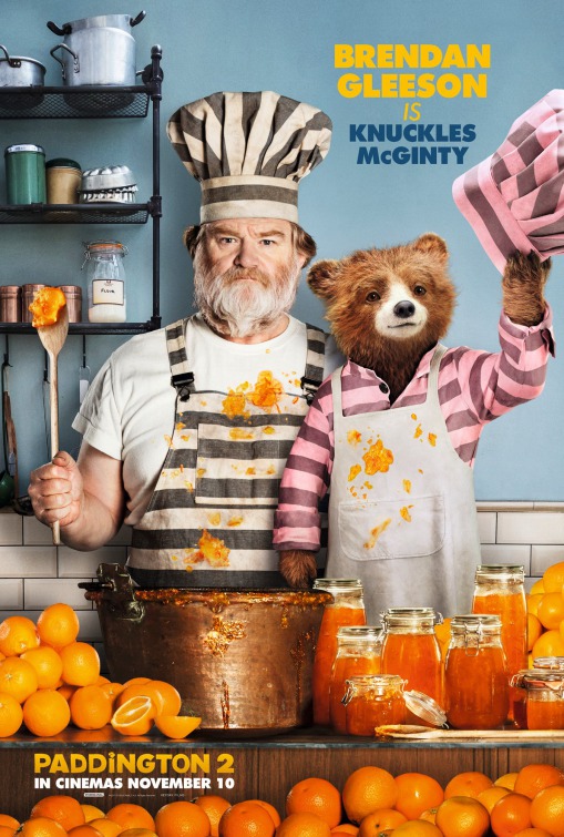
I don’t know what it takes to make marmalade, but I would totally make marmalade with those dudes. Brendan Gleeson is a very bear-like man. He could be Paddington’s gruff-but-loving Irish dad.
Well this certainly appears to be a movie about hair. I feel like a period piece constantly references the hair and styling in the promotional material is a very bad sign.
Christ, another one? What school are you guys even in at this point?
OH HELL YES IT’S THE RETURN OF BOOBOO STEWART! I’d been counting down the days, y’all.
I appreciate that they sort of tried to make the names and faces match up, but really everything else about this poster kind of screams bargain bin. Unless it’s Daniel Day-Lewis or Dame Judi Dench, there’s no reason to put an actor’s headshot above the title. Especially not when the actor is (*squints*) Jonathan Lipnicki (yes, yes, it’s the kid from Jerry Maguire, I remember). Also, this is neither here nor there… What the hell is on top of that keg?
NEW POSTER TREND ALERT! What should we call this one? My Head Is The Singularity?
The colors and the artwork are very cool, but everyone in this looks incredibly bored.
No porgs? F*ck you.
Okay at some point we’re going to need to figure out a better way to represent poignant coming-of-age drama than with someone’s wide open mouth. See also…
Hell yeah. It’s about time Jon Bernthal got top billing. Also, is this his 37th movie this year? Whatever, I’m not questioning it.
Hey, great job, Thor. It’s a diagonal that actually makes sense. See, it can be done.
Hey, another diagonal that makes sense! Have we ever had two in a row before? What’s the reflection lady doing, peering off her rooftop? That’s cool, I guess. Okay, gotta go.
I don’t know what Photoshop filter they’re using, but it has turned Owen Wilson’s face into a clay sculpture of a Joshua tree. Can we do something about that?