We hear a lot every day about climate change and the melting of the polar ice caps, but it can be hard to put what you’re hearing into perspective. Just how fast is the ice actually melting? How much has already been lost? In a recent speech, President Obama mentioned that global warming has necessitated the biggest changes in National Geographic‘s world maps since the breakup of the Soviet Union.
That’s the pretty striking statement, and National Geographic is really driving it home using the language the Internet understands best. Yup, they made an animated GIF illustrating the shrinking of the arctic ice cap between 1994 and 2014. It’s a simple thing, but it definitely makes this whole crisis clearer…
Wow. That… doesn’t seem good at all. Well, unless you’re still searching for the Northwest Passage. Here’s a video explaining Nat Geo‘s mapping process.
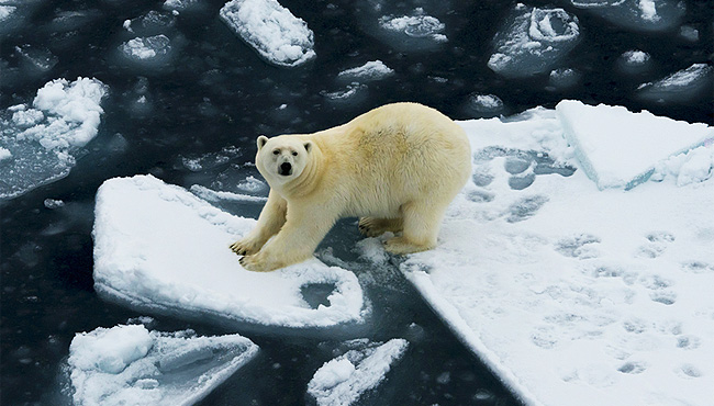
This just had to come out on the hottest, muggiest day of the year, didn’t it? But no, no air conditioning. I hope you polar bears appreciate this.
(via National Geographic)