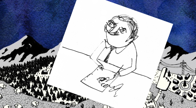
The cover art for Father John Misty’s Pure Comedy is a contemporary vision of a medieval nightmare — a wildly detailed cartoon illustration depicting fools, sadists, zealots and charlatans engaged in all manner of debauchery and nihilistic excess. Josh Tillman (Father John Misty) personally reached out to New Yorker cartoonist Edward Steed to draw the piece, as his characteristic doodled illustrations and wry black humor served a perfect complement to the record’s sardonic meditation on the modern condition.
Steed began contributing to the New Yorker about five years ago after responding to the magazine’s open call for submissions. At the time, he had no professional experience as an illustrator and says he had to develop his unique style and technique on the fly.
“At first, my drawings weren’t particularly good,” said Steed. “But it’s more about having ideas anyway, so I try to send a lot of ideas. That’s what impresses the New Yorker editors. And then I learned to draw gradually over the years.”
He soon became a favorite among editors and readers, selling dozens of pieces to the magazine each year. Once able to support himself as a cartoonist, Steed quit his job as an architect and recently moved to New York from the UK. In November, Steed, along with Tillman and Sub Pop Art Director Sasha Barr, was nominated for a Grammy for best recording package for Pure Comedy. A condensed and edited conversation with him about the nomination is below.
How did the project come about?
I think Josh must have first seen my work in the New Yorker. He wrote to me about a year before I started working on the cover. He sent I Love You Honey Bear and wanted to know what I thought about it, and we chatted back and forth on I email. About six months later he told me he was working on a new record, and six months after that he sent me the first track and asked if I’d like to do the cover art for it.
What was it like working with Tillman? How collaborative was the process?
He began gradually sending me rough versions of the songs from the studio. I started working as I received the songs, diddling ideas down. The idea for the cover — the mountains with the changeable background — that was Josh’s idea from the very start. That was really his only requirement: To have interchangeable backgrounds for the sky, so I could draw whatever kind of chaotic scene in the foreground. I sent him a couple of sketches early on but he never had any notes, so I stopped sending them and I got on with it myself. It was a very easy collaboration; he was always very enthusiastic.
The surreal scene depicted in the album cover reminds me of one of Bosch’s paintings. Was that kind of medieval art an inspiration for the work?
When I was working on the sketches for the album cover, I would go to the library and look at paintings by Hieronymus Bosch and various medieval texts and illuminated manuscripts — visions of hell and things like that. I spent about a month doing that and doodling — getting ideas for the tone of the cover. The finished work took about three days straight of drawing to complete the front cover and another three or four straight for the back cover.
It seems to me there are a lot of similarities between your work and Tillman’s. Would you say you both touch on the same themes or share a similar an outlook on the world?
I think so. I never made any effort to illustrate the songs or reference any of the lyrics. I drew the kind of thing I’d want to draw if I was making an album. Since Josh had asked me because he liked my work, I assumed that would be alright. Obviously, he thought there was some overlap in our worldviews, and I think there is.
I don’t analyze my work very closely, but I suppose we share a vision of man’s fragility or the absurdness of man’s existence at all. I’m sure Josh is much more articulate on this kind of stuff than I am. I just sort of draw what’s in my head, what comes bursting out from doodling. Rather than having a concept, I just start drawing and see what comes out.
Do you have any favorite scenes or characters in the piece?
My favorite is the bit with the guy with a rocket attached to his back standing on a ping pong table. We made a set of pretend tarot cards to accompany the record with all of the same characters from the album cover, and we used that character on one of the cards. I think Josh likes that one too. For his stage show, he animated the characters and projected them on a big screen behind the stage. He made quite a cute little animation of that rocket man flying through the sky.
How does it feel to be nominated for a Grammy? Is this something you ever expected?
I didn’t know there was such a thing as a Grammy for a record cover. I think it’s funny. I must be one of the least musically talented people to ever be nominated for a Grammy, which is alright with me.


