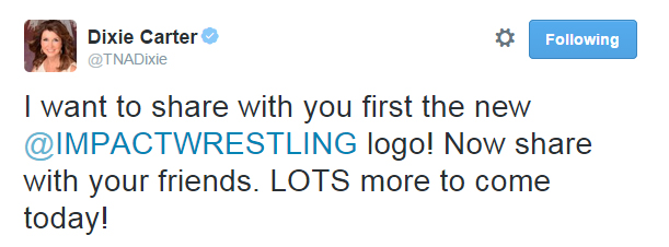
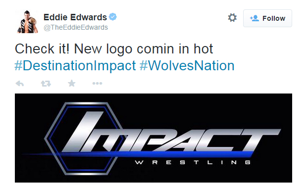
If you’ve wondered what kind of changes are to come with Impact Wrestling’s move to Destination America, Dixie Carter took to twitter earlier to announce what are hopefully the first of many to come. A new home deserves a fresh new logo, and…oh…oh my, that’s what you’re going with?
Eeeeeyyyyuuuuuup. Someone, nay, multiple people saw this – a logo that looks like the entirety of AJ Styles put into a PowerPoint slide – and said oh yeah, that’s the one for us! Now look, there are a lot of cool things that Global Force Wrestling is doing that could set a great precedent in the industry, like partnering with New Japan, and bringing more awareness to small indie promotions and wrestlers in other countries (like our beloved Evie). Making all of your professional wrestling logos look like they were designed by an unpaid intern at a security company desperate for that elusive mall cop contract, however, is not one of them.
Of course, because ~corporate synergy~ or whatever, the Impact Wrestling Superstars have not been getting hype, but staying hype about the new logo as well. The Monster Abyss took time out from his busy schedule of eating crustless cucumber sandwiches and playing pinochle with James Storm in the woods somewhere to send this kayfabe-busting tweet:
I’d be remiss if I didn’t point out that The Monster Abyss having a purple sparkly bishōjo twitter background is the highlight of my week, and is doing nothing to dissuade me from the idea that boy wrestling is just one giant reverse harem anime.
Ooo yeah. Comin’ in hot, like a bowl of soup for a cranky octogenarian, or what my baby brother used to leave behind in his diapers.
Haha whoops how’d that get in here


