Welcome to the new era of Dallas Stars hockey — the one where everything is super green, stars get rounded off and the “Dallas Starbucks” joke is way too easy.
Via SportsLogos.net:
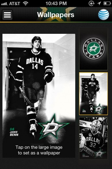
Overnight the new logos for the Dallas Stars have been leaked courtesy the team’s official iPhone app.
According to our amazing and always accurate sources, SportsLogos.Net can confirm that the new logos, which appear in the screenshots, are 100% accurate and will be used by the team in the 2013-14 NHL season. The leak was spotted and tweeted to us by @DamnOldNylon
Here’s a look at the screengrab from the app, via Twitter.
Compare and contrast:
Is anybody else sick of these round logos? I think that’s one of the subliminal reasons I’m a Caps fan … our logo looks like Batman, kinda, and the text one is too long and gangly. The other subliminal reason is sadness. But I’m pumped to see this all over Texas next season (and by “all over” Texas I mean “in two giftshops in Dallas only”), and hope it trickles down to the Texas Stars as well.
I am also gonna run out and grab some coffee, brb.


