The past few years have been a goldmine for uniform lovers as Nike has gotten their hands on teams and made some drastic changes. Nike and the NFL revealed earlier this year that some teams will be wearing special “color rush” uniforms for some future games. On Thursday, we got our glimpse at our first two teams, the Jets and Bills. They look terrible. The Jets green is freakish. Anyway, they started plenty of arguments among the world as to who has the best uniform. Well, it’s time to hand out some grades and make a definitive list of who has the best duds in the NFL.
For this exercise, I will ignore all alternate jerseys and throwbacks. As sweet as some of them are, some teams have them and some don’t, so it’s not fair to factor them into the ranks, and I’ll just save those rankings for their own separate posts, and rest assured the Steelers bumblebees will be last.
Let’s do this, from best to worst. Here are the definitive rankings, and if you disagree, you’re wrong.
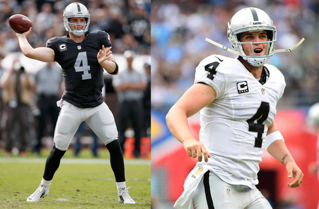
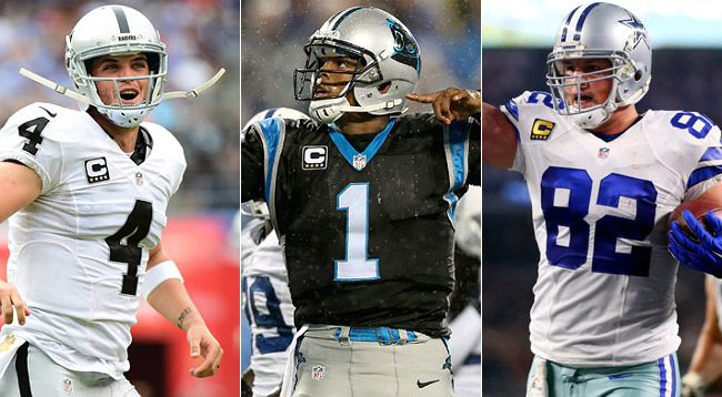
Raiders
Helmet: A
Home: A
Away: A
The Raiders uniforms are perfect. OVERALL: A+
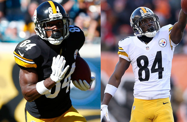
Steelers:
Helmet: A
Home: A
Away: A
It’s hard to find anything wrong with the Steelers look. OVERALL: A
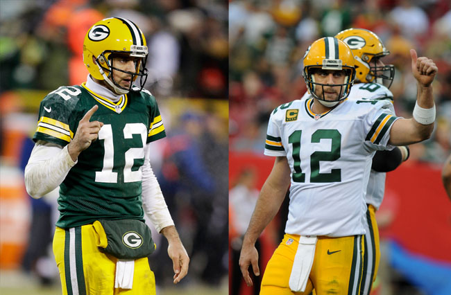
Packers
Helmet: A
Home: A
Away: A
The Packers have kept their uniforms largely the same for decades, and it’s easy to see why. They are fantastic. OVERALL: A
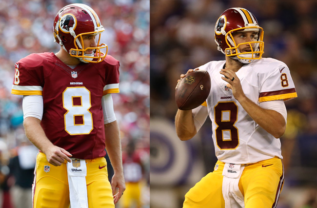
Redskins
Helmet: A
Home: A
Away: A
The Redskins uniforms are great. Burgundy and yellow (they say it’s gold, but come on, that’s yellow) are perfect together. The yellow facemask on the helmet is superb (colored facemasks are the best). This is just a stellar getup. If they ever change the name, they better not change the color scheme at all. OVERALL: A
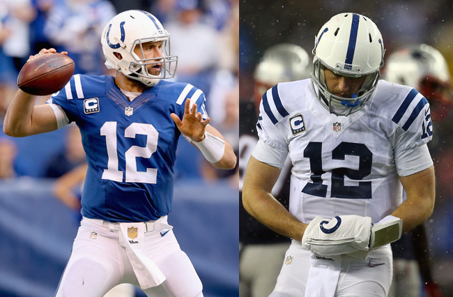
Colts
Helmet: B
Home: A
Away: A
The Colts have a great getup. Simple, great use of shoulder stripes, and one of the most tolerable white helmets (it looks very good with the white uniform). OVERALL: A-
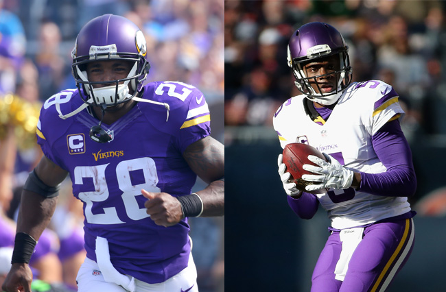
Vikings
Helmet: A
Home: A
Away: B
The Vikings uniform got a Nike makeover a few years ago and probably came out of it with the least amount of controversy. The Vikings toiled in bad uniform hell for a lot of the 2000s, but the redesign is solid. It’s simple and classic. I’m still torn on whether or not I like the matte finish on the helmet, but it hardly matters because the Vikings have one of the great NFL helmets — they don’t just slap the logo on it. While the home purple uniform gets the job done, I feel like the white away uniform doesn’t work quite as well, but I can’t explain why. Purple shirt on white pants looks great, but white on purple just feels off to me; maybe it’s the particular shade of purple used. OVERALL: A-
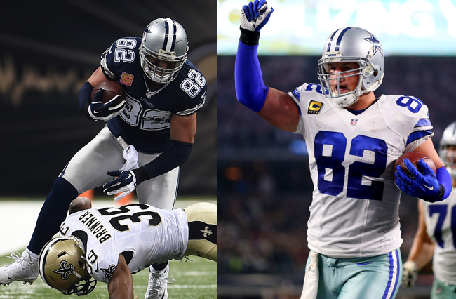
COWBOYS
Helmet: A
Home: B
Away: A
The Cowboys are one of the few teams that wear grey well. Maybe because they don’t overuse it and have strange light blue-grey pants. The one thing I really don’t like about the home (white) uniforms is the black trim on the numbers/stripes. I think it’s unnecessary. Sadly, because they wear the white ones so often, we rarely get to see the amazing uniforms, which are actually the best. The fanbase considers them cursed, which makes them even better; they need to wear them more often. OVERALL: A-

49ers
Helmet: A
Home: B
Away: B
I love the gold helmet. The home uniform is great and a classic look, but the current iterations have this awkward thing going on with the stripes; the stripes aren’t complete but get cut off by the armholes in a strange way. There are supposed to be three stripes, but it’s like one and a half. That weird Nike quirk alone keeps these from being an A. The away uniforms have the same problem and look even less bold as white. OVERALL B+
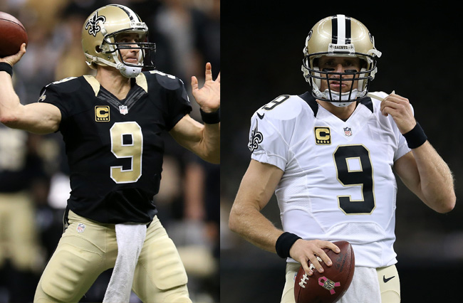
Saints
Helmet: A
Home: B
Away: B
I think the Saints uniforms are underrated. They are really good. The gold half collar is a little distracting at first, but the colors look so good together. The big downside here is when they wear the all black pants. All black pants should never be worn; it looks like everyone has leotards on and does the fatter players very few favors. OVERALL: B+
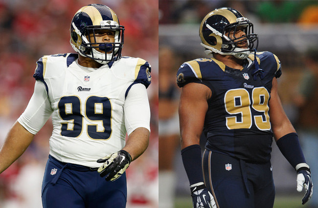
Rams
Helmet: A
Home: B
Away: C
The Rams uniforms are overshadowed by how awesome their yellow/blue throwbacks are, but these home jerseys are still good. Blue and gold is still a solid combo. The away uniforms are fine, but they have that stupid Nike half collar thing going on. The helmet is still the best in the NFL. OVERALL B+
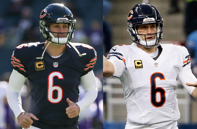
Bears
Helmet: B
Home: A
Away: B
The Bears have great home uniforms, special notice to the striped socks, which more teams should do. The three stripes look great. The away uniforms are slightly bland, but still fine. A solid, steady uniform. OVERALL: B+
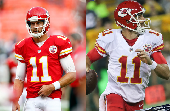
Chiefs:
Helmet: B
Home: A
Away: B
This is a solid uniform. Gets the job done right. OVERALL: B+
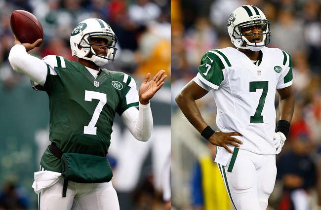
Jets
Helmet: B
Home: B
Away: A
The Jets uniform is underrated. The stripe pattern on the shoulder looks great with nothing fancy overloading it. It’s a surprisingly strong look, although this is one of the few times I’d say the white away version looks superior to the home color version. I dislike white helmets, but the Jets wear it better than most with the stripes. OVERALL: B
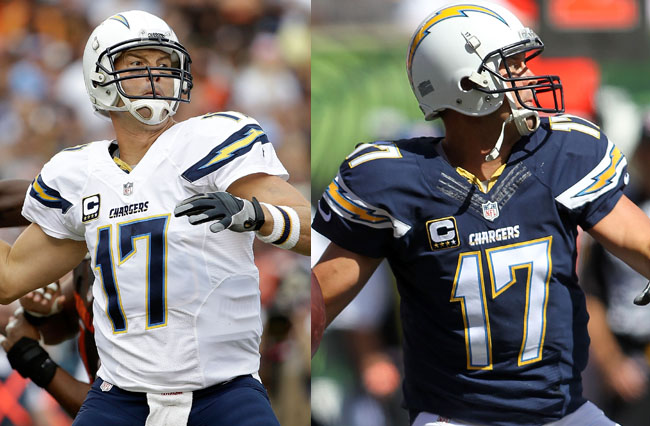
Chargers
Helmet: D
Home: B
Away: B
The Chargers uniforms are nice, but not fantastic. The new versions have yellow lettering and it just looks terrible; make the colors white again. The pants are overlooked, but are actually great. The big thing that drags the uniform down for me is the helmet. White helmets are the worst, they will always look like someone just forgot to paint a helmet and slapped a logo on. It looks like boring drywall with a lightning bolt sticker slapped on it. Or a refrigerator with a magnet on it. OVERALL: B
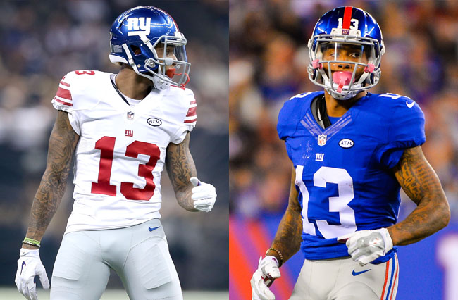
Giants
Helmet: B
Home: B
Away: C
The Giants uniforms are incredibly basic, in a good way. There really isn’t much to say. They have a very simple, no nonsense style. Just white on blue. Dull grey pants. The helmet is a nice shiny blue. Nothing fancy. The red numbers on the away uniforms are actually nice and contrast well with the helmet. Sadly, the stripes on the sleeves are just a touch too close to the 49ers away uniforms; they could use more distinction. OVERALL: B
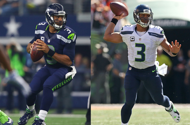
Seahawks
Helmet: B
Home: B
Away: B
The Seahawks were the first major makeover by Nike, and as far as outlandish ideas go, I still think they’ve gotten the best overhaul. It was quite a shock the first time, but over the past few years, I’ve really come to appreciate them. The Seahawks had really boring uniforms for a while, and these are bold and different. The pants are fantastic; I love the pattern. The numbers are big and grey and textured just subtly enough. The grey shoulder stripes are a little strange, but as a whole, this is a solid output. OVERALL: B
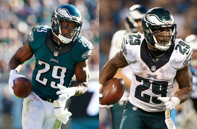
Eagles
Helmet: A
Home: C
Away: C
The Eagles uniforms are trapped in the angst teen phase when everything was dark and dreary. Big black collar. Overly fancy numbers with grey trim and a drop shadow. It looks even worse on the white. The midnight green color is reasonably nice, that’s about it. The helmet is fantastic, though. I wish more teams would make creative helmets like these. OVERALL: B-
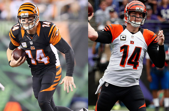
Bengals
Helmet: A
Home: B
Away: D
The Bengals uniforms seem like a love it or hate it affair for most people. For me, I think it’s in the middle. I love the helmet, but I love unique helmets that refuse to use logos. I like the black home jerseys and the stripes, but I think they should drop the white sides and make the collar orange all the way around or not at all. But while I think it works for the home, I think the away uniforms are just a mess. There isn’t a true dominant color on the away jersey; the white only covers the torso with big black letters and orange outlines, then orange shoulders, black stripes and black collar. It’s three evenly spread colors all vying for dominance, and it clashes terribly. OVERALL B-
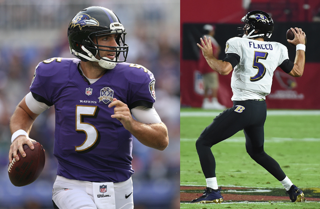
Ravens
Helmet: B
Home: B
Away: D
Purple is such a good color, and with black, this should just work beautifully, but it doesn’t. The name of the team makes this the one team that should be dark and moody, but the font is goofy. The big knock here is the all black pants, which, as I said for the Saints, looks like a leotard and should be banned. OVERALL: B-
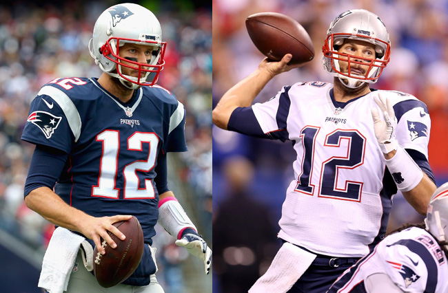
Patriots
Helmet: C
Home: C
Away: B
The Patriots uniforms are at best mediocre. There isn’t much to say; they are just sort of there. There is nothing bad, but nothing good. The only part I think is unique and good is the away uniform numbers. I like how the red outline doesn’t actually touch the blue. OVERALL: C+
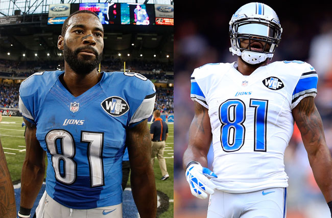
Lions
Helmet: C
Home: C
Away: C
The Lions uniforms are just sort of there. They are fine. The font with the little notches in the numbers is bad. OVERALL: C

Dolphins
Helmet: C
Home: C
Away: C
Nike did two things I really don’t like in making the new Dolphins uniforms: They added weird black stripes around the numbers and removed the shoulder stripes. Also, they changed the logo, so three things. This used to be one of the best uniforms, now it’s just kind of average. OVERALL: C
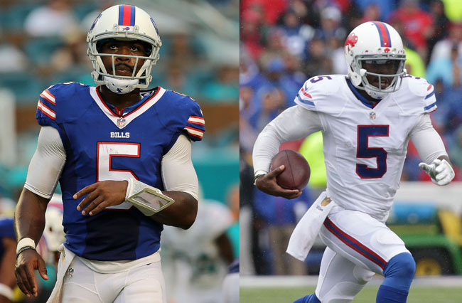
Bills
Helmet: D
Home: B
Away: C
Boring white helmets. A terrible uninteresting white away jersey. Uninspired color selection. The only decent part of the uniform is the color home jersey, because the blue is nice when there is a lot of it to go around. OVERALL: C
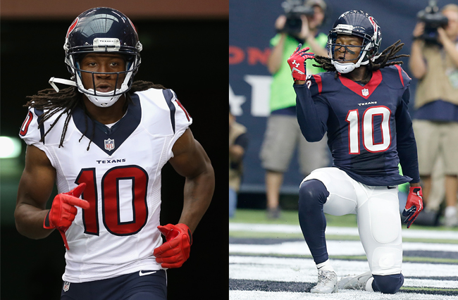
Texans
Helmet: C
Home: C
Away: C
The Texans are one of four teams that use red, white and blue as their colors. The unique font is good, but overall the uniform doesn’t inspire or offend. The Texans have a very uninspired look, and I wish they would do something crazy just to give it some personality. OVERALL: C
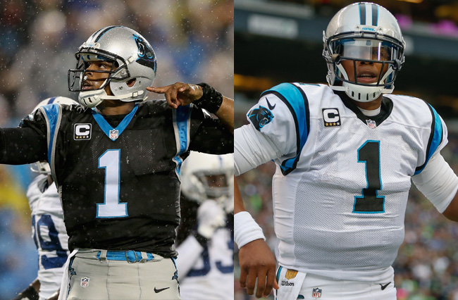
Panthers
Helmet: C
Home: B
Away: C
The Panthers aren’t really remarkable. Grey is a boring color and does the helmet no favors. Black jerseys with bright highlights are great, but I don’t like the strange loops the shoulders have. Part of me wants the grey gone completely, leaving just stark black and blue. OVERALL: C
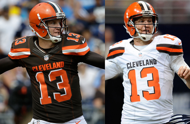
Browns
Helmet: A
Home: D
Away: B
Oh the Browns, how you have fallen. Just a year ago, I would have listed the Browns in the top three uniforms, and Nike went and ruined it. The new home uniforms are just terrible. Orange numbers and names on brown is unreadable half the time, the white drop shadow should at least be a white outline. The BROWNS on the pants are just terrible and way too big, and the orange pants make them look like traffic cones. The saving grace here is the new away uniforms, which actually still look pretty good outside the BROWNS on the leg. If they kept the numbers white on the home jersey, this would fly up the rankings, but those orange numbers are an atrocity. OVERALL: C
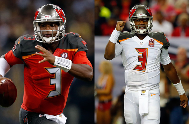
Buccaneers
Helmet: A
Home: C
Away: D
The Bucs got quite the overhaul by Nike and, unlike the Seahawks unis, the Bucs just feel like a mishmash of neat ideas that don’t really come together into a cohesive whole. The digital alarm clock numbers are the biggest offenders; what about digital clock numbers fits a pirate theme? There is an overload of pewter, and the shoulder pads look a little too arena league. The away uniforms are even worse because it highlights the terrible numbers even more. The one saving grace is the helmet, which is simply fantastic. OVERALL: C-
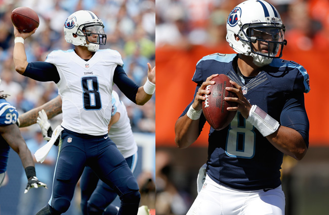
Titans
Helmet: D
Home: C
Away: C
The Titans uniforms are kind of a shame. They took a really good idea (the thin top stripe on the shoulders) and gave it boring colors and a stupid font, wasting its potential. Dark blue and light blue are far too common in the NFL, and this jersey uses them both. It’s just bland, bland, bland. Also, white helmets are bad. OVERALL C-
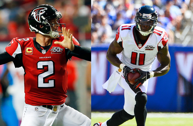
Falcons
Helmet: B
Home: C
Away: D
The Falcons uniforms are like a slightly more interesting version of the Cardinals, but that doesn’t mean much. The strange pattern on the sleeves makes little sense. The drop shadow is outdated. Mostly, it’s just sort of there. The white away uniforms are bad. The Falcons have a stupendous throwback, but that doesn’t count here. OVERALL: C-
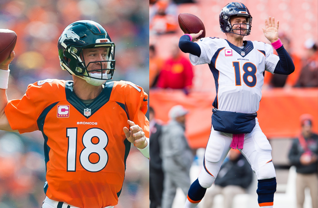
Broncos
Helmet: C
Home: D
Away: D
The Broncos are stuck in the ’90s. The strange side stripes that link to the collar… The orange traffic cone color is bold, but the layout of the blue just doesn’t do it favors. The away uniforms are even worse. The helmet is average. At least they look better than the actual ’90s uniforms. I’d love to see Nike try something new here. OVERALL: D+
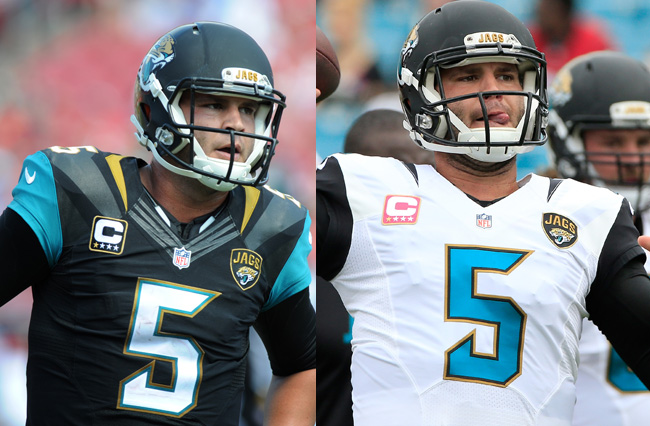
Jaguars
Helmet: F, the lowest F humanly possible
Home: C
Away: D
The uniform is another Bucs; a mishmash of ideas that don’t really come together. A gold collar? Teal shoulders? Straight black uniforms in Florida? The numbers are nice and stylish, but it just doesn’t come together. But they’d be okay if it wasn’t for the helmet, which remains the worst helmet in all of sports. I could write a doctorate thesis on how much I hate these helmets. Two different finishes, a terrible balanced gradient, ugh. A two-tone helmet is a nice idea, but this is about the worst execution of that idea, and it is disgusting. OVERALL: D
Cardinals
Helmet: D
Home: D
Away: C
The Cardinals uniforms are one of the least inspiring in the NFL. There just isn’t anything interesting, and a lot of it just feels dumb. The white helmet is boring and plain, almost like they forgot to paint it. The font on the numbers is nice, but the jersey has weird white spots in the armpits and random black trim. The whites are better, and the shoulder pads and red sides are nice and make it more interesting than plain white, but they still have the stupid armpit white spots that make no sense. If Nike wants to take another team to change, I’d pick the Cards just for something new. OVERALL: D
Argue about why I’m wrong in the comments, even though you’re wrong.