So we’ve essentially known this for a year now, but the next team to get the Nike re-design treatment is the Cleveland Browns.
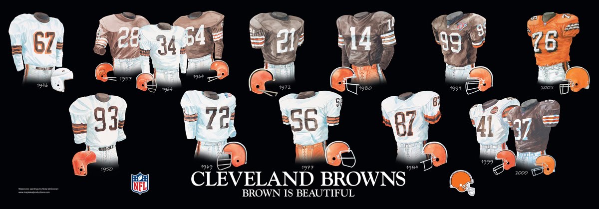
I have no idea why. The Browns look is perfect and by far the best thing about them. I have no issue stating that the Browns uniforms are my absolute favorites in the NFL, especially the home Brown jersey with the white and orange stripes on the sleeves. Why mess with perfection? It’s so perfect that the Browns have looked like that for their entire existence with almost no variation.
But, if anyone is likely to okay a dumb idea, I trust Jimmy “Lets draft Johnny Manziel because a homeless man told me too” Haslam to be the man to do it. Plus, if any company is likely to get too cute and try something stupid to be different, it’s Nike “Let’s put digital alarm clock numbers on a uniform” Incorporated. So far The Seahawks, Vikings, Dolphins, Bucs, and Jags have gotten makeovers, and the only real winner has been the Vikings, which of course was the team that opted for a more classic look. I’d argue the Seahawks unis are also good, but that’s for another column.
So what is Nike going to do? I’m going to wildly speculate.
(If you are a Browns fan that hates jokes about how bad your team is I would advise you to turn back now. KSK assumes no responsibility for emotional damage)
Let’s start with the logo. This is the first thing we will see from the new look, as the Browns are finally going away from the blank orange helmet and are finally putting a logo on there. Naturally, since their current de-facto logo is their helmet, they can’t really put that on the helmet. OR CAN THEY?!?!?!

INFINITE HELMET RECURSION
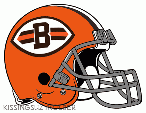
yeah, that probably won’t work. You’d have to make a helmet sticker of the helmet, then continue to print out smaller ones and math would defeat you. The Browns have an alt logo of a “B” in a stlyized football shape. It’s actually pretty good and has that classic look like a Green Bay or Chicago logo. Why not try that or a variation of it?
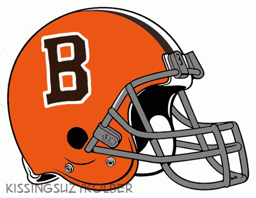
Eh, see, that actually looks kinda good. Nike won’t stand for that sorta thing, it’s too classic and not MODERN or DYNAMIC enough. Needs more PIZAZZ. It needs to “POP” MORE. Needs to be more EDGY. These terms are the Intangibles of the design world.
So lets move away from that into more interesting territory. The Browns, since they came back into existence, have proven year in and year out that despite all odds and even with some wins, they are still The Browns. So the Browns should use that as a design philosophy and embrace the Browniness. What symbols and icons can best visually represent their accomplishments?
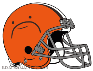
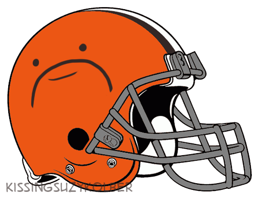
- This logo is a shoutout to all their fans by showing the face each of them make when they watch this team lose another numbing heartbreaker

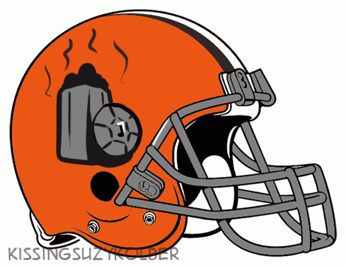
- Honor the new era of Manziel by making the new logo the trash can where the homeless man who drafted him lived
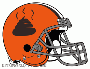
- Fun Fact, humorous internet articles about the Browns are required by United States law to include at least 1 poop joke somewhere in the article.

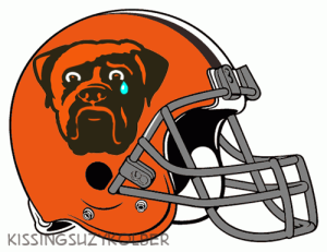
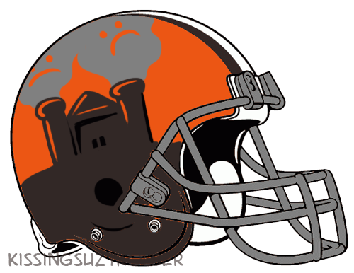
- The Angry Dog is so determined and defined, two things the Browns organization is not. So with a few modifications, the dog can more appropriately reflect the Browns as a whole.


- The modern idea of the Browns as coined by local Cleveland hero Mike Polk Jr. is the Factory of Sadness. This modern idea offers many opportunities, one of which I have illustrated above.
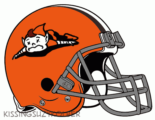
The Brownie, which looks like an elf but totally isn’t an elf, is the Browns other alternate logo. He’s too goofy for the modern era, so bring him into the modern era by having a logo about how dead he is, both in his body and soul.
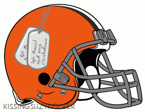
Man, being a Browns player is tough. It drives you to drink and smoke, if certain recent “examples” have proven. The modern talk is all about concussions but there is more to the brain damage these Browns players suffer. Many are treated for PTSD. We should honor these troops better and make every player wear dogtags of who they are so we will never forget those we’ve lost, those who chose to take lots of money and willingly play for a team in a city that had a river catch fire multiple times.
Or, honor the fallen in a different way, and make the Browns wear the number of QBs that they’ve had since their 1999 reincarnation. It’ll serve like a real life “Days since last accident” counter for everyone to see.
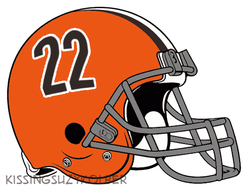
That is the current # of QBs who have started since 99. Seriously. Be sad.
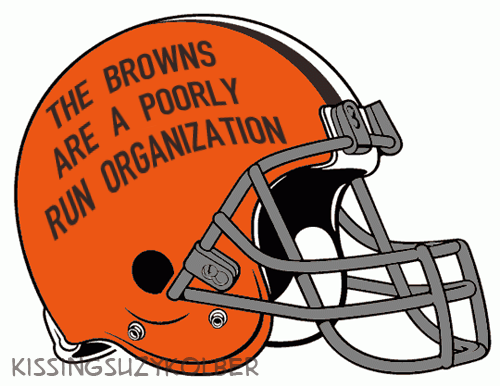
But we are just beating around the bush here. Let’s get to the root of the issue. No frills, nothing fancy, just a logo of cold hard truth.
But maybe we aren’t pushing the envelop far enough. Maybe the Browns makeover will change football uniforms forever. Nike is trying to make revolutionary changes in Helmet technology, and the Browns are the guinea pigs. Here are a couple of their ideas.
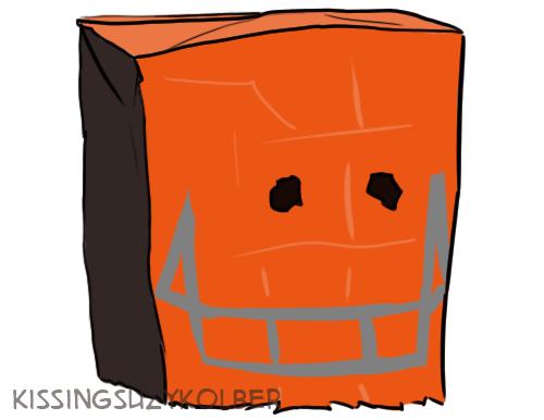

With that toilet helmet, the Browns can really tank like professionals. Flush their previous efforts down the drain. Plunge into their souls and unclog their true potential. Put the seat up and stand like men. Other Toilet Puns.
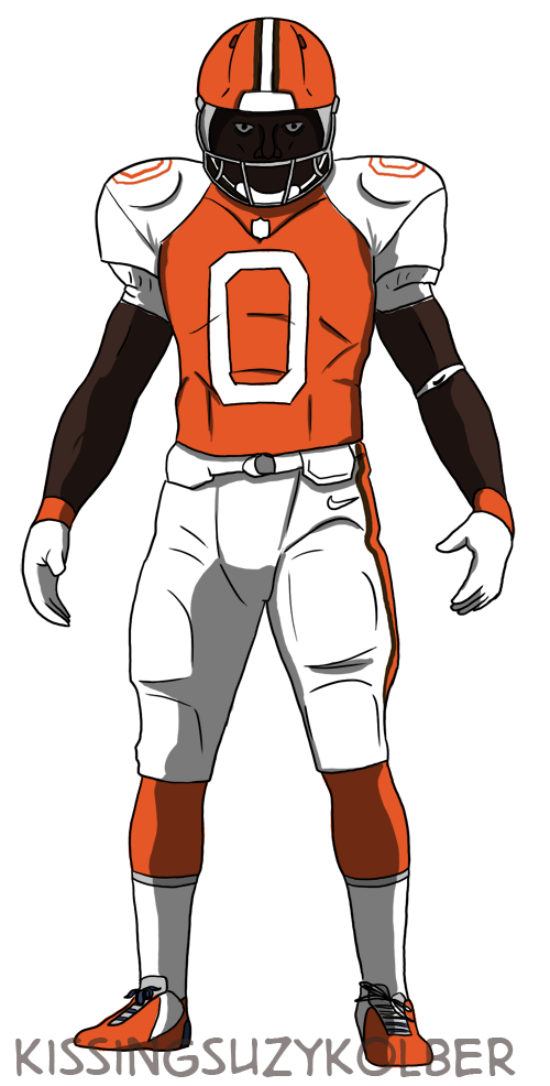
But we are focusing only on the Helmet and logo. The Browns are changing their uniforms soon too, what disasters might Nike try to come up with on this?
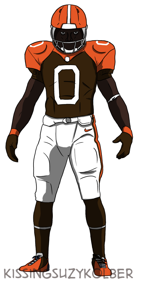
- The Radical Browns logo featuring no Brown

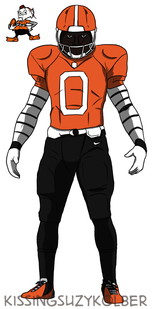
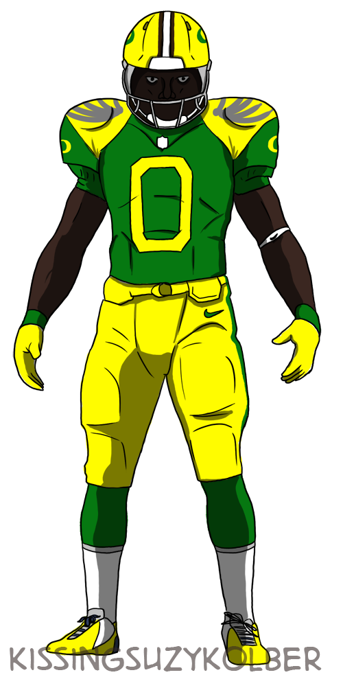
There are plenty more where that last one came from. At this point Nike could clothe the entire league in old Ducks uniforms.
But finally, maybe the Browns need something even more drastic. Something radical. Something unbelievable. Something that will shake the organization to it’s core. Browns? This is a terrible name. A name of of some old fart who’s descendants now own the Bengals. Change it. Change it all. All new colors. All new stadium. All new schemes and fans. All new location. Change everything except the “b” part. That part is good.
Alright I’ll admit it, that was a low blow. But hey, I warned you.