Perhaps more than any other sport, fashion is everything in the NBA. Players extensively plan out their pregame and postgame wardrobes, and the on-court looks of teams and players are legitimate news. That’s why the NBA was the first to drop true “home” and “away” designs in favor of a more dynamic uniform scheme that, ultimately, gave teams more options to wear different jerseys.
Sure, the ultimate goal is to sell more stuff, but this is a capitalist society, so of course that’s what’s happening. The least we can do is judge how well everyone is doing their jobs and assign arbitrary grades to everything in the process. Nike has finally revealed all 30 “City” designs, and there are definitely some winners in the group. There are also, unfortunately, some outright duds, along with a lot of pretty good efforts that will neither offend nor impress. That’s kind of how it goes in life, as the bell curve rules all. But let’s put some numbers to the styles here and see where they fall.
These rankings are, of course, completely infallible. (Okay, not really.) Anyway, let’s get to it.
30. Indiana Pacers
This one’s for Indy.#AlwaysLead https://t.co/vJKLNtVKUp
— Indiana Pacers (@Pacers) November 8, 2018
Hey what if we took a picture of a road in the middle of nowhere and then hit the “invert colors” option on our phone to see what it looks like? Oh sweet, man. You gotta post that on Instagram, you gotta post that, man.
29. Phoenix Suns
Somos Suns | City Edition https://t.co/mpYTub2SvZ
— Phoenix Suns (@Suns) November 3, 2018
These would be much cooler if the “Los Suns” look wasn’t literally something that has been happening in Phoenix since Steve Nash played there.
And now, let’s go on a quick rundown of the wide array of Inkwell-filtered jerseys we’ll be stuck with this year.
28. Washington Wizards
REP ⬛️ THE ⬛️ DISTRICT
2018-19 CITY EDITION 🔥🔥🔥#RepTheDistrict #DCFamily https://t.co/WSo33z6URm
— Washington Wizards (@WashWizards) November 2, 2018
The District is a mediocre nickname, and these black jerseys just don’t work. The Wizards should loan this space out to the D.C. statehood movement instead. Still, the jersey fits for a team that increasingly looks like it might not work out.
27. Dallas Mavericks
@NickVanExit Hey, found this pretty good pic of the City jerseys while looking for Mavs stuff in the Mexican Nike web shop. pic.twitter.com/0Q7ITfvWC4
— It’sDaveVillanueva (@EsDeib) November 7, 2018
Pretty great of the Mavs to model their jersey off of a POG slammer I had when I was eight.
26. Detroit Pistons
Our city. #MotorCity
Our new black City Edition jerseys are based on inspiration from automotive culture and the hard-nosed mentality of Detroit.
On-court debut November 23! #DetroitBasketball pic.twitter.com/1xRuSpEddS
— Detroit Pistons (@DetroitPistons) November 1, 2018
Come on now.
25. San Antonio Spurs
Camo vs. camo – How this season's @spurs City Edition jersey compares to last year. #gospursgo More on the design choice here: https://t.co/HJP0NCQ9uv pic.twitter.com/DXpsb65YAx
— Chris-you-daily (@chrisudaily) November 9, 2018
This would have been better off it were modeled after a soccer jersey, which is saying something.
24. Orlando Magic
Magic x @nike x City
On Sale at Orlando Magic Team Shop: Nov. 9 🔥 On Court: Nov. 14 vs. @sixers pic.twitter.com/o64Y6vQfQP— Orlando Magic (@OrlandoMagic) November 1, 2018
Orlando doesn’t have an NFL team, so it must be nice for its residents to see what it’s like to punt on something.
23. Charlotte Hornets
IT'S HERE. Introducing our 2018-19 City Edition Uniforms.
→ https://t.co/NwjR761kdo https://t.co/xqrI3QUrNJ
— Charlotte Hornets (@hornets) November 1, 2018
Buzz City: Not bad! These jerseys: Not great!
22. Portland Trail Blazers
(Rip) City Edition pic.twitter.com/N9TgiKFejq
— Portland Trail Blazers (@trailblazers) November 8, 2018
OK but … what if we ADDED A SASH?!?
21. Memphis Grizzlies
“Uniform is lit, it has a lot of Memphis in it.” – @jarenjacksonjr
The City Edition ‘Main Event’ Nike uniform makes its appearance during our 6 wrestling nights this season. Want more info on the design and inspiration?
Visit: https://t.co/hHdVaabUaRhttps://t.co/FzbxgyjYoh
— Memphis Grizzlies (@memgrizz) November 7, 2018
Memphis has a new look across the board this year, but this is one City jersey that should have been kept from last year. The I Am A Man jerseys are iconic and a wonderful tribute to the city’s history. They looked great, too. Bring them back.
20. Brooklyn Nets
A better look at our flashy ways 🔎#WeGoBig pic.twitter.com/Ucohj3IoZl
— Brooklyn Nets (@BrooklynNets) November 1, 2018
What the Nets are trying to do here is pretty cool, but it still falls into the category of black uniform with an accent around the outside. You’re also not allowed to do a Biggie tribute alongside a corporate partnership with an airplane. That’s against the rules of cool, folks.
19. Chicago Bulls
Chicago is OUR CITY.
City Edition jerseys are here! pic.twitter.com/JjwGiqoryP
— Chicago Bulls (@chicagobulls) November 1, 2018
The four red stars on the Chicago flag will forever be an excellent look, but it should have been an actual replica of the flag. Make this a white uni like the flag of Chicago — which they did last year! — and we’re in business.
18. Toronto Raptors
The Toronto Raptors have unveiled their 4th uniform also known as their "City Edition" Nike jerseys.
This jersey is similar in design of last year's, but in white. It's called the OVO City Jersey. #WeTheNorth pic.twitter.com/qksWIIFlLe
— Kris Pangilinan (@KrisReports) November 9, 2018
Much like the Raptors prior to this season, these jerseys want to look good but fall short.
17. Atlanta Hawks
For the fans. For the culture. For the 🅰
👀| https://t.co/NAewD6CWbG#TrueToAtlanta pic.twitter.com/EF3azyA11q
— Atlanta Hawks (@ATLHawks) November 6, 2018
I’m not sure what the Hawks are doing here, which is something I’ve said a lot about the franchise for the last few years. Makes sense, actually.
16. Sacramento Kings
https://twitter.com/SacramentoKings/status/1060260613992128513
I mean, they’re fine.
15. New York Knicks
https://twitter.com/KnickFilmSchool/status/1060586274128576512
These kind of look like knockoffs, which maybe is a reference of sorts I’m not getting, but the tessellating orange and blue just reminds me of the poor state of the MTA. Actually, you know what, they’re prefect.
14. Philadelphia 76ers
Our 2018/19 City jersey is here.
👀 https://t.co/zNcmqDTGP9 | #HereTheyCome pic.twitter.com/zTOM5RLWUy
— Philadelphia 76ers (@sixers) October 30, 2018
I want to love these, and I totally get the Rocky reference here, but it feels unfinished. The Sixers struck gold with their snake’d out logo last postseason. They should have doubled down on that instead of this soft but comfy looking weighted blanket.
13. Oklahoma City Thunder
More than just a uniform – we’re excited to honor Oklahoma’s Native American heritage. pic.twitter.com/Pi9eenoASj
— OKC THUNDER (@okcthunder) November 1, 2018
These are the best jerseys the Thunder have ever worn. There is a really cool homage to Native American art and design happening here. The color scheme is still not my favorite, but this is an improvement.
12. Houston Rockets
https://twitter.com/HoustonRockets/status/1060879680096649217
I get what they’re doing, but it would have been a nice bit of synergy to have some space-themed uniforms to match the Harden Vol. 3, right? NASA is huge with the kids these days. Give the children what they want. A nice Gemini 8-themed jersey is exactly what the youth need, folks.
11. Los Angeles Lakers
The 2018-19 #LakeShow City Edition unis honor the legendary, @MagicJohnson! https://t.co/v0u1MvucQK pic.twitter.com/YlwOzF4ASL
— Los Angeles Lakers (@Lakers) November 9, 2018
This is a bit busy and there’s a lot going on, but LeBron’s going to wear purple a lot because of this jersey and I think that should be appreciated a bit. The Lakers know how to make purple work.
10. Boston Celtics
Haven’t officially unveiled by the team yet but the leaked “City Edition” jersey and headgear(!) of the Boston Celtics are already on sale here in the Philippines by Nike. pic.twitter.com/WL3zRAFGxW
— RV (@randallviloria) November 8, 2018
Boston has made a habit of beating L.A. in sports this year, which had to continue here. There isn’t anything necessarily wrong with this jersey, it’s just another Celtics jersey that pretty much works. So it’s here.
9. Minnesota Timberwolves
“Hey Ryan, didn’t you just make fun of a bunch of black jerseys with slight color accents and say they are all boring and predictable?” you might ask yourself right now, and it’s a fair question. But here’s an important difference: None of those were an homage to Prince, were they? No, they were not. Prince will automatically get the top-10 rank he deserves. It’s freaking Prince, you guys. Come on.
8. Golden State Warriors
#DubNation, Be The First to Rep the Bay!!! @warriors City Edition Jerseys are Available Now!!!https://t.co/ZHZDmIb318 pic.twitter.com/IK1WkpkIqp
— Warriors Shop (@warriorsshop) November 9, 2018
The Dubs usually do a nice job with these jerseys, and this is no exception. Still, it’s a bit … busy? I think that’s what is disorienting about it. The sides and the size of the crest is a bit too large and that color blue is a bit less crisp than the one they usually rock. It’s good, just not ELITE.
7. Los Angeles Clippers
35 years in the making.
Introducing our 2018-19 City Edition uniform: https://t.co/VD2to06rJ5 pic.twitter.com/ev4rHiixiS
— LA Clippers (@LAClippers) November 9, 2018
These almost certainly reference the 1984 Los Angeles Olympic Games logo, which is excellent. It’s also a huge upgrade from their ordinary uniform style, which has been — what’s the word I’m looking for — kinda bad.
6. Cleveland Cavaliers
In it for pride. In it for Lake Erie. In it for The Land.
View photos, shop gear, win prizes and more, and join us on 11/13 for our first City Edition night → https://t.co/cr0CZTtQW5#BeTheFight || #ThisisCLE pic.twitter.com/Qms3co3uMp— Cleveland Cavaliers (@cavs) November 8, 2018
The Ziggy Stardust design is a bit of a surprise, but it really works well with the Cavaliers throwback colors here. This is the best the team is going to look all year, both in terms of uniforms and general performance on the basketball court.
5. Denver Nuggets
🌈 X 🏙️ #THERETURNOFTHERAINBOW pic.twitter.com/V5TMXtAl9K
— Denver Nuggets (@nuggets) November 1, 2018
I really need to stress how good the top-5 picks are here. They could probably go in any order. Just strong work all around, and it’s because the teams are embracing a very specific thing about themselves and making a style all their own. Nike jerseys often fall prey to template, with a few tweaks to make them seem original. None of these do that, starting with the Nuggets rainbow jerseys here. They’re really, really good.
4. Utah Jazz
❤️🧡💛 CITY 💛🧡❤️ pic.twitter.com/rvVvse4Tj0
— Utah Jazz (@utahjazz) September 21, 2018
Ombré uniforms forever for Utah, please. I don’t care if repetition can get boring, these are tremendous and make for great postseason shirt giveaway patterns. It’s a very modern style for a team that’s often had throwback jerseys as their best jerseys for a while now.
3. New Orleans Pelicans
I'm not entirely sure what I think yet, but Nike absolutely nailed the inspiration for the leaked Pelicans City jerseys. Anyone who has spent time Uptown during Mardi Gras gets it. pic.twitter.com/LD87P62uaq
— Jake Madison (@NOLAJake) October 29, 2018
The Pels try very hard not to overdo it with Mardi Gras-themed jerseys, which is a surprising amount of restraint from a city whose bars will sell you grain alcohol in tupperware containers. But this is a great use of the party colors on a white jersey that doesn’t look like you’re trying too hard to have too much fun because it’s required in the city charter. This is a nice weekend in NOLA with good food, some drinks, and great jazz. The Frenchman Street of Pelicans uniforms, if you will.
2. Milwaukee Bucks
Introducing the Bucks 2018-19 City Edition!!
Inspired by the MECCA, celebrating risk-taking and the art of the game.
More at https://t.co/2ki7LvqSKC pic.twitter.com/4TUgQzSlxh
— Milwaukee Bucks (@Bucks) November 5, 2018
These don’t have a hint of deer on them, so they fail to represent our full decline into an authoritarian state. Still, the MECCA reference here is tremendous and it absolutely works as a standalone jersey. The color scheme is great, it’s not too busy and it’s a great homage to the team’s past. Get me one of these bad boys with an ANTETOKOUNMPO nameplate, stat.
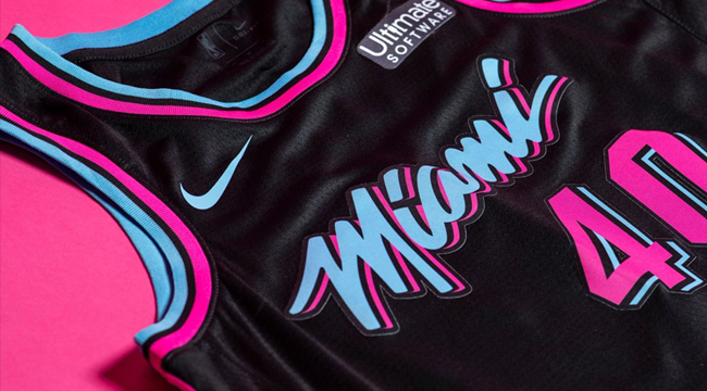
1. Miami Heat
https://twitter.com/MiamiHEAT/status/1059514792514338818
These jerseys got their own midnight madness party for a reason. This is what Miami should wear all the time, full-stop. It works in both black and white, and you can do Dwyane Wade-era throwbacks as the City edition or whatever. This is forever what Miami will be associated with, and the team is already embracing it. Why not go all the way?