There are something like 1,000,000 different debates involving various things in the NBA being the “best.” Is LeBron James the best basketball player on earth, or is it Anthony Davis or Kevin Durant? Was Stephen Curry the best player in the league last year, or was it James Harden? Is the best coach in the league Gregg Popovich, or is it someone else?
One such topic is the debate over which NBA team has the best logo. It’s certainly not as prominent, but throw a Celtics fan and a Knicks fan in a room together and it can turn into a really entertaining discussion. Grantland basketball guru Zach Lowe decided to tackle this very, very important question, ranking all 30 team logos in the Association. Here’s how his list looked:
- Chicago Bulls
- Charlotte Hornets
- Miami Heat
- Milwaukee Bucks
- Memphis Grizzlies
- Boston Celtics
- Portland Trail Blazers
- Toronto Raptors
- Philadelphia 76ers
- Golden State Warriors
- Atlanta Hawks
- San Antonio Spurs
- Indiana Pacers
- New Orleans Pelicans
- Los Angeles Lakers
- Houston Rockets
- Brooklyn Nets
- Phoenix Suns
- Orlando Magic
- Cleveland Cavaliers
- Washington Wizards
- Utah Jazz
- Dallas Mavericks
- Sacramento Kings
- Denver Nuggets
- New York Knicks
- Minnesota Timberwolves
- Detroit Pistons
- Los Angeles Clippers
- Oklahoma City Thunder
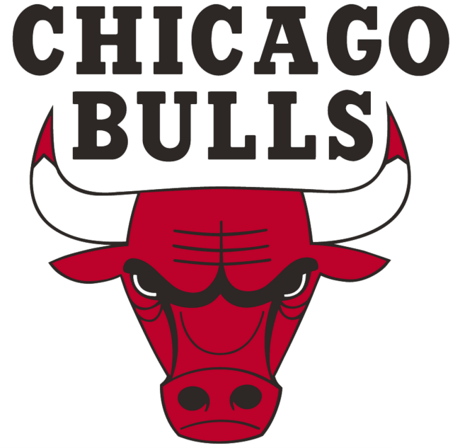
While I personally strenuously object to some of these – Golden State’s logo is one of the three best in the league, in my eyes – there is no denying that the Bulls deserve to be No. 1. Here’s a little bit of what Lowe had to say about Chicago’s iconic logo:
This was never going to end anywhere else. This thing is perfect, right down to the red on the tips of the horns, which suggests that this mean motherfucker just gored some poor sap. Look at that glare, and those flaring nostrils! The most enjoyable forms of entertainment tiptoe to the border of kitsch without crossing over, and that’s right where this logo stops. Add another color, and that blaring red might lose 5 percent of its power. Depict a full head-to-toe bull, and you’ll end up with a children’s cartoon character.
This is a cartoon, but it’s not quite cartoonish. It’s simple and clear, and it depicts exactly what the team wants to be: a tough group about to shove the ball down your throat. Thank god the franchise didn’t pollute it with the awful balloon letter font that tars the court design.
Of course, most of these teams are one spot higher than they should be. Everyone knows that the classic Seattle Supersonics logo is better than basically every other logo in the league.
(Via Grantland, via sportslogos.net)

