This week in This Week in Posters, we begin with this new poster of Alien: Covenant, which isn’t being too subtle about trying to turn Katherine Waterston into the new Ripley. I would not have predicted this look when I was watching Inherent Vice, that’s for sure. Anyway, I’m not sure a “cast vignettes inside floating head silhouette” design ever works that well, but it’s definitely better with an oozing alien than, say, face inside Professor X’s torso.
“You are what you eat” is the tagline for Animal Crackers, from which we should deduce… that this person ate a guinea pig cracker and is now guinea pig? Do they even have guinea pig-shaped animal crackers? Obviously I don’t have a clear idea what this is about. I like the blue eyebrows though.
Come on, man, you can’t just make a landscape-style poster and not rotate it. There’s no way to look at this without tilting your head sideways, which feels like some kind of practical joke. Am I being punked? Is this a prank movie? Stop it with this shit, it isn’t clever.
Is that… Alicia Silverstone, the drummer from The Wonders, and a teenage Justin Long? How did they cast this, with a time machine? The styling is also so aggressively average that I have to imagine their first three costume designers killed themselves and then they just hired a Mormon grandma. And she got all the clothes from Ross’s Suburbia Is Death collection. This poster makes me hate family. I hate your family now. I am sorry. Give the kid a haircut.
Get it? There’s a rift between Dom and the crew. Also, they’re in New York. Which is funny, because the entire Fast franchise is about a crew of street racers who use their fast cars to pull off heists, and easily the one city in the country where a fast car would be least helpful is New York, especially during rush hour. “No, you go ahead, Dom, I’ll take the subway. I’ll buy you a Corona and hang out until you get there.”
It makes sense that Going In Style would mimic the awful, pointless diagonal poster trend considering the “old guys doing stuff” genre is equally terrible. Old guys doin’ stuff is the pointless diagonal of genres. Also, what are they suppose to be standing on? Do they live in a gravel desert?
This one is a little better. I mean, the poster is still butt ugly, but at least it’s kind of an homage to the Fate of the Furious posters and Gone In Sixty Seconds. Somehow I doubt any of the target audience for Going In Style is going to catch a clever poster reference, but sure, why not?
The diagonal is even worse here. Not to mention the weirdly Photoshopped face and body on Michael Caine. And again, what are they standing on? Is there a giant asphalt desert just outside of Manhattan that I don’t know about?
The trend for team-up/squad of superhero movies is to have some kind of lens flare in the middle, so at least Guardians 2 went all out and made their lens flare an actual supernova. Also, is Drax the Vin Diesel of their crew? Discuss.
This poster for The Hero really sells the “SAM ELLIOTT IS IN THIS!” angle, which is probably wise. I mean that’s why I’d be seeing it. It also looks a little like a coin. Which is a great idea, Sam Elliott should definitely be on a coin when he dies. E Pluribus Unum, sometimes you eat the bear and sometimes the bar eats you.
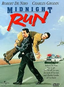
I feel like they switched up the order of the faces and names just to piss me off. Otherwise, I’m getting a Midnight Run vibe from this, which isn’t a bad thing. I’m not sure why Ryan Renolds is staring at Samuel Jackson’s chest.
This Justice League poster has the traditionally orangey glow and lens flare of the superhero team up movie poster, so it’s pretty much exactly what you’d expect. Though I do like the font. Usually they’d use Futura for this, so it’s a nice subtle twist.
Whoa, two portals AND a lens flare? Also the upside down thing. I need a good name for that trend, as also seen in Doctor Strange and Dark Tower and Inception. I think it’s meant to convey “This is going to blow your mind so hard you won’t even know which way is up anymore.”
The Escher Effect? I dunno, I will accept suggestions. Anyway, it’s fast becoming the visual equivalent of the BRAAAAAHM sound effect.
This is a poster for King Arthur, which you probably would’ve never guessed without the hashtag. “Take back the kingdom” sort of makes it sound like a Medieval Step Up 2 The Streets. I don’t know who Djimon Hounsou is playing, or how sixth century Africans might have dressed, but his outfit looks more believable than Charlie Hunnam’s Old West sheriff get-up, so there’s that. What is he standing in front of here, a blotchy wall? Many questions.
I like the mirror effect here. Usually when the subjects have their head that close together in the poster it evokes yearning, but that’s generally only when they’re facing each other with their eyes closed (the close-eyed headbutt, as I like to call it). Here, he almost has his eyes closed, but she’s facing away, and looking right at us from a mirror. It’s because there’s a whole other side of her, you see. Also, the fact that it stars Rachel Weisz as a woman named Rachel kind of makes it feel like a meta-fictional take on Rachel Weisz’ real-life persona. I like the idea that the Rachel Weisz version of Curb Your Enthusiasm involves forbidden love and ascots.
They’ve been lying to us? About the street lamps? About the candle made from an abalone shell? Sorry, I’m going to need a little more.
I thought the next poster for Phoenix Forgotten would give me more than the one with the mysterious lights on it, but now I’m even more confused. Is that a spelunker on the left? And then who’s that in the middle, a Catholic nun? Also, is analog fuzz still scary horror movie thing? Do kids who grew up on digital cable even know what that stuff is?
Jeez, look at all that mascara under Johnny Depp’s fingernails. Wouldn’t they want to clean all that off before his big Pirates of the Caribbean poster shoot?
I know I talk a lot of trash on Pirates of the Caribbean because it’s such a terrible franchise, but credit where credit is due, that’s a fantastic hat.
Johnny Depp has had to fight a new ghost in every single one of these movies now, hasn’t he? This franchise should be called Ghost Wars.
Pirates Of The Caribbean: Young Girl’s Chest.
Here’s the latest poster for The Smurfs: Blue Lives Matter.
All these Snatched posters seem oddly obsessed with their hair. Also where’s that lens flare supposed to be coming from if they’re standing next to a wall?
And here’s the latest Star Wars: The Last Jedi poster that everyone loves. I don’t know: I think I’d probably enjoy Star Wars stuff a lot more if they didn’t plan a corporate pep rally every time they released a new limited edition Burger King cup. They’re like the corporate equivalent of obnoxious parents. Anyway, this poster has a nice ’70s vibe that looks classic but not jaded, which they’ve been doing a really good job with lately. They justified their lens flare with a magic sword. Nice.