This week in This Week In Posters, we begin with this poster for 3 Generations, which, say what you will about it, at least lined up the names with the corresponding faces. I always appreciate that. I don’t know what the color bars are meant to represent (Pastels! Spring!) but the film seems to be about three generations of bad dressers. There’s soccer mom Penny Lane, the Polyester Grandmother, and of course Elle Fanning as Steve Buscemi in the “Greetings fellow young people gif.” I’m assuming she’s playing tomboy or is meant to be genderqueer in some way, but that’s no excuse for an ill-fitting cardigan. Also, neither here nor there, but why does Naomi Watts look like Jennifer Aniston all of a sudden?
Here’s a U.K. poster for Alien: Covenant, which isn’t nearly as good as the U.S. posters. I’m not even sure what’s happening. Is that a gun or is she leaning on some sort of future rail™? And what’s up with the pose? I assume they’re trying to recreate that old image of Sigourney Weaver and the alien face to face, but Katherine Waterston is looking back at the alien like she’s going on vacation and she’s worried about seeing him again or something. Is that fear or yearning?
The Assignment is of course a Walter Hill film in which a deranged doctor played by Sigourney Weaver gives an assassin a non-consensual sex change, who is then played by Michelle Rodriguez. The poster chose to communicate this through a title that doubles as a mustache, it seems. And the tagline, “Payback’s a bitch.”
Like, because payback is a lady now? Hey, at least this poster is embracing the B-movie tackiness of the concept.
This one seems… less successful. First off, why the giant syringe? I mean it’s a sex change, not rabies, right? That being said, I would definitely watch the rabies version. Michelle Rodriguez was born to play a rabid assassin.
Is that book the actual book of Henry, from the movie Book of Henry? There seems to be some kind of steampunk contraption drawn on the cover, in case you were unclear on whether this was going to be a twee dramedy. I also enjoy the implication that young children are the ones into steampunk and not 45-year-old men who work in network security. Meanwhile, the only thing worse than not matching up the faces with the names is matching up two of the faces and mismatching the others. Jaeden Lieberher, Jacob Trembly — so far so good… wait that’s not Sarah Silverman, damn you!
This is probably unfair since I can’t read most of the text, but this poster for Brain on Fire isn’t giving me much beyond that Chloe Moretz is in it. She has very nice lips. I know she’s going by “Chloe Grace Moretz” now, but I refuse to call her that. You can’t be known as a two-named person and then randomly switch to three names, mid-fame! That’s not how it works. You want three names you have to assassinate someone, those are the rules.
Here’s the poster for Buster’s Mal Heart, which they changed a little since the one for the TIFF premiere (below), adding the TV fuzz effect. I think I like the old one better. Rami Malek looks more like a frog in a pond, which is the coolest thing about the poster. The fuzz just distracts from it and the white makes it look more futuristic, like it’s for a Divergent sequel or something.
In the future, every grey-haired actor gets to play Winston Churchill at least once. Hey, whatever, I’ll take a Brian Cox Churchill movie, why not?
I like this straightforward poster for Colossal, which is apparently about Anne Hathaway controlling a kaiju. Question, is the fact that she’s a parody of a first-act rom-com heroine addressed in the plot? She looks like she’s about to fall down some stairs to make herself seem more relatable.
I didn’t realize the kaiju had elephant toes and Batman forearm thingies on his calves, which is important info. See? This is why posters are important.
Is she doing a Nazi salute? Maybe a little too close for comfort? Good thing the movie isn’t coming out a day earlier, on Hitler’s birthday.
A lot of things going on in this F8 poster, like that horrendous vignette effect, but I think I’m most transfixed by the fact that The Rock is wearing two layers of clothes and neither of them have sleeves. Also, what is Charlize Theron doing back there? It looks like they put her on time out and she’s trying to figure out when she can join the party again without being too obvious about it.
I’ll admit it, I laughed at the yellow speedo. I also like that the faces match the names up there. But why not just put the three Robs next to each other? That is far too many Robs for one movie, but if you’re going to make a three-Rob film you might as well lean into it.
I know that Arthur is a probably-mythical fifth and sixth century Welsh king, and thus, you can sort of just make stuff up about him and it will be about as true as anything else. But even so, these wardrobe and grooming choices are baffling. He looks like an Old West sheriff from the neck up and a Russian mobster on a ski vacation from the neck down. Knowing action movie posters these days, I’m actually surprised there isn’t more debris flying around in the background.
I can’t tell if they were conciously trying to evoke the famous Afghan Girl from the National Geographic cover or if “shrouded lady” is the only way to communicate olden times.
This is probably too small, but if you look at the link for the full-sized version you can really get a feel for the bizarre wardrobe choices. Is that… a fur hoodie? And King Arthur definitely still looks like he’s going to take that magic sword to the OK Corral. It’s all worth it for Jude Law though. No one is better at sneering in a fancy head piece than Jude Law. He’s really discovered his niche.
A-ha! There’s all the debris flying around I was expecting! But again, what the hell is he wearing? Is that a hunting vest?
This Mummy poster is a lot like the earlier teaser versions, but with more Tom Cruise and London getting destroyed by sand. Can’t have a blockbuster without a big star and a destroyed city, I always say. I bet they got Tom Cruise that shirt in the children’s section and thought they wouldn’t have to alter the sleeves. Classic mistake.
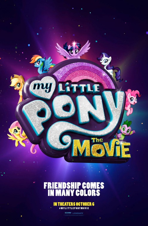
Here’s a poster for The My Little Pony Movie that’s sure to be a hit with all the Bronies. Do they actually want to have sex with the ponies, or is that a sub group? You know, now that I think about it, it’s probably better if we don’t ask.
Here is a picture of Johnny Depp on a normal day.
How many more times is the Pirates franchise going to pull the “he’s actually an enchanted dead guy” trick? Oh well, I like his outfit, at least.
If you can’t have debris flying around, sparks are the next best thing. How often do you think this guy has to spell out his first name?
“Brenton.”
“Brent?”
“Brenton”
“Brendan?”
“Brenton.”
“Brandon?”
Also I feel like it should be Thwaiteth instead of Thwaites for the thake of conthithtenthy.
I don’t know who this is either, but her hair looks nice. Look out for the sparks!
Here’s Geoffrey Rush, doing his “daydreaming about my lunch break” face.
“One life leads to the next.” Ahh, so a reincarnation movie? Cool, cool. Also, I think if you ever see a Variety pullquote that isn’t in the “adverbly adjective!” format you get a prize or something.
“A good hostage is hard to find.” Wow, this sounds just like the plot of Excess Baggage, starring Benicio Del Toro and Alicia Silverstone.
This is the first of a new batch of poster for The Void, all of which are pretty badass. This one in particular also doubles as a porn thing.
Do you think there are more tentacled creatures under there? These posters are so good.
I hope The Void is the movie people who love Event Horizon think it is.
Coming in just under the wire, it’s the poster for Thor: Ragnarok, whose font makes it look like a radical Hot Wheels toy from the ’80s. Also, more debris flying around. Plus lens flares, diagonal, a giant portal… really it just looks like they tried to combine all the lamest, most overused poster trends. Great work! His triceps look nice though.