This week in This Week In Posters, we begin with this poster for BPM (Beats Per Minute), which I assumed was some kind of European We Are Your Friends (that was the Zac Efron EDM movie, in case you forgot). But IMDb tells me it’s about AIDS. Either way, I imagine it will be life-affirming. You know a film will be life-affirming if the main character is backlit and shimmering. That’s always a dead giveaway.
“Defiant euphoria” still sounds like a club drug side effect. Are we sure this isn’t about raves?
You can’t really tell that the thing in front of his face is supposed to be a boxing glove at first, but it is. Oh boy, another white boxer biopic! Which is sure to be creative because they used the “American _____” naming convention.
(*checks IMDb*)
It’s about Chuck Wepner! Sorry, guys, they already did this biopic. That they made two biopics about the guy who was famous because someone made a movie about him (Rocky) says a lot about where we’re at with the white boxer biopic genre. But hey, good for (*squints*) Zach McCowan.
I like how even with “Match” in the title, “swipe” in the tagline, and a cracked screen aesthetic (did Donald Kaufman from Adaptation design this?), they still had to put an oversized cell phone in it so you’d know what it’s about Tinder.
Aw hell yeah, this looks like my favorite kind of action movie, where it’s the future and there’s a sweet car and shit all over the place and someone has a gun for some reason.
Damn, that is one tasteful librarian. Er, bookstore owner (library = biblioteca, librería = bookstore). The tagline is “Among books, no one can feel alone.” I’m guessing she’s a lonely bookworm, until Bill Nighy shows up one day and changes everything. Which sounds great. I just hope we get an explanation of why the ivy is dying. Fix your ivy, lady.
This looks like a serious and compelling documentary, so I’m not sure why they used papyrus’ cousin for the font.
Aw, man. I loved the dumb-looking doggy, but now we’ve got a Dreamworks-faced kid and a dancing skeleton. The world has enough Pirates of the Caribbean movies, people.
Big yellow text is old hat at this point, but I like the billboard reference and when they treat the letters as real objects for some reason. This is a good poster.
Are you rrrready??? For Insidious 5: The Most Hauntedest House?
Wow. This Killing of a Sacred Deer poster is this week’s best by far. Usually when they do the morphing thing they blur it all, where one character looks the same just upside down, or inside someone else’s shoulder. Here they left Kidman’s chest on the upside down guy’s face and made it look like a tactile Play-Doh sculpture or something. It’s extra creepy/cool. It doesn’t tell you much about the plot (good luck trying to explain the plot of The Killing of a Sacred Deer in a single frame) but if the poster’s cool enough who cares?
Okay, but why the blue teeth and eyebrows?
“He’s done keeping his story straight.” “Coming out 2018.”
Oh, I see what you did there.
I always get Dahmer confused with Kurt Cobain. They both brood a lot and wear cool glasses.
What is she laying on? Are those just pillows on the right? It looks like she’s huffng her own armpit fumes. Stop smelling your armpits, you weird lady.
This looks delightful. Is that Brendan Gleeson’s “jailbird chef” outfit? Yes, please. I want to bathe in all this tasteful plaid.
Oh sweet, I can’t wait for this road trip comedy about a regular joe and his generically too-hot girlfriend and dumb friend Mike. Plus, Chris Mulkey!
Boy, for a famously hirsute hero Biblical hero he sure doesn’t have much chest hair.
This new Last Jedi poster is really painting the desert red. I guess it makes sense that all the little droid planes or whatever would be synced up like that. I am sorry.
This other Star Wars poster has cool brushwork that is totally undone by whatever the hell is happening in the distance there. Is she fencing a rock? And what’s up with the perspective, is she 27 feet tall?
Speaking of bad Star Wars posters… I guess the two sides are supposed to look like ship bay doors, which is all well and good, but then they put it… on a shiny grey computer background? This looks like if one of the South Park characters had a Star Wars screensaver.
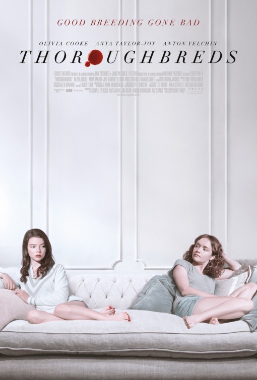
You know they’re rich because of the high ceilings.
So I finally saw the trailer for this and apparently it’s about a child with a facial deformity. I’ve heard it’s good, but it’s weird that they seem to be trying so hard to disguise the basic plot while promising some kind of generic schmaltz. “Choose Kind” makes me feel like I need an insulin shot.
Yo, more dog less helmet.
Get it? It’s a world, because that’s what Auggie Pullman is going to change.
I like the yellow font and ultra-serious Joaquin Phoenix expression, but good lord that is some bad body photoshop.