MLS is back, and the league started the 2018 season on Saturday with six matches on opening day, including the defending champion Toronto FC losing 2-0 to the Columbus Crew.
The top flight of American soccer has gotten bigger this year and has even bigger plans for the future. The league has a new team and a bevy of new jerseys for all 23 clubs. Ten teams are debuting new primary jerseys, while others are refreshing secondary looks, and LAFC is showing off its jerseys for the first time.
What better way to kick off the 2018 season than to rank every club’s new jerseys based on completely arbitrary means? Overall, it’s a strong set of kits with some very cool symbolism for each team. The best soccer jerseys impart a bit of a team’s history or a city’s traditions in the design, and MLS really nailed a few of these.
Let’s rank some kits, folks.
23) Montreal Impact
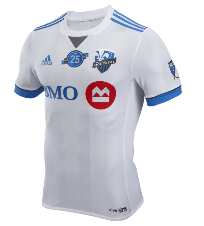
Montreal is one of the only clubs not to have a new jersey this season, but they could use a refresh of their secondary jersey, in my opinion. They do add their 25th anniversary patch to the equation, but that makes for a really busy look up top with not much else going on here. Sorry, Frankophones. Someone’s gotta be last.
22) Seattle Sounders
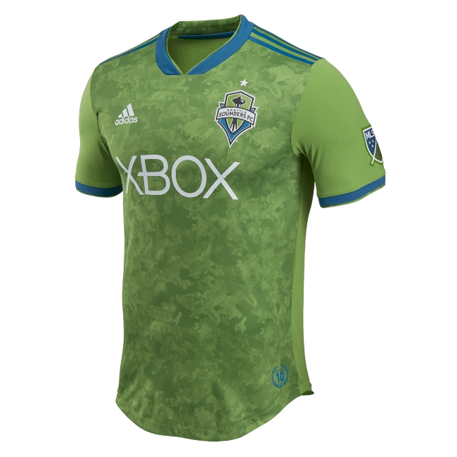
I get what they’re going for here, but I’m not a big fan of the foliage camo look. The plain green sleeves throw me off a bit as well. I’d put them behind Montreal if not for their willingness to embrace odd green colors. It’s admirable but not great overall.
21) NYCFC
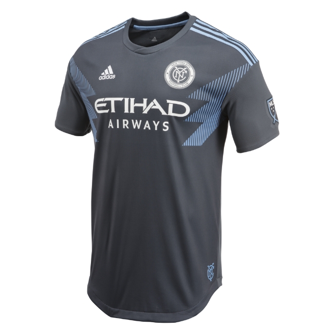
This is a departure from Manchester City’s copy/paste jerseys, and that should be commended, but these look like straight-up practice jerseys. Good on them for trying something different, but I’m not a fan of the jagged accents on the chest. Looks like something expensive you’d buy knowing full well it won’t be in style the next trip around the sun.
20) Orlando City
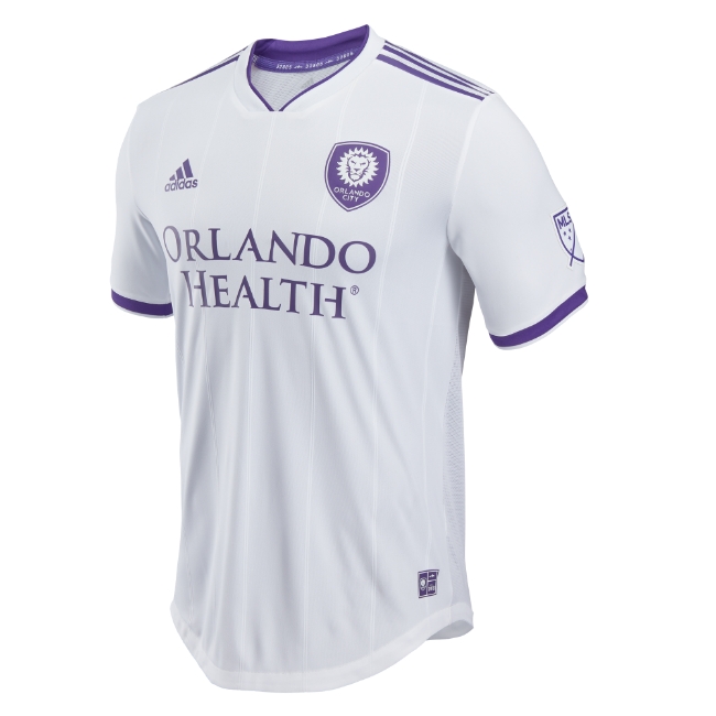
I think I just don’t like this purple. The lion crest is great, but something about this purple looks…faded. And not in a Kendrick Lamar “Swimming Pools” way. Just not all that inspiring.
19) LAFC
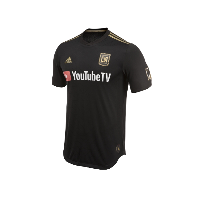
There is something to be said for keeping it simple in your first season, but these look like straight up create-a-team kits from a FIFA video game. Black and gold is in these days, with the Las Vegas Golden Knights choosing those colors for their first uniforms and the Toronto Raptors picking the palate for their Drake-inspired alternates, but it comes off as a bit generic to me. Good crest, though.
18) Atlanta United
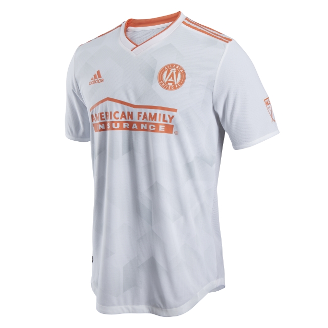
These are secondary jerseys, so I shouldn’t be too critical, but I’m not in love. The Georgia-peach-inspired look comes across as a creamsicle to me, and there are black-and-white pinstripes on the back. It’s just a lot and not all that much, somehow simultaneously.
17) San Jose Earthquakes
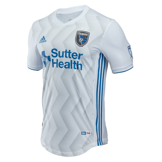
This secondary jersey uses a wavy pattern on the front, but it’s not as cool as the gradient on the black primary kit. One cool note about these, though: five percent of every jersey sold at the Earthquakes Team Store will go toward the Navy Seal Foundation. Very nice.
16) New York Red Bulls
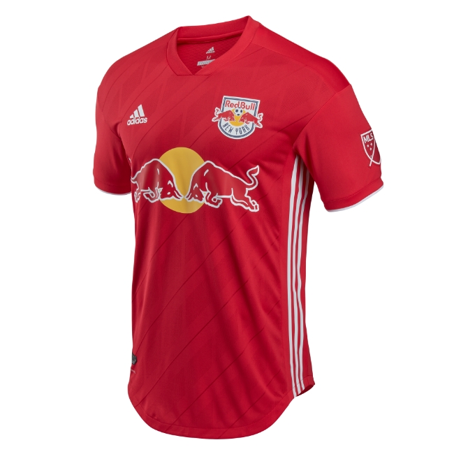
Red Bull has one of the funner corporate logos out there, but these are pretty generic. It’s the first time the Red Bulls have had a red secondary jersey in team history, and there’s some geometric representation of the New York skyline in the pattern, but it’s tough to pick up here. Maybe it shows up better when they’re actually worn on the pitch.
15) Colorado Rapids
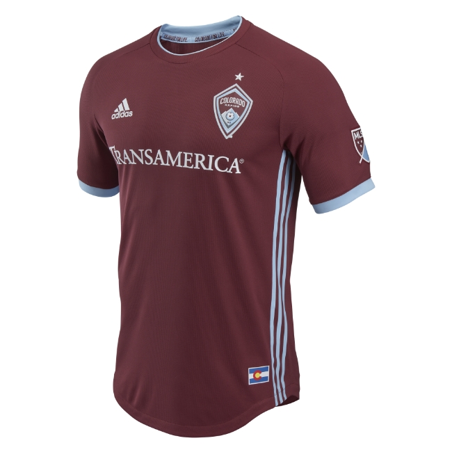
I’m pretty disappointed with these because the secondary jerseys the team has, which are entirely based on the state flag, are so much fun. They also carry the elevation of Denver on them, which is a nice touch. All that’s missing here. The burgundy is fine. Good, even. I just don’t like it as much as the alternative.
14) Chicago Fire
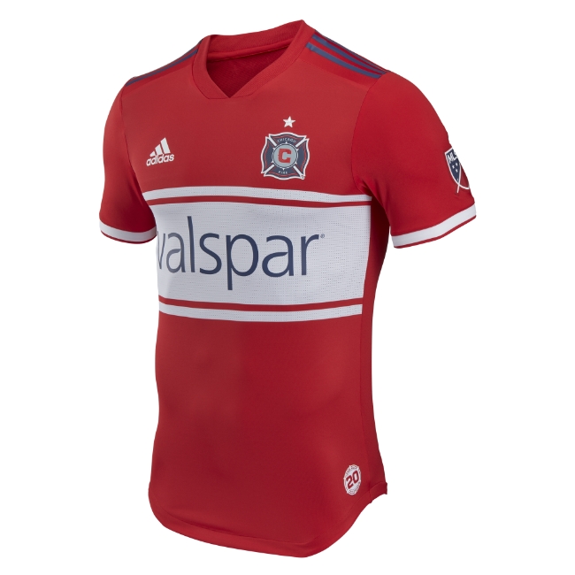
What saves these is the classic Chicago four stars iconography on the back. It’s not pictured, but trust me here. I’m a sucker for flag-inspired jerseys, and the second star on the back is outlined to represent the team’s 20 years in MLS. It saves what otherwise looks like an early 2000s fire engine.
13) Vancouver Whitecaps
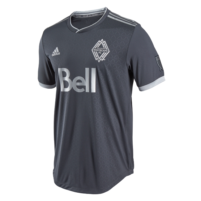
The embossed diamonds mirroring the crest are a nice touch, and as mandated by Canadian law there’s a maple leaf on the back neck of the jersey. Those are the rules in Canada, you know. Maple leafs everywhere, no exceptions.
12) Toronto FC
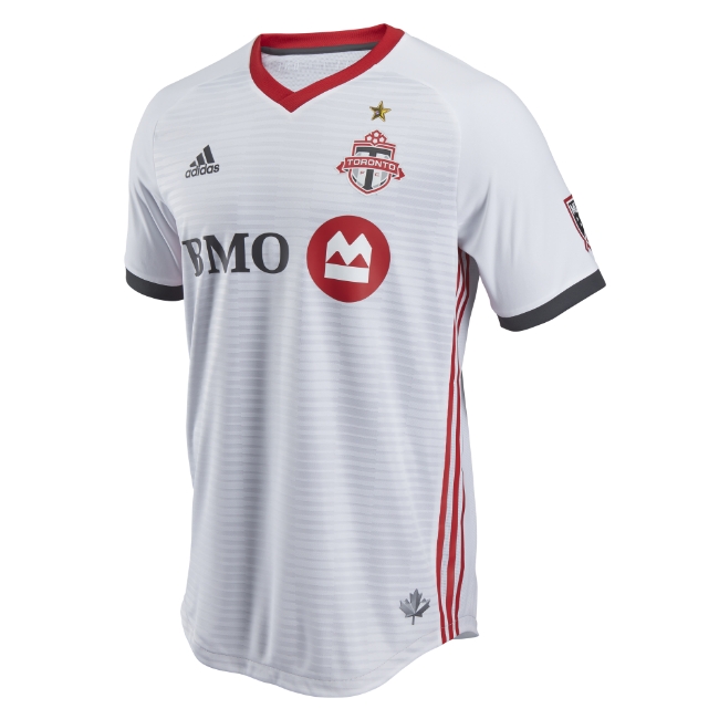
The defending MLS Cup champions sport their first star on the front of this secondary uniform, which is totally fine-looking. These are right in the middle, where they should be. It’s a perfectly fine soccer jersey.
11) Dallas FC
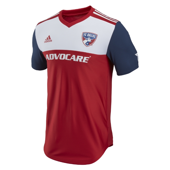
There’s something vaguely Piet Mondrian about these blocks of color on the front here that I’m digging. Like in Canada, everything in Texas gets approved if it mirrors the state flag, and they stuck to form here.
10) Sporting KC
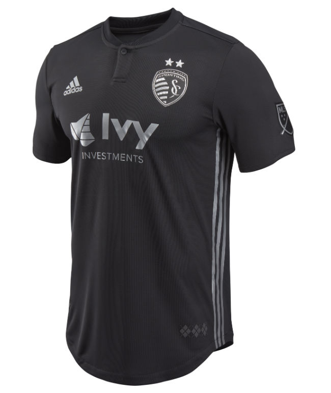
One unique design element: a single button on the collar stand that’s been described as “elegant.” These are fancy jerseys, you see. Expect a lot of pinkies out when Sporting rocks these.
9) Columbus Crew
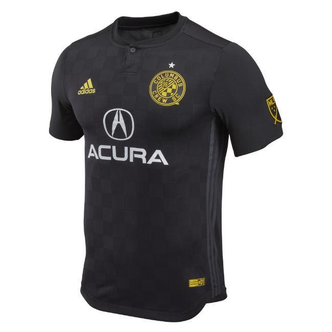
These are pretty solid for a secondary uniform, but it loses a lot of the checkerboard charm of the primary kit’s design cues. The Crew are very likely relocating to Austin next year, though, so wearing black a lot this year seems fitting.
8) LA Galaxy
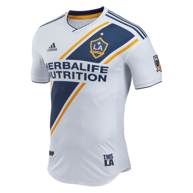
This is the only new jersey that utilizes the horizontal stripe design, and I think that’s a shame because it’s a good look. These look crisp, the colors work and even the piping on the shoulders isn’t too much here. These are good.
7) Philadelphia Union
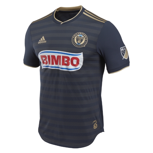
Philadelphia has a lot going for it here: Bimbo is an amazing jersey sponsor, and Philly has really leaned into the snakes. The crest is great, there are snake accents on the back, and the gold just seems to work better here than it did on LAFC.
6) Real Salt Lake
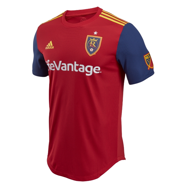
This and the Union jersey I like for reasons that are not entirely because of their pure aesthetic appeal. These kind of look like the jersey you’d make for a fast-casual burger restaurant, right? I can’t put my finger on why exactly these primary uniforms work. There’s also a beehive on the back neck. Bees are important, you guys.
5) DC United
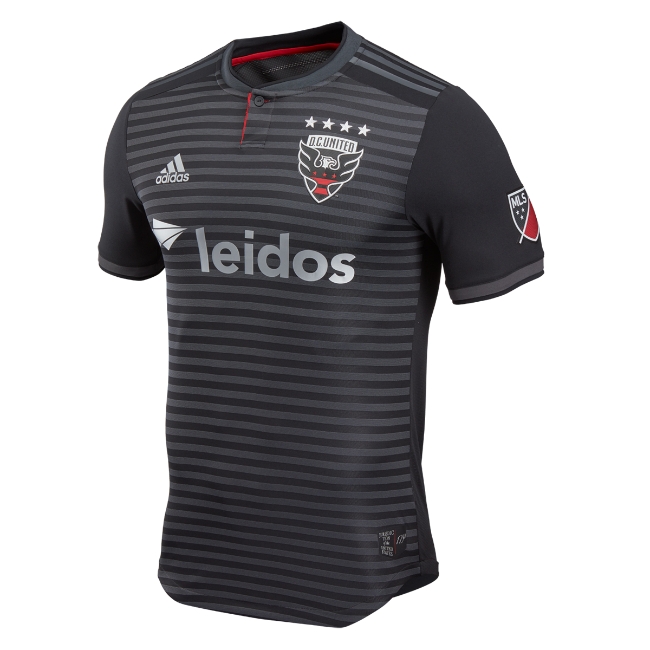
Now that’s a strong-looking black jersey, DC United. Damn. This new primary jersey also has the GPS coordinates of the team’s new stadium on the back, which rules. It’s a nice touch on a great new design. Simple but really effective.
4) New England Revolution
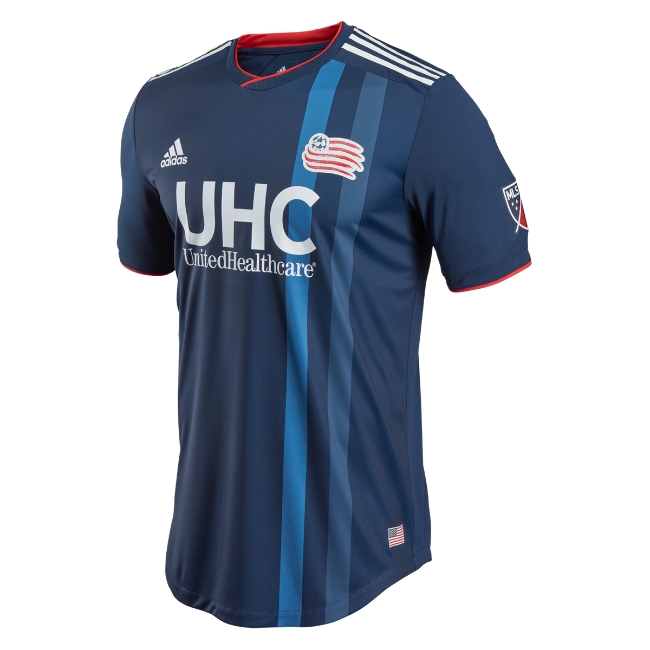
This one surprised me because I’m not a big fan of the Revs logo at all, but these work really well. I’m a big fan of the striping, and it’s a red, white and blue jersey that doesn’t just look like a big flag. You know, like that logo.
3) Portland Timbers
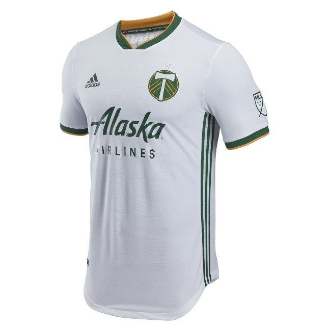
These are relatively plain for a secondary look, but two important facts automatically put these in the top five. The first is the color names: Ponderosa Green and Ravens Gold. Awesome. The second is the inclusion of the phrase “There’s a party in Portland no one’s sleeping tonight” on the back, which is something the supporter’s section sings at matches. That’s unbelievably cool. You’ve gotta have principles in this world, and I’m sticking by mine here.
2) Houston Dynamo
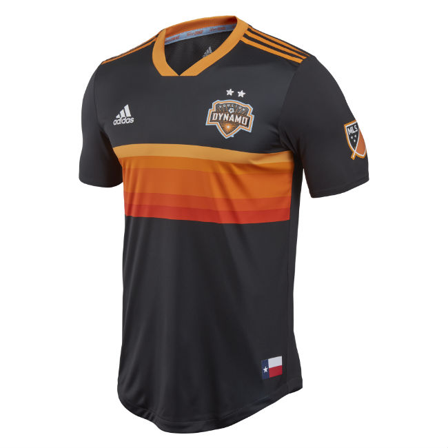
Tequila Sunrise everything, please. These secondary jerseys mirror the Astros old uniforms with a bit more of a modern edge, and I think it works really well. They also have the Texas flag on there, which is good. I like these better than the orange-all-over primary jerseys the club currently has. These are great.
1) Minnesota United
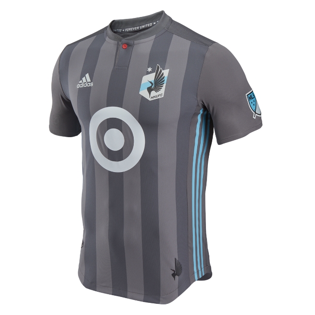
I’m a huge stan for this club’s whole look. The colors are great, the crest is the best in the league, and this balances out the Target logo really nicely. There’s a single red button on these to symbolize the eye of a loon, the club’s mascot. I’d wear this jersey every day of the week.