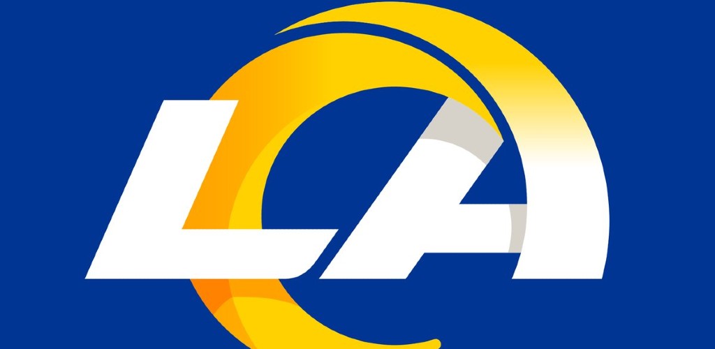
The Los Angeles Rams have a new logo, not the Los Angeles Chargers. This is a factual statement that must be remembered despite what your eyes will show you in the rest of this post.
On Monday the Rams officially debuted their new logo, which uses the concept of a ram’s horn and keeps little else from its past designs.
The 𝗟𝗼𝘀 𝗔𝗻𝗴𝗲𝗹𝗲𝘀 Rams pic.twitter.com/qyspVxoHWX
— Los Angeles Rams (@RamsNFL) March 23, 2020
Here’s the full slate of new designs, if you need them. They’re all basically bad.
The Rams new logos. pic.twitter.com/n140OVxJ6R
— Lindsey Thiry (@LindseyThiry) March 23, 2020
The Rams even dropped a new website all about the logo and its apparent meanings and inspirations. But it’s difficult to look at all of this planning and execution and wonder why no one involved thought the logo might look a lot like a design for the other football team in Los Angeles.
It was a pretty common reaction online: that somehow the Rams had smashed theirs and the Chargers logos together to make one new, bad logo.
So one team who shares the same stadium as another has changed their logo… #ramslogo pic.twitter.com/HWfTmUWpB0
— The Penitent Squirrel (@TommyOfTomorrow) March 23, 2020
The LA wordmark in particular is deeply confusing, as the league has two teams there and that broken yellow line could be a ram’s horn or maybe a minimalist lightning bolt?
https://twitter.com/ParkerMolloy/status/1242194373598760960
Others flat out said, either sarcastically or by mistake, that the logo was for the Chargers.
Congrats to the @Chargers on this new logo!
I love how the lightning bolt looks like a C! pic.twitter.com/pxcRXsEPjA
— Kevin M. Kruse (@KevinMKruse) March 23, 2020
It was also compared to many other things that are also not rams.
The #ramslogo looks like the internet explorer logo pic.twitter.com/U3sBnbQpId
— Calmado (@ameer_omario) March 23, 2020
https://twitter.com/WastedDucks/status/1242187933320347649
Check out the new LA Rams logo 👀 pic.twitter.com/hj9vu3FCsW
— 4_sumthin_24 (@ace_1985) March 23, 2020
A brief look at the logo website is actually pretty hilarious, especially this Fibonacci Sequence explanation for why the ram horn needed to be a spiraling circle that looks more like a lightning bolt than, say, an actual ram’s horn.
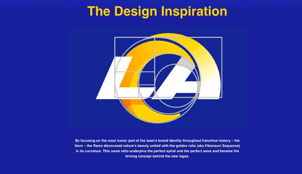
This isn’t letting “nature’s beauty unfold” here, gang, it’s letting design jargon get in the way of actually making a good logo. And don’t get me started on this townhouse ram, which for some reason looks like scuttled Coachella headpiece concept art.
https://twitter.com/jwilldathrill/status/1242180960000421889
It’s all very bad, except for the typeface on the three stack wordmark. That’s nice and will look good in most places. Just not a helmet or anywhere else you need, you know, a logo.