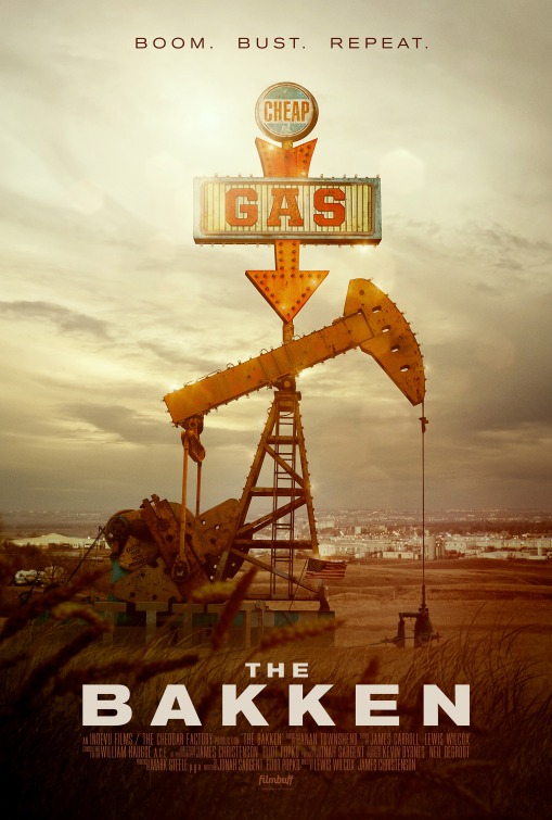
Happy New Year, This Week In Posters readers. New year, same great poster content. If you missed it, check out our best and worst posters of the year features. This week, we begin with The Bakken, one of those titles that wouldn’t mean anything to me without the poster and tagline, which do a solid job telling us what it’s about. Thus upgrading it from “dismissive shrug” to “worth a Google.” For the record, The Bakken is a documentary that “takes an intimate snapshot of the people involved in North Dakota’s historic Bakken oil boom, telling a story of rural industrialization and distress that unfolds over multiple story lines to form a mosaic of cultural, environmental, and economic turbulence.”
Don’t think I’ll be Googling all of these. That’s a reward reserved for the decent poster havers.
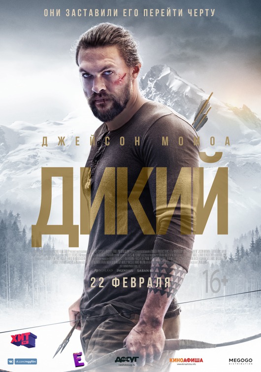
For those of you who don’t speak Cyrillic alphabet, this is a poster for Braven, which sounds like one of those boring Liam Neeson movie titles that got accidentally got misconjugated on the way back from France. Brave, Braved, Will Brave, Braving, Has Braven.
The actual story: Jason Momoa plays “Joe Braven.” I can’t decide if that’s better or worse.
“Brave” could be a nice portmanteau of “brave” and “craven,” like a guy who runs into a burning house to avoid paying his child support.
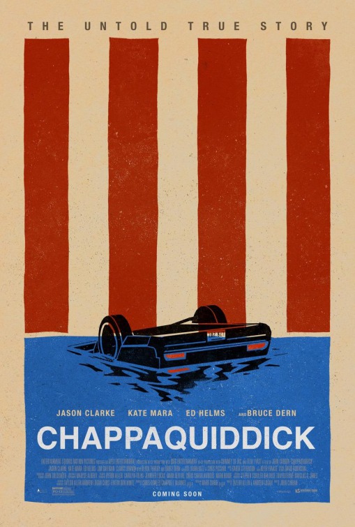
I like the minimalist car art, but it’s undercut by the cliché of using American flag motifs for everything. Is Chappaquiddick a quintessentially American story? Feels like a stretch.
Also, you’ll need to see the movie to understand how laughable “the untold true story” tagline is. The story is neither untold nor true.
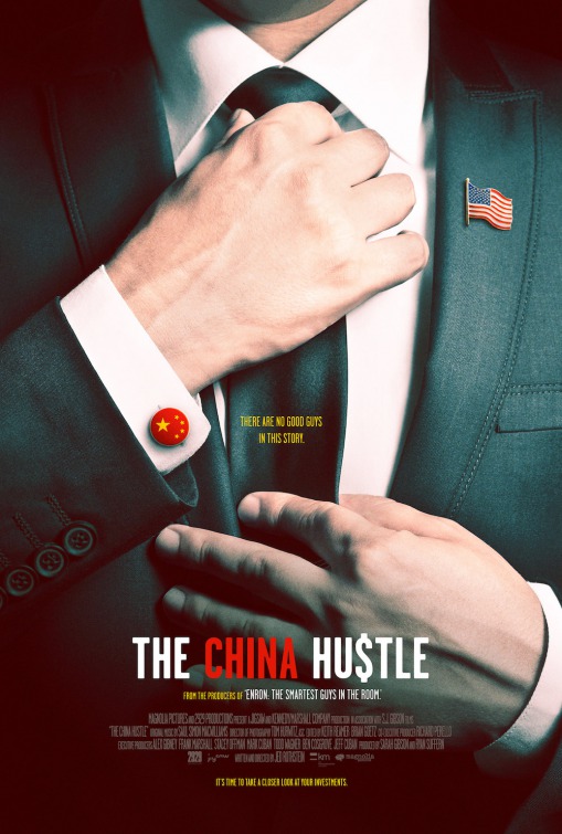
Is he Chinese or is he American? All we know is that he’s not a good guy! I kind of hate that I’m intrigued by this based solely on two or three words and symbols.
Also, I feel like “straightening a tie” is visual shorthand for “about to rob you blind.”
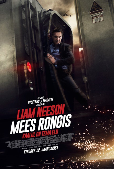
MEES RONGIS. Hell yes, that’s such a better title than The Commuter. “Mees Rongis” sounds like something you’d say to Dutch prostitute in the heat of passion. Apparently, it’s just Estonian for “Man on the Train.”
Anyway, mees rongis aside, it’s nice to know where sparks are actually coming from on an action movie poster for once. I feel like I can hear the train brakes screeching when I look at this. Usually, poster designers just put sparks everywhere, even if the movie takes place entirely underwater.
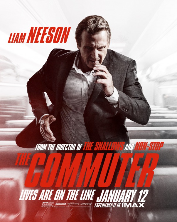
Meanwhile, this other Commuter poster focuses on Liam Neeson’s run, which seems like a bad idea. He looks more like a guy pantomiming running than a guy running. It makes me think of that scene in Taken 3 where it takes 15 cuts to show Liam Neeson jumping over a fence.
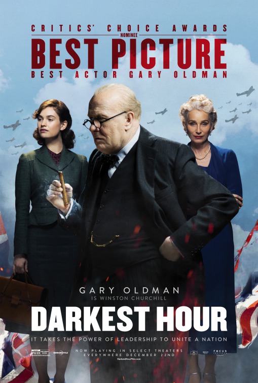
Is it just me or does this look like a wacky WWII sitcom? Kristin Scott Thomas should be resting her chin on her palms and sighing.
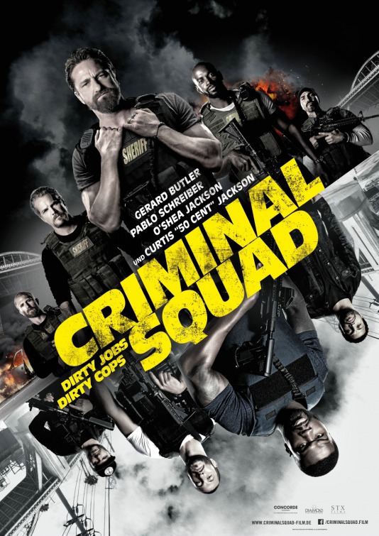
Oh good, one of the worst posters of 2017 is back. Only now, Den Of Thieves is called Criminal Squad (that’s apparently the European title). I get the feeling me having to Google that will be the most anyone ever thinks about Den Of Thieves.
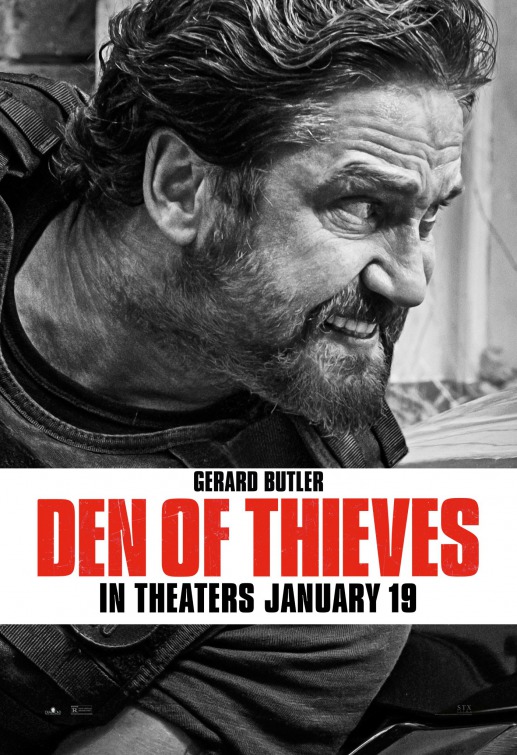
Gerard Butler looks like he has a dip in. Which would be appropriate for the character, I imagine. In fact, if you see a white dude in body armor with an AR-15, there’s a good two out of three chance he has a dip in.
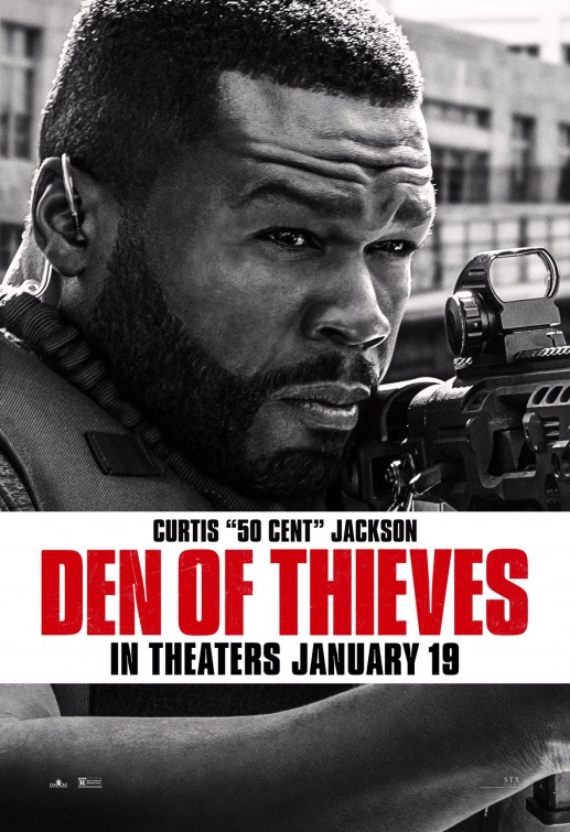
Haha, remember when 50 Cent almost died losing weight for that cancer movie no one saw? Rough. Then again, Jared Leto almost died getting fat to play Marc David Chapman in that movie no one saw, and like four years later he won an Oscar. And then he dedicated his win to the brave people of the Ukraine. Remember that? I guess what I’m saying is, just keeping plugging away, Fiddy. Also his beard is lined up nicely.
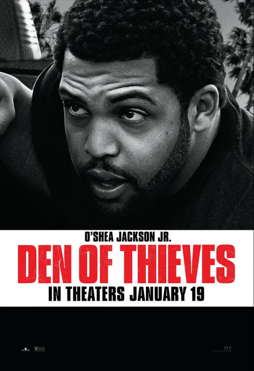
Jeez, did these guys walk right out of the barbershop and into the gun range? Everyone is lined up nice.
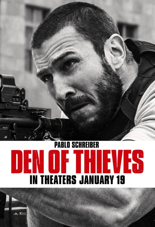
Okay, I don’t think we needed a character poster for Pablo Schreiber. Next time just send this directly to Pablo’s mom.
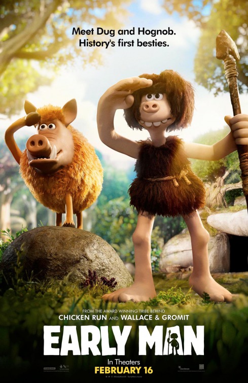
One thing I never get tired of is Aardman Animation’s goofy overbite humans. Gets me every time.
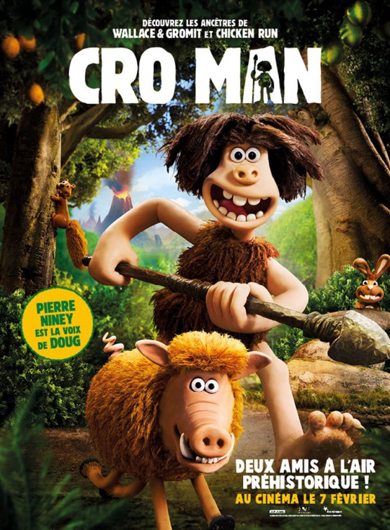
It’s weird that plastic googly eyes on clay seem so much more lifelike and sympathetic than millions of dollars of CG.
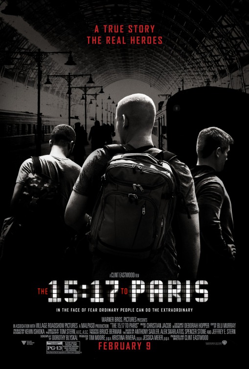
Are you guys aware of this movie? Clint Eastwood made a movie about the thwarted terrorist attack in Paris in 2015 and he cast the three Americans who prevented the attack and a wrote a book about it as themselves. It’s a whole new marketing angle. Imagine if Sully had played Sully! Anyway, you know who I bet is pissed about this? Mark Wahlberg.

Man, I was hoping that in 2018 we could just pretend whatever this gnome movie is didn’t exist but I guess I was wrong. So there’s Sherlock Holmes wearing a clown nose… and he’s opening a Christmas present… which has a living gnome inside. Great poster! I totally know what this is about now.
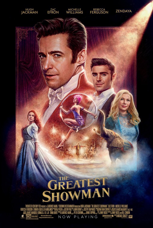
I like the spotlight fog effect they got going here. That seems like it’d be hard to draw. Also, Zac Efron and Hugh Jackman have the same haircut.
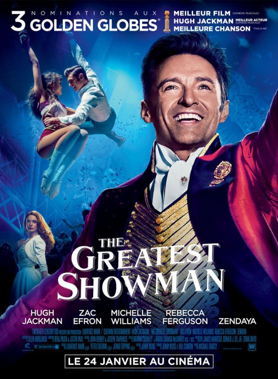
Rebecca Ferguson is my favorite part of this poster. “What’s that? Oh, just standing over here backstage with my perfect hair, hoping someone notices me.”
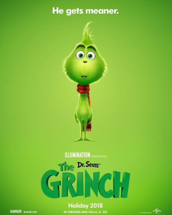
I know, I thought they already made this movie too (BTW, if you think Jim Carrey was a dick when he was in character as Andy Kaufman, I can’t imagine what that Grinch set must’ve been like). I guess it’s animated now? *shrug* Think I’ll wait for the claymation version.
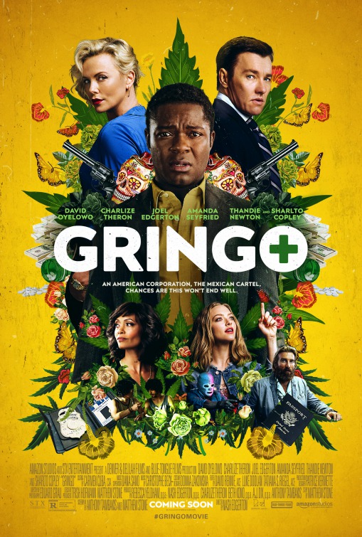
I think this is my pick for this week’s best poster. It’s busy, but beautiful.
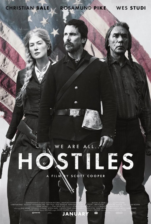
Goddammit, how hard would it have been just to line up the names properly? And again with the crowbarred American flag imagery. I’m only seeing this if Pantera sings the theme song.
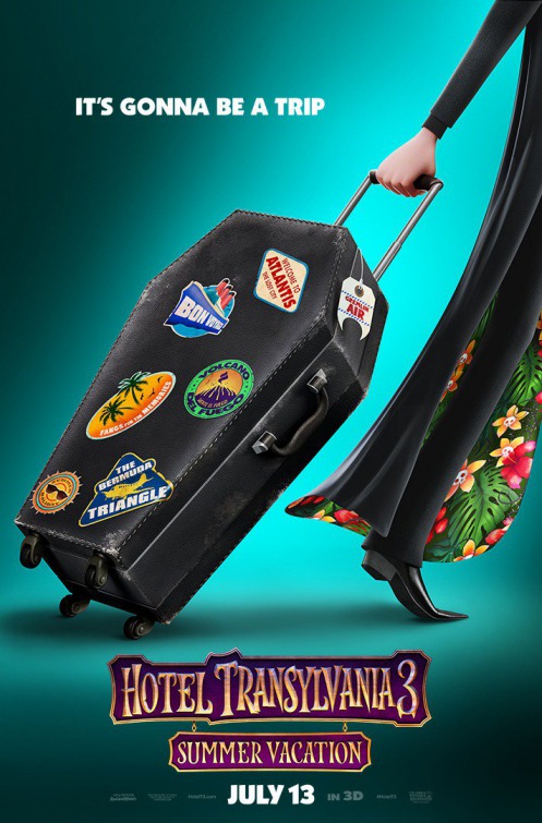
Everything about the Hotel Transylvania movies seems dumb and lazy, but you have to give the poster designer credit for economy of imagery here. Then again that’s probably easier when the entire concept of the movie is “Dracula on vacation.”
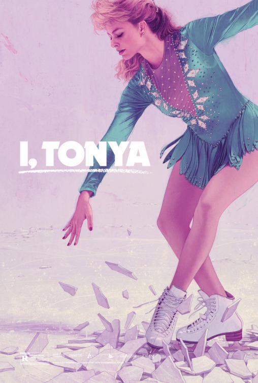
As a group, I think the I, Tonya posters might be this year/last year’s best.

Oh no, I may have spoken too soon when I declared Gringo the week’s best poster. This one for Wes Anderson’s Isle of Dogs is really quite something. It’s clear the designer took my “needs more dogs” suggestion to heart after the last one.

I started leaving the Jumanji posters out of this roundup on account of they were so boring, but The Rock punching a hippo was a great way to regain my attention.
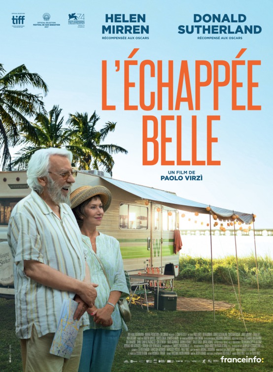
*nudges date*
“That’s l’echappee.”
(This one’s for The Leisure Seeker, but I wasn’t going to let that ruin my “that’s Chappie” joke.)
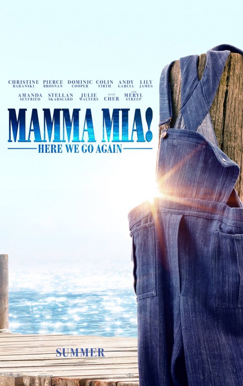
Oh God, a Mamma Mia sequel? Between this and all the Pitch Perfects I’d swear these damned musicals multiply like rabbits. They’re worse than bed bugs. You have to get them right at the jazz hands or else they’ll just grow into full-blown show tunes again. Anyway, the poster. The discarded overalls make me think there’s some naked person with an overalls tan out in the water. It’s a very specific fetish.
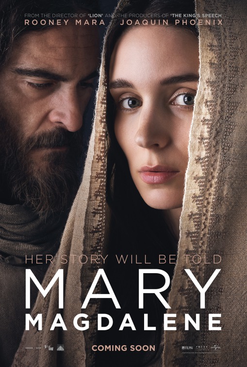
Couldn’t they have gotten someone whiter to play Mary Magdalene? Yes, I’m sure this won’t be controversial at all. Also, I like to imagine this is a spiritual sequel to A Ghost Story.
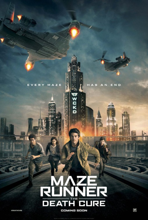
(*Poison voice*)
Evvvvvvvery maaaaze has its end.…
It’s funny to me that the last Divergent movie had to go straight to TV but The Maze Runner of all things is still going strong. They seem to have the same color palette and serious faces and “Future Mall” aesthetic, I wonder what the difference was? Was it the running? People do love running. Tom Cruise’s career proves that.

Enjoy it, Pacific Rim fans, these movies never get better than the posters.
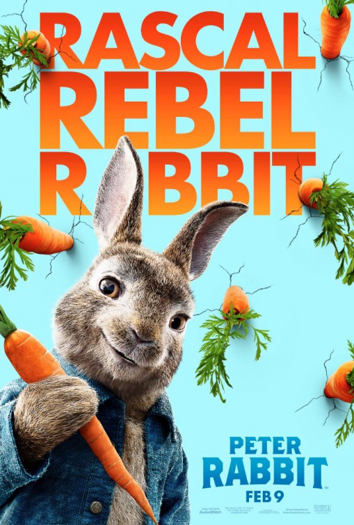
REBEL. That’s right, this ain’t your grandmother’s Peter Rabbit. This time he’s like a rabbit Banksy. Look at him plant his carrots in the side of a building (I bet it’s a bank). He’s totally in my face.
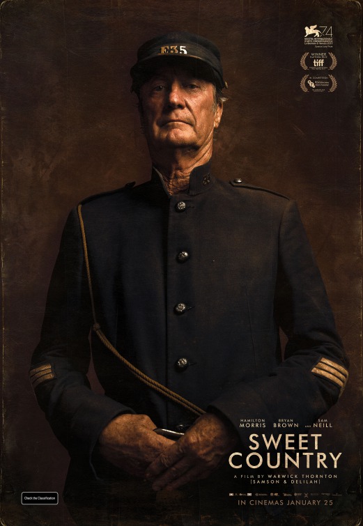
I don’t know what it says about me that a period Australian western starring Bryan Brown is precisely my wheelhouse. I want this movie right now.
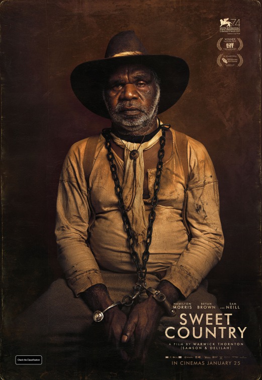
It was like three million degrees and everyone was covered head to toe in red dirt yet even the guy in handcuffs had to wear an ascot.
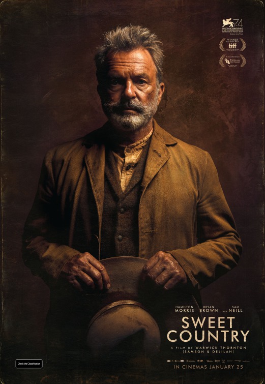
I mean look at him. He’s wearing at least three layers of clothes and two of them are probably wool. English colonists had to be some of the dumbest people on Earth.
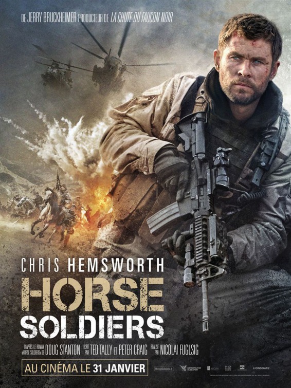
I know 2017 was bad, but 2018 is giving us a Jerry Bruckheimer movie called “Horse Soldiers.” I mean it’s called “12 Strong” in America, but I think we can all agree that “Horse Soldiers” is a much better title. I like to imagine the horse from War Horse coming to the lead horse in this in an Obi-Wan-style flashback to remind him to have moxie.
Yes, yes, Horse Soldiers is the name of the book on which the movie is based, stop trying to ruin my jokes.
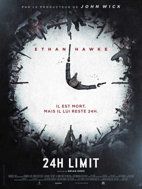
Eh? They’re trying hard to recreate the awesome John Wick 2 posters, and they almost did, but I kind of feel like I’m looking at a weird Sims animation movie now. Also, the director’s name doesn’t have any vowels. “Brian Smrz?” I don’t think that’s allowed.
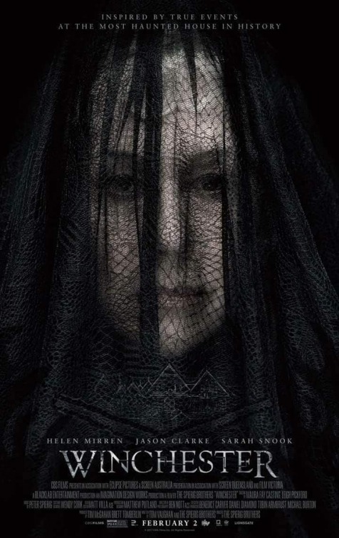
HELL YES! I like to say that all horror movies are about a haunted house or a creepy little kid. I like that Winchester really leaned into that. It’s about the MOST HAUNTED HOUSE IN HISTORY. Oh man, you guys. This is going to be so great. This house is haunted as shit.
