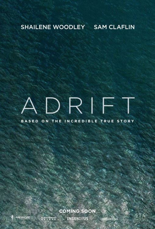
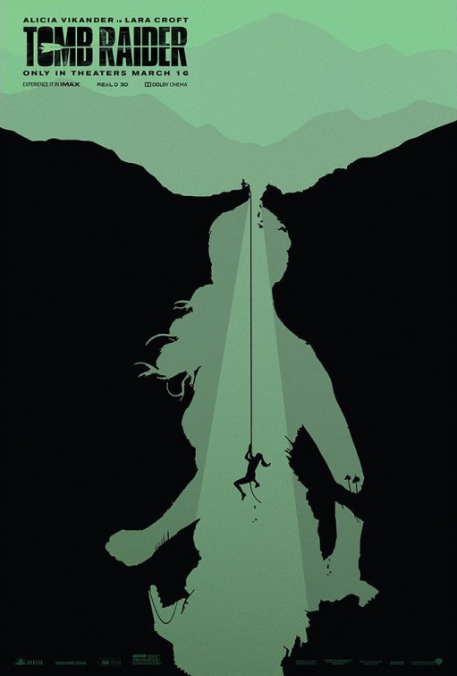
This week in This Week In Posters, we begin with this extremely moist poster for Adrift. So maybe it’s not the most visually dynamic of the bunch, but I always appreciate choosing a conceptual image over trying to squeeze a bunch of actors’ faces and text in there. You think Sam Claflin voices Shailene Woodley’s talking volleyball? I assume this is a Castaway situation.
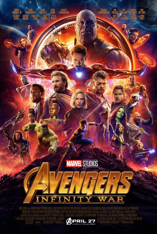
I’m sure there will be seventeen trillion individual character posters for Avengers: Infinity War in the coming weeks, but in the meantime I’m enjoying the sheer absurdity of trying to squeeze all these names onto the same poster. You know how I said that thing about not trying to squeeze all the names and faces onto the same poster in the last one? I rescind that. If the point of the marketing campaign is to show how overstuffed the movie is, this is perfect.
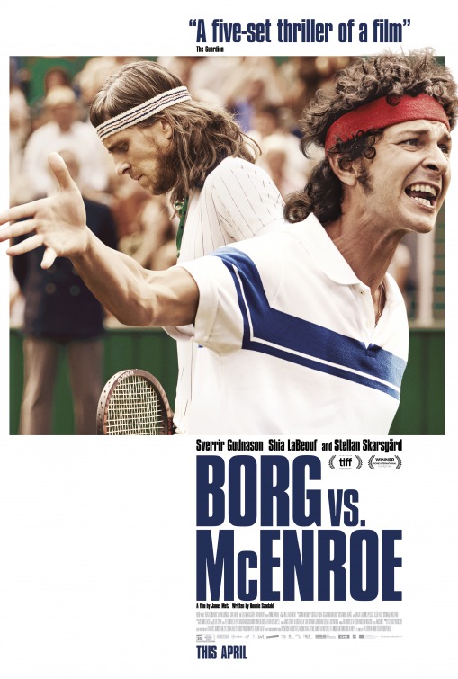
Yo, wasn’t this movie supposed to come out like a year and a half ago? Here’s a Borg/McEnroe poster from last August. Apparently it came out in the UK and Sweden last Fall but they saved it for April here in the US. Strange. Anyway, I like how the imagery is all pushed to the right margin. Feels like McEnroe is crowding us. He’s totally in my face!
Also, the only thing worse than film critics trying to do themed plays on words in their pull quotes is studios using those quotes in their marketing campaigns. What consumer does that work on? “Gee, honey, I was on the fence about seeing The Burger King, but then I heard Gene Shalit called it ‘a whopper of a biopic,’ so…”
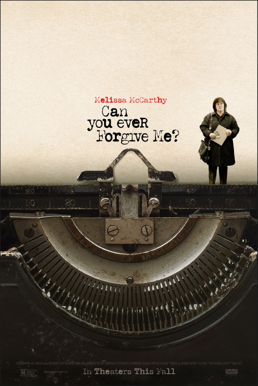
Is this just Stranger Than Fiction 2?
IMDB says…
When bestselling celebrity biographer, Lee Israel, is no longer able to get published because she has fallen out of step with current tastes, she turns her art form to deception, abetted by her loyal friend, Jack.
Okay, that sounds interesting. Who is this “Jack” though? Is he a doggy? If Jack is a doggy you have to tell me.
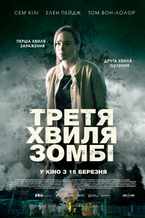
In case you can’t read Cyrillic, this poster is for The Cured. I’m curious about the thought process behind this one. “Okay, so we’ll get a background that looks like gray paint splattered on a gray wall shrouded in fog.”
“And then?”
“Then we’ll get an Ellen Page picture that looks like a Soviet Bloc mugshot lit with car headlights so unflattering she’ll probably sue us for it.”
“Well you clearly have a ‘look’ in mind, so go nuts man.”
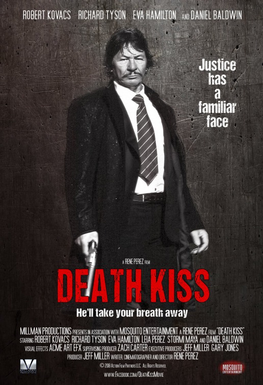
Wait, what? I had to look this up, but yes, they actually did hire a Charles Bronson lookalike for a Jackie Jormp-Jomp Death Wish remake. Not only that, they seem to have made the actor change his name. According to this article, the ersatz Bronson is named Robert Bronzi. Yet the poster says “Robert Kovacs.” Either Kovacs is Bronzi, or the poster doesn’t credit the actor they built the entire concept around. It’s always a good sign when your lead actor changes his name right before the release of his break out role.
This looks to be Daniel Baldwin’s best gig in years.
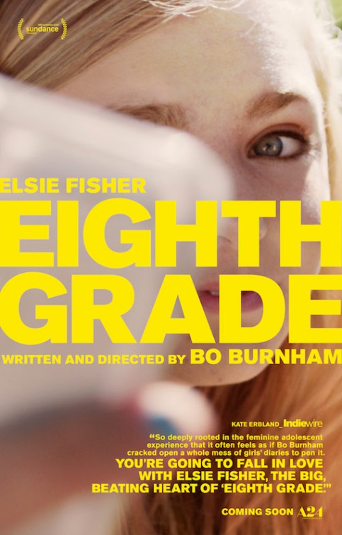
The big yellow text makes this look like a bookend scene from The Royal Tenenbaums. What’s being held up in front of her face there? A urine sample? She’s looking wistfully at a urine sample? Why is there a urine sample? Have I read weird things into this?
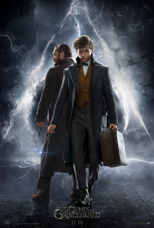
Hmm, great, but could we maybe get Eddie Redmayne a few more collars? He hasn’t quite reached Steve Bannon levels of collar-having. When I go see an Eddie Redmayne movie my top concern is how well his neck is covered.
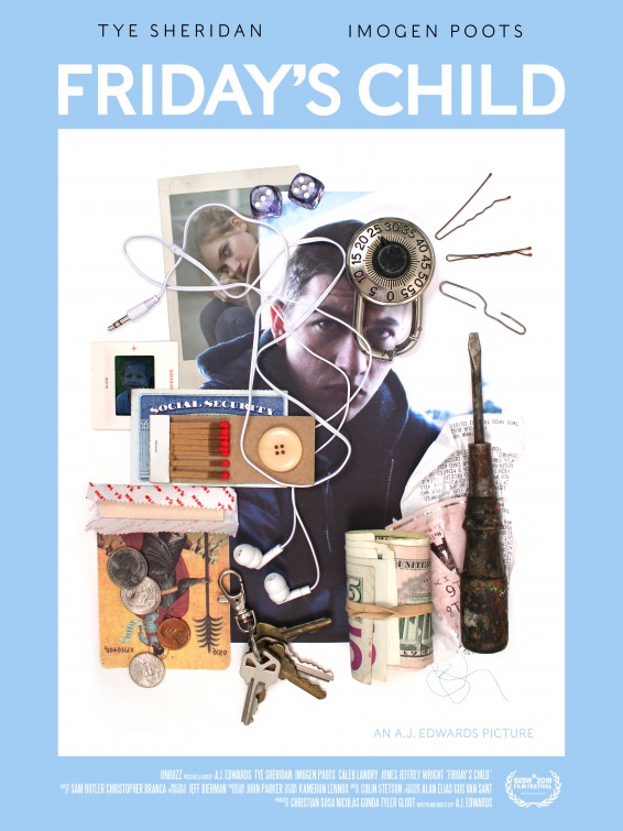
This poster for Friday’s Child is the most unusual we’ve had in a while. Which feels like an achievement of some sort. I enjoy that the color scheme doesn’t seem to fit the subject matter at all. It’s like a happy song about murder. I love happy murder songs.
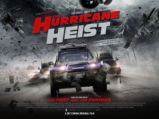
The money flying around lets you know that it’s a heist.

If you’re going for “the dumbest cheesy thing ever” you might as well use the pointlessly diagonal horizon line poster.
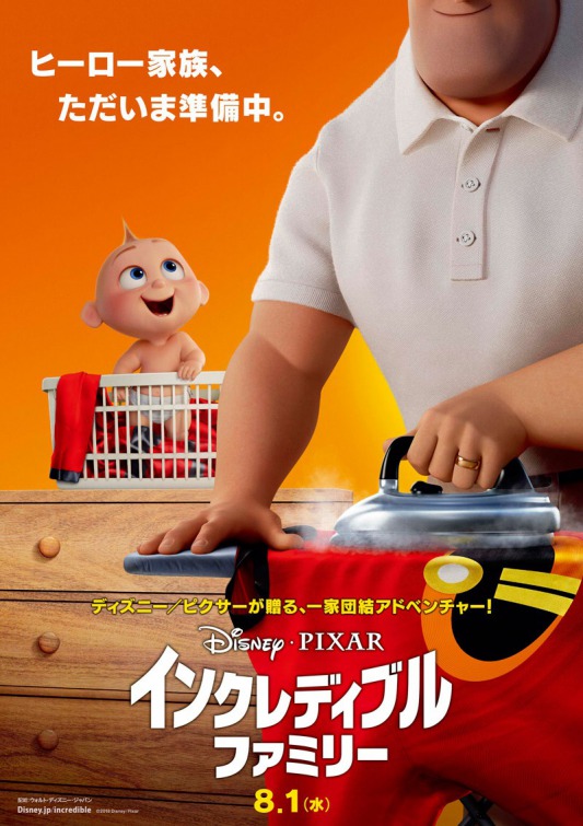
Is the draw the baby? I don’t get it. I’ve never seen a superhero movie and thought “this is great, but I wish he could care for a toddler.”
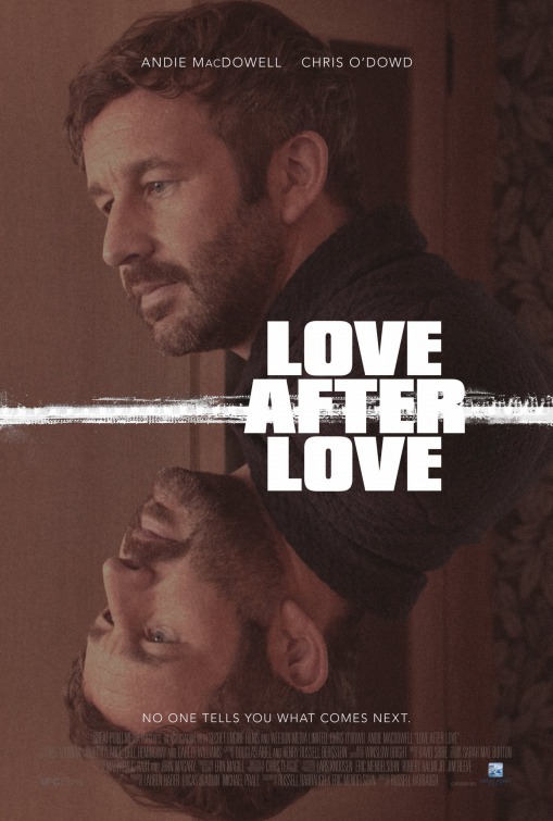
The mirrored image with neutral facial expression positively screams “psychological sci-fi.”

This is like the very serious version of one of those meme pictures where they gradually zoom in on someone’s face.
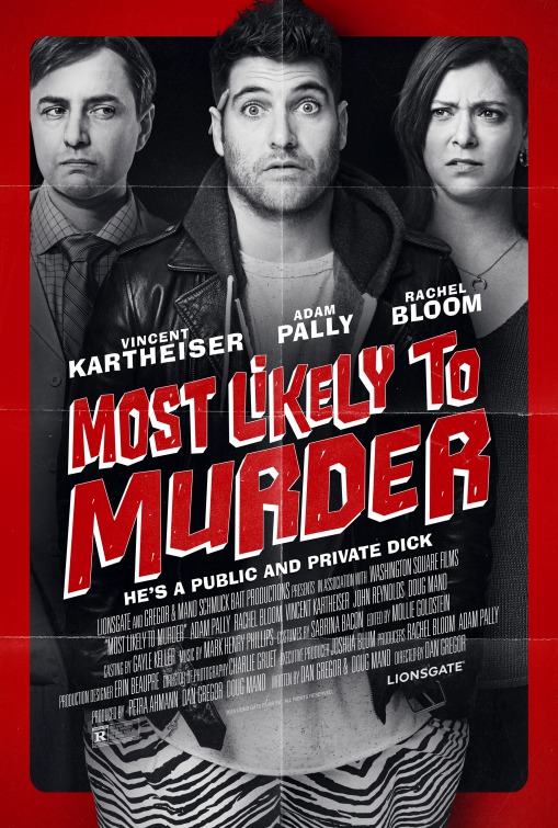
I’m having an extreme reaction to Adam Pally’s face here. It looks like the face of every guy trying to trap me in conversation at a bar. He looks like young Andrew Dice Clay in boardshorts. No chance that hoodie isn’t built in to the leather jacket.

You have to appreciate a poster that lays all its cards on the table. No one walks by the Pacific Rim: Uprising poster and says “Gosh I wonder what that one’s about.”
Pacific Rim: a franchise for people who don’t like surprises.

Speaking of laying your cards on the table… Is that just standard practice for Asian markets, you think?
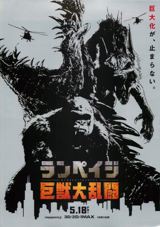
I like that someone got all cool and arty with a poster campaign about a giant crocodile fighting a giant wolf and gorilla based on an arcade game.

*whispering to date* That’s the iron giant.
Haha, having “a date” to Ready Player One, that’s a good one.

Is this a reference to something? That’s the only trouble with the Ready Player One ad campaign, if they do anything I don’t immediately recognize as an homage to something I get confused. Did I fail the test? Am I no longer the good boy?

Is he Lloyd Doblering on the iron giant’s shoulder? Sure, why not.

This one looks like a futurist painting from the thirties, which is cool. But did they replace Tye Sheridan with a young Mick Jagger?

You know what makes this poster a thousand times better? Imagine Tye Sheridan is squeezing a giant bewb.

Is it a reference?! Tell me the answer! Tell me I am the good boy!

Is that a dracula baby? I hate dracula babies.

Here’s the first of a new batch of Han Solo posters. I like the color scheme and general vibe of these, but I question why Han and Chewy have to have their mouths dangling open. They look like a couple of Eli Mannings out there.

Hot movie guys always have to tilt their heads down and look through their brows. I don’t know why either.
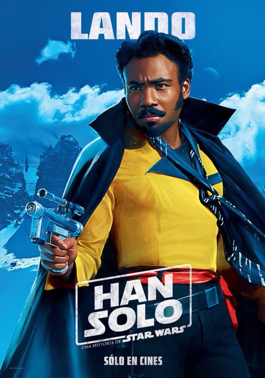
Yes. I don’t know why you even need the other posters when you have Lando in a silk scarf and space cape.
