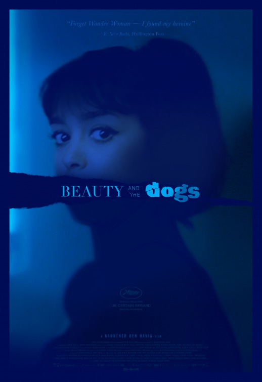
This week in This Week In Posters, we begin with this poster for Beauty and the Dogs, which doesn’t even have any dogs on the poster. Does that mean the title is just some bullshit metaphor? I need this poster to prove to me that there are dogs in this movie. I’m not going if there aren’t any dogs and it’s just some proverb about sad people or something. Also, is it my colorblindness or is this poster incredibly hard to read? Or is that part of the dog metaphor, trying to make us feel colorblind, like a dog? Anyway, bad poster. No dogs, says some stuff on it I can’t even read — pass.
[all posters via IMPA]
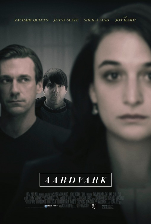
There’s that damned dramatic Fifty Shades font again! Only this time it’s for a movie starring new Spock as little Nicky. No clue what this is about, but I’m somewhat intrigued.
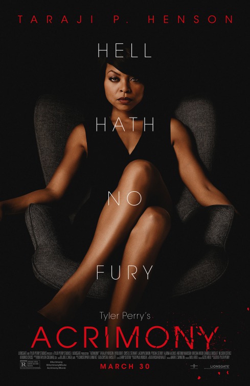
Whoa. It looks like Taraji P. Henson is about to murder me, but sexily. Like I’m going to die with an erection (again). This poster is too good for a Tyler Perry movie. I bet Taraji P. Henson is playing Janet Acrimony or something and the movie is about God punishing her for infidelity.
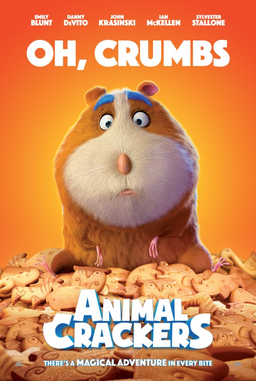
Oh, you made a movie about Animal Crackers? Neat-o. This will surely leverage that built-in audience of cookie enthusiasts. Remember that Ali G episode where Ali G invents a glove to keep ice cream from dripping on your hands, and he measures the potential market for it by multiplying the number of people who like ice cream by the number of people “who have hands?” This looks like someone did that for real.
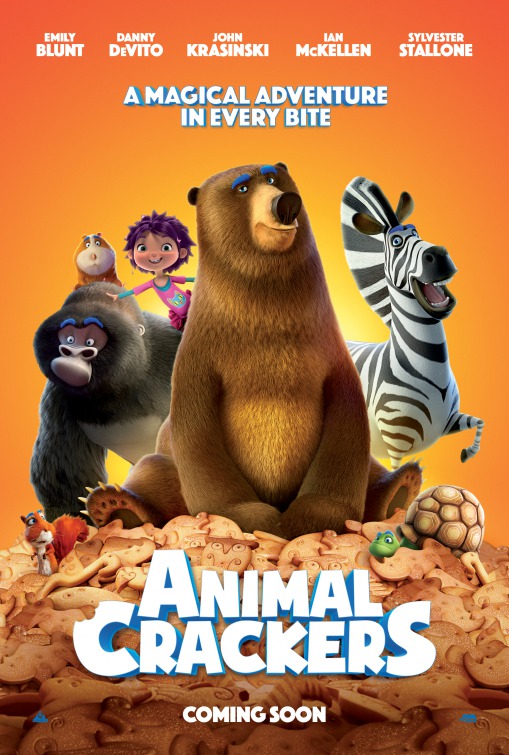
Imagine trying to fit a storyline to “a movie about cookies.” How many screenwriters do you think killed themselves before this was finished?
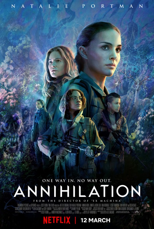
Natalie Portman has a very big head– OH HOLY SHIT I JUST SAW THE SKULL BEAR. Do not sneak a skull bear on me like that ever again. Vote Skull Bear With Human Screams in 2020.
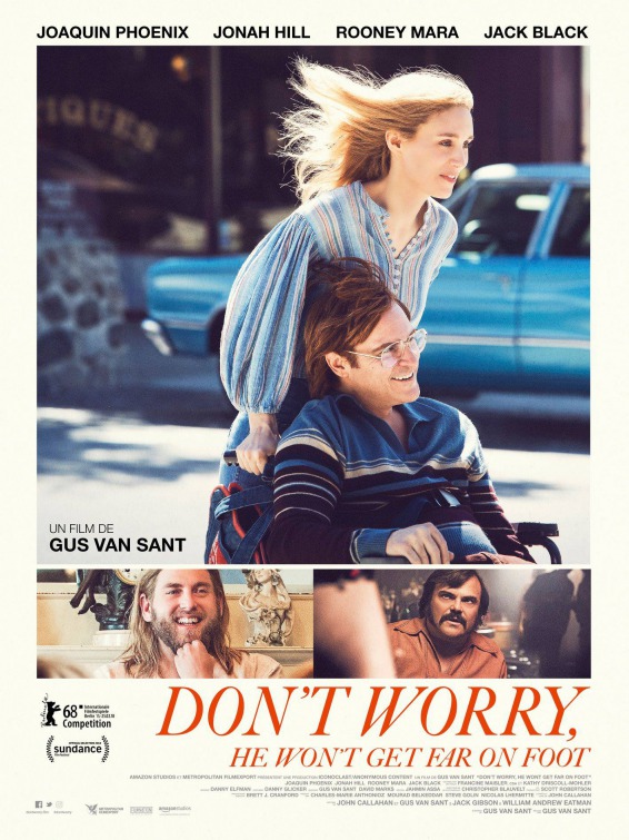
Okay, I understand wanting to let people know that Jonah Hill and Jack Black are in this movie (both great, incidentally) but maybe don’t try to squeeze three images into one poster? That never really works. Instead of one memorable image you get three or four that make no impact.
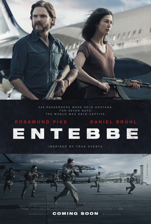
I have this theory that Daniel Brühl should only play rat-faced Nazis.
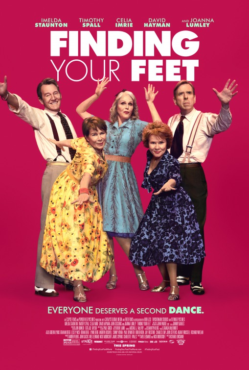
Boy, that Timothy Spall sure has… a face doesn’t he? Anyway, this looks, uh… fun. Should we just skip to pretending we’ve already seen it like Billy Elliot?
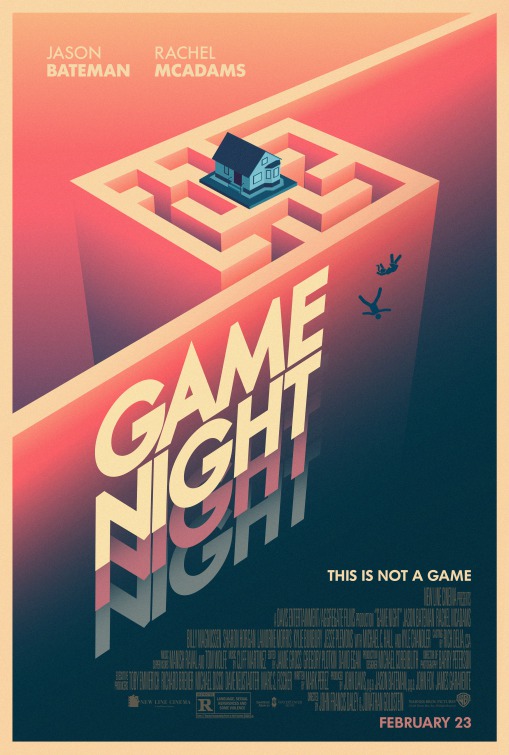
I can’t believe a movie that had such terrible posters also had this one. I always appreciate a poster that gets their beloved diagonal lines in there without just tilting the horizon for no reason. Plus a Vertigo reference? Seems like a lot of work for the kind of movie this is, but hey, you guys do you.
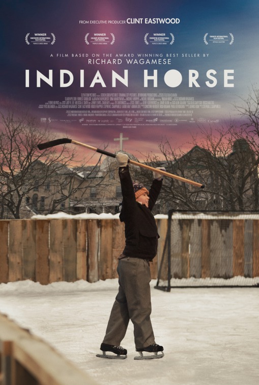
Hey kid, there’s a cross coming out of your hand. Might want to get that checked out. Also, did they use the Game Night font for the executive produced by Clint Eastwood part?
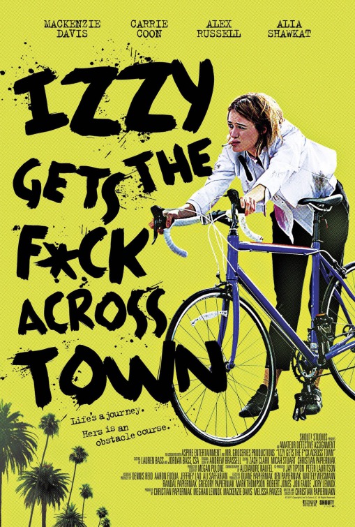
Well, that’s certainly quite a title. I’m guessing she gets the F across town on that bicycle? And that the town is LA because palm trees? Yes, I think I understand the premise.
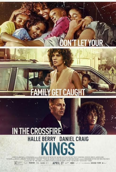
I’m a little worried that Halle Berry has been typecast as “lady protecting her family on the road.” Is this a period piece? Discuss.
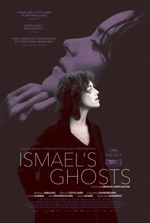
So what’s this one about, chins?
JOE PESCI VOICE: “I like this one. One French lady goes one way and the udda French lady goes the udda way. And this guy’s sittin there like, ‘Whaddaya want from me?'”
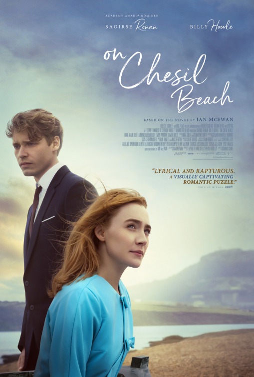
What do you think makes this look more serious, the male lead’s face, the morning mist, or that font?
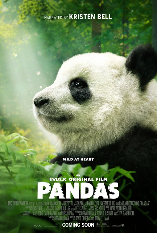
Can never have enough panda movies, I always say. Such fascinating creatures. The sitting, the eating the bamboo, the… uh… laying?
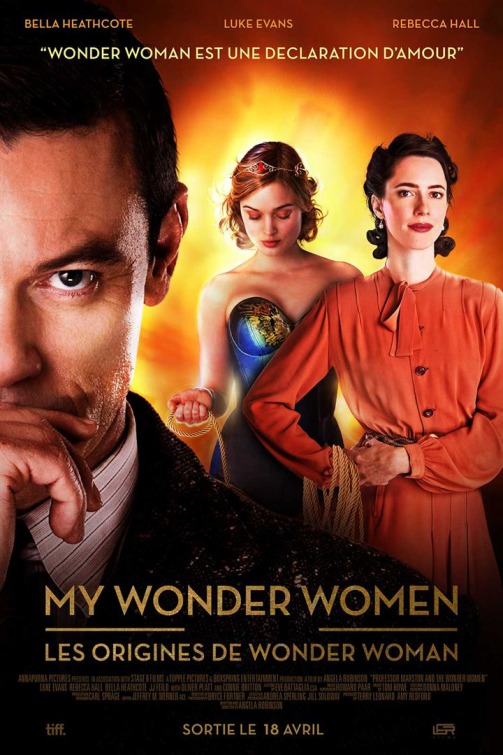
Come on, man. Just put the names over the corresponding faces. Would it be so hard? This feels like they almost fell out of the box matched and then someone had to mismatch it to be cool. Anyway, cool bodice.
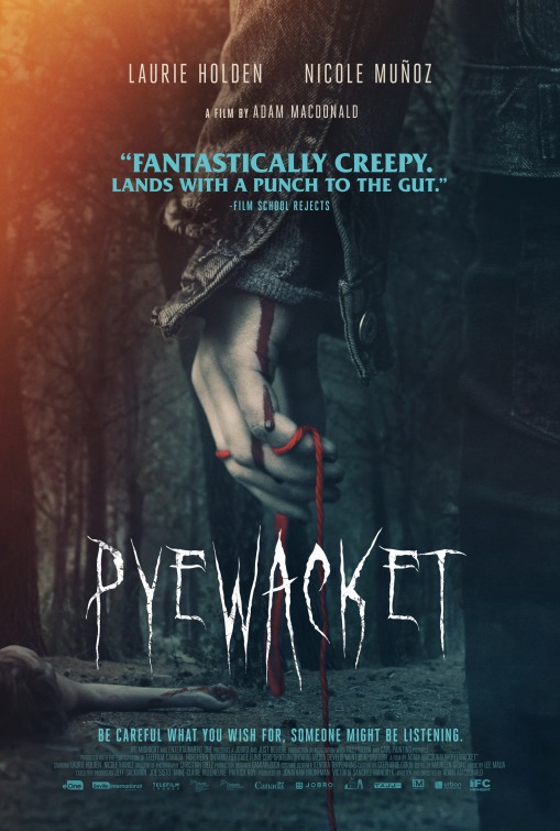
I like that pull quote font. That’s a nice classic horror movie font. This is pretty solid all around. I think “atmospheric mystery” is a good way to go with horror movie posters.
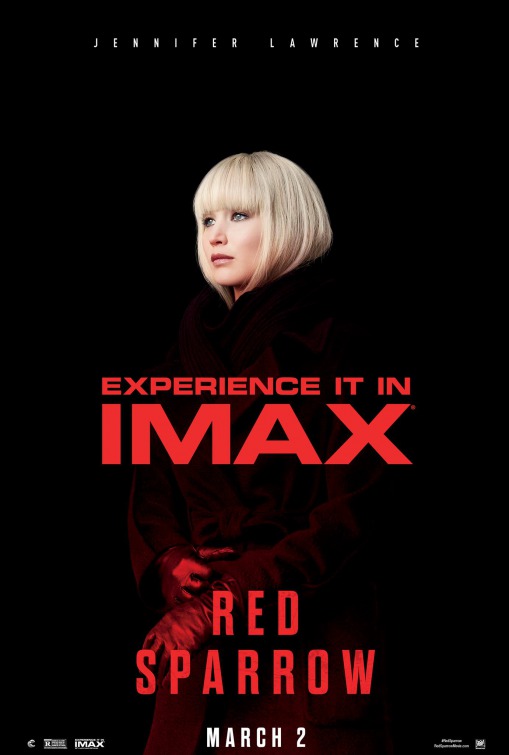
Oh look, it’s the poster for Atomic Blonde 2 I mean Red Sparrow.
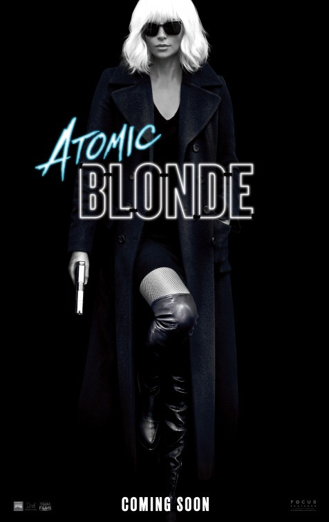
Is it a coincidence that they have almost the same hair? Is that a sexy spy thing? “This Summer… it’s not just the guns that have bangs.”
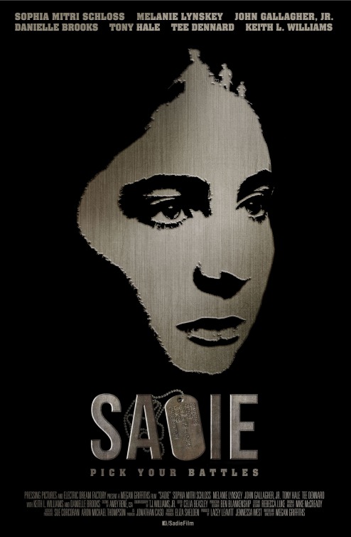
Uhhh… Saoie? Sapie? I appreciate the simple approach, but the thing is that dog tag doesn’t really look like a letter.
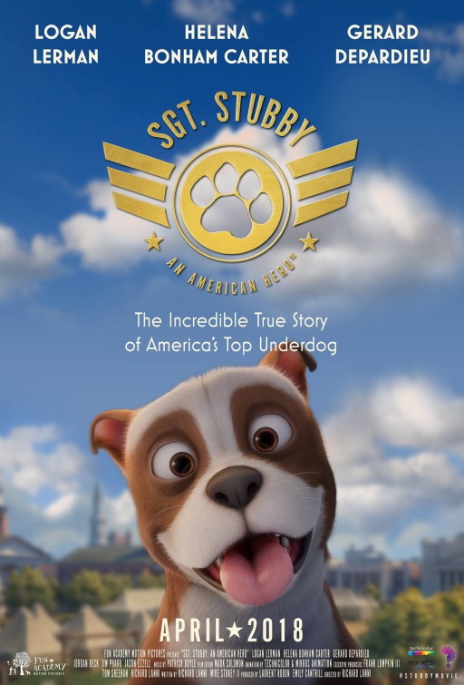
Oh man, a movie about a cute stubby dog? I am so in for that. Why couldn’t this have been live action? Also, voice work is the easiest paycheck any actor will ever get, so if you’ve got Gerard Depardieu above the title I have to think there were some money troubles. Also, according to the Wikipedia page, Stubby was a Boston terrier. This doesn’t look like a Boston terrier! Where are his googly walleyes? It also says this is the first major computer-animated feature to be based on a true story, so there’s that.
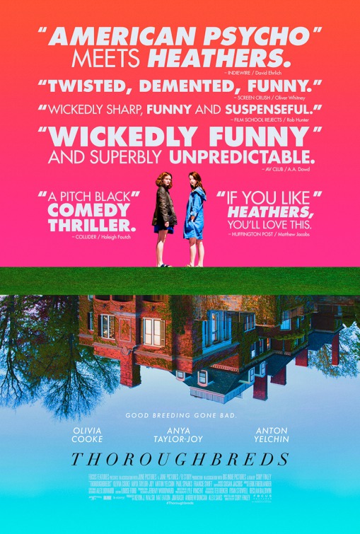
There’s that font again. This is actually a really cool poster. I guess the only real question I have is whether this is like Heathers.
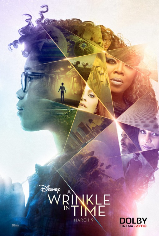
I like the color scheme, but I’m never a big fan of the “character montage inside a silhouette” style posters. Also, I feel like every character should be Oprah.
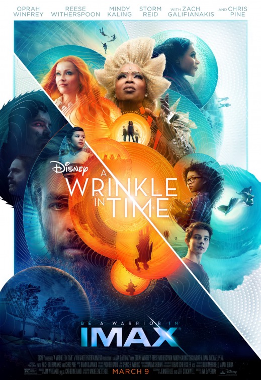
Same montage, now with spheres. See? Doesn’t this work better? Also, this one correctly identifies Oprah as the focal point. This looks like Doctor Strange designed it.
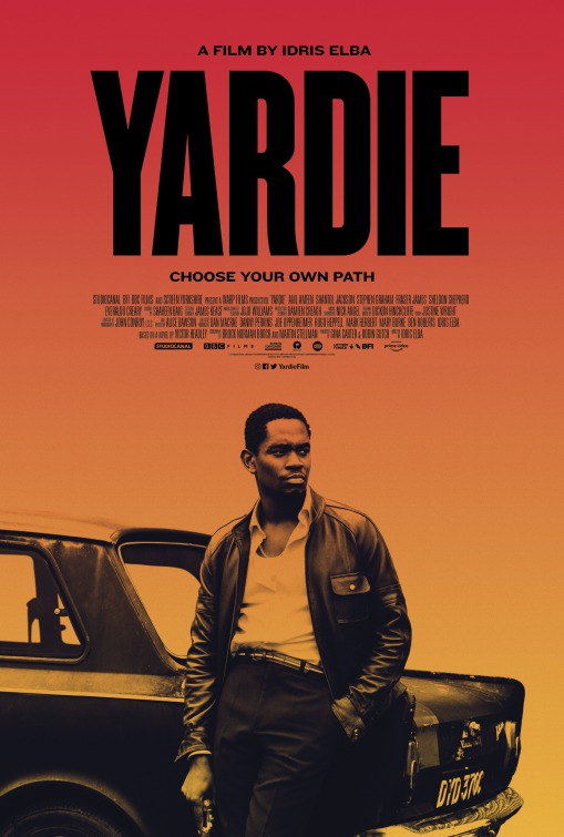
Hell yeah. Any time there’s a movie about guys being badasses with their pants pulled above their belly buttons I’m there.
