SHOWS
Covers Books
EVENTS
FEATURED
BRANDS
TRAVEL,
DRINKS & EATS
DRINKS & EATS
Latest
Snoop Dogg Pours One Out For Tupac With A New ‘2 Of Amerikaz Most Wanted’ Wine
There are very few rappers, if any, who have a more diverse portfolio than Snoop Dogg. Aside from his legendary music catalog, he has a big new deal with NBCUniversal, he's basically an honorary Olympian at this point, and he's even in the wine business with Cali By Snoop, a line launched in 2020 in collaboration with 19 Crimes. On the latter front, there's some news today (March 10): The latest Cali By Snoop wine is called 2 Of Amerikaz Most Wanted and it's out now. It's a tribute to Tupac Shakur from Snoop himself, and it's based on the…
Sailorr And Eem Triplin’s New ‘Coconut’ Video Has Everything From ‘Grand Theft Auto’ To Sock Puppets
Sailorr had a major 2025, first with her debut mixtape From Florida's Finest and then with the deluxe edition, From Florida's Finest Delu/xxx [For My Delusional Ex], in December. Among the new tracks on the deluxe was "Coconut," a collaboration with Eem Triplin. The pair just unveiled a new video for the track today and it has a bit of everything: Grand Theft Auto references, sock puppets, and of course, coconuts. Announcing the video on social media, Sailorr wrote: "if someone gave us a budget to make a commercial about coconuts this is what it would look like COCONUT OFFICIAL…
Bruno Mars’ New Album ‘The Romantic’ Debuts At No. 1 And It’s Somehow His First One To Do So
Bruno Mars has fewer No. 1 albums than you might think. His 2010 debut Doo-Wops & Hooligans, featuring hits like "Just The Way You Are" and "Grenade," peaked at No. 3. His second album, 2012's Unorthodox Jukebox, did go No. 1, but 2016's 24K Magic did not, topping out at No. 2. (His 2021 Silk Sonic album with Anderson .Paak peaked at No. 2 as well.) Now, for the first time in well over a decade, Mars has another chart-topper, as on the Billboard 200 chart dated March 14, The Romantic debuts at No. 1. This makes it his first…
SNX: The Nike Air Max 95 Neon And This Week’s Best Sneakers
Welcome to SNX, your weekly roundup of the best sneakers to hit the internet. This week is a big one for Air Max fans due to the return of the 95 Neon. If you’re not an Air Max head, try to think of this release as the return of the Jordan 1 BRED. It’s a big deal! Outside of the Neon 95, this week brings a new NB silhouette, a blue-toned Women’s Air Jordan 1, the return of the Imperial Purple AJ-4 and a Patta Nike link-up. Which begs the question: Where is Adidas at? It’s been a quiet year…
Harry Styles Goes Full Stuntman In His Daring New ‘American Girls’ Video
Kiss All The Time. Disco, Occasionally., the new album from Harry Styles and therefore one of the biggest pop events of 2026 so far, is out today (March 6). Accompanying the release is a new video for the song "American Girls." In the James Mackel-directed clip, Styles is on a film set doing a bunch of stunts. That includes everything from driving a car under an exploding truck, although it's made abundantly clear that green screen was heavily used to achieve these big moments. Styles recently told Apple Music's Zane Lowe of the song: "It's actually quite a lonely song…
Fred Again.. Puts A Cap On The ‘USB002’ Era With A Collection Of Remixes
While Fred Again..'s USB project is ever-expanding, the latest era of it, USB002, ended with Fred's fourth show at Alexandra Palace last weekend. Now, Fred is putting a cap on the whole thing with a new project, USB002 Remixes, which is out now. Fred invited a bunch of artists, many of whom were involved with the latest tour, to contribute remixes, including Skream & Benga, HAAi, Hamdi, Oppidan, Lou Nour, KETTAMA, Lil Silva, and MC Dricka. In January, Fred reflected on all of his 2025 activity, writing on Instagram: "im thinking about the past year, watching back a whole bunch…
Tainy Takes The Field To Helm A World Baseball Classic Soundtrack Featuring Myke Towers, Young Miko, And More
The 2026 World Baseball Classic has begun. It kicked off with Pool C play in Tokyo yesterday (March 4, ET), while Pool A, Pool B, and Pool D begin in Puerto Rico, Houston, and Miami, respectively, on March 6. For the international event, World Baseball Classic Inc. went all in on music this year by releasing the first-ever tournament soundtrack, produced by two-time Grammy winner Tainy. There are three original songs and the highlight, described as the "anthem track for the tournament," is "Make It Count," a collaboration between Becky G, Yeonjun of Tomorrow X Together, and Myke Towers. The…
Here’s The Verdict On One Of America’s Most Expensive New Whiskeys
Any time you get to taste a premium whiskey from Michter's, it's a cause for celebration. It just so happens that this particular expression is so painstakingly created that its name is an homage to the occasion. Michter's Celebration Sour Mash debuted in 2013 and, at the time, represented a major innovation in the American whiskey world, not only as one of the few expressions that blended bourbon and rye, but also as one of the first super-premium American whiskeys on the market. With an original MSRP of $4,000, Michter's anticipated the current crop of high-end American whiskeys we're seeing…
Harry Styles Has A Few Reasons Why He’s Not Doing A Traditional Tour For His New Album
Harry Styles has a bunch of tour dates coming up this year in support of his album Kiss All The Time. Disco, Occasionally. that's out this week. But, he's not going to a bunch of places. Instead, he's doing a series of residencies, which includes a run at Madison Square Garden that stretches from August to October. As for why he's doing it that way, there are a few reasons. Towards the end of a conversation with Apple Music's Zane Lowe that was shared today (March 4), Styles explained: "I think it makes the show better. I think you can…
‘Brat’ Summer Is Back As Charli XCX’s Movie ‘The Moment’ Hits Streaming
Charli XCX's new movie The Moment is a smash: Deadline reported recently that the film had a limited opening that grossed just under $107,000 per screen (four screens total), the third-biggest limited debut post-COVID, following Marty Supreme and Asteroid City. It's also top-three ever for A24 after Marty Supreme and Uncut Gems. Now, the film can be a hit from the comfort of your own home, whether you'd like to rent/own it digitally or stream it with a subscription. For the former, Amazon's Prime Video has it available to rent for $19.99 or buy for $24.99. There's an even better…
Johnny Blue Skies Just ‘Leaked’ Their Physical-Only Album Online Ahead Of Its Release
Johnny Blue Skies & The Dark Clouds announced the album Mutiny After Midnight last month, setting it for a March 13 release. Interestingly, Johnny (a new moniker of Sturgill Simpson) decided to release the project only on physical formats: vinyl, CD, and cassette tape. But, ahead of that release, they've actually shared it online first, as a sort of "accident." Currently, the whole album is available on YouTube as a single 45-minute upload. They shared the news in an Instagram Story, writing, "Ooops,.mighta just posted the whole f*k'n album on YouTube....for the real ones." Johnny previously shared a statement about…
Sombr Believes The UK Beats The US ‘In Terms Of Iconic Acts’
The US and UK music scenes aren't exactly the same, but there is a lot of overlap. Sombr, for example, had his 2025 debut album I Barely Know Her peak at No. 10 on the charts from both territories. Consequently, he was on hand for the BRIT Awards this past weekend, where he pledged his allegiance to UK artists. In a red-carpet interview with NME, the interviewer noted how Sombr has said previously that something about the UK resonates with him and she asked what it was. He responded: "It’s the music that comes from the UK. In my opinion:…
Anderson .Paak Explains Why It Was So ‘Important’ For Him To Star In ‘K-Pops!’ Alongside His Son
Anderson .Paak is a singer, drummer, and now, director as his debut movie, K-Pops!, is in theaters. It debuted this past weekend, and at the premiere, he discussed hos meaningful it was to star in the moving alongside his son, Soul Rasheed. .Paak told Variety: "I could have pulled from a lot of things in my life, but it was important to do a family comedy where I'm sharing the screen with my son -- for people to see Black families, for people to see joy and happiness." .Paak also told Rolling Stone about the personal significance of the film's…
Alex Warren Has A Bonkers ‘Fever Dream’ Featuring Paris Hilton In His Chaotic New Video
Last week, Alex Warren dropped "Fever Dream," which was teased as being an "introduction into Warren’s next chapter." The song is about Warren meeting his wife for the first time, but he takes a more literal approach to the title in the song's music video. The visual, directed by Andrew Theodore Balasia, sees Warren driving and guiding a celebrity tour when a mystery woman catches his eye. A chaotic sequence of events unfolds from there, and as for the woman, much to Warren's surprise, it ends up being Paris Hilton. At that discovery, he wakes up. Warren recently talked about…
The Best Physical Media Releases Of February 2026
Streaming services are the primary way a lot of people consume their media of choice, whether that be music or TV shows or movies. Not everybody is on board, though, and some who are are getting tired of it. Regular price increases and limited streaming libraries have some consumers returning to physical media, preferring vinyl and CDs and DVDs and more, objects they can hold and own without fear of losing access, over streaming options. Companies are more than happy to support this wave: Whatever you might be into, each month brings a slew of new releases that has something…
SNX: The Union x Fragment x Air Jordan 1 And This Week’s Best Sneakers
Welcome to SNX, your weekly roundup of the best sneakers to hit the internet. Let's all take a second to gently laugh at this Nike x Stranger Things collab: the Vecna Air Foamposite One. Look, we don't like to be negative but what's going on with this shoe? Vecna is such a textured dude, imagine the different fabrics and materials Nike could've pulled together to make something that feels as iconic as the character (say what you will about the final season of Stranger Things, but Vecna's design is going to live on beyond this decade). But instead of doing…
Yeat And EsDeeKid Take Over Drake’s Mansion In Their New ‘Made It On Our Own’ Video
Yeat has been one of the most exciting new rap stars of the decade so far, and he's set to continue his ascent soon with the release of a new album, ADL (short for A Dangerous Lyfe). The project doesn't have an announced release date quite yet, but we do have some new music: Today (February), he teams with Liverpool rapper EsDeeKid for "Made It On Our Own." The video, directed by Director X, is a big one, as it sees the two rappers taking over Drake's Toronto home. Caleb Williams and Cole Bennett make cameos in the visual, and…
Nettspend’s Debut Album Is Coming Soon As He Gives ‘Early Life Crisis’ A New Release Date
Nettspend has been on a rapid ascent over the last few years. It started with the teenage rapper's "Drankdrankdrank" going viral on Twitter, and that was followed by his debut mixtape, Bad Ass F*cking Kid, in 2024. Fans are still waiting for a proper album, but they won't have to wait much longer, as Nettspend just announced the release date for Early Life Crisis. The project is set to land soon, on March 6. A description on Nettspend's web store notes of the album: "Nettspend's early life crisis album reflects a generation being ushered into adulthood too quickly. It channels…
Alex Warren Starts A New Chapter With The Punchy Single ‘Fever Dream’
Alex Warren is coming off a huge 2025 that saw "Ordinary" become one of the most-streamed songs in the world. His 2026 is off to a strong start, too, with a memorable performance at the Grammys earlier this month. Now, he's gearing up to launch a new era with the release of today's (February 27) new single, "Fever Dream." On the jaunty tune, Warren sings about meeting his wife for the first time: "Left the room the second that you walked in, somethin' like a fever dream / Haven't slept in weeks, I think I'm seeing things / Like our…
Anderson .Paak Links With aespa To Blend Their Styles Together On ‘Keychain’
Way back in 2022, it was announced that Anderson .Paak was making his directorial debut with a movie called K-Pops!. Now, the movie is playing in AMC Theaters nationwide, and today (February 27), .Paak has shared "Keychain," a collaboration with aespa from the movie. The track blends .Paak's hip-hop and funk sound with aespa's K-pop sensibilities. In a statement, .Paak says: "I'm excited to join forces with aespa on 'Keychain.' K-POPS! is all about connection, and this track reflects that perfectly. We come from different worlds, but we're connected by the same passion for music." aespa adds, "Working on 'Keychain'…
Yung Miami Is Looking For A ‘God-Fearing’ Man Worth At Least $100 Million, She Reveals On ‘Sound Check’
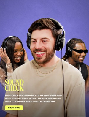
Uproxx's Sound Check is the show where music meets tough decisions, and along the way, we get to learn a little more about the artist. On the latest episode, the guest is Yung Miami, and during the this-or-that song-choosing game, she laid out some of the attributes she's looking for in a potential partner. Pitting Beyoncé's "Dangerously In Love" and Keyshia Cole's "Wonderland" against each other, host Jeremy Hecht asked which of the songs "feels like 'Yung Miami in love' more." After listening to snippets of both, she went with "Wonderland," explaining how her mother is a big fan of…
HARD Summer 2026 Boasts A Lineup Led By Kali Uchis, Shygirl, 2hollis, And Others
There's no shortage of standout summer entertainment options in the Los Angeles area, and that's especially true thanks to the HARD Summer Music Festival. Now, fans can start planning for this year's installment, as today (February 25), organizers have announced the lineup. The fest's lineup, as it generally is, is electronic-leaning, but there's some great stylistic variety. Highlights include Kali Uchis, 2hollis, Shygirl, DJ Snake (DJ set), Zedd, Tokischa, Zach Fox, and more. Everything goes down at Inglewood's Hollywood Park (right by SoFi Stadium) on August 1 and 2. Tickets go on sale starting February 27 at 10 a.m. PT,…


