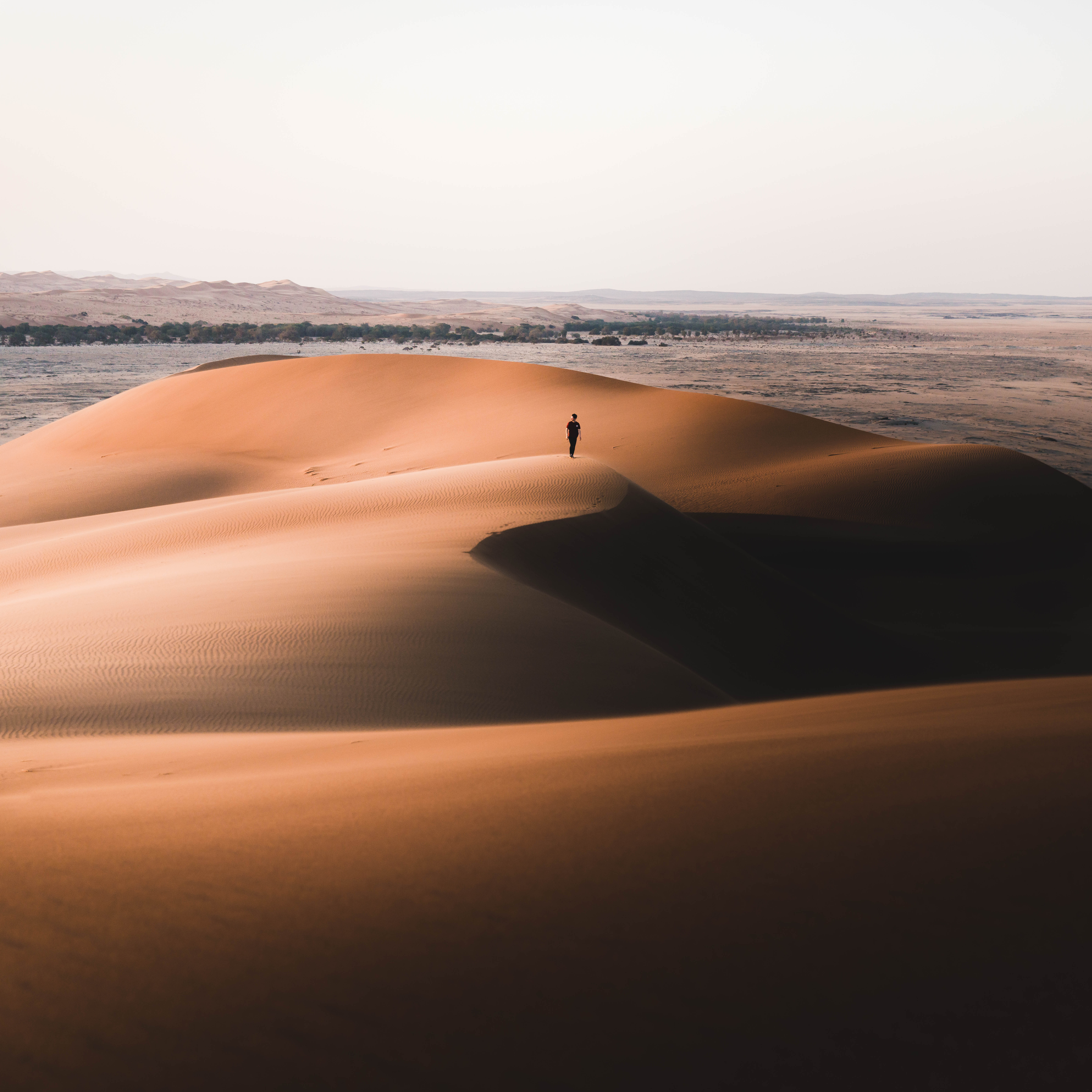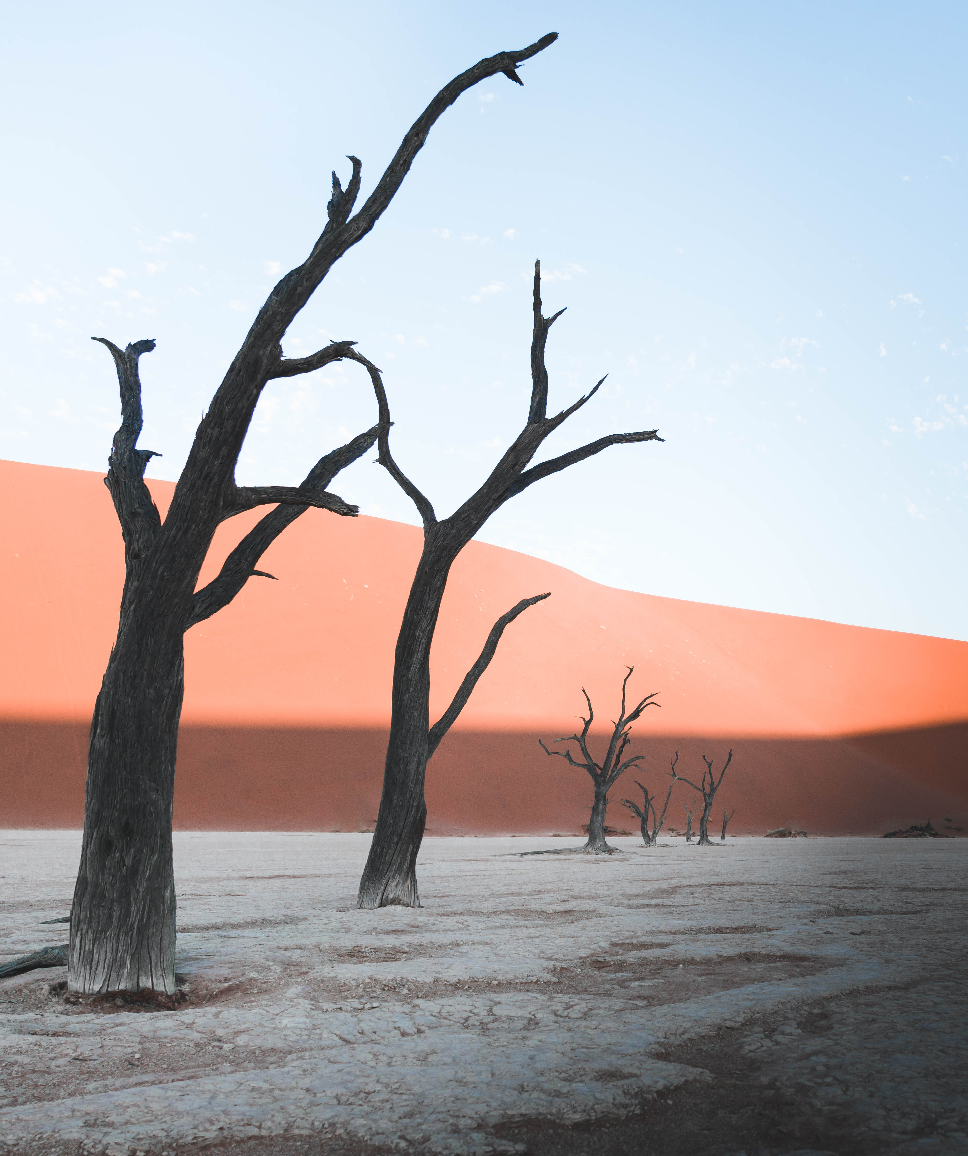
Thanks to Instagram, photographers can now develop a global following with relative ease, and we love that. Seriously, we discover new photographers frequently that we are certain would have otherwise remained unknown. But with that ability to reach the masses, there’s also a challenge. How does one get work noticed when absolutely anyone can upload photos to social media? Well, part of what draws us and other viewers to the work of specific people is how those photographers use color. Accounts with a clearly defined color style take the world we know and shift the way it appears just enough to allow us to feel like we’re discovering it again for the first time.
We wanted to know how a photographer can make their work distinctive without limiting their subjects to a narrow color story (okay, there are some people who only photograph bright yellow objects, but that’s not what we’re talking about). So, to learn more about how to use color to develop a signature image style that screams your name, we turned to a pro: Nathan Szwarc.
Nathan Szwarc grew up in the foothills of East Tennessee, an hour’s drive from the majesty of Great Smoky Mountains National Park, so it’s no surprise that he has been hiking and loving the outdoors for as long as he can remember. In fact, he started taking pictures to document these adventures with his friends and family. And to this day, he primarily shoots landscape and outdoor lifestyle subjects.
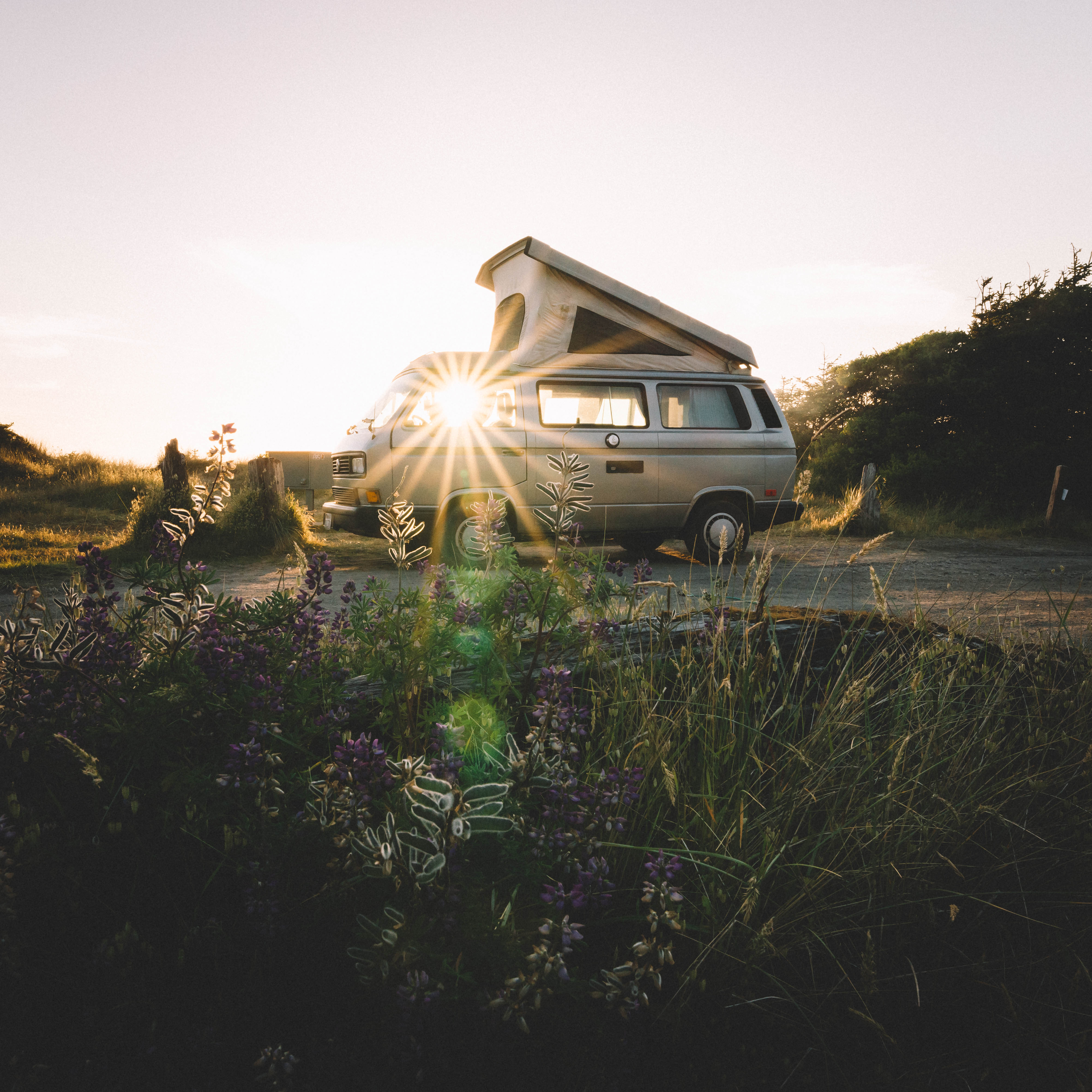
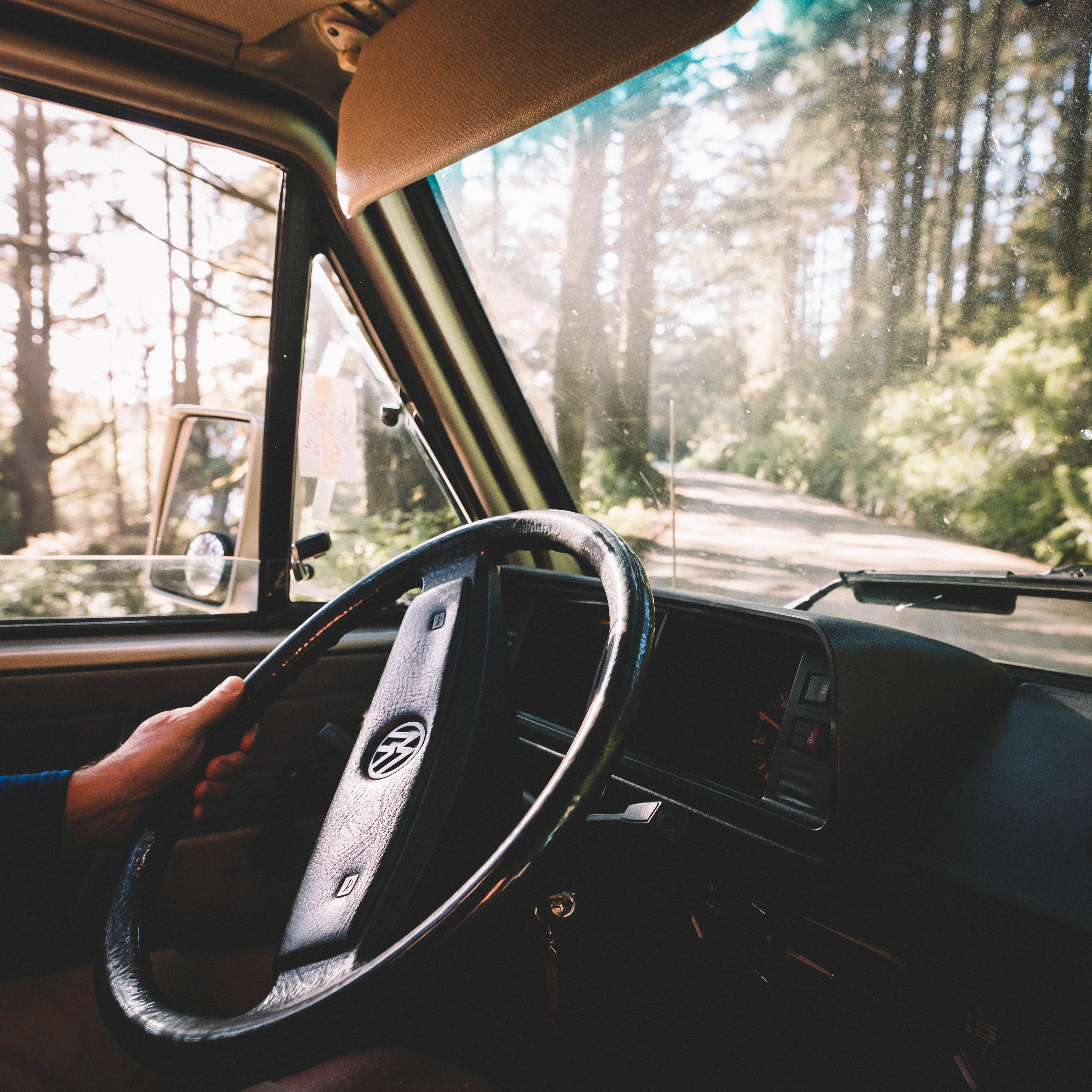
He is so committed to his photographic work, he has dropped out of college and plans to spend the next year out on the road, living in a 1984 Westfalia. Szwarc will be traveling, exploring different regions and cultures, and taking photos the entire time. And you know we are stoked about that because the intersection of vanlife and good photography makes us tingly.
“My goal with every shot,” Szwarc says, “is to tell a story and hopefully allow the viewer to feel like they are actually there. I want to evoke a sense of freedom in them. ”
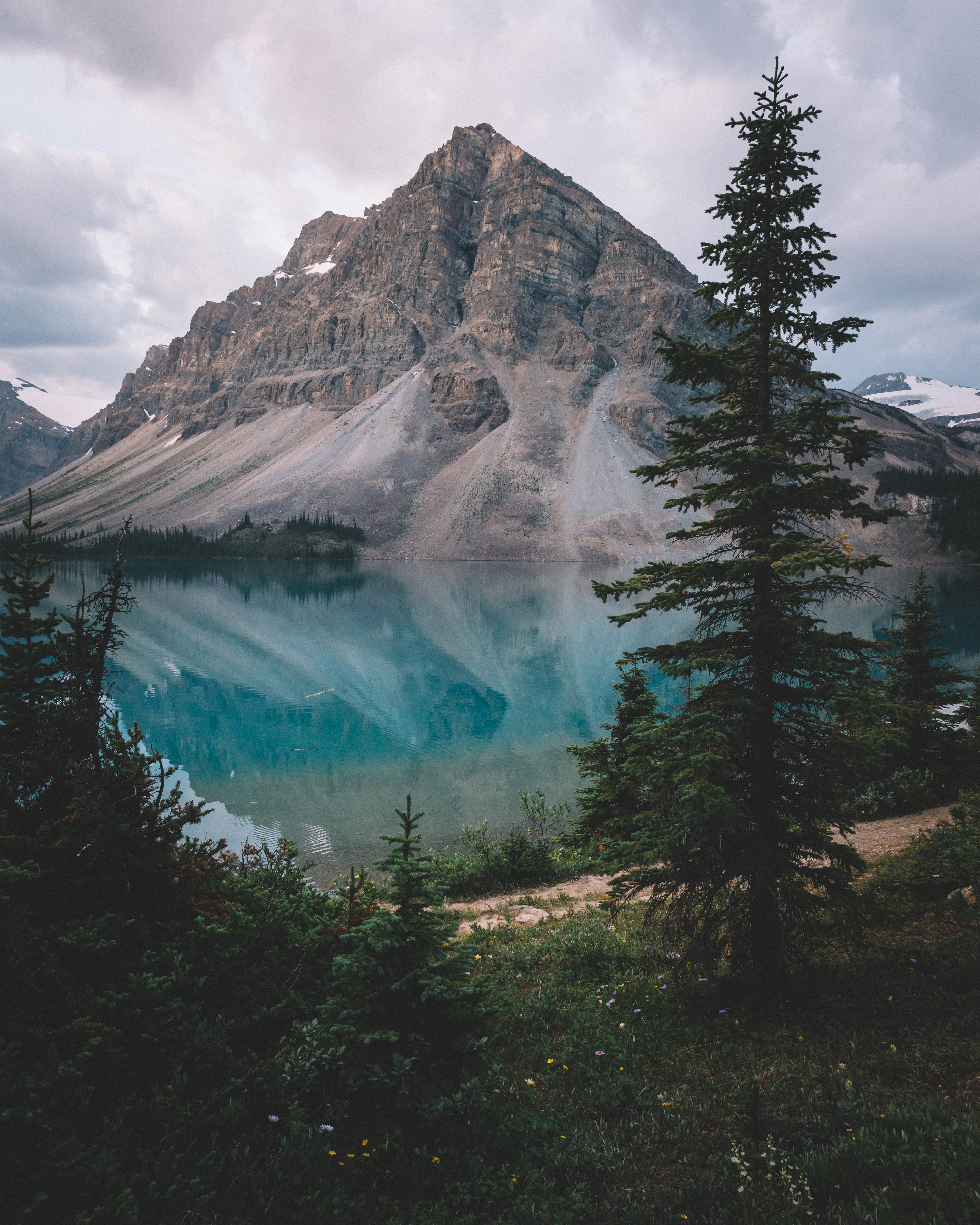
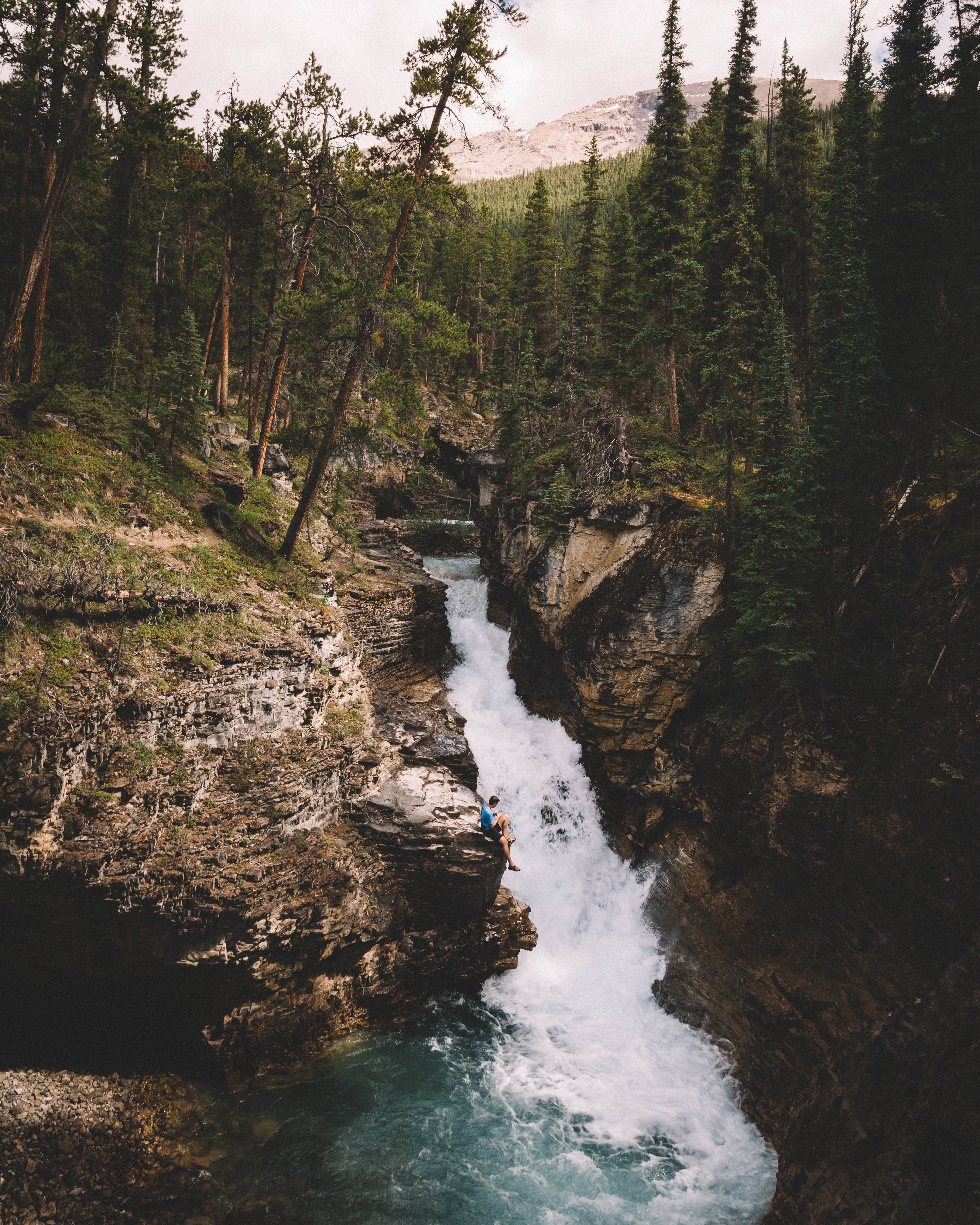
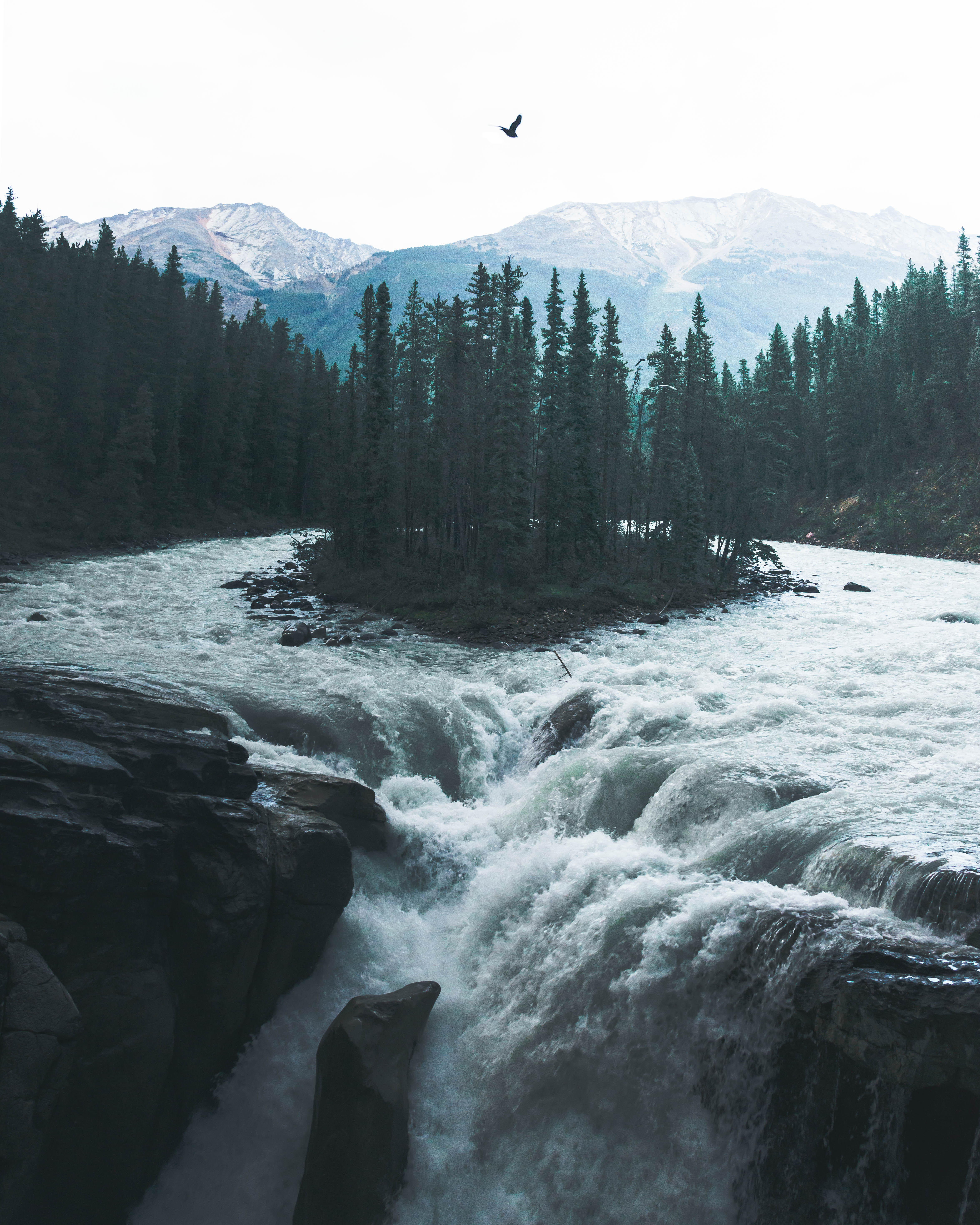
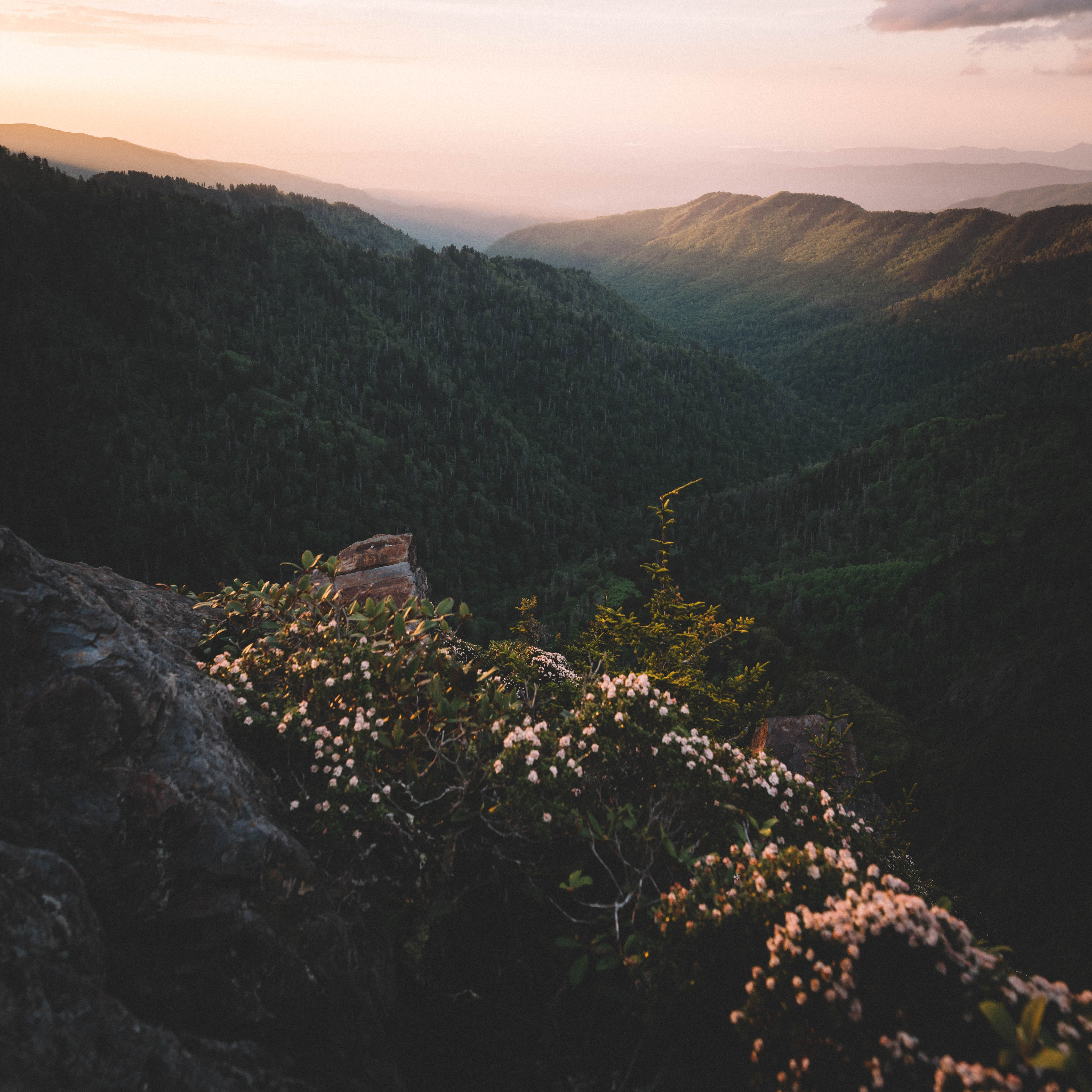
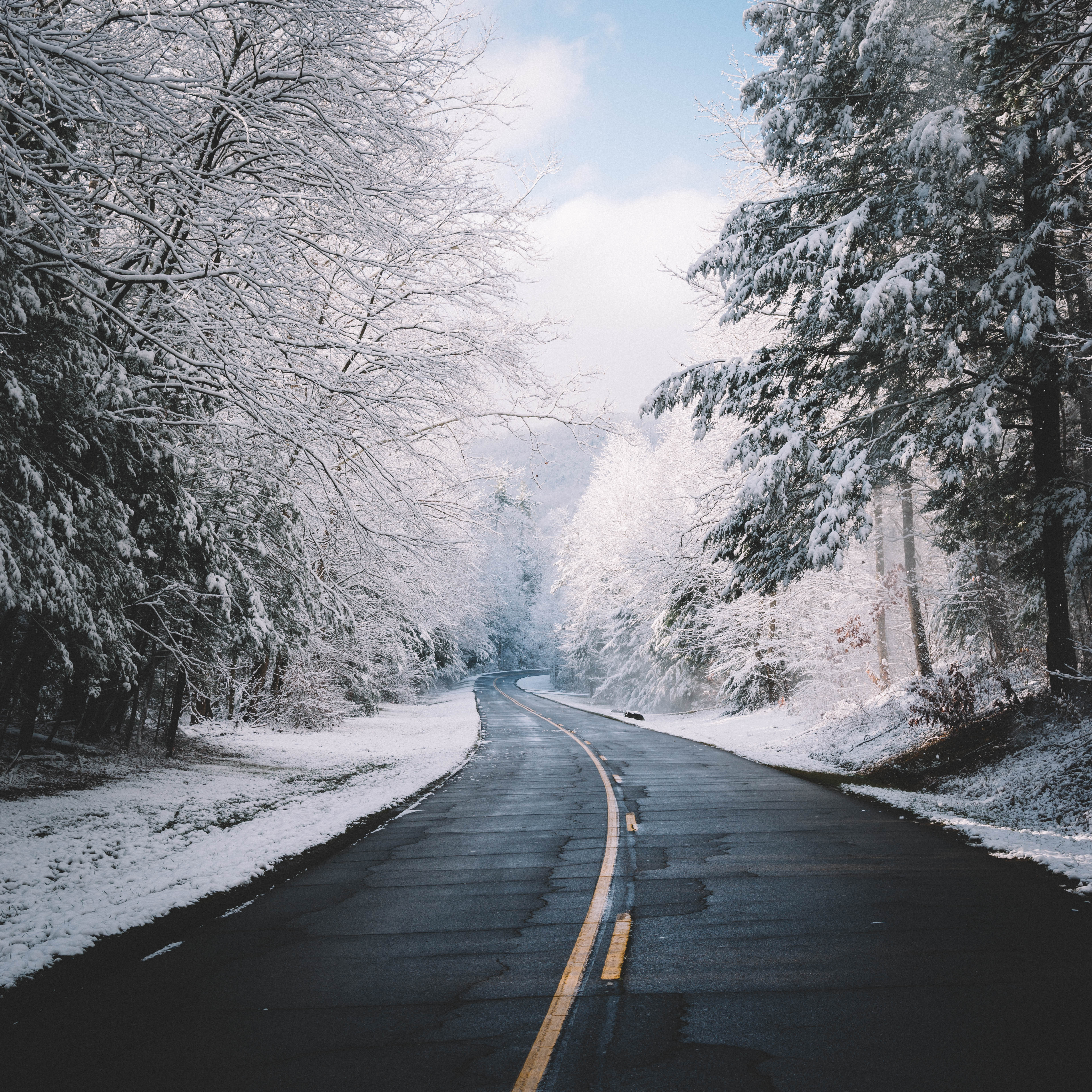
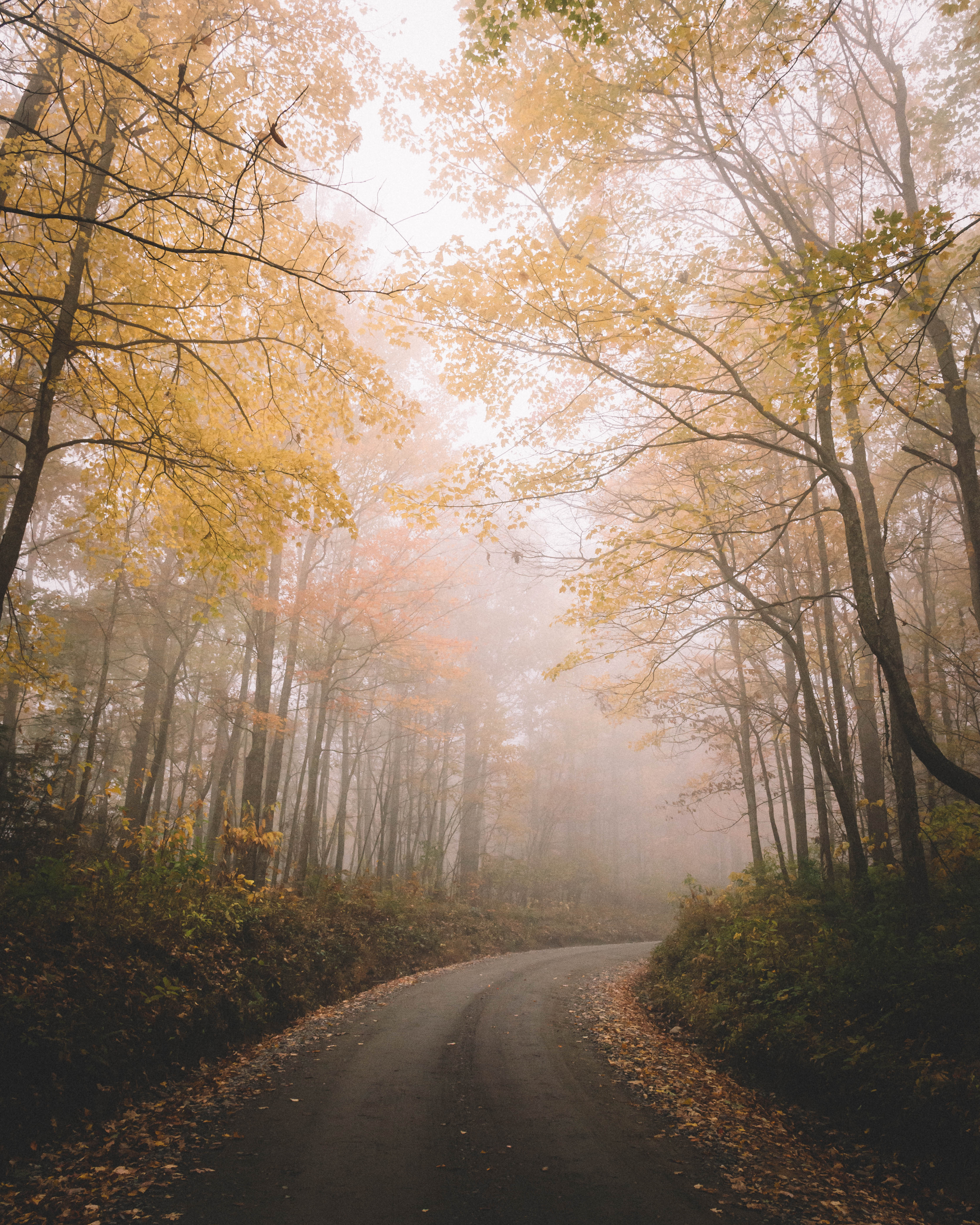
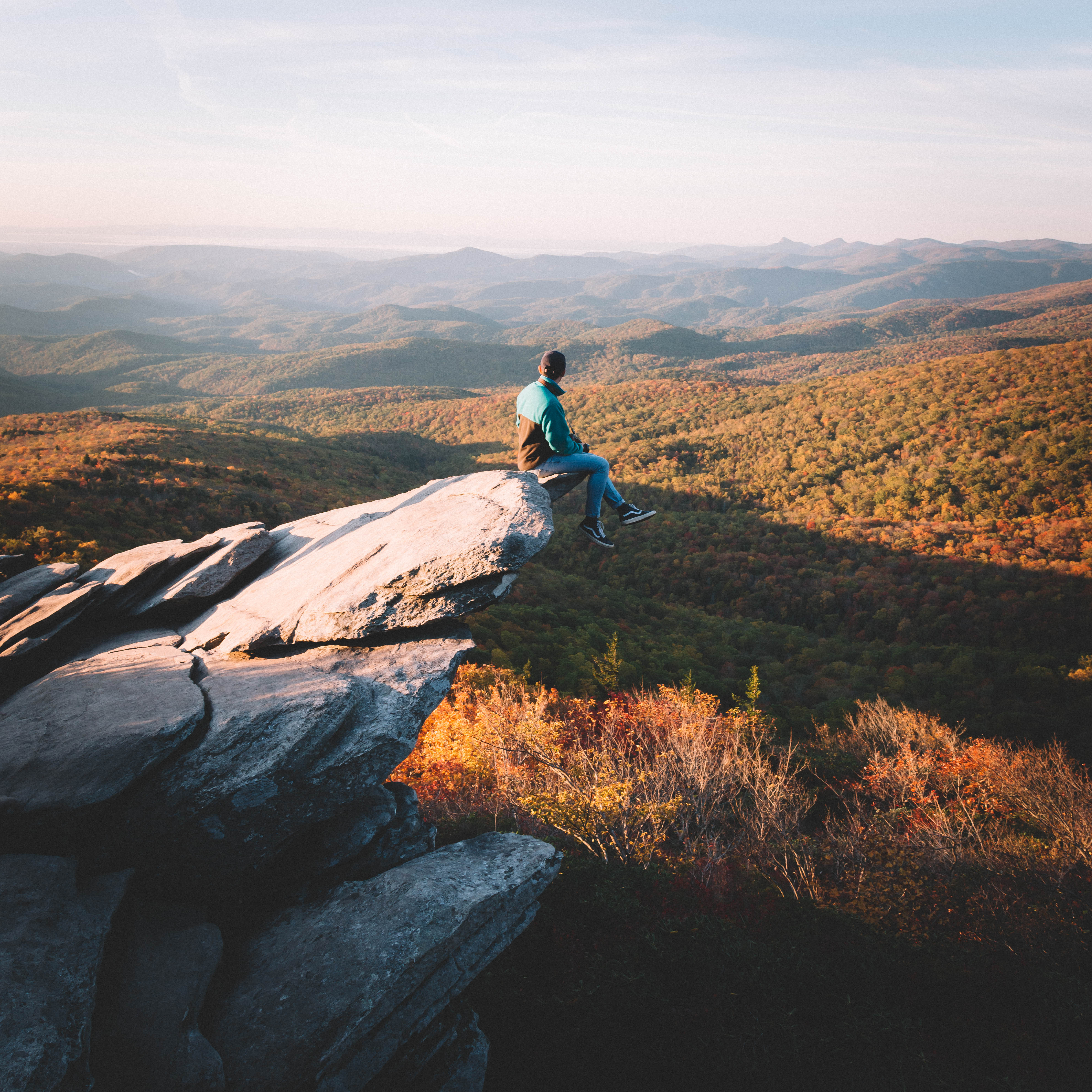
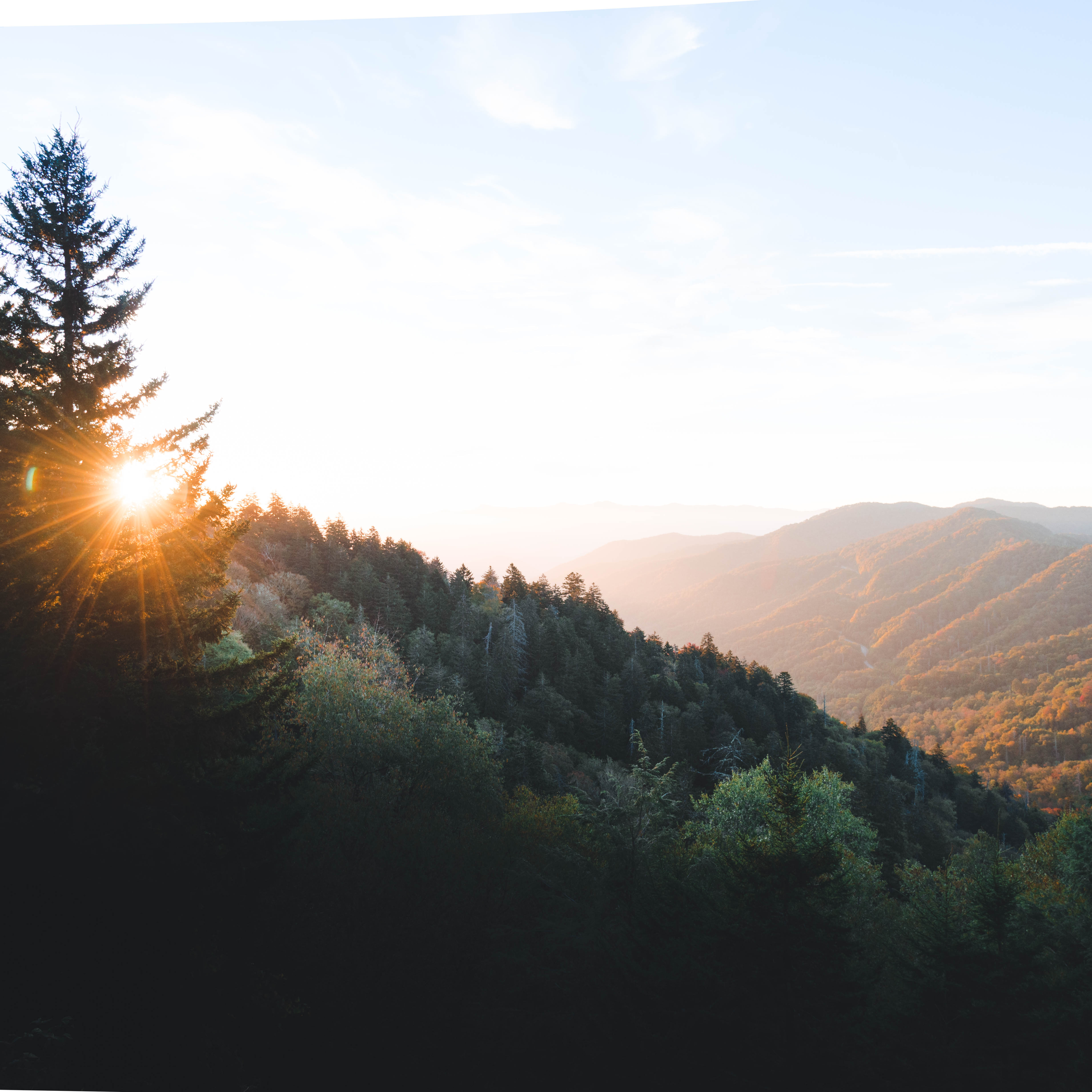
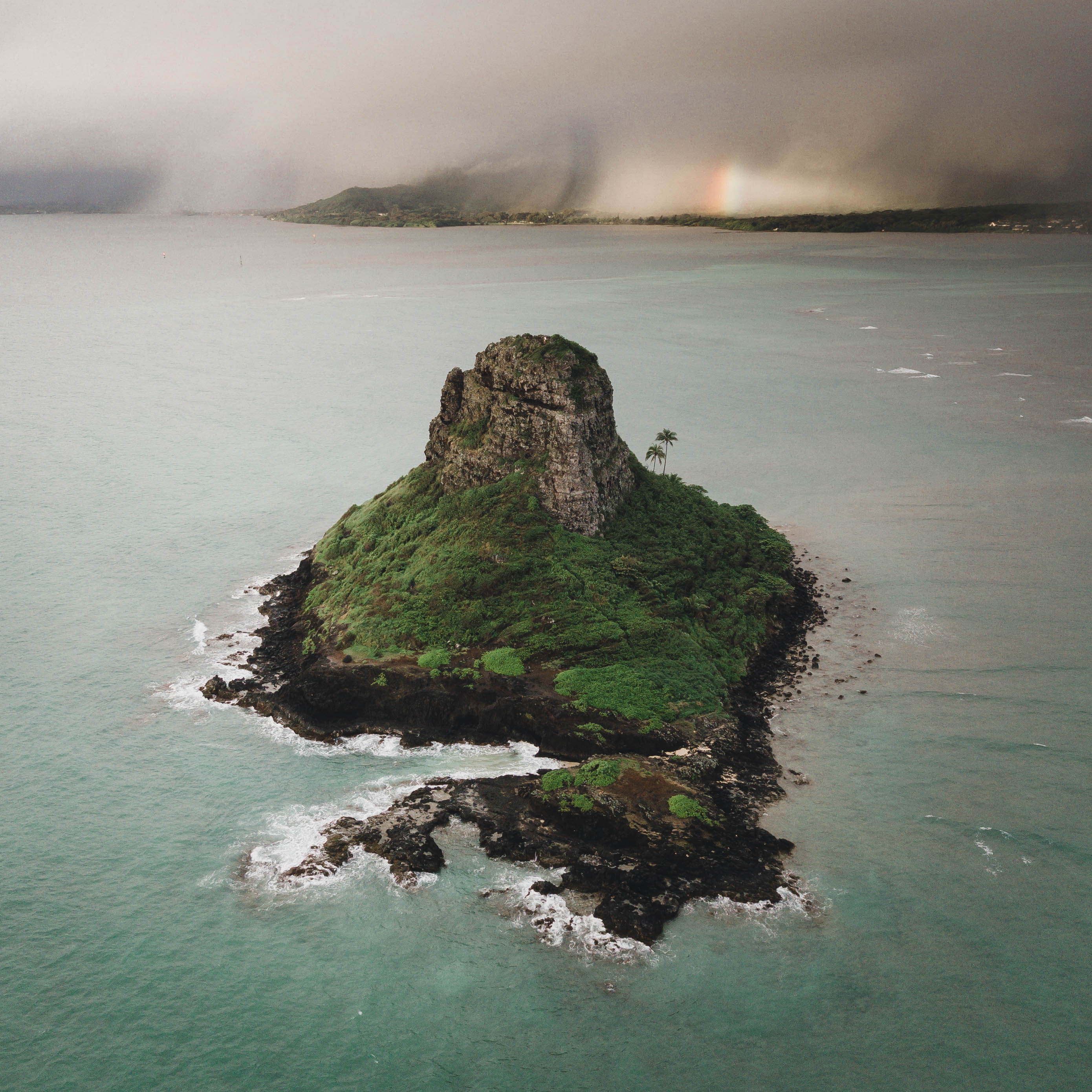
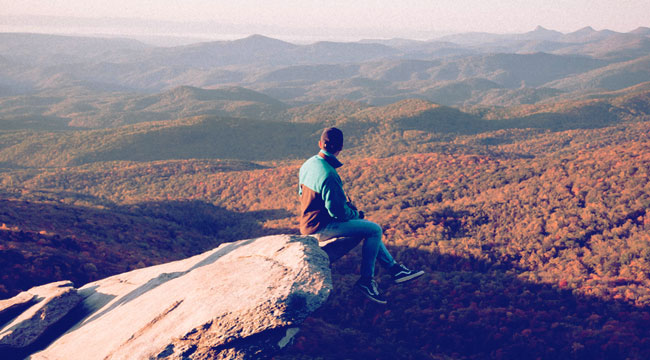
Part of the way he does this is with his unique approach to color. His palette of dark, lush greens swathed in golden light, draws the viewer into a magical world, a heightened version of our own reality that nonetheless feels completely natural. It is this signature style and his photographic chops that surely led to his conclusions in the recent #Nikon100 campaign, which recently celebrated 100 extraordinary photographers on Instagram. We knew he was the perfect person to walk us through some ways to craft a color story that is instantly identifiable as your own.
Check out his tips and photographs below!
Try Desaturating A Color
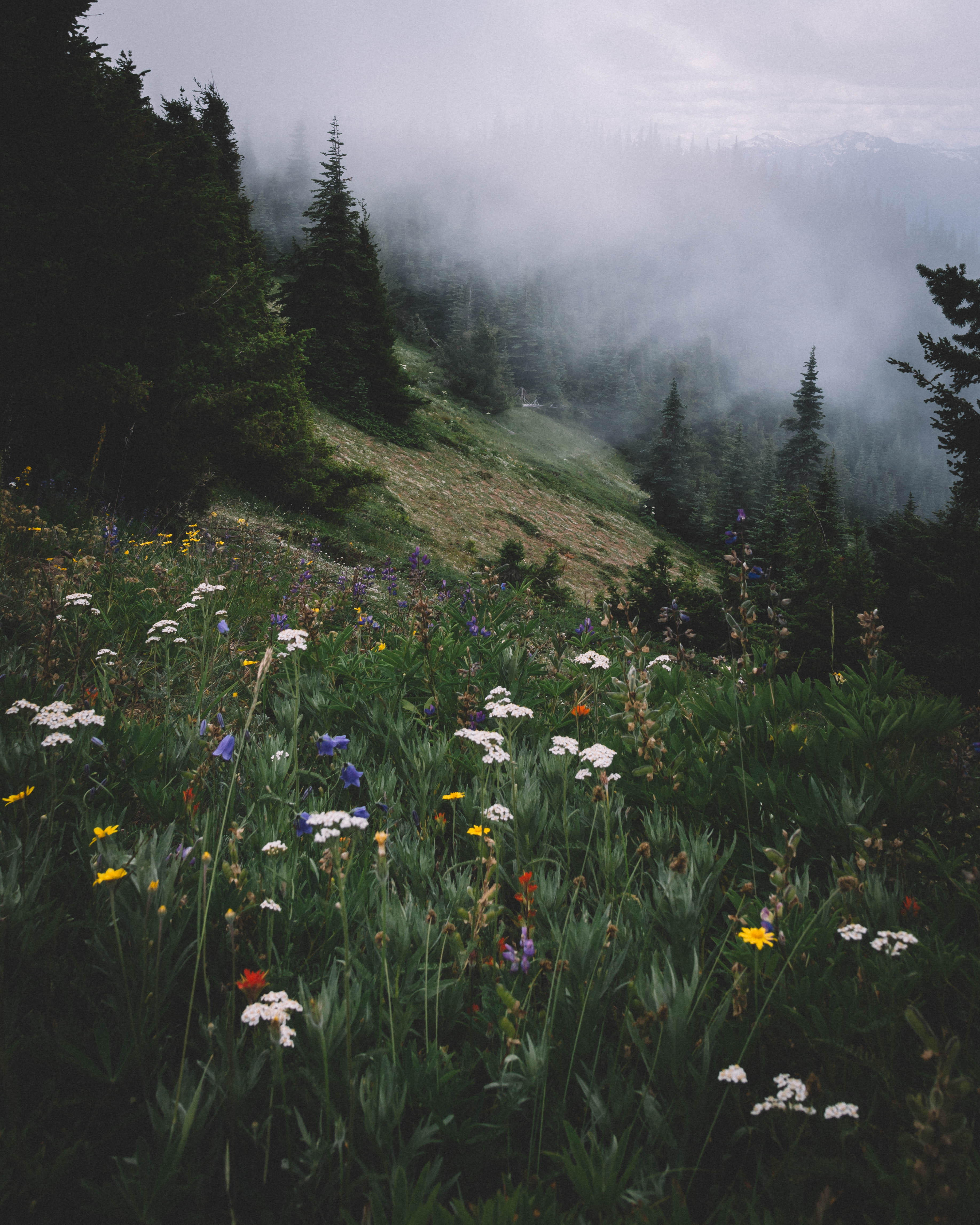
On the topic of developing my own style, I think a lot of it comes from being exposed to nature a lot. I’ve taken most of my photos in East Tennessee and North Carolina and growing up here meant a lot of being outdoors. In the summer, everything gets insanely monotone green. I always struggle with that because everything looks the exact same. Nothing pops out or anything. It’s just a wave of green. It’s nice because there’s always color on the trees in the summer and it looks good, but nothing really pops.
So one of the things I do is desaturate my greens. Desaturating them gets this deep, dark, almost faded green. I’ll usually do that in Lightroom. I’ll go to an editing feature called HSL; it stands for Hue, Saturation, and Luminance. I usually drop the saturation on the greens as much as possible.
That has a lot to do with my style because greens and yellows make up a huge amount of color in a lot of photos, even if it’s kind of unnoticed and in the background. That gives a lot of a deep saturated, faded green in a lot of my works. Also, I try to add some fade to my photos. I’ll go into an editing feature called Point Curve, and I’ll bump up the fade. If you want to get really specific, it’s a 9.5% out of 100. And that fade takes some of the saturation out of the colors.
One of my biggest pet peeves with color in general in photos is when people just go in and bump up the saturation in every instance; every color has this hundred saturation. It’s overblown. There’s no real distinction between what color should be outstanding in the photo or what color you’re trying to focus on. I like fading all my colors in general and then I go in and focus on one color to saturate.
Try Saturating The Subject
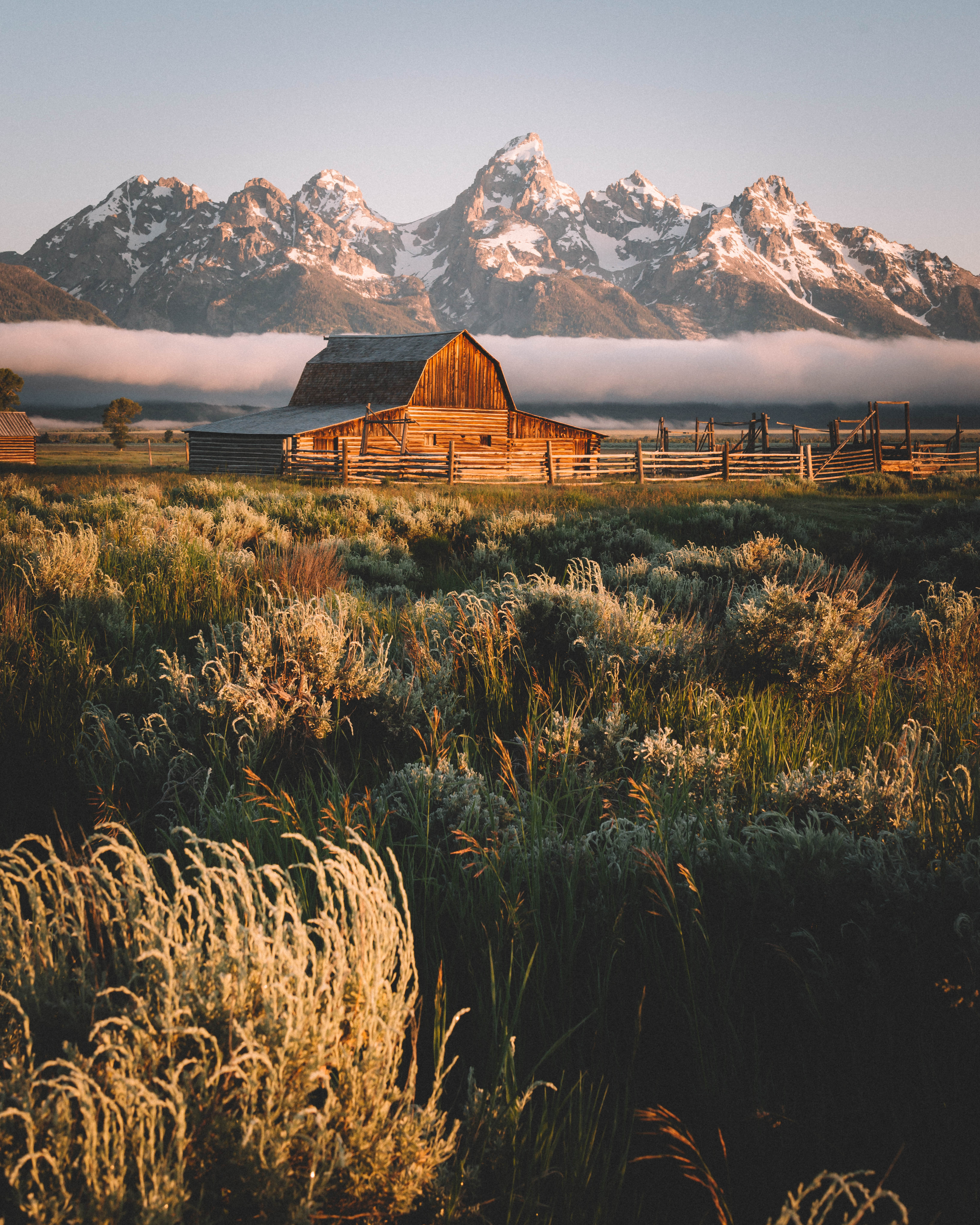
A lot of times, I bring up the oranges a bit or I bring up the yellows a bit to try and saturate the subject in my image. By saturating the color of the subject, it stands out more. In general, I don’t have a color that I always go in and saturate, like one specific color that I can only bump up like reds every time to 20+ saturation.
I usually look at the subject in my photo and then try and distinguish what color it is. And then, I bump up the saturation of that color to make it stand out and have the viewers’ eyes directed to that subject. I think when you’re trying to create an image that draws in the viewers, it’s all about getting their eyes to draw in on one point. Any feature I can use, including color, to highlight a subject is what I aim for.
A lot of times I’ll even go in focusing on the subject and color and change the color of the subject completely. I was editing an elephant photo and the elephant was a deep, dark orange, but it blended in with the surrounding savannah, so I completely desaturated him to the point where he was gray, and I painted him blue a bit. I made him this nice grayish-blue to where he stood out in the background of the orange savannah.
The big thing for me in using color is always to focus on how I can highlight the subject in my image and make the subject stand out from any surrounding stuff that may be a distraction. Then, I always desaturate greens because it’s just the look I like. I don’t know if there’s a real rhyme or reason for that. I guess that would be my basic fundamental of how I go about doing colors.
Use Editing, But Don’t Get Carried Away
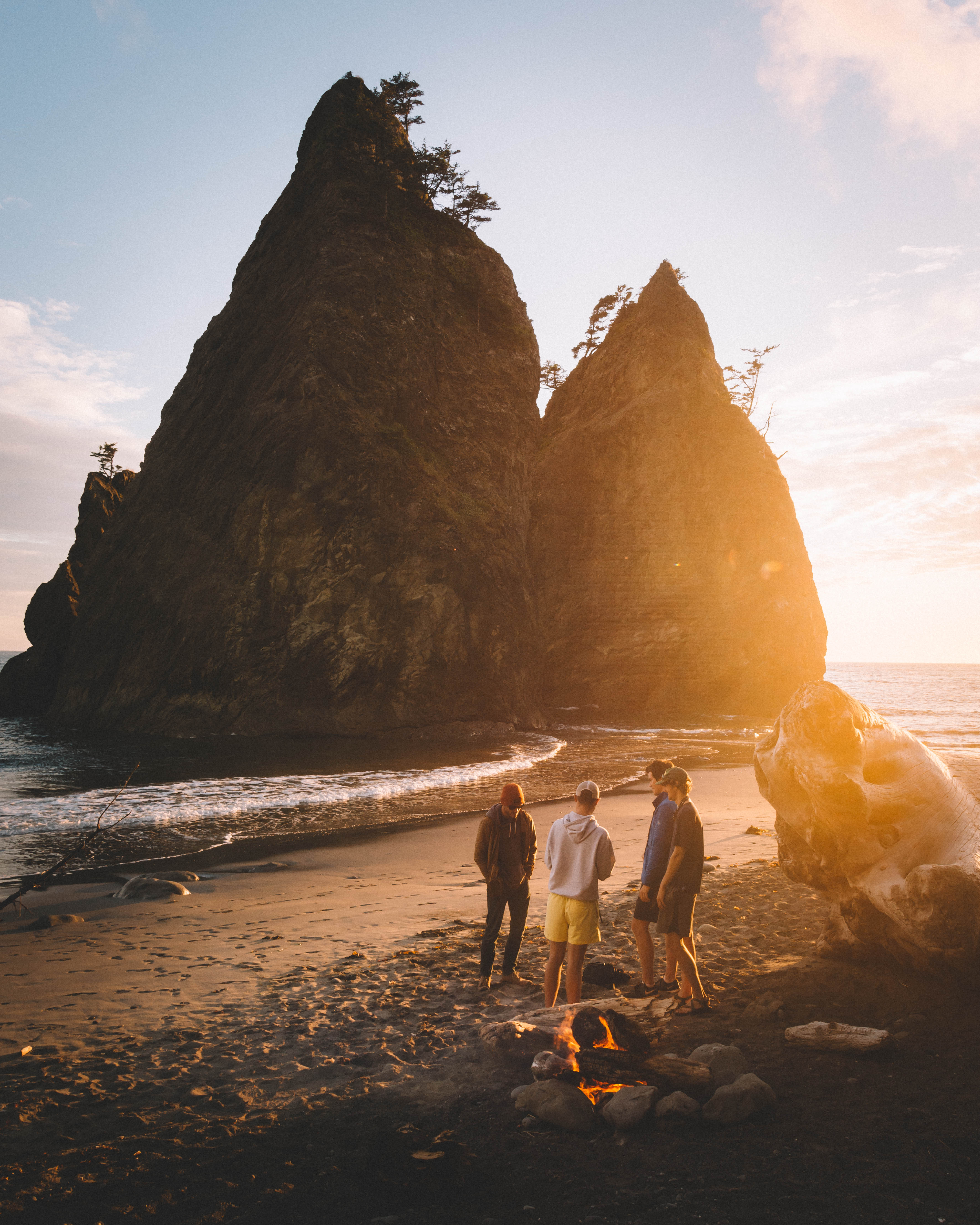
Because of post-editing, I can do so much with photos now. I did a workshop with one of my favorite photographers Donal Boyd, who’s huge in wildlife photography. I learned a lot from him about editing, specifically, colors. He really showed me that I can take a picture of almost anything and edit it to where it’s the color palette that I want.
But I would like to take a picture of something that stands out for its color, whether it be flowers or something in the landscape, just so it makes it easier for me. I’m not trying to go in and change colors for a solid two hours on an image because editing can get really time-consuming. The more post-processing you do, unless you really know what you’re doing 100%, the more it can make your image look over-processed.
When I’m taking a photo, if there are flowers in the foreground that really pop out, I definitely try and get them in the foreground. Or if there’s just some nice, warm light from a certain direction, I’ll always try and get color that is in that environment to make my pictures look as natural as possible with my own kind of editing style to them.
I do look for specific colors, but there’s plenty of photos that I’ve gone back to and I’m like, “Man this photo has, like, no color to it.” I can go in and just completely revamp it with editing. So, it’s pretty amazing what you can do now with editing to the point where you almost don’t even have to focus on what color is around you. You can really manipulate the colors to anywhere you want, which is to me, pretty mind-blowing.
Develop A Signature Approach
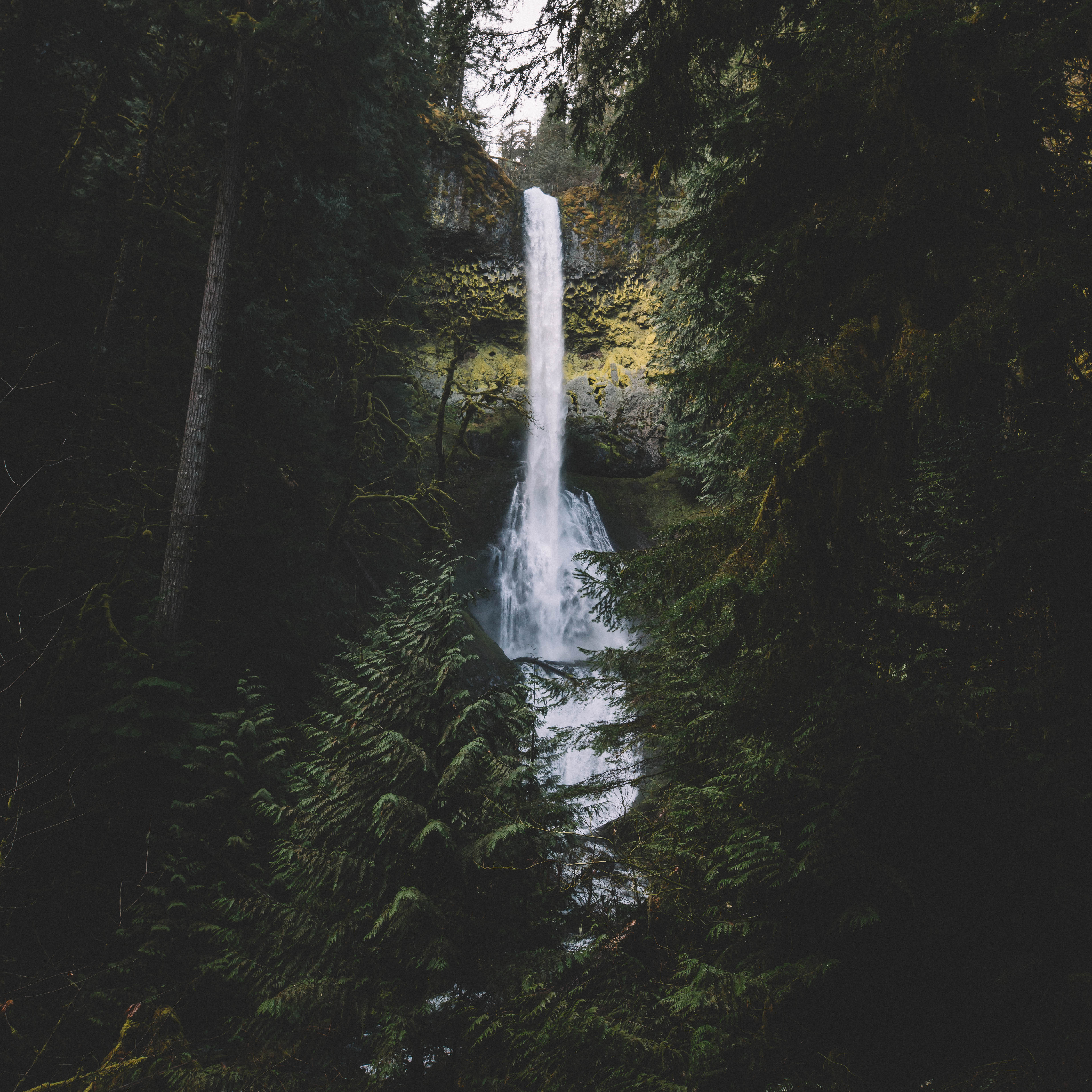
Color, along with light in composition and overall focusing on the subject in the photo, is obviously a huge part of seeing a photo or an image for the first time. Color is always going to stand out to the viewer. When I’m trying to create an image, I want to make sure it’s my style and my editing process and color look. I think it’s important photographers develop their own color look, so when people see the photos they know who took it. It stands out.
I like to just edit a bit out of the box and do some weird things with color, so if people see my photo when they’re scrolling through Instagram, they can immediately recognize, “Hey, that’s Nathan Szwarc’s photo.” And they immediately recognize that. I don’t want them to look at a photo and wonder, “Huh. I wonder whose photo that is?” It’s just a matter of attention or lack of attention that photos get on Instagram today. With all that’s going on, you have a minimal amount of time to grab someone’s attention. So, developing your own color style is key because you want people to recognize that color style and associate it with you so they can immediately recognize your work.
I notice specific people on Instagram. When I see their photos, because of specific colors they saturate or desaturate or how they edit their colors, I can immediately say that’s so and so’s photo. It kind of grabs my attention. Let me look at this photo because I know whose photo it is rather than scrolling through a hundred other photos that all kind of have a similar color style and don’t really grab my attention. I just think it’s key to develop your own color style to stand out and be recognized.
Use Lighting To Enhance Colors
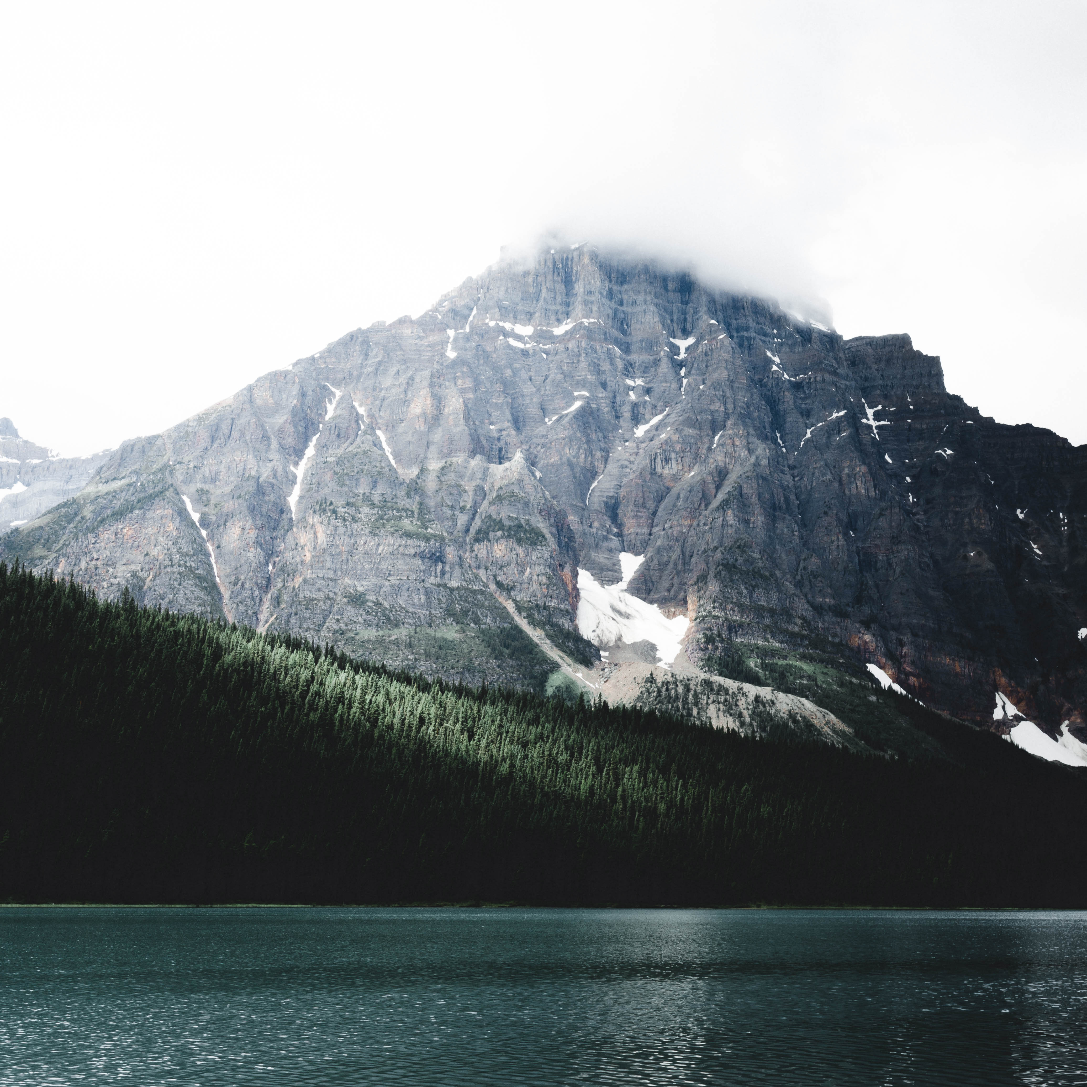
There are three or four things that are really important to me: lighting, color, composition, and focusing on the subject. Lighting is huge. Once again, similar to color, editing with the new tools can give you a crazy advantage. With editing now, I can go in and virtually create photos I took midday where it was sunny and make them look like it was like dusk or almost nighttime with just enough lighting to highlight the subject and everything else is pretty black.
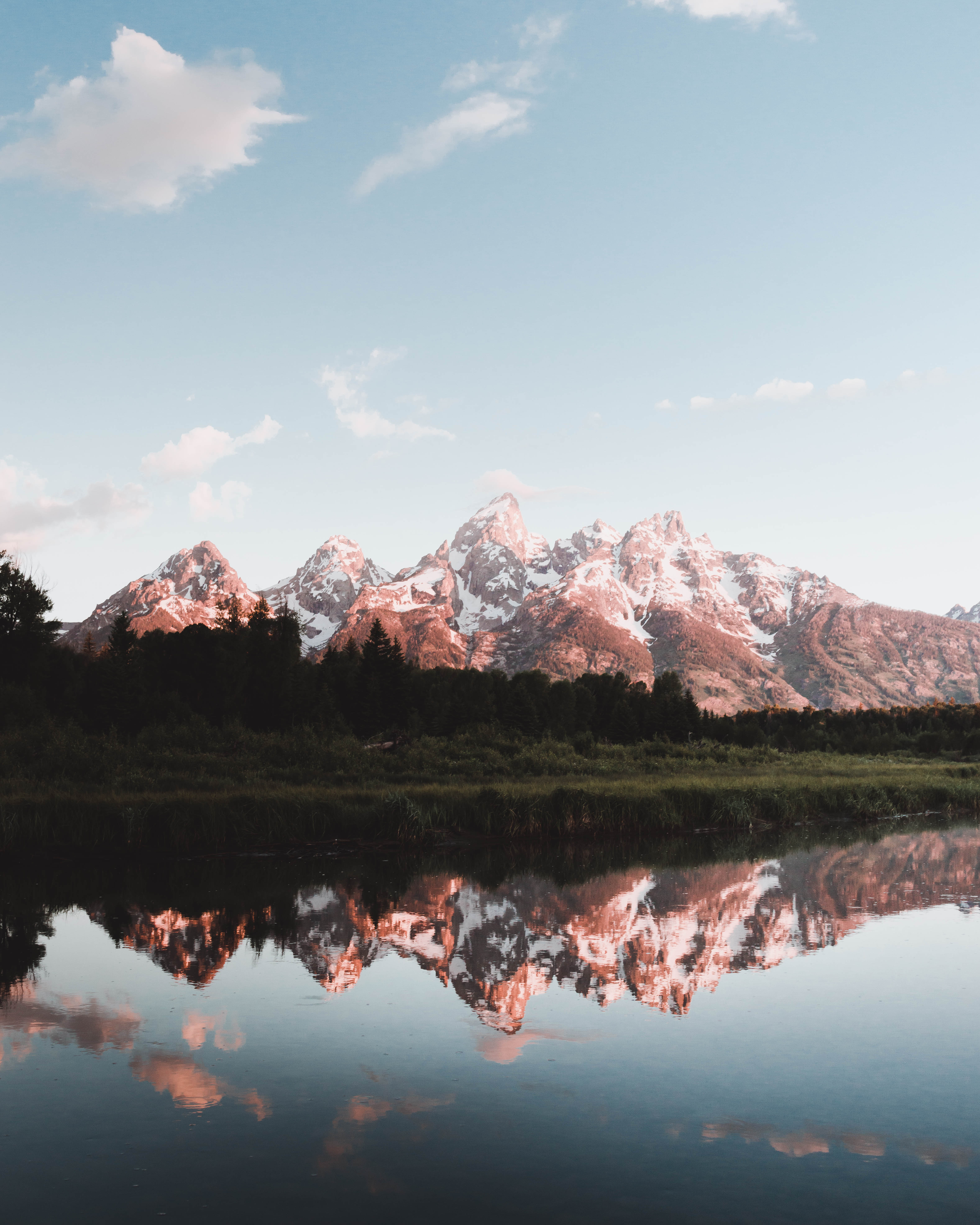
That’s pretty incredible, but I still think, once again, trying to make your images more natural with lighting is important. The best times are definitely in the morning, about an hour before and after sunrise. If the sky is clear and is nice and the sun has visible light coming out of it, you’re going to get these really nice oranges, pinks, reds, warm colors, and tones. If you’re going for a warmer style in your photos or are more color-focused on red, orange, and yellow heavy photos, I would try and focus on editing or taking photos during those times.
You’re going to have an easier time in post-processing than if you try to take photos an hour after sunset, what they call “blue hour,” when the sky is clear and has this nice blue tone to it. If you’re taking photos in blue hour, everything has this blue tone to it and you have to edit in reds and yellows and oranges. You’re probably going to struggle a bit just because you’re having to do some much editing for all those colors and it’s just going to be so taxing on you.
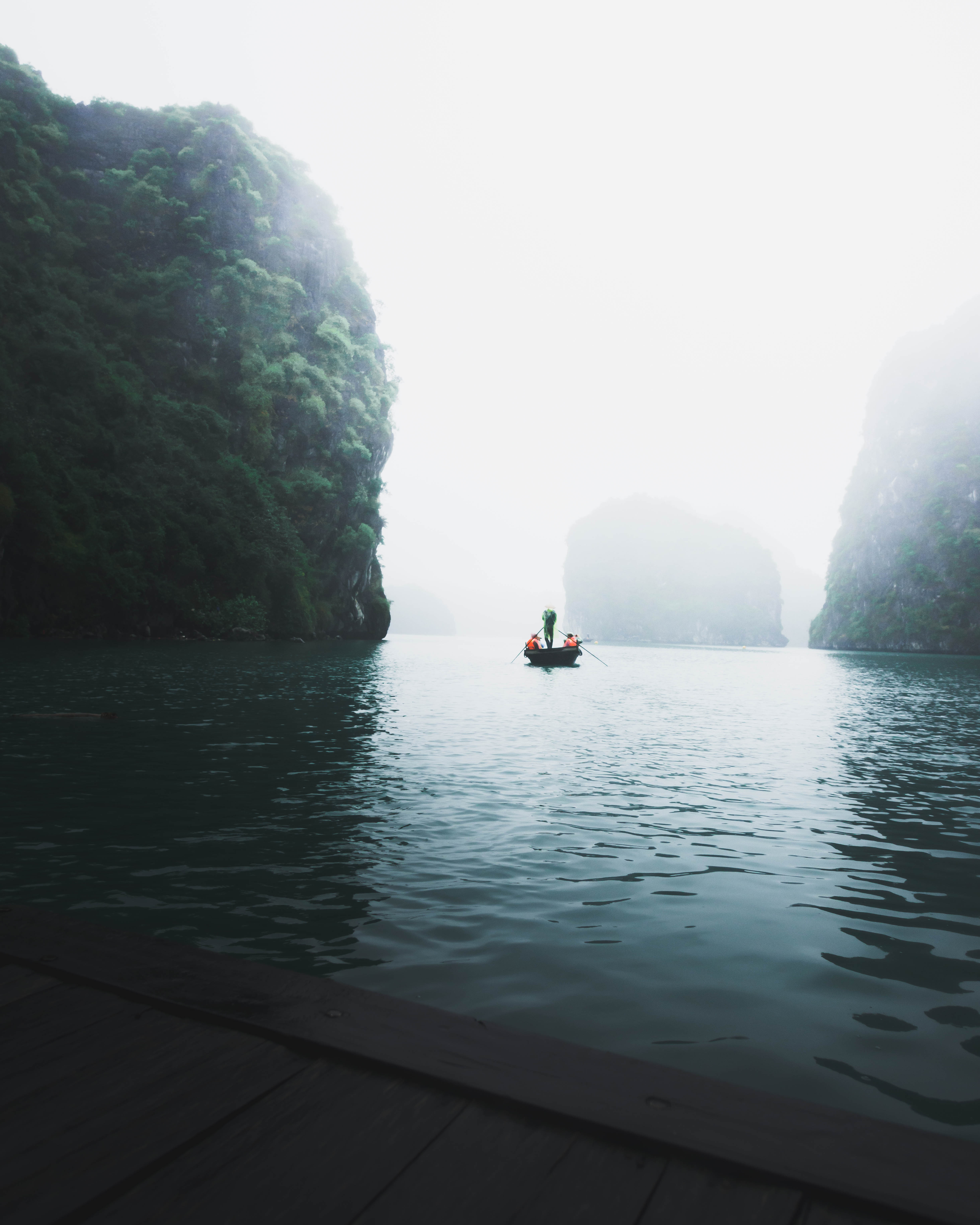
It’s the same with a dark, maybe Pacific Northwest environment where it’s very rainy and very cloudy. That’s going to be hard to edit. You’re really going to focus on greens and blues and aquas at that point. On cloudier days or days where the sun isn’t as strong, you’re going to have an easier time editing those greens and blues and such.
Getting the reds and oranges makes it tough to really shoot any other time than sunrise and sunset. You can always make it work throughout the day and even with the part you’re editing, but for warmer tones and colors stick mostly to sunset and sunrise. If you’re wanting those nice deep greens and blues and deeper yellows, I’d try and work cloudier days, times when the sun isn’t as strong and completely blowing out all the greens. You can always make it work in editing, but it just makes it easy for you in the long run.
