In February, when indie synth-pop group Chvrches announced its latest album, Love Is Dead, I experienced a sensation I hadn’t felt in ages. For the first time since I could remember, I truly disliked an album cover.
The garish amalgam of smudged pastels and bad ’90s alt-rock typography sent my mind reeling. At the time, I observed that Love Is Dead looked like “Video Toaster threw up and died.” Today, I would suggest that Love Is Dead resembles a Hot Topic flyer that threw up and died. Either way, I think I’ve made my point: This cover is very, very bad.
My disgust made me nostalgic. When was the last time you really cared about an album cover? What is an album cover now, anyway? For many listeners, it’s a box on your phone measuring roughly two inches by two inches, displaying an image signifying a track that’s playing on a streaming app. An inconsequential bit of data that endures only until the playlist moves on to the next track.
It’s rare for any of those flashing pictures to get imprinted on the collective consciousness in the way that album covers once were. You either love or hate album covers like you love or hate tweets or Facebook posts — at best, the most memorable covers become memes, for good reasons (like Kanye West’s The Life Of Pablo or Lorde’s Melodrama) and bad (Taylor Swift’s Reputation or LCD Soundsystem’s American Dream). But they don’t really stand as the defining images for particular eras in artists’ careers, like the covers for Dark Side Of The Moon, Thriller, Nevermind or The Blueprint do.
It’s one thing to discuss iconic albums in order to contextualize the golden era of album covers. But another, perhaps most illuminating way to explore this topic is to look at the worst example of an album cover that was also culturally ubiquitous. Because even very bad album covers used to become very well-known, staring dumbly at millions of captive shoppers from the shelves of record shops and department stores. Nobody, no matter their taste, could escape them. Back then, real life was un-swipeable.
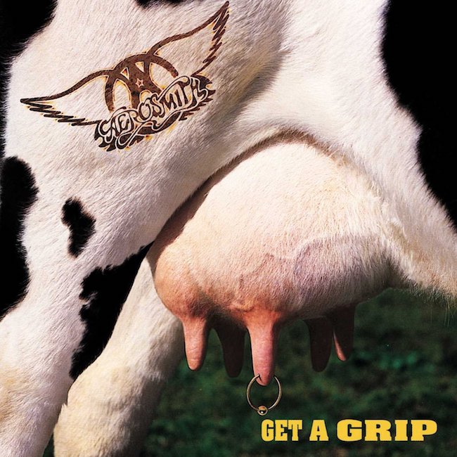
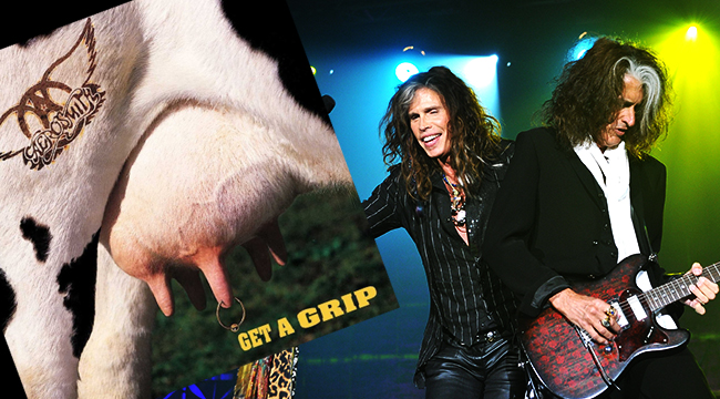
This is the cover of Aerosmith’s Get A Grip, which was released 25 years ago this week. You might remember Get A Grip as the album that produced the “Alicia Silverstone trilogy” of soundalike power ballads that dominated MTV in the mid-’90s, which includes “Cryin’,” “Crazy,” and “Amazing.” Thanks in large part to the popularity of those tracks, Get A Grip sold more than seven million copies in the US. Those sales statistics are even more impressive when you consider that shoppers had to knowingly pay, in public, for a CD emblazoned with a photo of a pierced cow udder.
I’ve long believed that Get A Grip is the worst album cover of my lifetime. Which means I’ve also spent a lot of time thinking about how the cover for Get A Grip was conceived.
Who designed this cover? Who signed off on it? Were there even worse ideas that were pitched and rejected? Could anything have been done to prevent this tragedy of graphic design?
This is how I’ve always imagined the story behind the Get A Grip album cover:
Album Designer: Hey guys, so honored to work with Aerosmith!
Steven Tyler: Badawadatada-thank you!
Album Designer: Now, I’ve been thinking a lot about this record, and I figure that the best approach is a jokey graphic that’s a super-literal representation of the title.
Joe Perry: [affirmative Boston-accented grunt]
Album Designer: What if we showed a beautiful woman provocatively holding a hot dog?
Aerosmith Manager: That’s a little crass for us. Our last album cover was a black-and-white photo of two old-timey trucks posed in a sex-simulation stance. We want something classy like that.
Album Designer: I see. What if it was a monkey in a top hat holding a banana?
Joe Perry: [negative Boston-accented grunt]
Aerosmith Manager: That’s not quite it, though I like the animal theme …
And the rest is history!
As I dug into the liner notes of Get A Grip, I learned that the cover was designed by Hugh Syme, a name that seemed vaguely familiar. How did I know Hugh Syme? Had he committed some other crime against humanity? Had I seen him long ago in an episode of America’s Most Wanted?
The answer is no, because it turns out that Syme is actually Canadian. But also, Syme is best-known as the long-time art director for Rush, designing all of the band’s album covers going back to 1975’s Caress Of Steel. That means that Syme is responsible for some of the awesomest iconography in the history of proggy hard rock. He has done spooky covers, satirical covers, inscrutable covers, and extremely naked covers. All of them look cool. He even produced a good example of a “jokey animal” album cover more than a decade before Get A Grip.
Finding out that the guy who designed the cover for 2112 also did the cover for Get A Grip was a “Francis Coppola also directed Jack“-level revelation for me. But there is a valuable lesson buried in there, too. To quote a fictional musician with poor taste in album covers, there is a fine line between clever and stupid.


