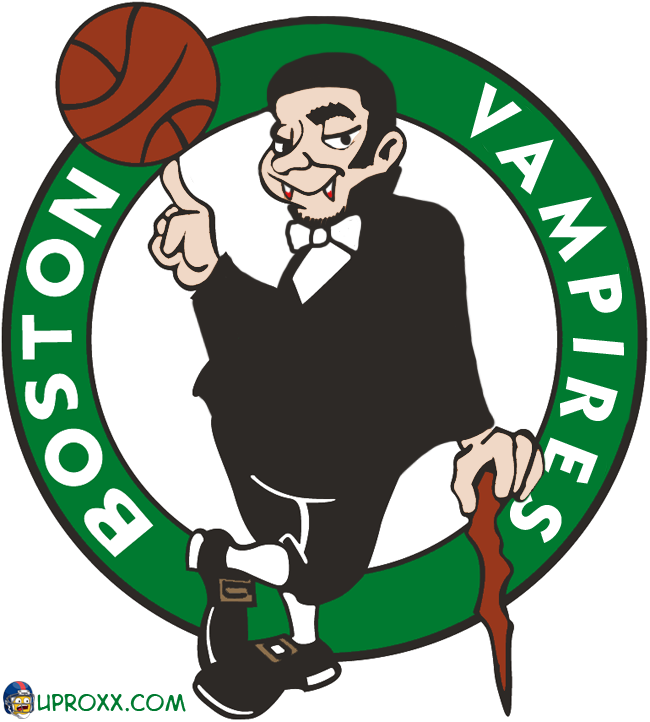
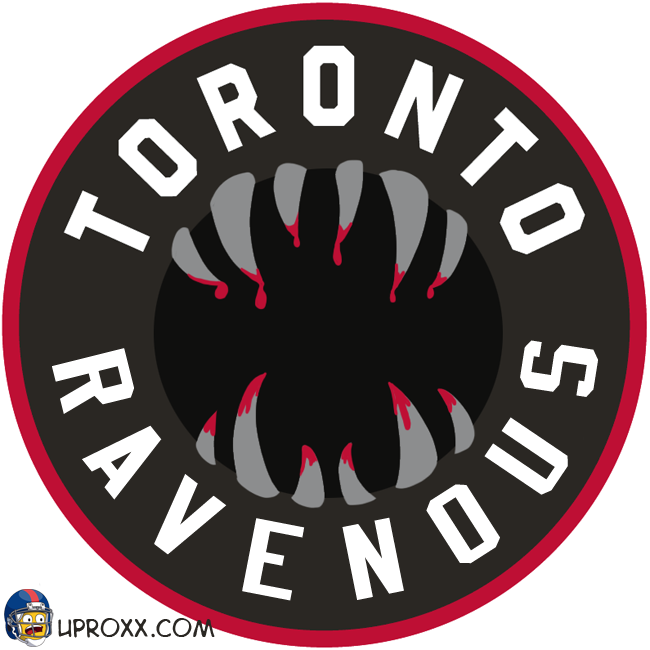
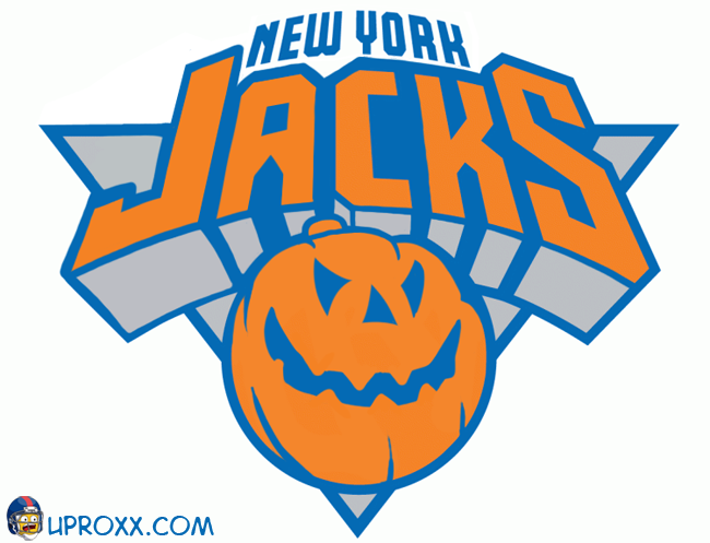
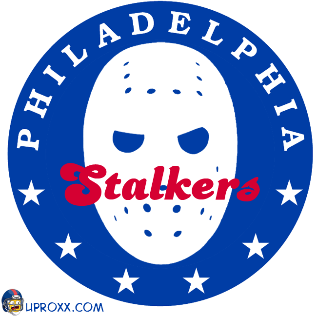
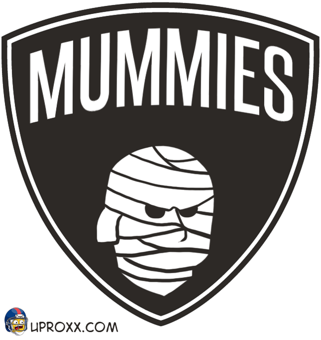
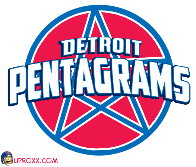
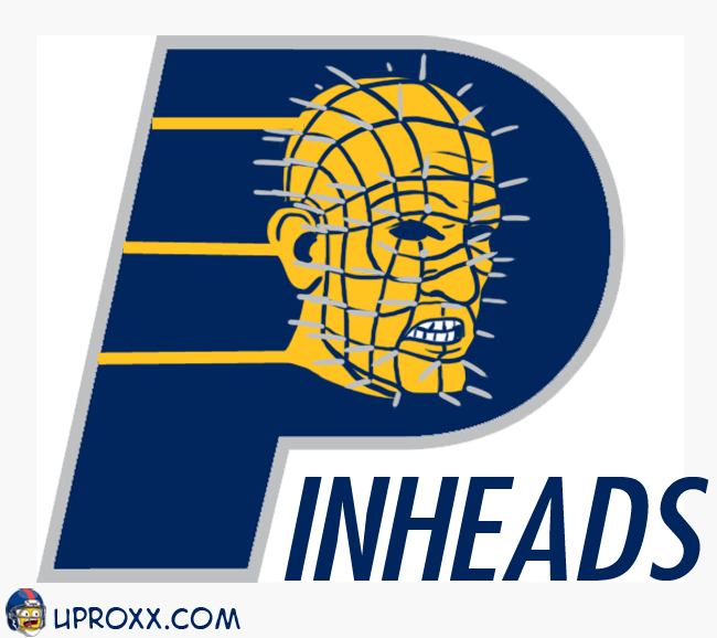
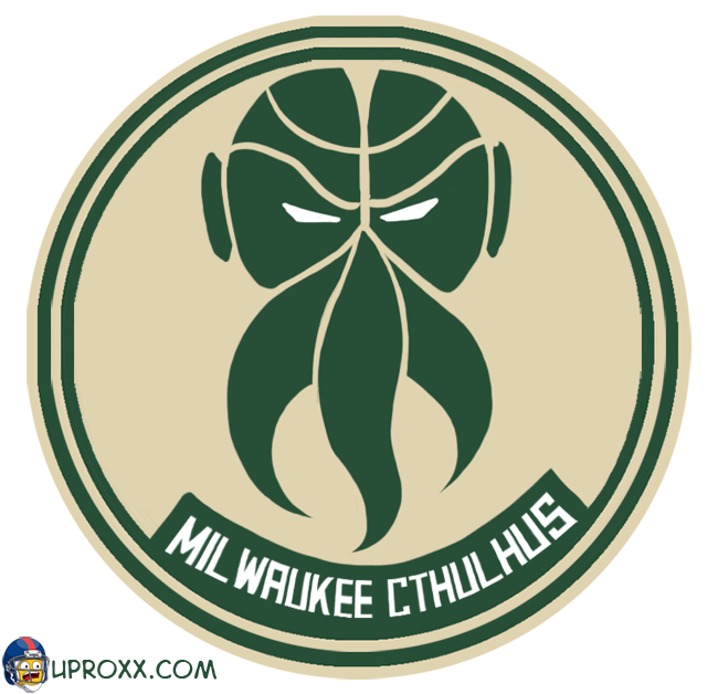
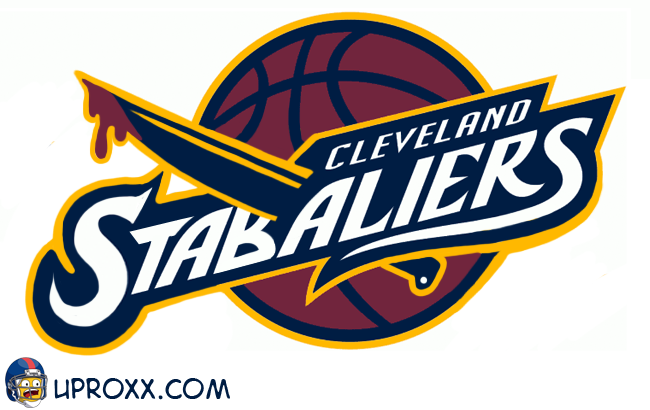
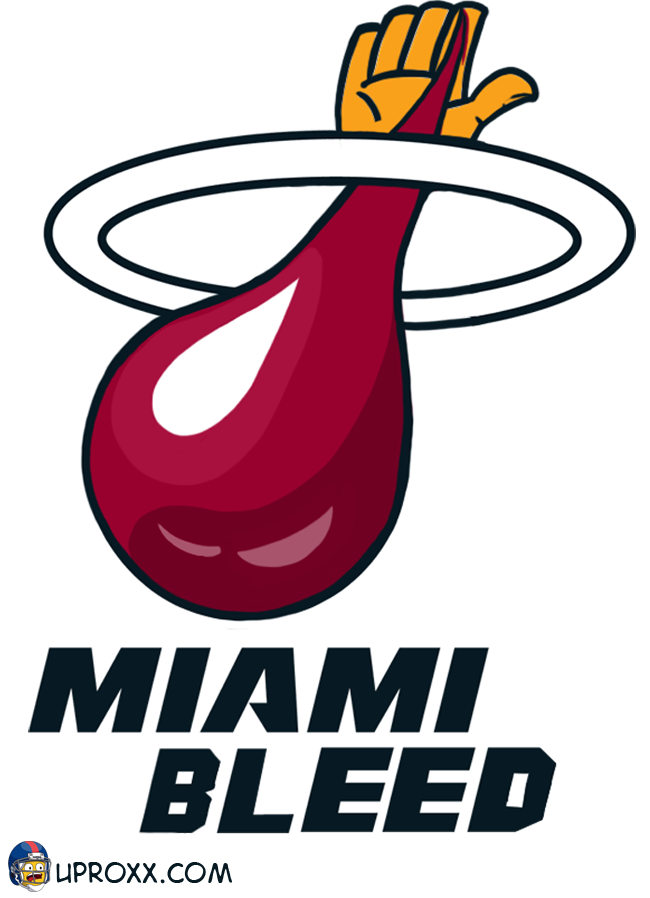
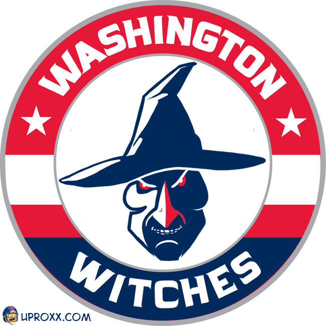
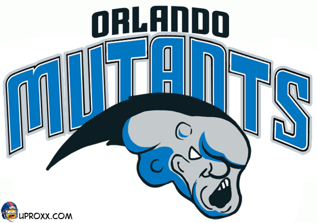
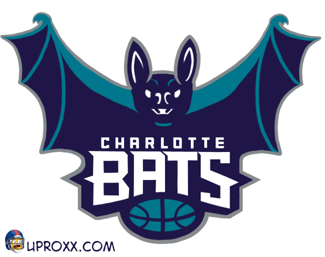
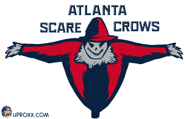
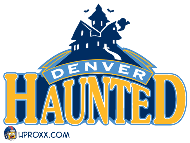
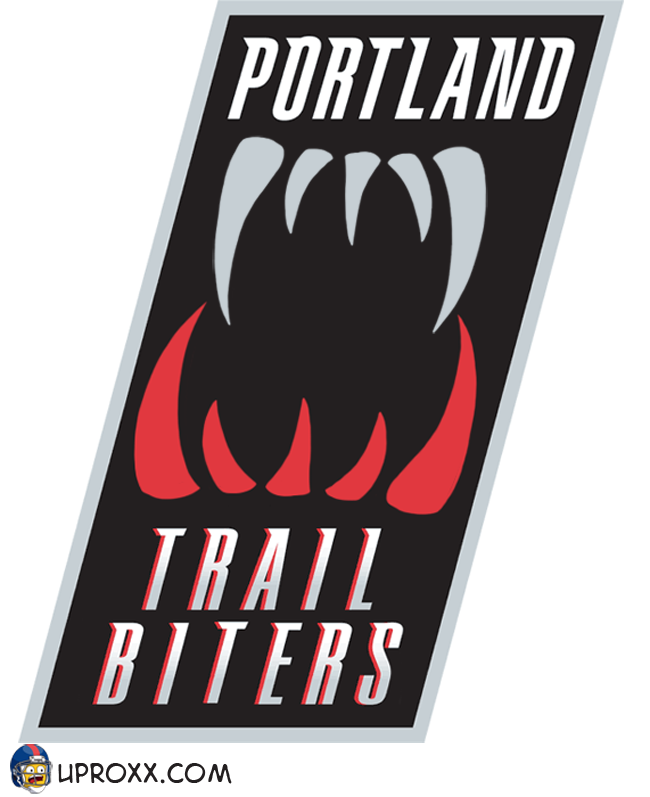
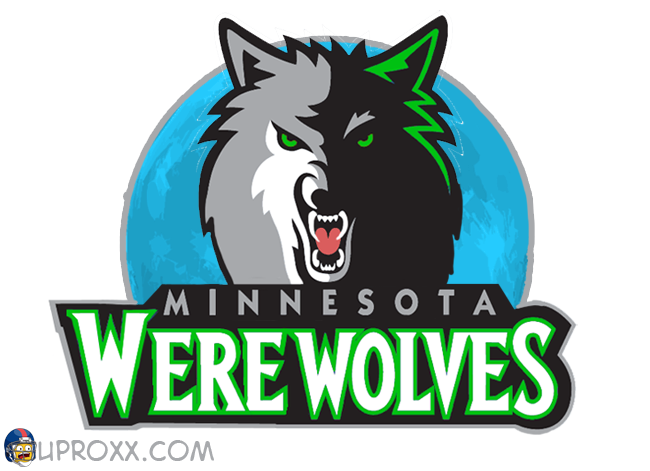
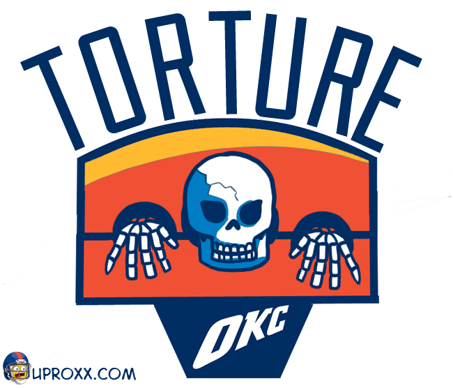
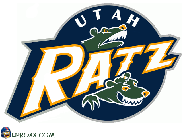
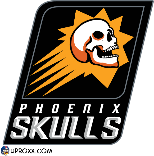
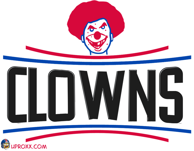
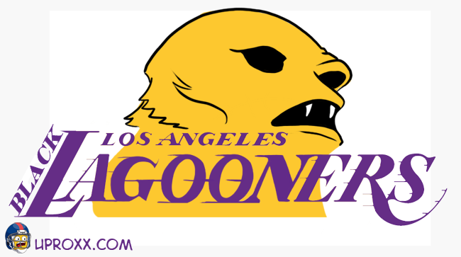
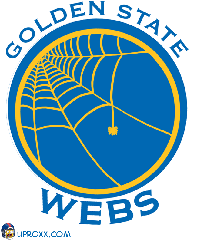
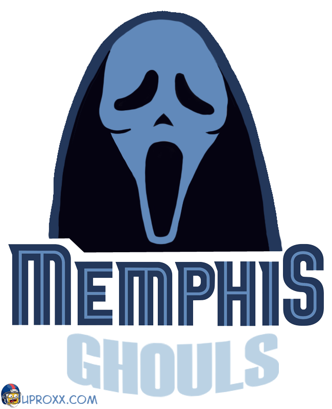
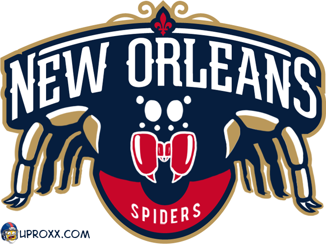
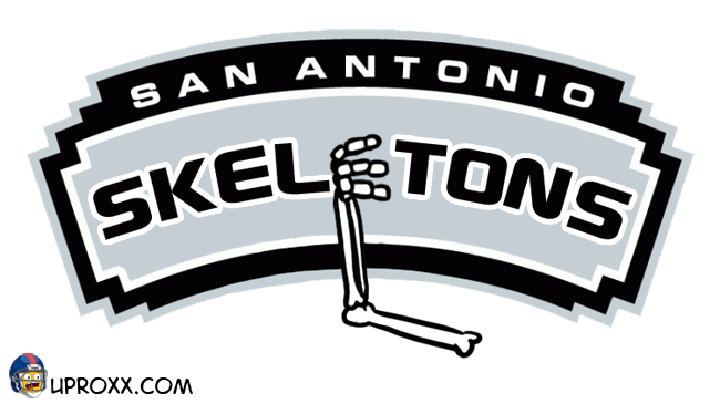
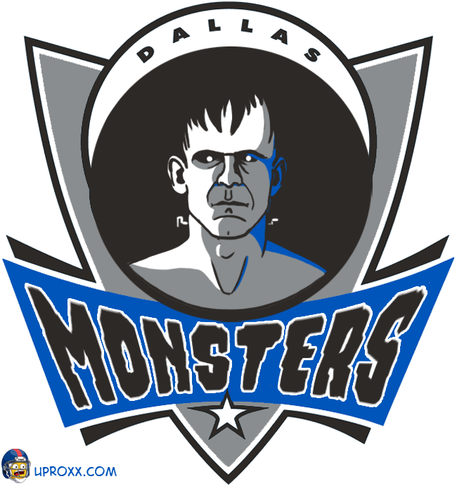
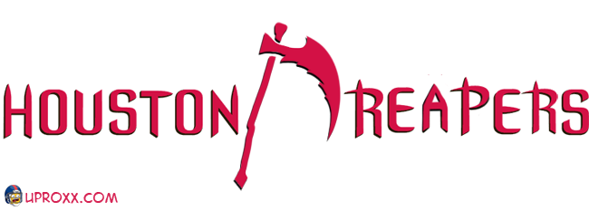
(These logos are the work of David Rappoccio. You can find him on Twitter at @drawplaydave.)
“Oh no, is Dave doing another logo re-imagining? I wonder what it is this time. Halloween? Didn’t he do that already? Wait… does that say… NBA logos?”
You bet it does. Being that it’s October, I wanted to revisit my old Halloween-themed ideas, but as some of you might remember, I did the Halloween NFL logos just last year. I couldn’t very well do that again. After 10 (!) NFL logo extravaganzas, I needed fresh blood. Because the NBA regular season just started up this very week, I figured why not? Basketball is cool. Plus, after 10 go-rounds, it’ll be nice to have a completely new set of logos to work on instead of the same old haunts. I got pretty familiar with those football guys, so I asked them if we could have an open marriage and try new things. NFL logos said yes. Things had started to get weird between us, anyway.
So, my theme for this year is exactly the same as last year: The logos will be re-done around a Halloween theme, which means monsters, evil, ghosties and creepies. First thing I noticed about the NBA logos: There is a lot of text and basketballs. Every single NBA logo has some stylized text on it. Almost every logo has a basketball on it. This was new territory, and it was clear that this was going to be significantly harder than the NFL logos. Most of the NFL logos are angry animal heads, which as logos are cliche and boring, but are extremely easy to manipulate for joke redo purposes. Text is hard to manipulate. I could go into Adobe Illustrator and meticulously redo them, but I’m a busy man, and doing that for 30 logos would take ages. I had a week.
However, thanks to the added challenge of manipulating text-based logos and working with a completely unfamiliar group of logos, I think the extra effort came out in the work. And as I write this in the wee early hours of Friday morning, I can safely say this is one of my more creatively satisfying sets. Taking a single theme and making 30 different version ideas in a short timeframe, each tailored to the original, is a difficult challenge. Even harder for this one, because I tried to come up with names for each team that sounded like the original being that the text was on each logo.
One last note: I did my best to use all the current logos, with the one notable exception of the Hawks, because I had no good ideas for that minimalist circle thing, so the Hawks logo is using the older version.
So, lets do this. Teams will be organized by conference and division, starting with the East.
RELATED: The Walking Ballers: 16 NBA Stars As Zombies
PACIFIC
SOUTHWEST
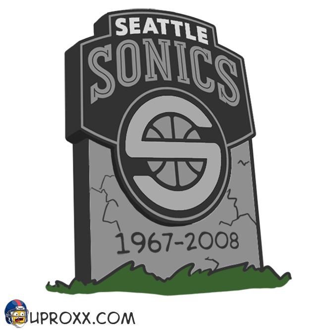
AND THEN ONE MORE SPECIAL LOGO BECAUSE I’M A HUGE JERK
I hope you guys enjoyed this, now I’m off to sleep and to figure out what logo set to parody next.
PREVIOUS LOGO SETS (All NFL)
Steroids
Manningface
British
Fat
Hipsters
Anime
Potheads
Halloween
Butts
Male Genitalia

