Back in January, Major League Soccer made its long-anticipated announcement that the league will head to Miami. It’s been a long time coming — Miami has been rumored as a landing spot for the league for some time, especially with David Beckham’s name attached to the organization — but it officially came to fruition several months ago.
Things have been relatively quiet on the Miami soccer front since then, but on Wednesday morning, the club made a series of major announcements. Most notably, it now has a name: Club Internacional de Futbol Miami, or Inter Miami CF (which, admittedly, is a bit clunky) for short.
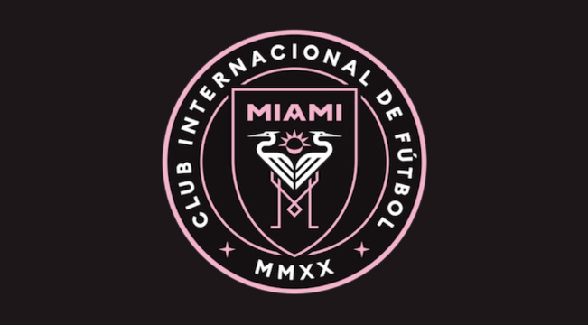
The coolest part is the club’s new logo and crest, which use a striking black, white, and pink color scheme that isn’t all that common.
Four years ago, we dreamt of a soccer club.
Today, we’re proud to announce the official crest of that club.
Join us on a journey that has only just begun.
THIS IS US. THIS IS MIAMI.#InterMiamiCF #ThisIsMiami #MLS pic.twitter.com/uw8QOA2lfG— Inter Miami CF (@InterMiamiCF) September 5, 2018
The colors are, obviously, the thing that sticks out the most — pink is rarely (if ever) used by teams in their logos and uniforms and things of that ilk, so to see that it will be a part of the club’s identity from the start is awesome. Some soccer clubs have traditionally used pink jerseys at times, Spanish teams in particular, but few embrace it as a primary color.
The club’s crest has a few nods to the city of Miami, mostly in the decision to have herons appear on it. There’s also an eclipse, which has a few details to represent the city and the club’s primary owner.
This is our story. This is our crest.#InterMiamiCF #ThisIsMiami #MLS pic.twitter.com/p3yCkFiO0S
— Inter Miami CF (@InterMiamiCF) September 5, 2018
It’s going to be a little before we see Inter Miami CF’s kits, or even what players are going to suit up for the club — the organization will join MLS in 2020. Until then, we’ll just marvel at the club’s new crest.


