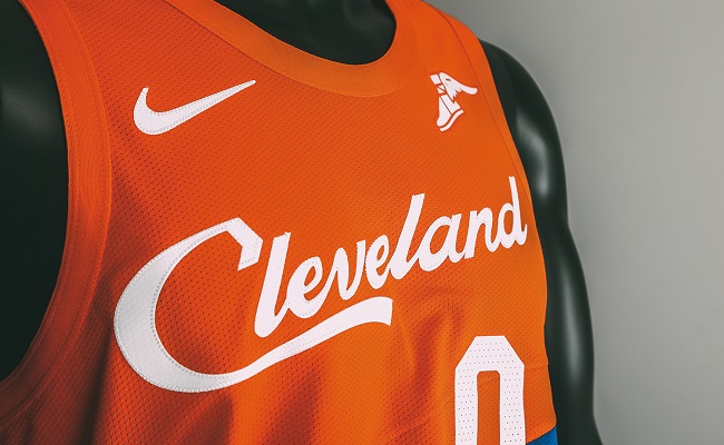
The Cavaliers unveiled their City edition alternates on Thursday and the style is a rather interesting one. The Cavs have a strange jersey history with some absolutely gorgeous sets and then a few that never should have existed in the first place. Their current main set is fine, but they lack the style that a lot of previous Cavs jerseys possessed.
The new City edition jerseys though are definitely not lacking in that department. The biggest weakness of the Cavs last few jersey sets is they took a very dark tone and could be bland in a way. There’s nothing wrong with dark colors, but Cleveland has a very colorful jersey history and I like to see them embrace that. These City jerseys did just that.
1 of 5 greats … it’s wavy 🌊
MORE PHOTOS → https://t.co/VqmeiHg90t#BeTheFight || #ThisisCLE pic.twitter.com/dbPXcKwTn6— Cleveland Cavaliers (@cavs) November 8, 2018
The blue and orange is a throwback to the Cavs old color scheme and the font is the same as the Welcome to Cleveland sign, also known as “tourism” font. As far as design goes these are very loud. There’s nothing subtle about them, besides the Cavs logo on the shorts, but that’s okay. If you’re going to make a loud booming jersey then it’s better to go all the way and be as in your face as possible.
There’s a very retro-modern style to these that I like about them. The design itself is something that would have fit right in on an older style jersey, but it works well on the more modern style jerseys of today. Is it perfect? Not by any means, but it’s a solid jersey and it’s different which is always a plus in my book.


