Nobody has suffered more from a poor rebrand than the Los Angeles Clippers. When the Clippers moved on from an old logo and scheme that made them infamous, under former owner Donald Sterling, they ended up with some of the worst uniforms in the NBA. The old Clippers logo was long associated with losing, and losing badly.
Their more recent LA wordmark just looks uninspiring, and the jerseys and followed suit. But a change to Nike, and another small rebrand has taken their jerseys from awful to tolerable last season. The problem is they still don’t have a single jersey that you could call ‘good.’
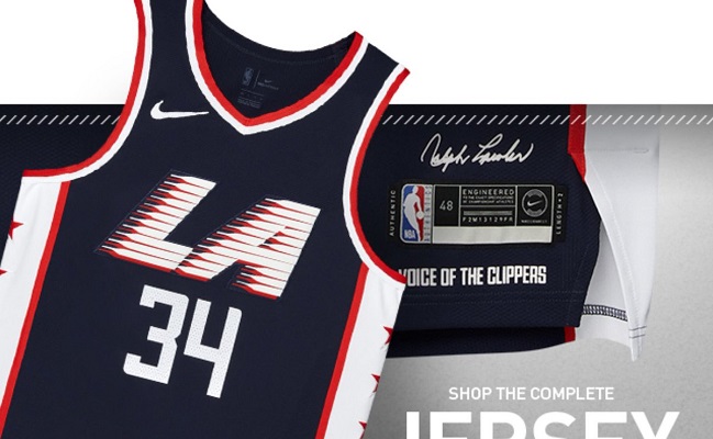
But that appears to all be changing, and the Clippers may finally have a good jersey worth looking at. Their leaked City edition uniforms follow the typical red, white, and blue color scheme but there’s some actual creativity here.
https://twitter.com/LAClippersFilm/status/1059965440385056769
Using a dark blue color scheme along with white side panels and red trim was genius. It all compliments each other gorgeously and none of it sticks out too much or looks boring in comparison. This kind of unity across the jersey is important because you don’t want one particular area to draw too much attention, which is why the logo is awesome.
This also appears to take inspiration from the 1984 Olympics logo, which is awesome, but it’s done so in a very subtle manner. The logo is there it looks cool, but it doesn’t overstay its welcome.
Could be that I’m partial, but damn that LA 1984 logo was fantastic. #Olympics pic.twitter.com/5fwEyUyOjK
— Nicole Alvarado (@Ch_eekyGirl) February 28, 2018
The stars on the side panels are a really nice touch and add the necessary pop to avoid making the white too boring. These are the Clippers first actual good jerseys and I hope they wear them all the time. Anything is better than their current uniform rotation.


