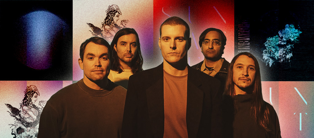
The album cover of Deafheaven’s second album, 2013’s Sunbather, accrued a weighty, polarizing significance that its creators never anticipated it would bear.
It garnered derision from metal purists, memetic adaptations from the chronically online, and lavish praise from the Pitchfork-pilled. Absent was the oft-illegible font so many black metal groups employed. In its place was an original serif typeface from graphic designer and Touché Amoré rhythm guitarist Nick Steinhardt. Coupled with warm pinks and oranges meant to evoke sunlight on closed eyelids, Sunbather‘s iconoclastic, unintentionally provocative cover became just as much a topic of discourse as the music within it.
When I speak with Steinhardt and Deafheaven frontman George Clarke over Zoom, it’s immediately clear how much depth and intention go into the artwork surrounding each record. They’ve been working together on the art direction and covers for every Deafheaven release since their 2011 debut, Roads To Judah, and they’ve managed to pull off something different for each LP while still tying the visuals into the musical motifs. They continue their creative partnership on Lonely People With Power, a back-to-our-roots record that steers away from the shoegaze atmospherics of 2021’s Infinite Granite and back toward the piercing viscerality of the band’s earlier work.
Below, read our conversation about the story behind every Deafheaven album cover, which (ahem) covers typography, photography, motion graphics, fine art, and more.
Roads To Judah (2011)
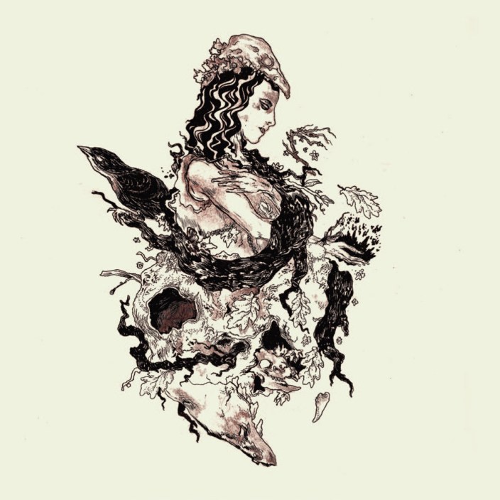
Nick: This one is really the start of our relationship artistically and our friendship. George and I met playing a show outside of LA in 2010/11. The night ended with him staying at my spot in LA, and we were gathered around my table, looking at record packages and books and getting to know each other. I believe you were already with Deathwish and had this illustration cooking but hadn’t figured out the packaging just yet, and that was how we started working together.
George: I was friends with and very into the work of this illustrator, Reuben Sawyer, who, at the time, had a moniker called Rainbath, and honestly, there wasn’t a whole lot of personal attachment or correlation between the album’s themes and the artwork for this one. We went as Nick and I kind of developed working with each other that would become a real integral piece. But for the first cover, I was just heavily into Reuben’s work, and Reuben worked with a lot of these up-and-coming American black metal bands and avant-garde bands, and I felt like Deafheaven was very much a part of that world. Working with him entrenched us further in that world. Aside from the work itself, that was definitely part of the appeal.
Nick: I want to say that this was the first time that we introduced the idea of reinterpreting the illegibility of black metal logos. Deafheaven, from the jump, was pushing the limits of what is metal or what’s accepted in metal. Literally, the word “illegibility” is a constant theme, with the branchy, abstract logos. I was just trying to think, “Is there a modern way we can interpret that theme, maybe in a more minimalist fashion, by taking away versus adding?” That’s how we ended up with the very first logo type.
Sunbather (2013)
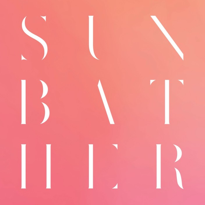
Nick: I’ll let George speak to the album themes, but the idea, both with the color palette and with all the thin strokes of the letters disappearing, was another experiment in legibility, but also the physical act of squinting, making those fine lines disappear. It’s all thematic to the title. In a lot of our work, we end up pulling back to the essence of what’s needed to communicate the message, and we felt like a more minimalistic, typographically based cover ended up being more appropriate.
George: I was getting a chance to think about how we kind of made this in preparation for the phone call and actually was reminded that originally, very early on… and this happens almost every time with me, is that I’ll have an image in my head, something that correlates to themes of the album, or lyrics, or just a mood. I will fixate on it until it runs its course, and then I’m often given clarity to the actual thing that I’m looking for that makes sense. For this one, I was really into this UK photographer, Ellen Rogers, who has this really soft directness, this ethereal, ephemeral aspect to her work. When we stripped it down to what I felt was Nick’s ultimate strength, his typography, there was an idea that we were presenting these letters swallowed by color, and they have this ethereal feel to it despite how modern it is.
Nick: The true essence of what we’re trying to do emerges halfway through, and there’s a sort of redirect or repositioning that happens. In terms of the actual styling of the font, it was very much a legibility experiment. I liked how sharp the letter forms are. It feels dangerous, and at the same time, they’re very sleek and modern. It felt like, in a way, a representation of both the hard and the soft of the music, which has always been a really beautiful duality of Deafheaven. How do we best represent that?
To me, the colors speak to that duality: the beautiful guitar tones paired with this guttural screaming.
Nick: Yeah, and that cover became very popular but also very divisive. A lot of people think that there’s this antagonistic angle to it, like we were trying to prod the metal community. I don’t think that could really be further from the truth. It’s more about representing the body of work than getting a reaction out of people. That’s never really been what we’re after.
New Bermuda (2015)
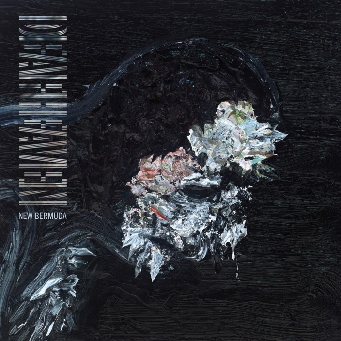
George: There were various things leading up to this. If memory serves, I had been into sculptural painting. I had sent Nick references for sculptural painting. The record in itself had this dark, overwhelming quality about it, and it felt, in a way, even a little messy. And it had a certain intensity that had really differentiated itself from Sunbather, and I felt like we needed that mess, and Nick, who was friends with Allison [Schulnik]. He sent me her work. I looked at her paintings. She does a lot of amazing stop animation, as well, like this video she’d done for Grizzly Bear. I was like, “If she is into it, I’d love to work with this person.”
At the time, I was going through this depression living in LA, and much of the record has to do with that. I was adjusting to these life changes in this new city I’d moved to from San Francisco. In these moments, I was often drawn to playing my keyboard that I had in my bedroom, and at the time, I was trying to teach myself to play piano. The cover is actually a profile image of a man hunched over a piano, which is funny because you don’t see it, but that’s technically what he’s doing. Allison was really amazing to work with, and she sent us four paintings, all of which have amazing, unique qualities. But we decided on the one that made the cover.
Nick: There’s just a couple more pieces to elaborate on. There is one that I remember you very strongly from the jump wanting like a sunken, sullen portrait that was, like you were saying, being swallowed, and listless and directionless. Also, inferring the title, this is probably the first time that we heavily mood-boarded and dug into themes in a more formal fashion. I remember doing this at the time to keep us in a direction, due to circumstances of the time.
I was actually looking back through the mood board earlier about there’s this diamond symbol that I think was potentially in the running for cover art. That was like, kind of like, “OK, the Bermuda Triangle is this area you can get lost. In between, a diamond actually opens up, and there’s even more space to become lost,” symbolizing the LA journey. I remember there was a minute where Allison was not going to be able to do the cover because of time, and we were exploring other types of art we could do. Very vehemently, I was like, “We cannot use typography on this record; the last record became so known for it. I don’t want any amount of comparison between the two records. It needs to be like a fresh body of work.” But I remember slightly losing the battle because we did end up putting type on the cover art, but in a very abstract way.
So, Allison’s paintings, they’re very three-dimensional. I remember when I picked it up from her studio to get photographed, it still smelled like paint for six months, and the paint came inches off of the canvas in every direction. For the deluxe record, there’s a bit of dimension to the cover. We did something called a sculptural emboss, so there’s three different levels of dimension on the actual cover. The physical painting literally has paint whipping off of all of the edges, like it’s been smeared on with a palette knife or something.
Ordinary Corrupt Human Love (2018)
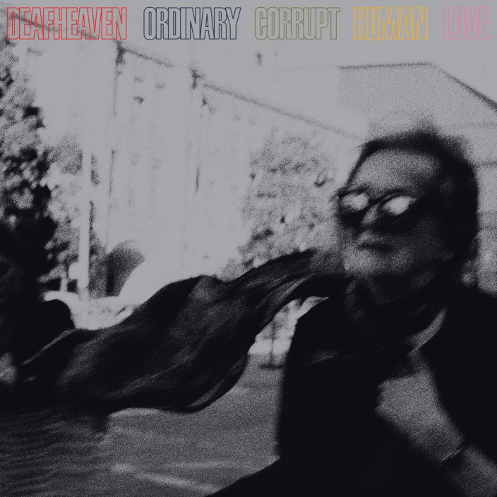
George: I’ll give my spiel. We were finishing the writing of this album at the very beginning of Kerry and I’s sobriety, which informed this album and sort of the band as a whole. But this was the very beginning. The first three months or so, we were making the record in San Francisco and Oakland, and we were returning to San Francisco and seeing the city again through these new eyes and reconnecting with our band members, and essentially creating new experiences in a city where a lot of our formative ones had happened years prior.
At the same time, I had gotten into social realism and street photography and had begun to dabble in street photography myself. Sean Stout, who photographed the record, is a favorite photographer of mine. I think his street photography is outstanding. I knew that we wanted to incorporate that in a way, and also have him document the recording and making of the album, and use that as the expansion piece to the cover. That was, from my recollection, the real impetus to that.
Nick can speak to more of this, but on the record itself, we started to delve into psychedelia, and there is a more of a psychedelic influence on the guitar work. Again, in reconnecting with San Francisco and seeing San Francisco through new eyes, we took that psychedelic history alongside the direction of the music and applied these secondary elements to the record in terms of color. I remember going over to Nick’s house, and we looked through all these books with Japanese psychedelia poster art from Tadanori Yokoo.
Nick: I remember you and Kerry coming over and being like, “What is this record going to look like?” And we were doing the same thing at my kitchen table: grabbing art books and record packages and just talking about it. G, I don’t know if you remember, because you just jarred my memory: We started with these psychedelic illustrations of different songs on the record. There was the deer that had keeled over…
George: Oh, my God, that’s right. I really like that.
Nick: Well, they ended up as your backdrop. So this is one of these roundabout things. If we started with these psychedelic poster illustrations, and then as the themes of the record developed, we threw them out in favor of the realism of Sean’s photography. But the colors that we were exploring early on felt very celebratory in honor of the band’s new sobriety and the vibrancy of the music. Those came in the lettering and the framing devices. Oftentimes we’re generating ideas so early that we don’t even know what we’re making, but the end product is informed by our own early experiments. Once they kicked off the tour for this album, we made this crazy, psychedelic backdrop of these hands that had the Sands Of Time pouring through them and became a focal point of the live show, even though it was originally intended as a potential album cover.
George: Wow. I completely forgot about those early versions.
Nick: There’s a real amount of sh*t on my hard drive [laughs].
George: I want to speak to Nick’s earlier comment about mood-boarding and the necessity of mood-boarding for the New Bermuda phase, and how we have continued to do that to a degree. But so much of this work throughout the years is born from conversation and born from experiences, and it’s a lot of in-person connection, and it’s fun. That’s part of the reason why I even tend to forget: I don’t have these files in front of me. It’s a lot of real discussion. By the time we end up somewhere, it’s very emotionally cohesive, and I think it’s very cool.
Infinite Granite (2021)
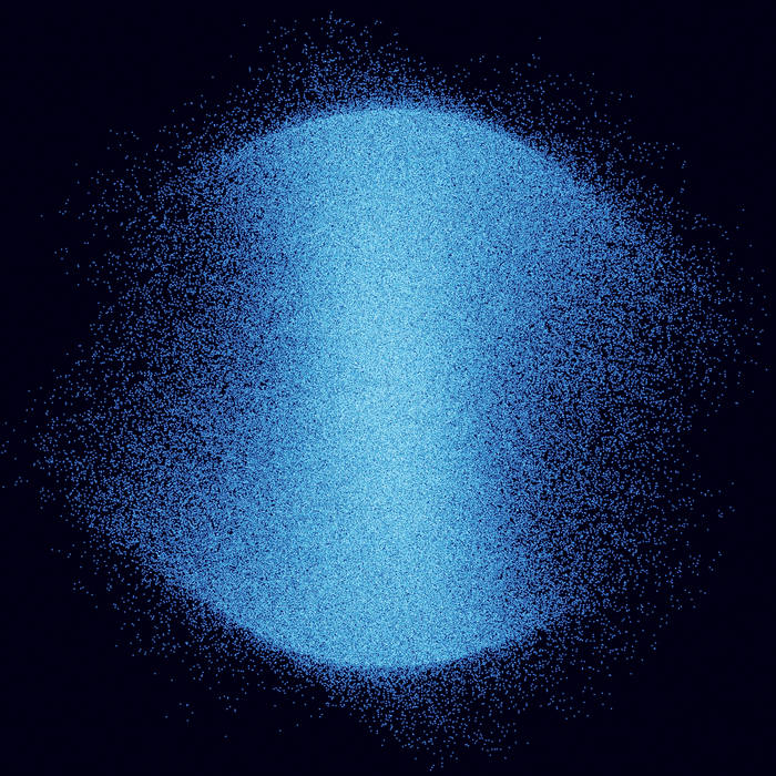
Nick: My memory of this one is George coming over and playing the album for me in full. It’s such an interesting one because it’s a marked sonic shift for the band. And it also isn’t because you can hear hints of it throughout. It’s leaning on one side of the band in a way, leaning on the atmospheric versus the metal. But when we were listening to it, there’s a few times where I could just see a color: this glacial, glassy blue. George was like, “Have I talked to you about this at all? There’s all these references to blue in the lyrics.” I was obsessed with color at the time, but those were completely disassociated. George had not relayed that to me at the moment.
I was picturing this blue orb floating in space. But I didn’t know how to create that, and I didn’t know how to make it mean something specific because that’s also very important. So I was experimenting forever. Also, we don’t really like repeating ground. It was like, “First record’s illustration, second record’s typography, third record’s a piece of fine art, and the fourth record is a photo. What haven’t we done yet?”
This cover was actually made in motion graphics software. It’s a simulated time lapse of the songs as stars in a 360-degree rotation. So I basically took the audio information of the songs, and it’s as an animated form. It’s a bunch of dots floating around. I believe it’s based on the volume. So I built that and rotated it 360 degrees during the duration of each song and did a simulated time lapse photo of each, so there’s actually an orb, sort of like an object, for each song on the record. We picked the most visually strong one as the cover.
In terms of the sonics of the record and the typography, again, George and I toured together just before they started making this record in 2019. We were at the Leopold Museum in Vienna, and there was an entire floor dedicated to the Vienna Secession, which was an art movement in the teens that was trying to be outside the norm. A lot of their poster art, if you looked at it now, you would just think of San Francisco psychedelic poster art, but it’s very much the beginnings of those types of experimental letter forms. Then again, back to the band dipping more into psychedelic sounds.
George: This sort of became like, “How do we apply the legibility formula to this style of music, versus something that’s objectively metal?”
Nick: And we did maybe my favorite font for you guys from this record.
George: Yeah, just to piggyback on these things, I remember strongly, probably more than any other thing we had worked on, that we were immediately on the same page as to what we thought the idea was. We had this meeting at Nick’s place. We had listened to the album. The album was written during the pandemic, and it felt very representative of that time. There was insularity there. There was a sort of density there. There was an idea that there could be no movement to the outside. You could only go internal or external. I remembered thinking, “This feels like deep space.” I really feel like the orb came into thought really early on, and the challenge was to interpret that idea and apply it.
Nick: Yeah, like I had a sh*tty blue gradient on my screen paired with typography forever. I was like, “How do we make this and how do we make it interesting?” I think I literally sent you an image of a close-up of some, like, blue rock.
George: But what was cool about the solution to this and everything that Nick came up with was that the record itself was such an inversion of our previous work that we were able to conceptualize. We were able to apply the art in the same way. Usually, the art direction is derived from the emotion of the lyrics, or just the lyrics themselves, and this time we did it from the sonics. So the album art is a literal interpretation of what’s being heard and not what’s being said. To me, to hear that idea for the first time was just overwhelmingly appealing and then to couple it with the Viennese Secession stuff, the whole Art Nouveau movement, and even a little bit of Kubrick’s 2001, a song on the album, “Neptune Raining Diamonds,” is derived from that idea. All these things put together made the art. I’d also be remiss not to mention the influence of [Wim] Crouwel, who is a Dutch designer from the ’60s.
Lonely People With Power (2025)
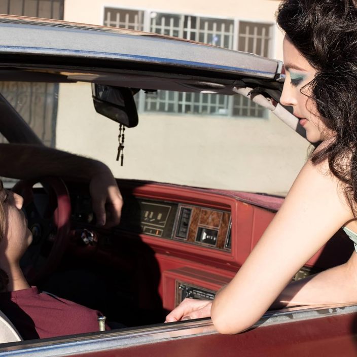
You went back to a photo for this one?
Nick: Sort of. This also had a lot of different twists and journeys. Yes, the cover, technically, is a photograph, but we were very interested in exploring video for this work. We had more resources than we’ve had in the past for the band. George and I, very conservatively, were like, “Let’s take this outside of just you and me for a second and involve some other collaborators in a heavier way,” and even before we really had any themes to go off of. He and I’ve been friends with Nedda Afsari for a number of years, who’s an amazing photographer and director, and we knew we wanted to work with her in some capacity. George, I’ll let you speak to how it really came about. But video and an external collaborator were two early things we identified. Again, we were given a bit more financial latitude to do this stuff, and that created opportunities that we hadn’t had before, which was to collaborate more widely.
George: I’ve been a big fan of Nedda’s work for a long time. I was sharing with Nick things that I liked and wanted to pursue directionally, and he was like, “You know, this kind of points to Nedda.” And I was like, “Yeah, this is exactly what I’m thinking of. Glad you said it.”
I grabbed coffee with Nedda. I originally had all these more symbolic ideas. Much of the record’s lyrics had been written, and I was taking the lyrics, which are sort of half-personal, half-symbolic and abstract. And I was taking the symbolic, abstract ideas and trying to apply them in a narrative way. I had written out a narrative based on those things and met up with Nedda and shared it with her. I already had a title. I was like, “This is what I’m trying to do.” Thankfully, she was very interested. It was a very easy meeting. And then I was like, “Cool. Let me actually figure out solidly what this idea is,” because at the time, it was a little bit here and there.
I got together with Nick and, like things tend to happen, we pursued a direction, and it was going well. We were coming up with really cool ideas, but somewhere along the line of making the record, I had this epiphany that the best way for Deafheaven to artistically succeed is offer our singular perspective. So I thought, “What is most important here? Pursuing these symbols and these secondary motifs that the album was speaking to, or do I lay bare what is underneath and what is truly personal about this record and offer the only thing that I really can, which is my perspective?”
What I felt was most important to this record was to offer the singular perspective, so we switched routes and developed a story that was directly based on the lyrics of a couple songs. The video work is based largely on the song “Amethyst,” and the cover image that we ended up going with is largely based on the song “Incidental III.” That was the impetus, and it grew in a sort of fictionalized, filmic way, but that was the core of it.
Nick: We basically took a music video budget and decided to create a vignette per song on the album. That’s where we got teasers for every song as well as the artwork, and basically a bunch more imagery and inspiration for a deluxe package that is being manufactured right now. We started out almost going to the depths of inventing a society and a societal constraint and building a literal world around all of that. We took the concept of that, but then went way more into the brutal honesty of a lot of the lyrics, which I think is the biggest evolution for this record. George is obviously very poetic, but it’s much more real than you’ve gotten in the past.
George: It’s definitely a lot more direct, and I wanted to speak a little bit more to the cover itself. The song “Amethyst” deals with this setting in a motel, and the expansion of the lyrics, the thing that moves it into this greater fiction is imagining that people who live in a motel live in the fringe, and the motel represents a sort of halfway house, and it represents people who are in transition from one thing to to the next. We were thinking about that in terms of life and death, and I was thinking about how people who live on these fringes and such are closer to death and that there is this ominous, ever-present death around these situations. In the video work, we have these various characters who live and exist around this motel, and we have this omnipresence, this phantom that also exists amongst them. He is, in essence, the death that is always hovering around these situations.
In taking this character, we were able to take a very terrestrial, tangible life experience, and make it more supernatural, more characterized, and that was a lot of fun. In the video, you see his hands, and he has the sigil that Nick designed. The other cool thing is the sigil, which, along with the video work, is quite an important component to the artwork and the packaging.
Nick: This campaign was really multifaceted. Being able to move into this video world, because you have other things to consider, like setting, production design, props, and color, that you need to be really intentional about going into a shoot. I love working this way, speaking with other artistic collaborators and dialing all of those details in, one of which was this sigil.
So, like George mentioned, it was loosely based around a series of real-life events, and we were digging into the aesthetic around a gritty San Fernando Valley early-’90s motel. It’s not necessarily a celebrated period of aesthetics or graphic references. We’d have a whole different bag of things to mine from. So the motel that this is loosely based around is not some cool noir neon that you wish was saved in a museum somewhere. The stuff we were referencing is very banal and, honestly, quite bad. So we were trying to figure out ways to bring that around, one of which was a cartouche for this hotel that involved Celtic links in a chain. I basically took that and spun it around on itself into four interconnected links, trying to symbolize family, lineage, and heritage, and then also George’s family’s origins in the South.
And then there’s a whole secondary aesthetic around this record, which is loosely based around this early 1990s motel thing. We made a bunch of fake Yellow Pages and white pages advertisements for all the collaborators on the record and basically each song in and of itself. I found a ’90s San Fernando Valley phone book and was thumbing through it for artistic references. That’s a secondary palette to the album.
How did you get the idea to do something like that sigil in the first place?
George: Like we were describing with Ordinary Corrupt, how we brought those psychedelic ideas from the original set into the final packaging. That’s where I think this came from because when we were working before, we decided to have it be a personal representation of the lyrics when it was in the symbolic art-direction lane. This idea to have a symbol that was used by a powerful entity. We were thinking about Lonely People With Power as a corporation. I remember that being a really early thing. It was meant to be more like a corporate symbol because there’s this secondary aspect to the lyrics, which considers the macro view of corporate influence. There’s a lot of references to ’80s Wall Street, and we were going to use this symbol as it applied to that.
When we decided to take a more personal direction, in terms of album branding and having its own identity, we kept that around and, at the same time, I was sending Nick medieval stuff. I was like, “Oh, what about this medieval component?” In the original set of ideas, the corporate emblem would come from a very old world, and it was a lineage and sort of Knights Templar kind of thing. When we sought to keep that around for this new set of ideas, I was unsure of how to apply that correctly because now the imagery was like focusing on my family and real experiences. Nick came up with taking the symbol, the little filigree from the town motel, and bending it into a circle. My family’s from Mississippi and Louisiana, and so we use the fleur de lis. Seeing it tied into the personal, I felt this was worthy to pursue and keep around. It doesn’t need to be this big, overwrought corporate conceptual identity.
It has those roots, but it’s still paying homage to the lineage that you imagined, plus your real-life family lineage.
Yeah, and then it became a little loose because it didn’t necessarily need to facilitate any direct meaning. We could use it freely. There’s a lyric about coins on the eyes, and so we printed them on the coins, and they’re over the boy’s eyes in the video work, or we have this omnipresent phantom death figure, and we were able to scar it on the palms of his hands and apply it in a more like liberal way that just felt cool. We were going to have almost a Mercedes-type emblem to put on the hood, which would have been awesome, but there’s always a future.