The days of looking at your friend’s Instagram travel photos with envy are gone. Why shouldn’t you be the person who gets comments like “OMG SO GOOD,” or “#goals,” or “Do you accept money for prints because I would totally hang this on my wall!” (to which I have to say, Kevin, I still haven’t been PayPal’d that money and your boy’s got bills so cough it up!). Your era of photographic obscurity is over.
Of course, taking great photos isn’t something that you just fall into. Moody filters and high-res smartphone cameras can only take us so far. If you really want to fill the feed with jaw-dropping photos you’re going to have to brush up on your knowledge of color theory and your basic composition skills. To help this cause, we sought the advice of a couple of pros – Nikon Ambassador Dixie Dixon and Nikon photographer, Brandon Woelfel. The two stars were ready to fill us in on how to build our own unique Instagram aesthetics and use the natural colors of our travels as a tool in our photography, rather than just a backdrop.
Dixie and Brandon are two very different photographers, making the pairing of their different perspectives and techniques for capturing effective images an enlightening read. Get your notes ready, check their tips, and scope out their photography below.
—
What are some of the tips to keep in mind for shooting outdoors?
Dixie: Natural light is my favorite. I do a lot of productions that require lots of light setups, but for me, almost all of the photos I post in my feed are either shot near sunrise or sunset. Getting up super early is so worth it to get that beautiful light. And then if you’re stuck shooting in the middle of the day, I always tell people to find shade, because it just tends to be a lot cleaner and softer. That kind of harsh light in the middle of the day is never very flattering.
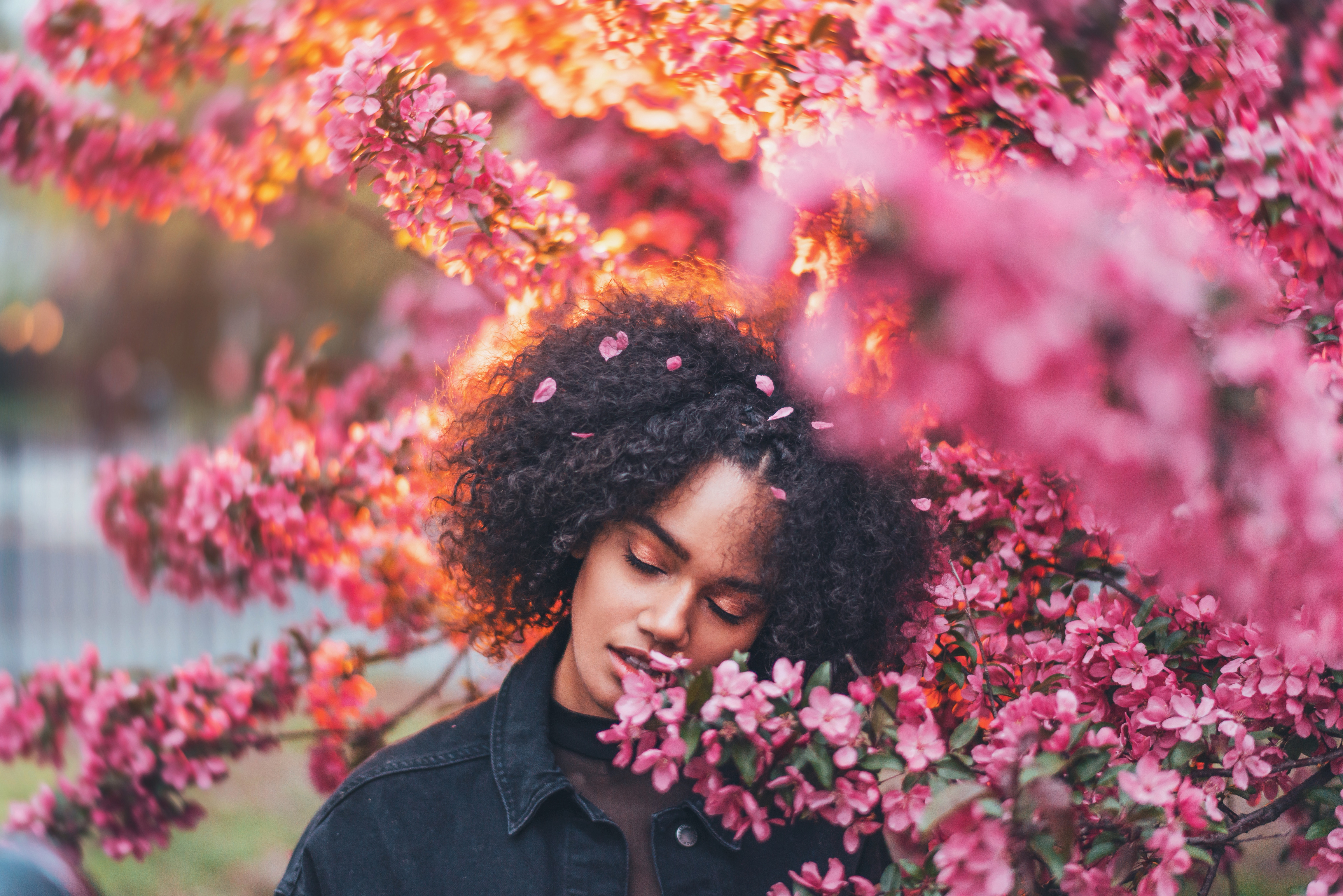
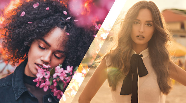
I also shoot a lot of backlit images, and I find that those do really well on Instagram. I think because sometimes you get a little bit of nice peek of lens flare if the sun is coming from behind your subject, and it just has a really neat vibrant look about it.
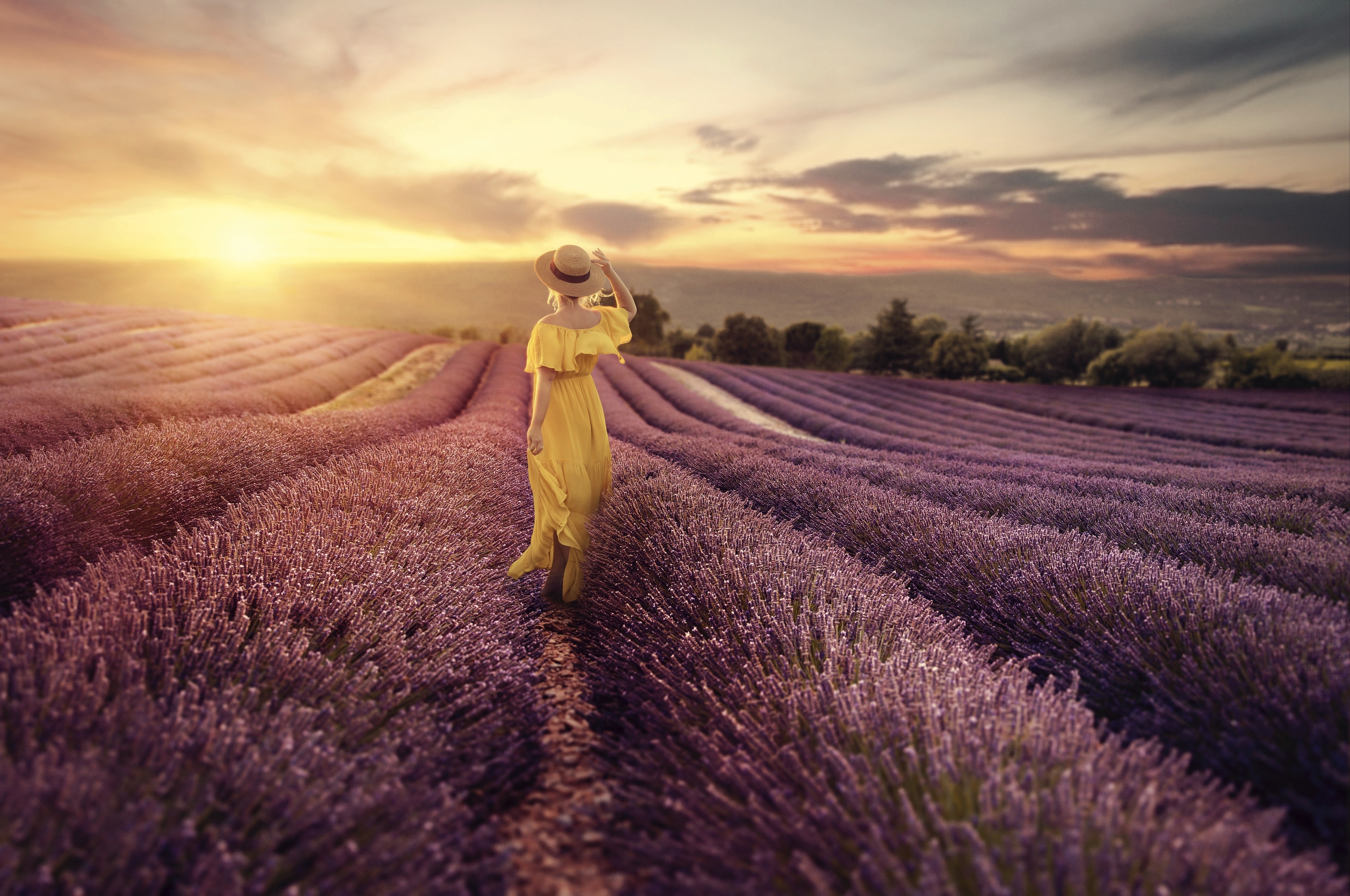
Brandon: I kind of lean more towards planning my shoots right before sunset and then I’ll kind of go into the night. So I think a tip for people just experimenting with outdoor stuff is to really be mindful of the lighting outside and pick and choose when you’re shooting.
I don’t really do sunrise. I don’t think I’ve ever done sunrise, just because I’m such a night person. I always shoot at night, I edit at night and I can’t wake up early. So I like to plan them from right before that golden hour. I like to get a lot of variety on my shoots just because I’ll post regularly on my Instagram and a lot of those images will just be from like a two to three-hour shoot, but it looks like we’ve got all these different shots because we plan out the timing, the lighting, and outfits and props.
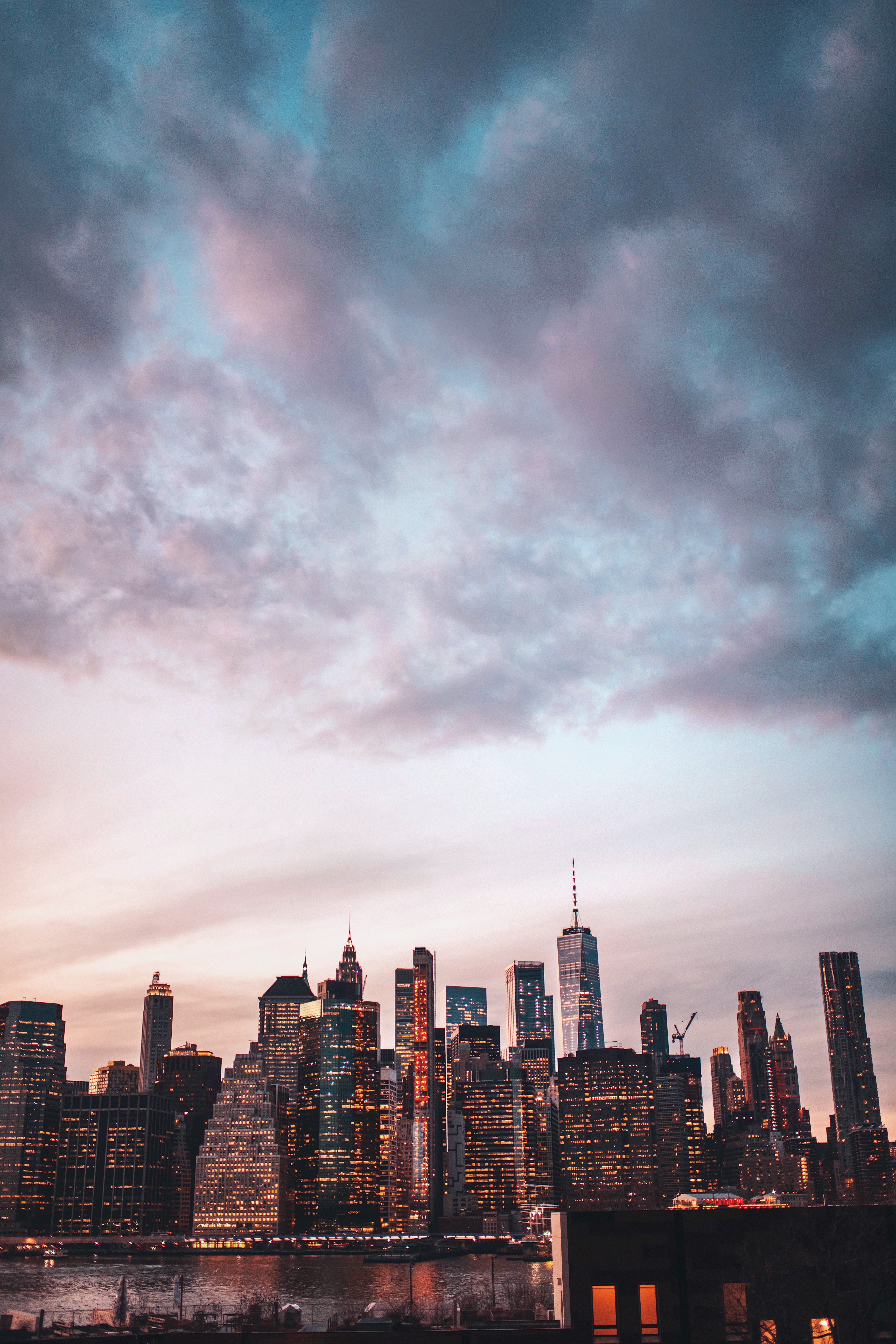
Then we’ll go into blue hour and then also get those nighttime images. So you get that variety in there. I guess for nighttime shots though since I do live in New York, I kind of have the upper hand on that because it’s really easy to find the light at night in New York. But if not, I’ll definitely have proper or artificial lighting I’ll bring on my end and keep that in mind to kind of whip out.
What are some tips for shooting something that’s backlit?
Dixie: It’s a really great idea to add a little reflector. I know a lot of people carry those around just to bounce a little bit of light back on your subject. You might need to overexpose your image a little bit to get the light on your subject to be really nice. Also, adding some contrast back in post-production is a really good idea.
Brandon: If it’s a silhouetted image, I like to have no foreground light on that subject, and just completely have a focus within that backlighting coming through. But sometimes with that, I’ll have the subject stand to the side so you can see their profile just because I feel like I need some kind of information in the image of what that kind of figure is. But if not and they’re facing towards me, I’ll definitely throw a foreground light on there. Just a minimal one.
Instagram has become synonymous with blue and orange tones and ultra-saturated images. If you like that look, what would you do to help bring that out?
Dixie: I’ve noticed my eye is drawn to images that have split toning. With split toning, you can color your shadows a certain color and then your highlights a certain color. I love warm and cool and the combination of that so sometimes I’ll make the highlights super orangy yellow and then take the shadows and make them super cool tones.
The combination of those adds extra oomph. Especially when you’re looking at a feed on your phone. I feel like it just makes everything pop and kind of creates a cool consistency. I use Photoshop and Skyrim software to kind of create those looks.
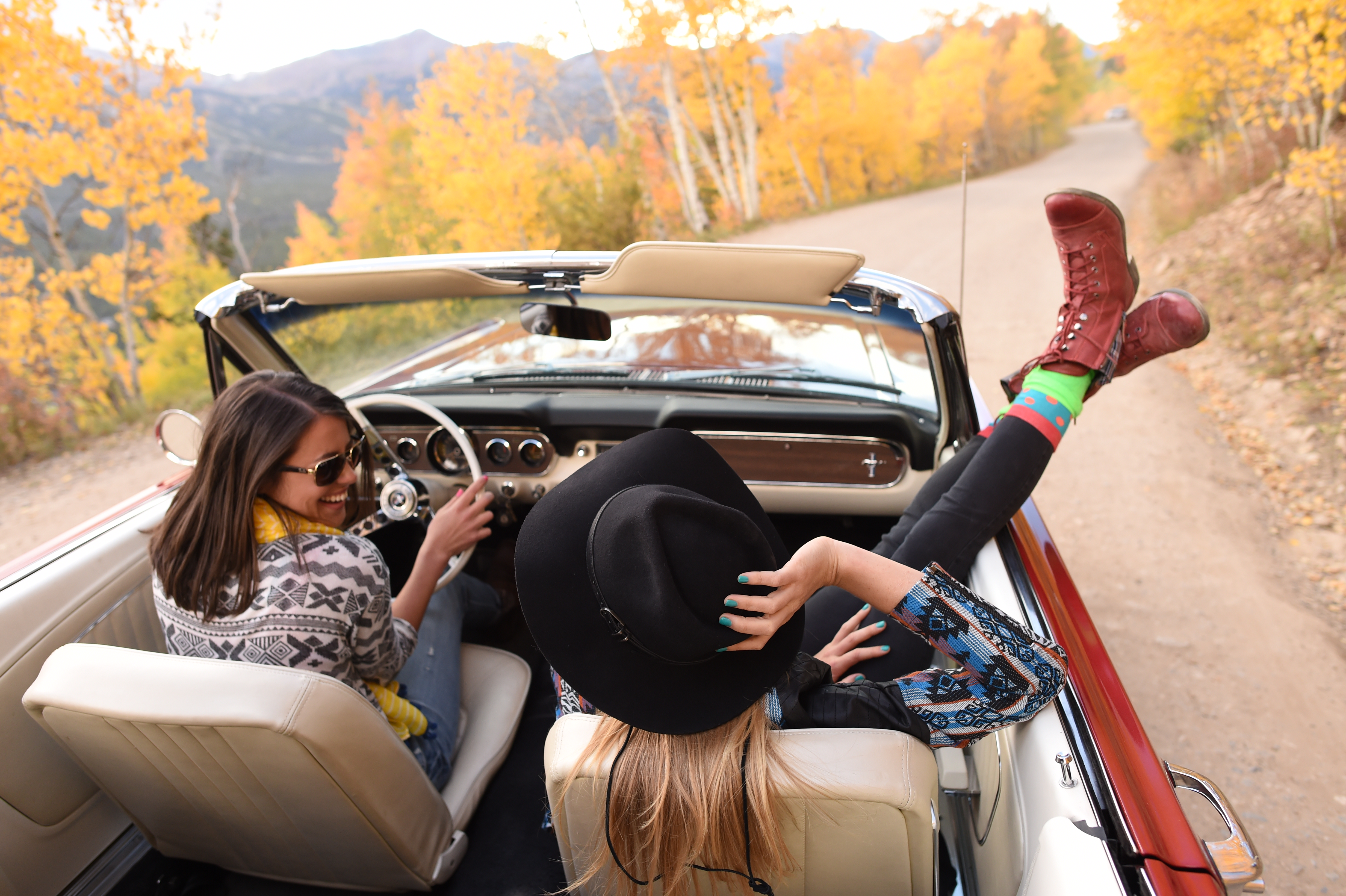
Brandon: I like to focus a lot on my complimentary colors. So that kind of teal and orange you’re talking about is something that definitely is indicative of like a pop image on Instagram. But I think accessing other kinds of complementary colors is great because that color wheel is there for a reason. Those colors do catch eyes and work off each other.
So I think using those colors but trying different patterns or colors within that wheel that kind of work off each other instead is interesting.
When it comes to shooting and editing, which skill is more important to cultivate?
Dixie: I think it really depends on your style because for some people their passion is editing. For me, my passion is shooting. So I tend to want to be out shooting a lot more than I am editing on a computer. I like to be out there with the environment, with the people, and I love that whole experience. So I try to really shoot solid stuff in camera and then anything I do in post-production is just like creating the split tones and really making them pop, just doing sort of basic stuff.
So I would say like… I don’t know… 75% shooting, 25% editing.
Brandon: Yeah, I feel like I view it like almost the opposite there. The timing is important. I set up shoots fairly quickly and I don’t really have a crazy softbox or a team behind me a lot of the time unless we’re shooting some kind of behind the scenes footage or something. When I’m capturing the shot it happens so quickly, even though there is a lot of thought and concept going into that, I focus more on how the timing works out. When I go to sit down to edit, I’m expecting to work on an image for up to an hour where I don’t kind of sit there and think of a shoot for hours on end, it kind of just happens authentically, naturally.
I do think that 25% is crucial when I’m shooting, because I know if I don’t like the image when I’m going to sit down to edit, I’m not going to edit them. I think it’s definitely crucial to have an understanding of lighting and of composition when you’re shooting, just because when you’re going to sit down to edit, you have to have that kind of base layer photo to work off of. And if it isn’t good, I’m not going to kind of waste my time on that. So I think it’s almost 50-50 just because I need the photo to edit, but I also, you know, it works both ways for me.
Would you say that a bad photo could be saved in an edit? There’s a phrase that goes around in creative industries, “you can’t polish a turd”
Dixie: Yes, I agree with, I mean… if you shoot something in really terrible lighting, no amount of editing is going to make it a decent photo. But if you start with something really solid, you can then take editing and make it amazing. It’s really hard to take a really crappy image and make it amazing in post, unless you just want to spend hours upon hours editing, and why wouldn’t you just shoot it, you know, well.
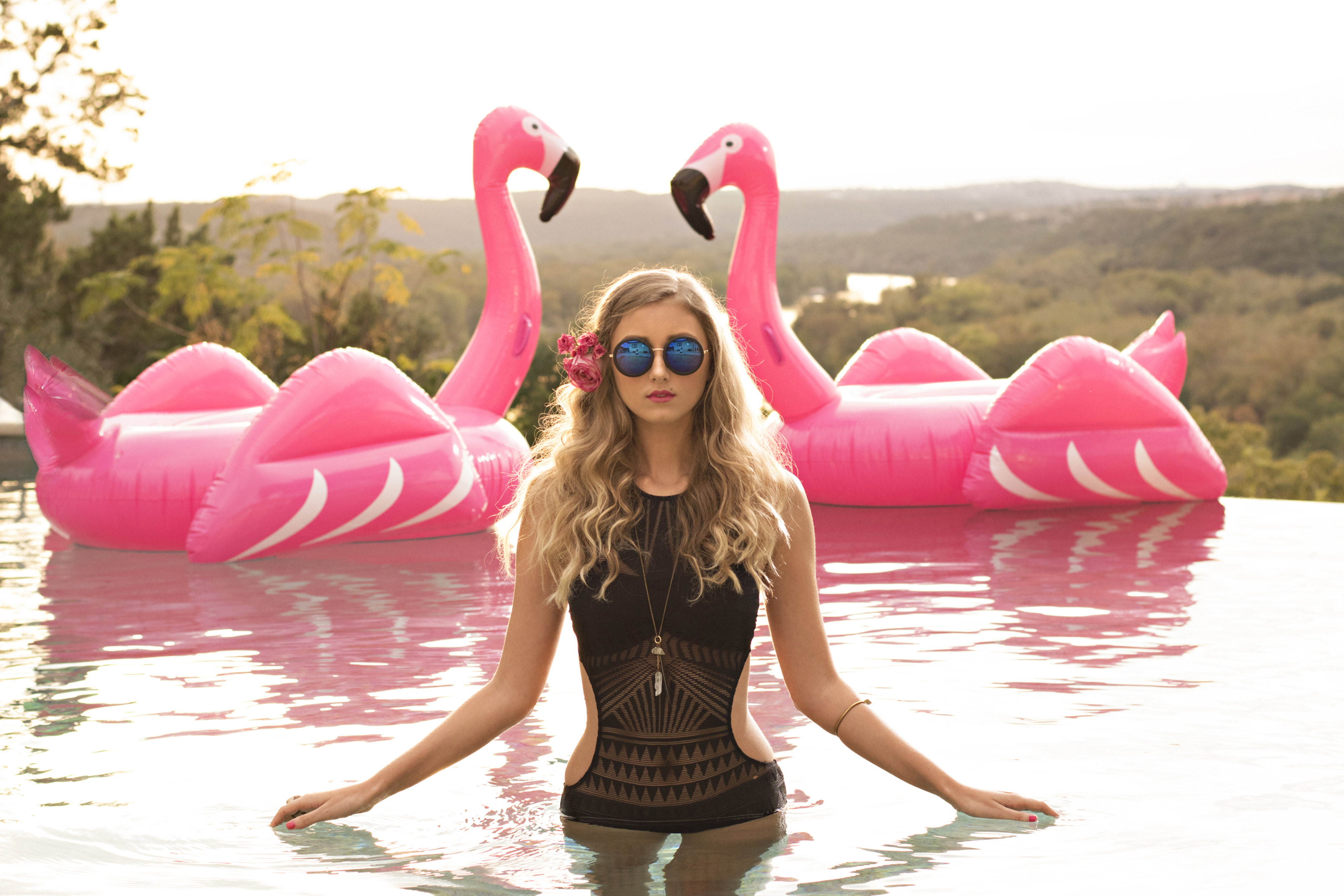
Brandon: I’ve definitely saved a terrible photo within editing, But I’ve also done another part to it where it’s like the image may not be what you wanted, but you kind of use techniques and overlays and you bring in different images to composite a photo together. I definitely think there are two types of ways you can do that with bringing a photo up from something that doesn’t look good originally.
But for me, it’s definitely crucial to like have that base layer image to be solid for it to be kind of like an iconic image.
Can a good photo be ruined by editing?
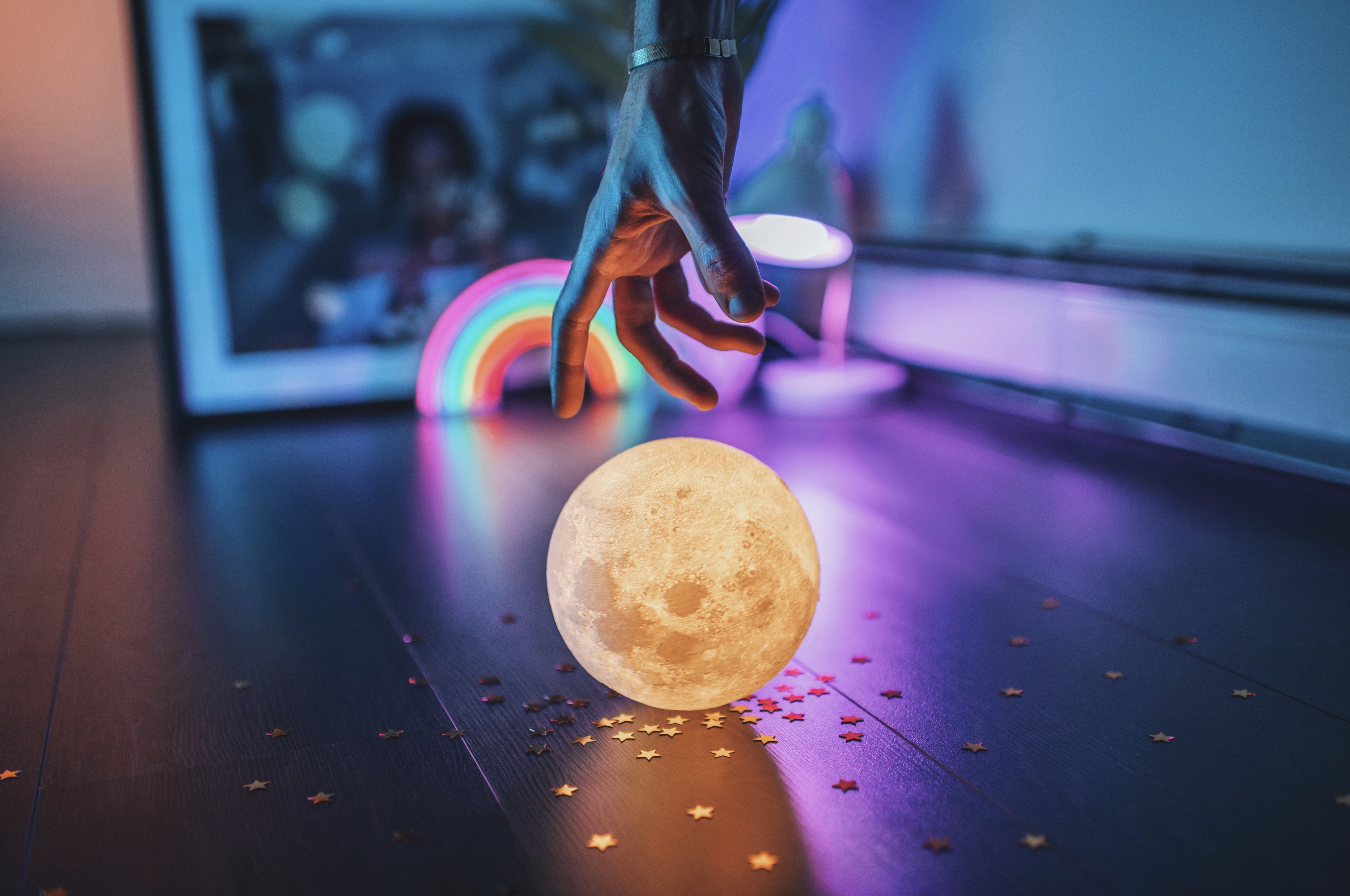
Dixie: Definitely. I think people have gotten used to this over-processed HDR look, and I tend to keep it pretty natural just because I like to show that it’s actually a photo and not just an edited graphic design image. I think you can definitely overdo it. I think some of the beauty in photos are from those little imperfections and things that aren’t quite perfect.
Brandon: Oh yeah, I definitely think so. With sharing before and afters across Instagram daily, I definitely get a slew of comments saying that they liked the before or they didn’t think it needed the editing. But I think that comes from someone’s personal techniques that they use. It’s kind of just objective of whether someone likes it or not. But I think as long as you think you like it and it’s not too crazily over-edited, that’s all that matters. I don’t think you really need to take other’s opinions into play with your own work unless obviously, it crosses boundaries with other types of things. But within the edit, I think it’s kind of up to you.
What other photo editing tools do you use and are there any free ones that you think are particularly good?
Dixie: I do all my main editing in Photoshop, and then I’ll shoot to Capture One to export my files. So those two obviously are not free. If I’m doing stuff for behind the scenes footage on Insta Stories and stuff like that, I’ll use the Foodie app. It’s mainly for food photographers, but it’s a really cool app that gives the images a really clean look. I’ve been liking that app for Insta stories, and then if you want to add text, Word Swag is an amazing app for adding cool fonts and stuff that aren’t available on Instagram. So I’ll use that a lot to create kind of artful looking Instagram stories.
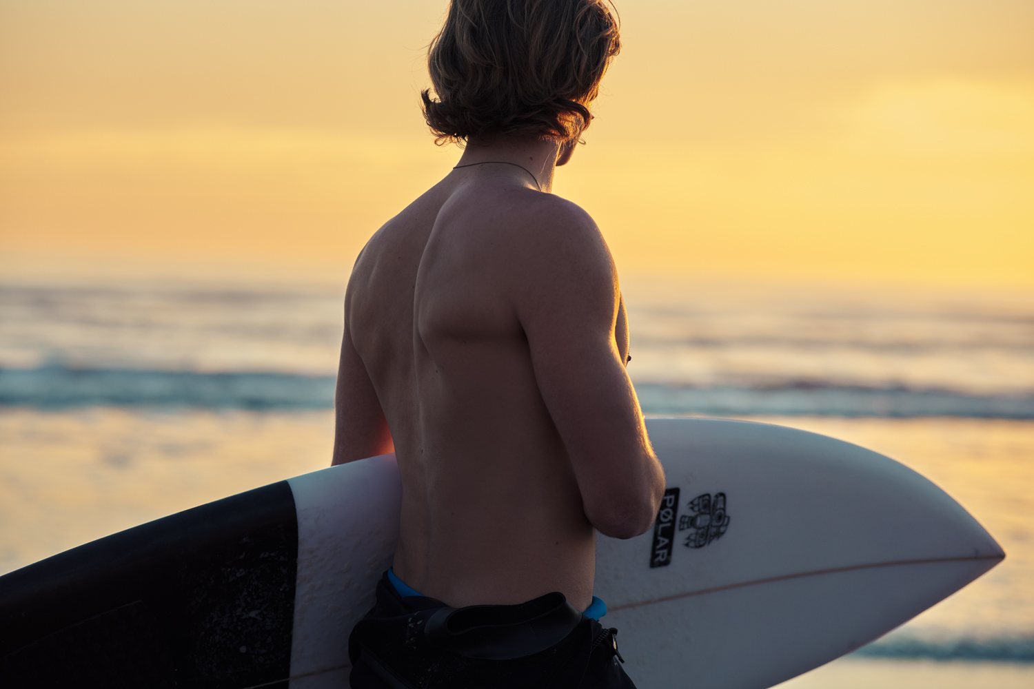
Brandon: I use Adobe Photoshop for my editing. I do a lot of work within Camera Raw, so I shoot in raw and then when I bring that image into Photoshop then I’ll do a lot of little tweaks in there. I’ll do a lot of work with selective color and dodging and burning and curves. After that, I’ll do minor tweaks on my phone, but I try to kind of have that image look how I like it to be on my desktop computer.
With iPhone editing apps, I like VSCO a lot. I know that kind of gives you some presets to play off of, which would be good for beginners that don’t know how to create their own curve tool or not really know what colors to play with. So they kind of give you that beginner’s essential, HSL sliders and whatnot, but on a nice easy-to-do level.
Regarding color theory, what colors would you suggest for a shoot in a forest, beach, and city setting?
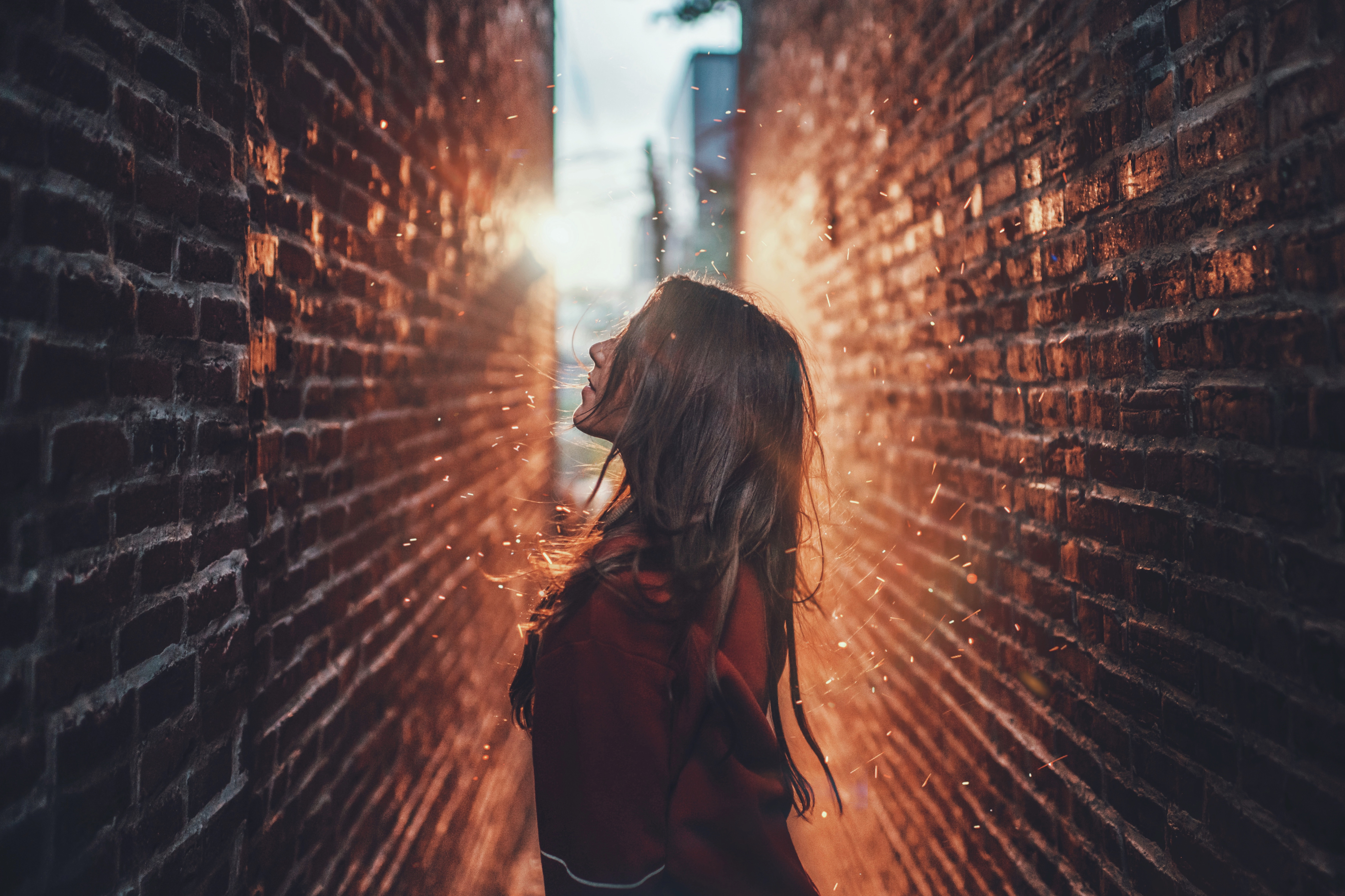
Dixie: Color theory is really interesting and I find that if you look at a color wheel, complementary colors really pop. They create really vibrant looks. So complimentary colors are basically across from each other on the color wheel. If you use that combination, it’s going to have a real cool vibrancy. For a forest, red and green is a really great look. So if you have a green backdrop you might think about putting your subject, if you’re shooting someone, in like a red or red tone, reddish tone, and it can be kind of a de-saturated red, but thinking about those complementary colors is really interesting and it kind of pops off the page.
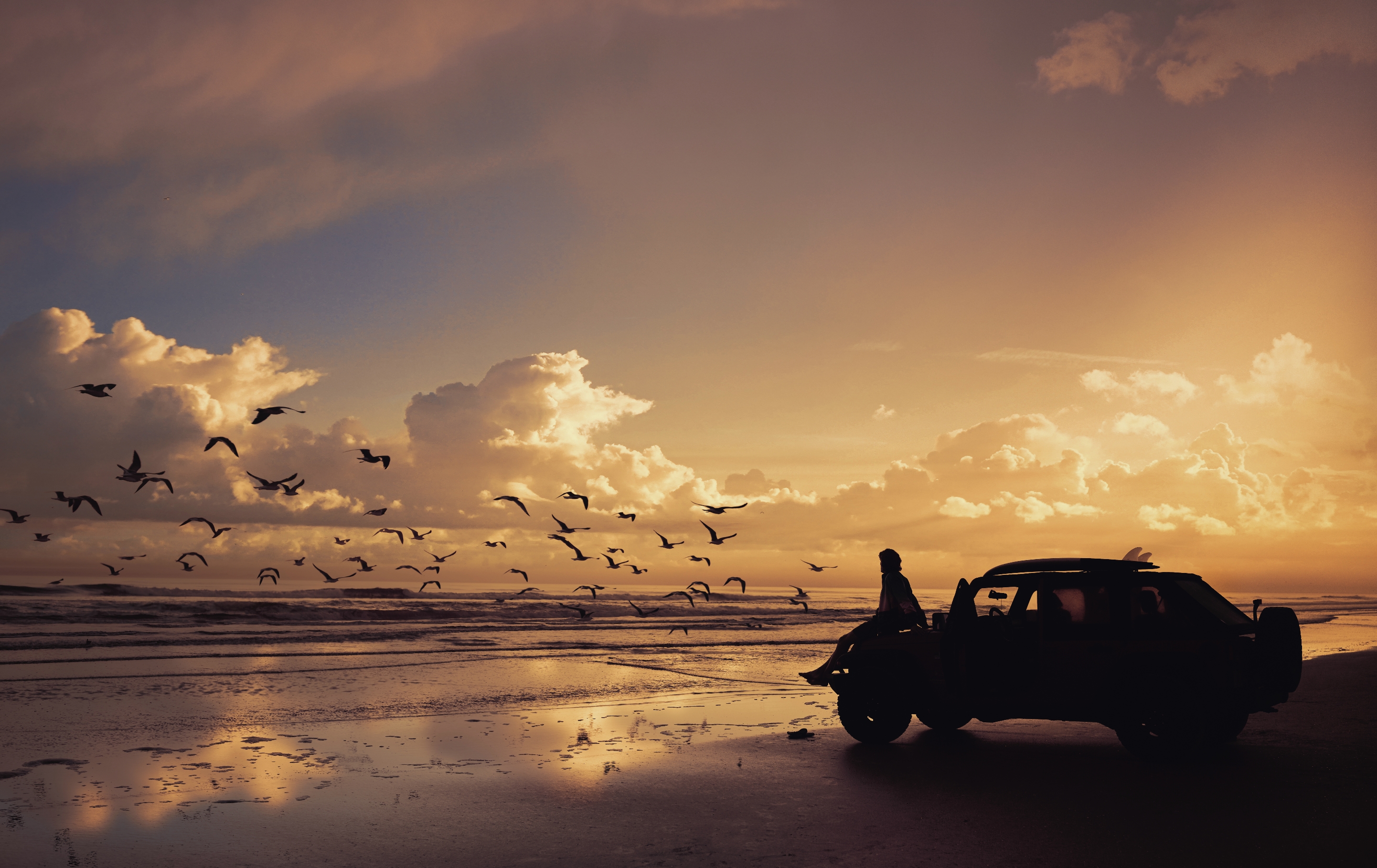
For the beach, you’ve got to go with the warm and the cool, like the real warm orangy tones with the bright blue. Sometimes turquoise tones is really neat. Love that look. And for the city, a lot of the stuff that I see taken in the city kind of has a neutral look that photographs really pretty with maybe like a pop of red or a pop of yellow.
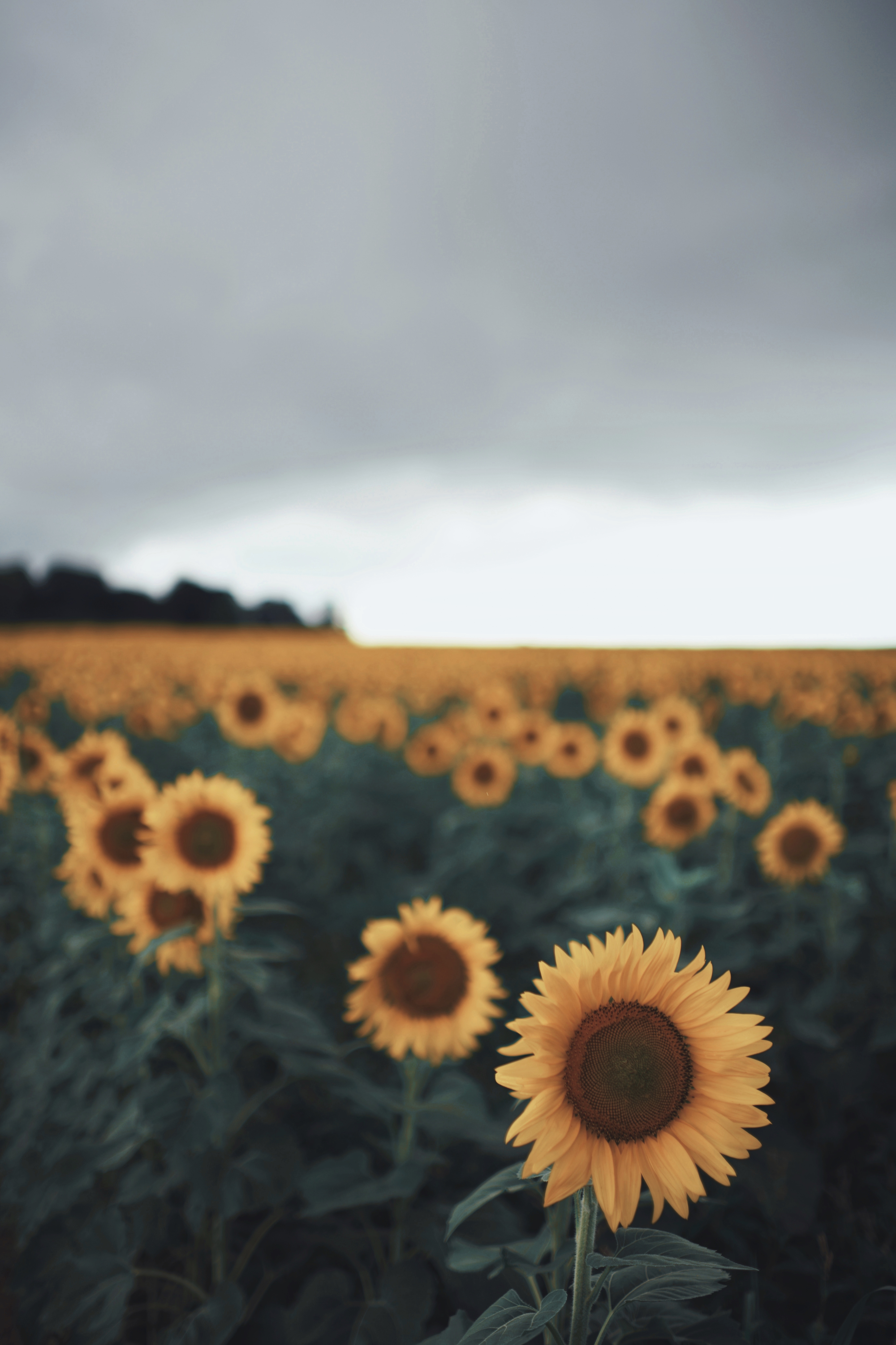
Brandon: So with forest scenes, I really like playing with whatever kind of nature I’m given. So I like shooting with a lot of greens… maybe you want to bring those greens to a more orangy tone or bring it to a blue tone. So I think using colors that compliment the greenery that you’re shooting. I’ve done some yellow pops of color with green but I’ve also done some oranges with green. So something that definitely compliments it but kind of playing with that juxtaposition of color within the edit is a lot of fun.
I kind of relate beach scenes to sunset. As I said, I don’t really go and shoot midday, I kind of like cotton candy colors when it comes to sunset.
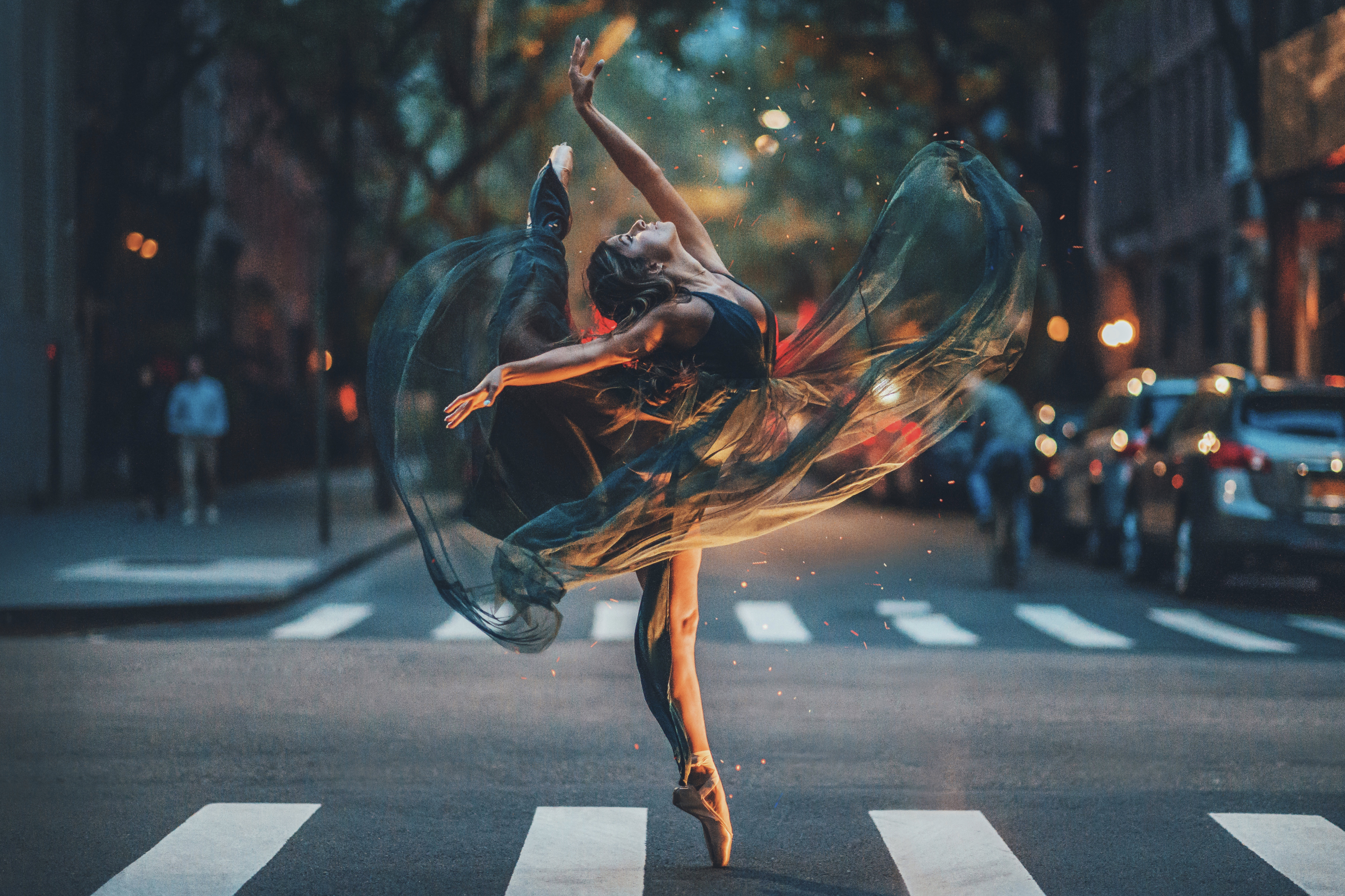
For city sets, since I do use a lower aperture, I like to get that city Bokeh effect in the back. It’s almost grayscale. So bringing colors into the subject or shooting or casting light onto the subject you’re shooting with different pops of color is super important for me. But if I’m thinking of a city, I’m thinking kind of grayscale and kind of using colors to pop and that can be kind of anything you want.
What are some basic composition tips?
Dixie: One of my favorites, especially for people that are wanting to create that sort of wanderlust kind of look, is small person, big scenery. Basically, the person’s really small and you have this really gorgeous scenery in the background. I think that’s a cool look. As far as composition, S curves are amazing, like windy roads. Anytime you’re out and about, you see a beautiful windy road, those S curves control the viewer’s eye when they look at your image. So if you want to look at a landscape and you see this windy road, your eye kind of follows that S curve.
Another composition tool is leading lines. So they’re kind of similar to S curves, but they might just be straight lines that end at the horizon that leads your eye throughout the photo. So looking for leading lines and triangles is a really good one. I use triangles a lot when photographing people. You know, having their body and their, I guess, their limbs create different triangles as they pose. So that’s another good one for people.
And then symmetry in photography is amazing. Also, using the rule of thirds is really a great basic composition tool… think about your photo as a grid, and place whoever it is you’re shooting in those lines.
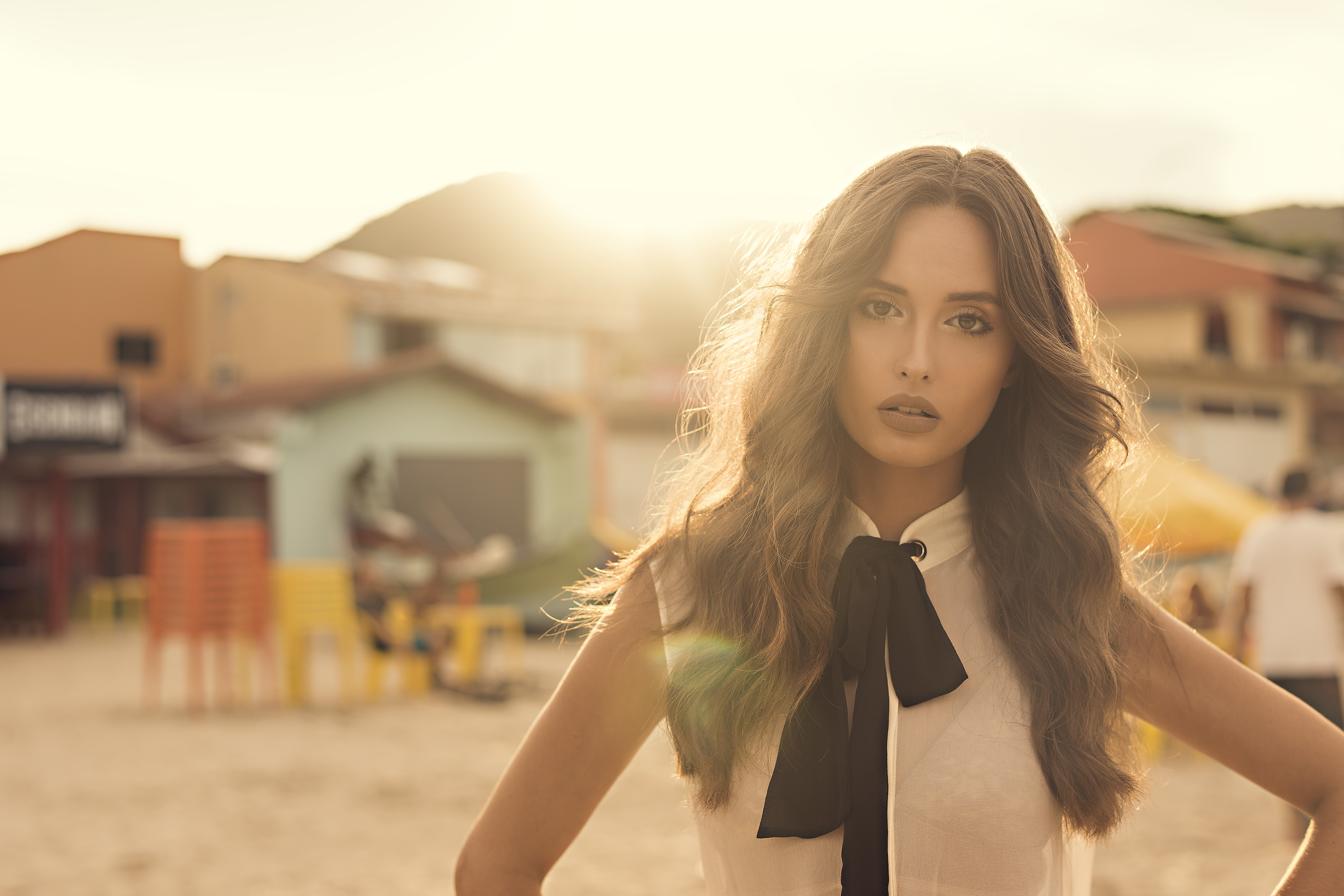
Brandon: I like to use a lot of different objects when I’m shooting. Whether that be a hallway or the doorway of a store. I’m someone who likes to center my subjects a lot. I’m just someone that likes to throw them in the middle and have different things that come into play, whether that be like nature and kind of having the subject interact with that. So for example, shooting in a greenhouse, maybe using that doorway of a greenhouse to kind of line up your subject nicely and have your subject play off different objects, interacting with what you’re given in the surroundings.
