VISIONARIES
COVERS
SHOWS
SHOWS
Sound Check
That One Video
The Bigger Picture
That Tracks
UPROXX Mics
Indiecast
How I Blew Up
Fresh Pair
UPROXX Sessions
MUSIC + CULTURE
MUSIC + CULTURE
HIPHOPDX
INDIE MIXTAPE
COUNTRY MIXTAPE
DIME MAGAZINE
FILM/TV
LIFE/TRAVEL
UPROXX STUDIOS
INSIGHTS
ABOUT
Privacy
Terms
Cookie Policy
COOKIES SETTINGS
…
23 Rap Lyrics That Reference LeBron James
THE ASSOCIATION
Six Of The Greatest NBA Player Cameos In Music Videos Of All Time
November 8, 2024
by:
Bill DiFilippo
The Biggest Celebrity Fan Of Every NBA Team
October 22, 2024
by:
Robby Kalland
and
Bill DiFilippo
ONE-ON-ONE
Stephen Curry On The Evolution Of His Style And Appreciation For The Art Of Fashion
November 21, 2024
by:
Robby Kalland
Sabrina Ionescu Is Staying The Course In Her Quest For Greatness
September 5, 2023
by:
Martin Rickman
The Latest
Shaboozey, Ludacris, And Cortis Are Headlining A Series Of 2026 NBA All-Star Weekend Concerts
December 18, 2025
by:
Derrick Rossignol
Clipse Will Be The First Musical Guests On Amazon’s NBA Postgame Show, ‘NBA Nightcap’
December 3, 2025
by:
Aaron Williams
Don’t Blame Megan Thee Stallion For Klay Thompson’s NBA Slump
November 13, 2025
by:
Aaron Williams
Anthony Edwards And Culture Jam Tell Another Side Of The Athlete’s Story With ‘Legend In My Hood’
October 30, 2025
by:
Aaron Williams
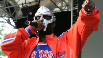
MF DOOM’s New Merch Drop Is A Love Letter To The New York Knicks
October 29, 2025
by:
Aaron Williams
Featured
LiAngelo Ball’s New Single Predicts The Future Of Rap, Which Sounds A Lot Like Its Past
by:
Aaron Williams
P-Lo Is Ready To Highlight The Bay Area’s Music At The 2025 NBA All-Star Game
by:
Bill DiFilippo
12 Songs That Show How Yao Ming Became A Staple In Rap Lyrics
by:
Robby Kalland
and
Bill DiFilippo
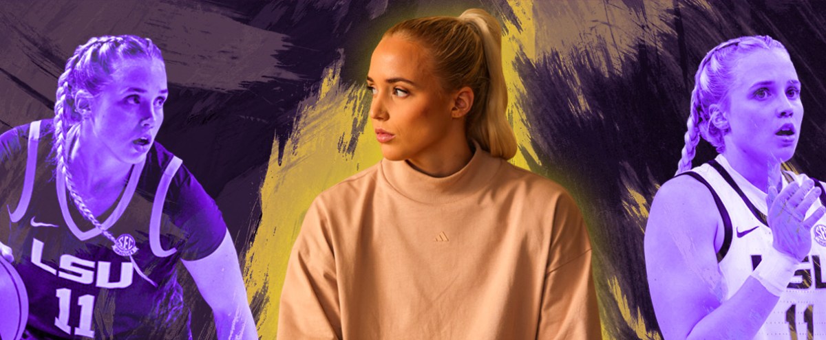
Rap Or Hoops, Flau’jae Johnson Knows How To Play The Game
by:
Jessica Toomer
The Biggest Celebrity Fan Of Every NBA Team
by:
Robby Kalland
and
Bill DiFilippo
23 Rap Lyrics That Reference LeBron James
by:
Bill DiFilippo
and
Robby Kalland
Six Of The Greatest NBA Player Cameos In Music Videos Of All Time
by:
Bill DiFilippo
Stephen Curry On The Evolution Of His Style And Appreciation For The Art Of Fashion
by:
Robby Kalland
The Bag: Hailey Van Lith Details Her Must-Haves On The Road For The NCAA Tournament
by:
Bill DiFilippo