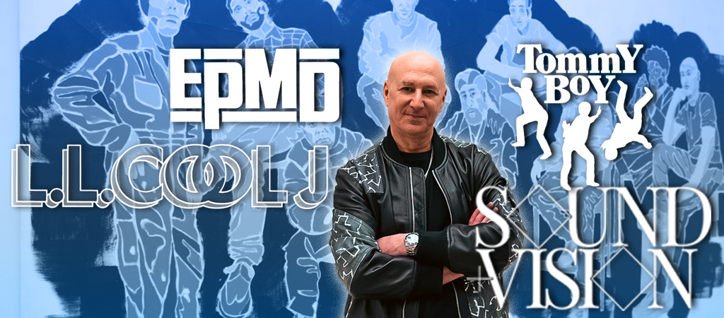
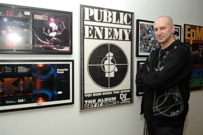
When it comes to the names that defined rap music in the 1980s, many are obvious: Public Enemy, LL Cool J, EPMD. But some names that are perhaps equally important, yet not often as easily recognizable, are those of the unsung heroes who helped make those names the legends they are today. That includes graphic designer and art director Eric Haze, who perhaps literally helped make those names and others legendary with his distinctive logos and art direction. Long before tablets and smartphones let designers build projects in the palms of their hands, Haze made a name for himself with the tools of the trade he honed bombing graffiti on New York City subway cars and attending the School of Visual Arts.
He’s since applied those skills on designing memorable album covers for the Beastie Boys and LL Cool J, iconic logos for the likes of EPMD and Tommy Boy Records, and more recently, updating the branding for Blink-182 — which he also did, once upon a time, for Public Enemy, in a story that has since been garbled. He set the record straight in an expansive Zoom call with me to discuss his Uproxx Sound + Vision Awards Lifetime Achievement Award, as well as telling some of his favorite stories behind these iconic designs and his first-of-its-kind installation at The Sphere in Las Vegas. If you didn’t know Haze before, it’s time to get familiar with him and his 45-year mission to bring hip-hop sensibilities to the world of design.
We’re here to talk about some of your most iconic logo work, design work, and you have so much of it. I’m almost tempted to ask you where do you want to start, but I know where I want to start. So we’re going to start with my favorite logo, which is the EPMD logo
Truth is, when asked, I always say that I do not play favorites with my work and my logos. They’re all my children. I try and love them equally, but EPMD is the one. To me, EPMD is the one, and it’s the one for a handful of reasons, mostly because it was from scratch off the dome. That’s not a typeset, that’s not typeface. It’s been reinterpreted by a handful of other designers after me. If you look at some of the later album covers, people tried to recreate it with typefaces and it ain’t it.
I always looked at Run-D.M.C. as the quintessential hip-hop logo, and EPMD really represented me saying, “How do I take that foundational vibe, look, strength, oldness, and push it to another level, and perhaps, ideally, a more original and unique way?”
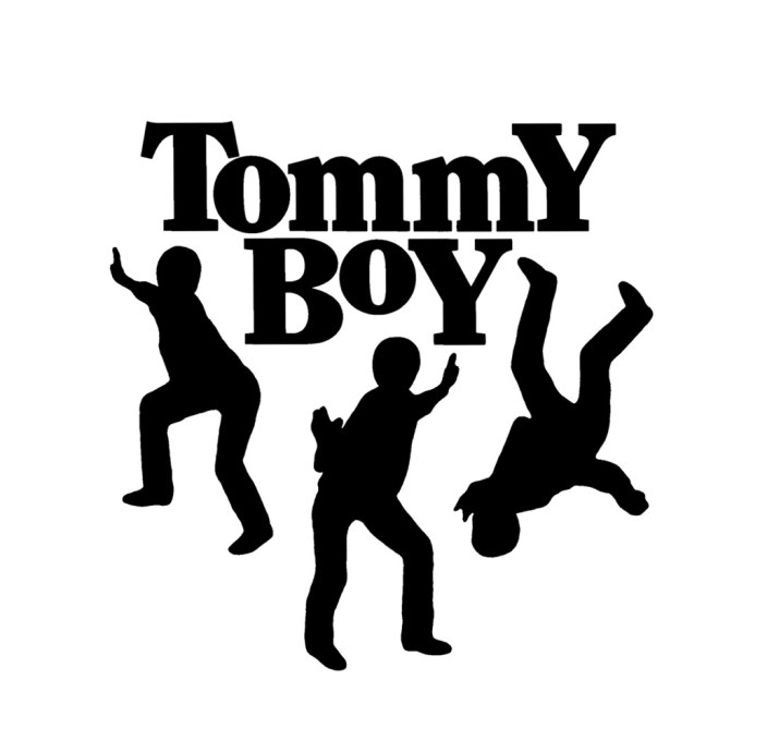
Obviously, this next one is very near and dear to my heart. As much as this organization has been a frustration to hip-hop fans for the last several decades, that Tommy Boy logo is untouchable. You could take any particular element out of it and you would know it was Tommy Boy.
Tommy Boy was one of the last logos I did prior to the Macintosh and having my own desktop tools to create typesetting. So the actual typography was still created on what was then an IBM Linatronic typesetting. So typesetting was still IBM based. That said, it was also one of the last significant pieces of identity design I did in New York before pulling the plug and moving to California.
So Tommy Boy was ’89, ’90, and there’s some interesting backstories, which is that Tommy Silverman himself reached out to me, and in all fairness, I redesigned and updated the logo from the wimpy press type version that had predated me. There was a Tommy Boy logo with three dancers. If you go back and look at the early 12-inch sleeves or iterations of it, it’s all press type. But the characters all had afros and bell-bottoms, and they were straight press type physical characters. So I re-imagined the typography and the lettering and the central identity of the type itself. And then I set about hand tailoring the characters to not being so dated. I think I spun them in different directions and placed them differently. So again, in all fairness to history, I was handed a deflated ball and I pumped some air back into it.
The other thing that’s very significant in my evolution was up to that point, again, everything was sort of, you didn’t have the kind of one-stop shopping and command over everything that Mac eventually gave you in the nineties. I had to send out to one source for type setting. I had to send out photo stats, and it was a physical process. When I delivered it to Tommy himself, he said to me, “Look, great job. I’m happy with the result, but I want to pull your card on something, which is that you’re charging me for your time, not just the result. Clearly, there’s a type setting bill, you’re charging me for the effort it takes to get the result. Well, the good news and the bad news is the computer is about to eliminate and explode the notion of time and you will no longer be able to charge for your time, just the results that the computer will allow in a more efficient way. So I advise you to get with the computer before the world passes you by.”
I did not own a Mac yet, and I took it to heart, and he was absolutely right. It was a year or two later when I arrived in California that I got my Quadra 700 and set about trying to do in Quark [QuarkXPress desktop publishing software] and the clunky-type suitcases, what I had done the hard way prior to the Mac. So it was that bit of advice that suited me well at that era of transition.
I could talk about this all day, trust me. Let’s talk about LL. LL Cool J.
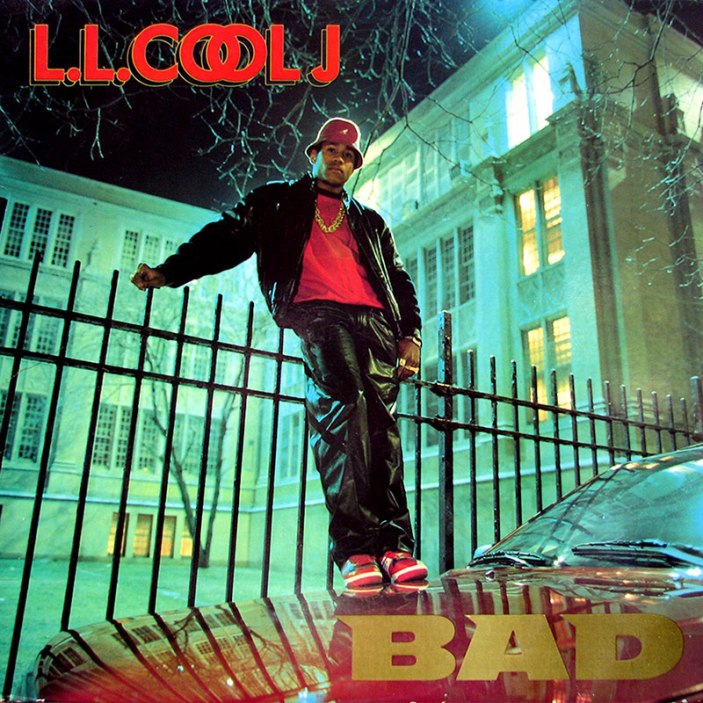
If EPMD was pushing a pre-existing thing, pushing the envelope of trying to build on something that I felt was strong already, LL was a much different scenario. And it predated EPMD by a year, if not more. The Bigger And Deffer album cover wasn’t my first album cover, but it was the first one I was given total autonomy for — where I was the art director and the designer, and responsible start to finish for delivering it, from meeting with LL to delivering it to CBS. The most key thing about that, that is so obvious I barely have to say it, was that I don’t even know if it was called “hip-hop” yet, it was just rap music. And rap music had made its bones and set its foundation on sampling.
Rap music was the true post-modern essence of “reappropriation to recontextualize.” And through that process to where we once were outsiders throwing stones at the castle, now we were incorporating the machinery and methodology of the power structure to shift the power structure and take some of these things back home with us.
LL was the first true high-level embodiment of my desire to find a visual parallel to what I understood happening on a sonic level.
So yes, the LL Cool J logo had beg, borrow, and stole from the Cool Cigarettes logo, which was a hood staple — but most importantly, I was trying to put under the light the notion that there could be a visual sampling that complemented the audio sampling. LL was the first big league opportunity I had to apply that in the market, the real world, and on cultural capital that was bigger than either LL or myself individually.
I wonder if you said this particular train of thought to him at any point. Because if you did, that would explain LL’s iconic Gap FUBU commercial. Because that’s a moment that defined my generation’s attitude towards all this. Like, get in and make them do things our way, instead of trying to prove ourselves to them. Walk in the front and kick open the back door for the homies.
Well, I’ll share one of my most magic hip-hop moments, which I know I told (Uproxx co-founder) Jarret (Myer) and these guys. When LL first came to my studio, we didn’t know each other, but he knew I was a graffiti artist. He said, “Come on Haze, I know you could hook up some dope graffiti shit.” And my response was, “Come on, L, this ain’t a breakbeats album, we got to come harder than that.” That was the low-hanging fruit of hip-hop. I was on a personal mission as a typographer and logo designer to show and prove I could reinvent the wheel in a more sophisticated, site-specific fashion. But when I first put the album cover in front of him and Def Jam, when I swiped it from CBS drawer, he gave me the ultimate hip-hop compliment I’ve ever gotten in my life, which was, “Yo, this looks like getting paid, son.”
So Jarret’s going to kill me if I don’t ask about it, because he was like, this is a chance to clear it up. You know exactly where this was going.
Real simple, and I always go out of my way to say this. I’ve never once in my life taken credit for the original design of the PE logo. It was my first album cover art direction. And I met with Glenn and the group, Chuck gave me his original loose sketch of the logo. I had a proof sheet, photographs. From there, I was the art director. I chose and cropped the photo and I typeset the logo. I took Chuck’s rough sketch and great idea, and I executed it in a professional fashion.
I cleaned up the target and the guy, and I had the military typeset again on IBM Linatronic. I still have the type galley with Public Enemy on it, dated, client, Eric, 1987. However, I have been miscredited with the design of the logo throughout my own career. I have never had a conversation with Chuck about it. I’m sure he probably thinks that I have claimed something that I didn’t. His original design is in the Smithsonian.
And that’s not worth unpacking at an award ceremony, that’s just for you and me. The truth, the punctuation I will give to that, is that you’ve never heard me talk about the Public Enemy logo in the last 30 years. It’s not in my portfolio, it’s not on my website. I have erred to the side of caution, taking no credit for something I had a lot to do with to avoid any controversy. Because, frankly, I have enough feathers in my cap to wear at any given time, even without the Public Enemy logo.
Let’s get into something a little more recent. You redesigned the Blink-182 logo.
I did. You know what? Travis called me up last year and said, “Yo, will you do our album cover? I just want your shit, man. I want your unfiltered hand style, no frills, no bells and whistles, just the basic.”
So for a long time I considered being an art director my primary function. I’m a designer, but I’m an art director. You come to me to help you build your identity for your project and your market. It’s not fundamentally about me. I may get some fingerprints and I may get off on it somehow, but the gig isn’t about me. The gig is servicing your identity. When the Beastie Boys’ Check Your Head was all you’d see on bumper stickers and shit, and it put my handwriting on the map. People would ask me all the time, “Yo, can you do it in Beastie Boy style?” And I’d say, “No.” Why would I play my client myself by repeating myself?
It was only the last 10 or so years that my studio manager and I said, “Wait a minute. You know what? Not only was it so long ago in time now that’s a pointless sentiment, but you know what? Actually, this is my style. This is my hand lettering that I blessed them with.” And I’m not the art director anymore, trying to be everything to everyone and switch it up every time. Now, I’m an artist who does that stuff, but this is my core style. And if people are coming to me for my core style, that’s great. Let’s lean into it and stand on it. Instead of feeling like it’s some antiquated shit we can’t revisit.
Once I hit that switch and I was like, “Yo, we use it for my brand. If that’s what you want for your brand. Everybody knows where it comes from. And it’s my signifier. It’s not their signifier.” So we’ve been doing that for my brand and our collabos and product and Haze brand for long enough that when Travis said, “Yo, I want the Beastie Boys style.” We were like, “Bet. You want my style. You got it. Frankly, I charge a hell of a lot more than I did 30 years ago now too. And what felt like a choice and and effort to make it look that way in the Check Your Head era in 91. 30 years later it’s just my natural handstyle, which I can do standing on my head nowadays.”
I guess I will qualify it with this, which is that I wouldn’t have done it if it wasn’t going to be an A league banger.I’m not going to play myself by adding my magic dust to a throw away meal that nobody is going to eat. I know Blink 182, motherfuckers are going to eat it up, we’re going to knock this out the park, and I just play my position and hope for the best. I guess what I’m saying is: the Travis Barker thing is at a stage that feels much different to me, where I am doing these things because they’re a great fit. I’m working with people I like and respect, who like and respect me, and we’re both bringing something to the table. So the whole is greater than the sum of the parts. It’s the same job, but it’s a collaboration now. It’s not a service.
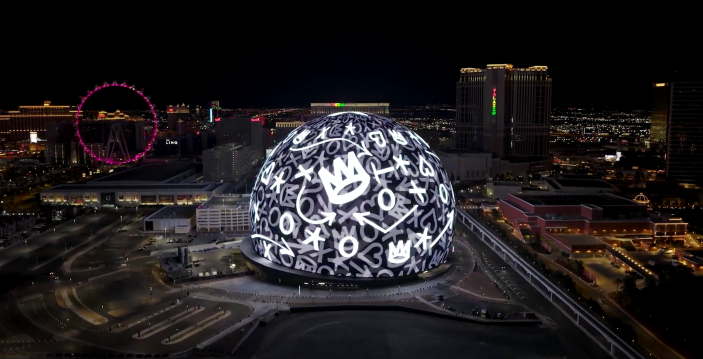
Then of course you get to do your thing on probably the biggest canvas any graffiti artist has ever had. Las Vegas, baby. The Sphere. So what does that mean to you as an artist, as the representative of a brand, as a culmination of 30 years of professional building to have something that nobody else would even have had this opportunity for?
First of all, yes, you were right. It takes 45 years to be able to knock something out in 45 seconds. It’s what I always call a shooter’s mentality. “Give me the ball, coach. Put me in, give me the ball. I want to take the shot.” But the fact is, if you’re not practicing that shot for 10 years before, nobody’s going to even throw you the ball, let alone allow you to take the shot. I got thrown the ball to take the shot. And to your point, it must say something about where I’ve arrived at that somebody like that gives me the first shot.
I got a call sitting in bed on New Year’s Day asking me if I was up for The Sphere, delivering it in six days. New format, new medium, new technology, new clients, working with a programmer, needing NFL approval. And I leaned away. I was like, my first instinct was, “You know what? I don’t even know what I’m getting into here, and I’m not sure I want to start the first morning of the first day of the year with my pants on fire for this.” My assistant was like, “Yo, you don’t fucking get it. This is huge.” And I was traveling and all this stuff, and I was like, “You know what? Fuck it, let’s do it. Let’s just make sure we don’t embarrass ourselves here in this new medium, but we’re taking the gig.”
And we worked flat on a flat screen with programmers. It never looked right to me. I kept saying every day, “Yo, it’s flat. It needs more layers, it needs more depth, it needs more motion.” I had something in my head. And all I kept hearing was like, “Yeah, well, we will do that. You’ll see that next time and you’ll see that next.” And I swear, 48 hours before it went live, I wasn’t happy with it.
Faith in the unknown is one of my gifts. It came together and I was beyond pleasantly surprised. To be honest, I just didn’t want to drop the ball. I wasn’t focusing on setting the world on fire. And I got more love and likes and response from that than I got from the US ski team. I did the Beijing Olympics. My hand style and brand logo were on Olympic uniforms, on worldwide TV. That felt like a much bigger moment for me personally than doing a programmed tech piece in Vegas, but clearly our work on The Sphere hit some current zeitgeist on the nose at the time.
Obviously, my last question that I love to ask, this is my favorite thing to do every time, because as a journalist, I know I got to ask artists of all stripes, the same questions that they hear all the time. They got to tell the same stories. You got to answer all the same questions. So my thing is I like to go, if you had a question, if you got to be the one making up the questions, if there was something you wanted to hear you talk about that you never get to talk about, that is way more interesting to you than any of things anybody’s ever asked you, what would that thing be? What would you want to talk about?
I would want to talk about how coming from the mean streets of New York that I grew up on, and the culture of graffiti and hip-hop that I grew up on, we were never taught to play nice in the sandbox. And that generosity of spirit was something that came to me late in life. What I came to understand was that I spent 50 years focused on being a great artist and chasing the word “yes,” and I had an awakening in my 50s. I got married when I was 50 and finally had a spiritual center and a partner, and a home, and an ability to start looking at myself and deciding that the icing on the cake of being a great artist was to be a great human being too.
I began focusing on being a better person and unpacking the parts of myself or my habits or my mentality or my character that, you know what? It wasn’t too late to change if I didn’t like them or if there was plenty of room for improvement. That just because I had become an arguably great artist, didn’t mean that there wasn’t still a lot of room for improvement as a human being. And once I had that revelation and also realized that when you build a brand, you’re also building an island.
I started to understand that people’s perception of my success created distance and that it was on me to close the distance, not on them. That yes, I had built a great island called Haze, but that I wanted to make sure that everybody knew they were welcome on my island and that I hope they invited me to theirs too. And that sentiment of generosity and connectivity was what allowed me to take my whole shit to another level as an artist brand and human being, hand-in-hand.

