The Utah Jazz could look like a very different team next season, with coach Quin Snyder resigning and rumors swirling about the potential for trades sending Rudy Gobert out of town to shake things up around Donovan Mitchell after another first round exit.
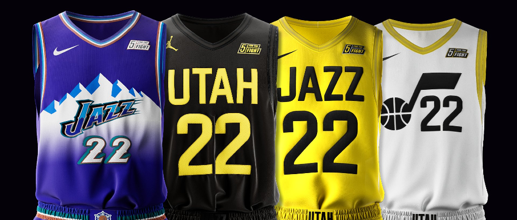
While we wait to find out how different the roster looks, the team unveiled a new design aesthetic for the upcoming season. Gone is the blue, green, and yellow look they’ve worn in recent years and in its place is a highlighter yellow and black that, well, isn’t great. There is some good news, as their beloved purple unis from their best years as a franchise in the 90s are back, but those terrific threads really make it clear just how miserably sterile and bad the other ones are.
Sixx in the new threads 👀
Preorder yours from the @jazzteamstore now: https://t.co/cGJx4P8afB pic.twitter.com/iMoexNgwFr
— Utah Jazz (@utahjazz) June 17, 2022
Along with the new uniforms are new court designs for the upcoming season, with the purple court once again making the regular court look dreadfully plain and uninspired.
Well, the new Jazz jerseys and court designs are out. Thoughts? pic.twitter.com/EMEK8CPrpD
— tribjazz (@tribjazz) June 17, 2022
The Jazz redesign comes on the heels of the Philadelphia Eagles announcing a similar change to a “modern” design with their wordmark, which is apparently a fancy way of saying you are creating a design without any character. Bland font and a uniform design with absolutely nothing unique or fun about it is certainly a choice you can make as an organization. They look like the uniforms you’d see in a video game or movie that couldn’t afford to get actual licensing from the NBA. Maybe Jazz fans will feel differently, but I’d venture a guess that the purple unis will far outsell any of the other looks and hopefully that’ll push the team to make tweaks in the future to bring some life to the white, black, and yellow set.
This is also where I’ll note that it is interesting that the person they chose to model these new uniforms is Jordan Clarkson and not Donovan Mitchell. Probably nothing, but it was noticeable.


