With Iron Maiden’s 16th studio album, The Book Of Souls out Friday, this seems like a good time to look back on the band’s many incredible album covers. Few bands ever have been more dedicated to creating iconic cover art. Maiden’s covers, featuring their immortal mascot Eddie, have been frightening eighth-grade metalheads for decades. With that in mind, we’re ranking every Maiden studio album cover from worst to best. Before we get started, let’s remember two key things:
- We’re strictly talking about the cover, not the quality of the album.
- I argued with myself a ton about these rankings, and will probably re-arrange them in my head several times after this.
Okay, now that’s settled, let’s begin sorting this out.
16. Virtual XI (1998)
This one is just way too messy. First off, the logo looks super awkward with the way they try to fit it into the color scheme. More importantly, Eddie looks too silly to be genuinely frightening here. It’s like he’s Krusty The Klown’s skeleton. In an amusing coincidence, Iron Maiden’s worst studio album also featured their worst cover art.
15. Fear Of The Dark (1992)
WHY IS THE LOGO SIDEWAYS
WHY IS THE LOGO SIDEWAYS
WHY IS THE LOGO SIDEWAYS
WHY IS THE LOGO SIDEWAYS
WHY IS THE LOGO SIDEWAYS
14. The Book Of Souls (2015)
The case for the cover art of Maiden’s latest release is that Eddie looks more frightening (and more detailed) than he has in quite some time. The case against it? It’s just him against a black background, so it’s not as vibrant or eye-catching as Maiden’s most memorable covers.
13. The X Factor (1995)
The title of this one was supposed to be a play on words, because it was their 10th album (Roman numerals, get it), but little do they know that this album would share a title with a singing reality show that stood for everything heavy metal doesn’t stand for. As for the actual cover, I prefer Cartoon Eddie over Realistic Eddie any day. Plus, it kind of looks like a still from a cut scene in a game from the original PlayStation; impressive for its time, nothing special now.
12. Dance Of Death (2003)
Having Eddie pose as the grim reaper is a great idea in concept, but it gets botched here because you can barely see his face, and in general, there’s just too much going on in the image for us to know what we’re supposed to focus on. As with The X Factor, this was an attempt to have Maiden’s artwork look more realistic by putting it in 3-D, but ultimately, it looked more cartoonish than ever.
11. A Matter Of Life And Death (2006)
This cover certainly fits the concept of the record. A Matter Of Life Death spoke about the horrors of war quite candidly, particularly on tracks like “These Colors Don’t Run,” and “Brighter Than A Thousand Suns.” With that in mind, the image of skeletons fighting on in a hopeless battle (led by Eddie, of course) was a suitably jarring image for this release.
10. Brave New World (2000)
This was Maiden’s big comeback effort, when Bruce Dickinson returned to the band after two albums with Blaze Bayley on vocals (The X Factor and Virtual XI) were largely panned by critics. The album – or at least its title track – is inspired by the Aldous Huxley novel of the same name, and the cover is certainly appropriate. A vibrant, thriving metropolis is haunted by the image of Eddie staring at them from the clouds, likely about to wreak a terrible vengeance on their Utopian society.
9. Piece Of Mind (1983)
Okay, I know this is one of Maiden’s best loved albums, but is the cover art really all that impressive? I mean, it’s just an image of Eddie in a straitjacket, and it doesn’t tie into the theme of the record at all. This cover probably brings back a lot of pleasant memories of high school for many people (myself included), but the band has given us far better efforts in the artwork department.
8. Powerslave (1984)
For some reason, seeing the logo in such a small font just doesn’t work for me, when it goes against the tradition of every other album the band made. Still, it’s undoubtedly a solid cover, and I’m guessing people will be surprised I didn’t rank it higher. This glorious monument to Eddie can’t help but remind me of the Futurama episode where Bender becomes Pharoah of a society remarkably similar to ancient Egypt, and demands they build an enormous statue of him that reaches all the way into outer space. That statue was destroyed at the end of the episode, but this society will remember Eddie forever.
7. Seventh Son Of A Seventh Son (1988)
When you’re creating a metal album cover, disturbing imagery is undoubtedly a plus, and this has to be the most unsettling cover Maiden ever came out with. Skeletal Eddie is holding his own entrails while his head is on fire! How did we get here? I can’t help but think we’re better off not knowing.
6. The Number Of The Beast (1982)
Probably Maiden’s most famous album cover, as well as their most famous album. It’s certainly not a bad cover, but I can’t help but see it as a bit overrated. Sure, Eddie looks great, but doesn’t that devil just look a bit silly to you? For an album that gave us the immortal chant “666!/The number of the beast!” shouldn’t Satan look a bit more threatening, and less like something out of a children’s cartoon?
5. The Final Frontier (2010)
The best cover art for any late-period Maiden release, and it’s not remotely close. I’m sure plenty of people will be surprised – and likely angry – that I ranked this over the iconic cover for The Number Of The Beast, along with a few other considerably more famous ones. But while that cover is undoubtedly more iconic, this one is far more visually impressive, depicting a futuristic hellscape in which a highly evolved Eddie is stronger and more powerful than ever. Had this cover been released during the band’s prime, it would be remembered as one of the best heavy-metal album covers of all-time.
4. No Prayer For The Dying (1990)
I ranked this ahead of some all-time classics, and I certainly expect that to take a few people off-guard, but here’s the thing: This is a so-so album with an absolutely incredible cover. People remember it as the album where Bruce Dickinson’s voice got kind of raspy, and the questionable “Bring Your Daughter….To The Slaughter” appeared, which is probably the dumbest song in Iron Maiden’s history. Hopefully, though, no matter what your thoughts on the album are, you can appreciate this visually striking – and downright frightening – cover.
3. Killers (1981)
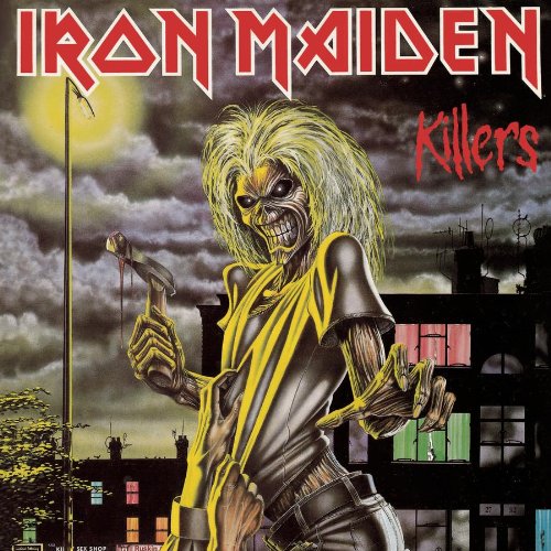
I thought about ranking this one a bit lower because it’s so similar to their first album (more on that in a bit), but ultimately, this image is just too badass for it not to make the top three. One can’t help but think Eddie and his hammer were responsible for a few “Murders In The Rue Morgue.”
2. Somewhere In Time (1986)
Considering how long Maiden has lasted, it’s odd to think they were being nostalgic as far back as 1986, but the Somewhere In Time cover, which featured a Cyborg Eddie on the cover, was a reflection on everything the band had done up to that point (it fit in perfectly with the lead single, “Wasted Years”). Fittingly, many references to the band’s past are scattered throughout. Most notably, on the back cover, a clock is revealed to read 23:58, a clever reference to the famous Powerslave track “2 Minutes To Midnight.” This was a brilliant way of referencing Maiden’s past, and one can only wonder what it would like if they attempted a similar cover now, with so much more history behind them.
1. Iron Maiden (1980)
For all the incredible album covers Maiden have given us over the years, they’ve never quite been able to top the image that first introduced us to the band, and to Eddie. His glowing red eyes staring you down, and the look of murderous rage on his face was the exact type of menace the band needed to show the world exactly what they were about.


