This week in posters begins this week with Michael F. Assbender in Assassin’s Creed, which looks pretty much like the artwork for the video game, which is probably smart, considering the art for the game was good enough that even a non-gamer like me remembers it. Anyway, it’s a fine poster, but I hope they paid Fassbender a lot for this, because Jesus Christ, man, you’re a two-time Oscar nominee. Now you’re doing Creed poses on top of a building wearing a leather dress? The world has plenty of Vin Diesels for this kind of thing. This is like using a Ferrari to tow a U-Haul trailer.
Here’s a clever poster for Nate Parker’s The Birth of a Nation, a Nat Turner biopic which received a standing ovation at Sundance. Not to be confused with the other Birth of a Nation. I realize using the same name was deliberate but… why? It’s still annoying. Anyway, how much you want to bet the original plan was to have the white people be the white stripes in the graphic? Then the graphic designer tried it and it just looked like a blue square with a bunch of grey gobbledy gook. That’s how I imagine it went down.
This is a documentary? Did someone secretly film the noon-3 pm portion of my post-blackout hangovers, during which I reevaluate my entire life and silently vow to make some big changes as soon as I can hold down solid food? Because that’s what it looks like. That being said, I don’t know what the black things are. Are they strings or has someone scrubbed the eyes out with a marker? Doesn’t really matter, I suppose.
This poster is for Cell, in case you can’t read Russian. Is it just me, or are they dressed too nicely for a post-apocalyptic movie? It looks like they just stepped out of a dad clothes catalog. “Two dads were out for a nice stroll… when all of a sudden, the zombies came. This Summer. Sam Jackson and John Cusack are… The Walking Dad.”
I saw this movie at SXSW and loved it, but God forbid they use one of my quotes in the poster. Is it because I occasionally use the word “cum” in my reviews? Yeah, probably. Anyway, the movie is about an improv troupe, and the poster looks exactly like the kind of “silly” group picture improv troupes take after shows, so that makes sense. If an improv troupe ever goes rogue and tries to kill you, the best way to escape would be to distract them with a photo booth. Make sure it’s filled with props. They’d be occupied for hours.
Here’s the first of a series of new Finding Dory posters. After the last batch of posters I pointed out that the character design for a lot of the characters looked pretty lame, with the exception of the octopus. And now this new batch is all focused on the octopus character. Coincidence? I hope this just means the octopus is a major character. I’m always in the mood for scheming octopi.
It looks like Pixar was heavily influenced by the viral video of the octopus climbing out of the tide pool and carrying the crab across land. Makes sense. Octopi are both intriguing and kind of terrifying.
Anyone see this and immediately think of This Boy’s Life? That was also a true story.
Oh hey would you look at that, another movie none of my glowing quotes were good enough for! Well sucks to you too, jerks. There’s also no way I would’ve known the middle person was Sam Neill if I hadn’t seen it. What are they supposed to be looking at here? The sun? That’s dangerous. Their own pull quotes? That’s vain. Also, the boar is the movie for like 25 seconds. False advertising.
As I like to say, choosing your horror movie plot is often a choice between haunted house and creepy little kid. Here, they chose a mine as the setting for the creepy little kid. Innovation!
Is this a narrative feature? A documentary? Why does it only advertise the music? Also, I’m never going to be able to see Machine Gun Kelly’s name without thinking about his outfit at the MTV Movie Awards last year:
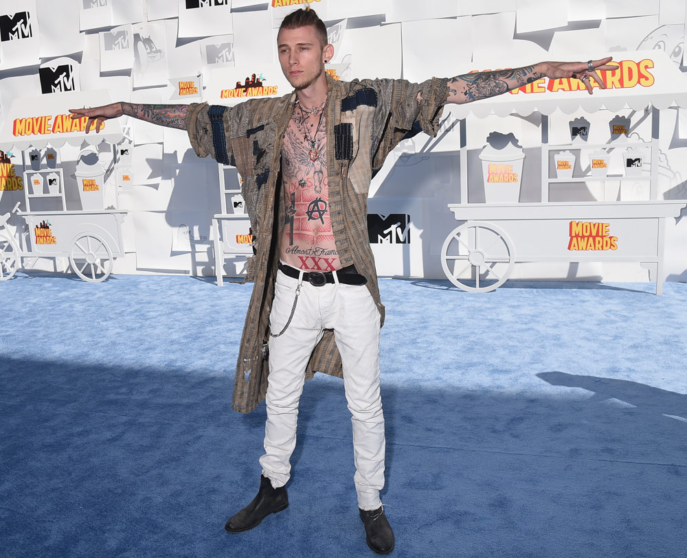
He looked like Hansel from Zoolander auditioning for Game of Thrones.
Hoo boy. This might be the worst poster of the week. Aside from the fact that it doesn’t give me the slightest idea what this is about, it’s like they deliberately mismatched the names and faces. Do they do this on purpose, like they don’t want to patronize us by assuming we don’t know which is which? Imagine if they did that with the placards at the U.N.
I know this movie isn’t about cougars, but now I really want to see a movie about cougars. Cougars are cool.
Here’s another poster for Refn’s The Neon Demon. It’s so decadent! It looks like studio 54 meets a VHS logo from the ’80s. No idea what it’s about, don’t really care.
“His life just got put on paws.”
That tagline is so perfect I almost forgive Nine Lives for being the dumbest movie I’ve ever heard of. This movie would’ve killed in 1990.
It’s almost creepy how effortlessly Andy Samberg can evoke Justin Bieber. Or is that simply because Justin Bieber is an empty vessel created out of tooly fashion victim styling trends? Probably the second one.
What number Purge is this? Has to be like five by now, right? /checks IMDb //okay, it’s the third. I was close. Remember how I said American flag imagery had become completely useless as symbolism? Yeah.
I’ve never seen one of these movies. I could never make the connection between “crime is legal for one day a year” and a trailer full of people in creepy masks. I still can’t. And is this one called “election year” because… the people are wearing creepy political masks this time? And because it’s being released during election year? It’s probably best not to overthink this. That is probably exactly the reason it’s called Election Year.
“Purge for the power.” Do you think the person who wrote the tagline for this knows anything about the movie or has ever seen one? Having been a copywriter, that sounds like something I would’ve come up with when I didn’t care enough about whatever I was working on to do any research. “Here are 50 taglines of less than a sentence that sort of sound like something. Let me know if none of these work, I’ll be at lunch.”
Be honest, is this a movie or just a Slipknot concert video?
Okay, the last one was a little over the top, but now I’m positive the person wearing this mask wouldn’t be able to see out of it. Is this whole movie just people in over stylized masks they can’t see out of hacking blindly at each other with machetes? Because I would watch that. It sounds like a Jackass bit.
This looks like what the gang of ex-presidents in the Point Break should’ve worn.
I’ve been imagining Papa Roach playing in the background of all of these.
I like to think they used white silhouettes of the actors because I don’t know who either of them are. I kid. This evokes “globetrotting adventure” really well. It kind of looks like some Christian rock knock off of Indiana Jones.
Hmm, I’m not sure I understand the symbolism.
Who is the lady in the middle? Is this Star Trek Vs. Kiss? I’d watch that. Kiss is the scourge of the universe.
I really like what they did with the Enterprise here — a diagonal line that makes sense, hooray! — but the 3D font looks like MS Word clip art.
In case you didn’t know what I meant by “a diagonal line that makes sense” in the last poster, here’s what it looks like when they just tilt the horizon line sideways with no explanation because they think diagonal lines look cool. It looks like I’m about to watch a movie shot on broken tripods. Also, that Megan Fox pose is just exquisite. It’s the closest they could get to having her butt and boobs on the same side of her body. If only they could highlight all the sex parts of the woman and throw out the rest.
So is it called “Fever” or “Tulip Fever?” Make up your minds. Apparently it’s called Tulip Fever, though to be honest, I looked at this poster, downloaded it, uploaded it, and scrolled through half a post before I even registered what the name was. I like that they thought, “Gee, how can we sell this movie about historical flower mania that became the first example of bubble economics? I know! With Alicia Vikander’s heaving breasts!”
This poster just gets me, you know?
I saw this the other day, it’s an Alex Gibney documentary about the CIA (allegedly) using a computer virus that can shut down infrastructure that ended up spreading all over the world. Pretty good, but the poster designer clearly faced the age old dilemma “how do I make computer code seem sexy and exciting.”
*raised hand*
“Yeah?”
“Maybe with a fog machine?”
“Goddammit, Tony, not again. Anyone else have any ideas?”
*silence*
“…Anyone?”
Vince Mancini is a writer, comedian, and podcaster. A graduate of Columbia’s non-fiction MFA program, his work has appeared on FilmDrunk, the UPROXX network, the Portland Mercury, the East Bay Express, and all over his mom’s refrigerator. Fan FilmDrunk on Facebook, find the latest movie reviews here.