
The Los Angeles Clippers have spent years trying to change the perception of their franchise. Once the laughingstock of the NBA, the Clippers have been a consistent playoff contender in the West for the last decade. Seven of those seasons have come under the ownership of Steve Ballmer, who uses his status as the NBA’s richest owner to give the Clippers every advantage possible.
That means going into the tax each year to bring in star players and financing his own new arena in Inglewood, the Intuit Dome, which will open next year and further help the Clippers get out of the shadow of their more famous and successful neighbors, the Lakers. To go along with the move into a new building, Ballmer had the team go through a complete rebrand to try and further elevate their public image, getting rid of their widely loathed current logo set from when he initially bought the team.
The Clippers unveiled their new logo set on Monday, along with three of their uniforms for next season, and the entire look is a considerable upgrade for the franchise.
![]()
![]()
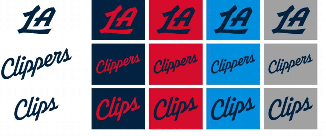
The Clippers are moving away from black as one of their primary colors and moving to navy, along with red, light blue, and gray, with a new logo that features a Clipper ship (albeit, one that also could maybe double as a mega yacht) in the middle of a C with compass lines. Considering how many teams and brands in general are going towards a completely minimalist approach to logos and branding, I appreciate that the Clippers went with something with a bit more character.
As Zach Lowe of ESPN reported, Ballmer considered a name change but learned from focus groups that fans were vehemently against it, which led to them embracing the nautical theme rather than running from it as they had in the past.
The new uniforms are also an improvement, as they cleaned up the script on their lettering and have a much cleaner trio of uniforms than their current set.


The red uniform is my personal favorite, as I think the navy looks much better as lettering on red than vice versa (I would have just gone white lettering with red trim on the navy uniforms). The white is a classic, clean look, but I like the little touches on the red uniform, like the nautical flags on the piping on the sides of the jersey. All three are at minimum solid options, which is an improvement for a team that’s had some truly awful uniforms, and moving away from the dreadful block logo is a huge win for them.
All told, the Clippers being taken seriously depends on what they do on the court — and this year they look like the most dangerous version of this team we’ve seen. That said, the “look good, play good” mantra exists for a reason and they’ve upgraded in that department considerably with this new rebrand.


