16 teams make the NBA Playoffs every year and the NBA has decided those teams deserve exclusive jerseys. On Wednesday, Nike announced “Earned Edition” jerseys. These jerseys are designed for the 16 teams that made the playoffs in the previous season. They will be available on Christmas and can be worn as much as the teams choose to. Which is great news, because some of the jersey designs are incredible. Others, not so much.
These jerseys have nothing to do with the playoffs at all and are really just more designs for Nike to play around with. Some teams got really cool designs, others had Nike just double down on current sets with a palette change. My personal favorites are the ones that went with a more unique approach.
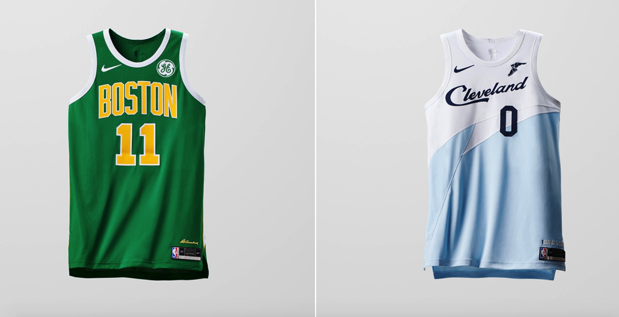
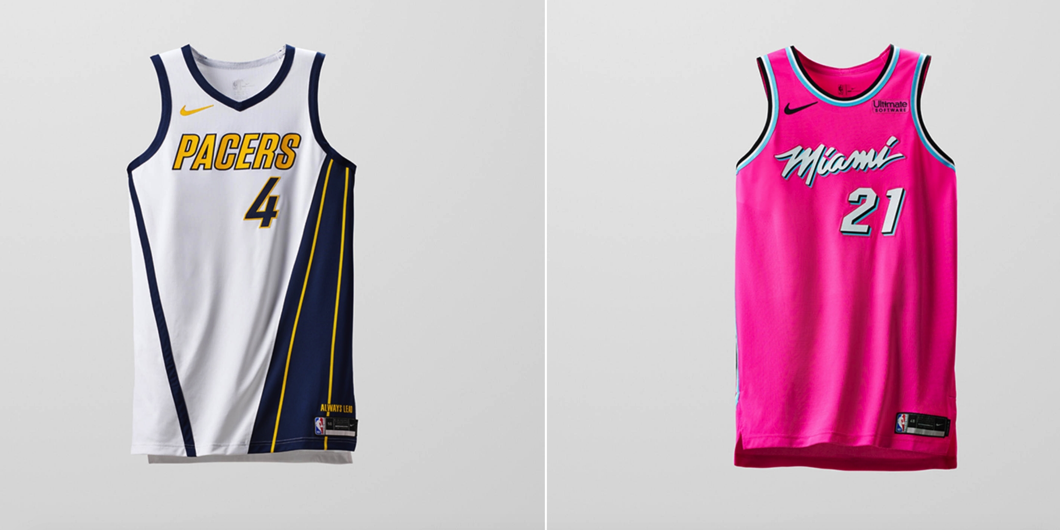
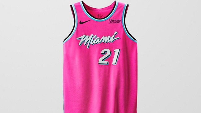
The Pacers and Cavs jerseys here are absolutely gorgeous. Cleveland using the tourism font is a great move, as it always is, and the Pacers seem to be going with a retro-modern styled design of their old set in the 90’s. The Celtics just doubled down on a current design. They’re fine, but nothing about them is really exciting. The Heat though. Oh goodness, these are either going to be beloved or hated. It’s a double down on the vice city style, but they threw convention out the window and went full on pink jersey. I adore them. Others will despise them. I personally want any and all color in jerseys so I’m very cool with this.
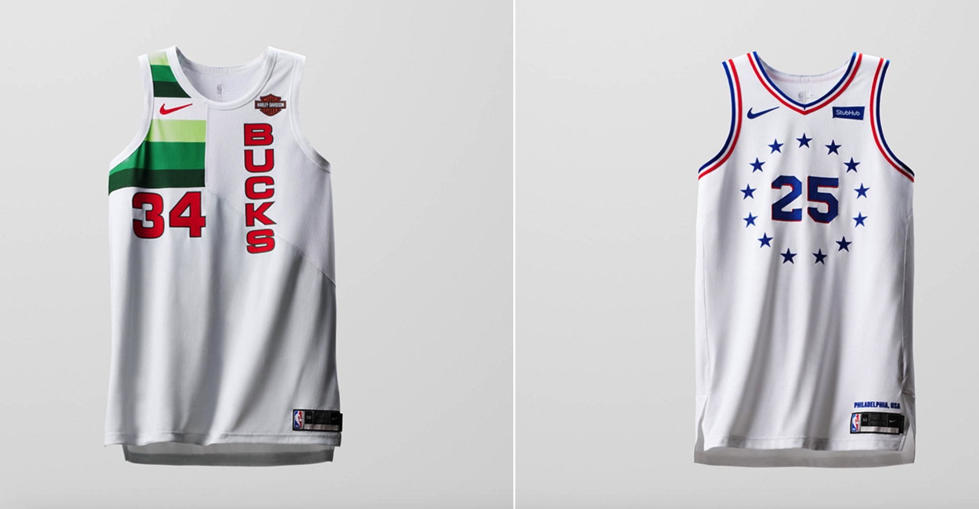
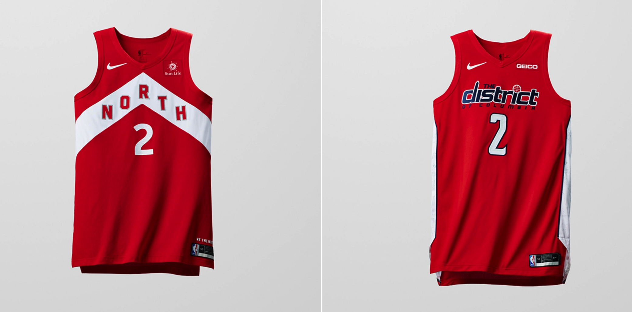
The Bucks design is very cool. It’s very old school with the vertical lettering, number placement, and a color design in the corner on a plain white jersey. I like it. The rest of these are just palette swaps of current jerseys the teams already wear, but the Wizards get points for implementing more red into their design.
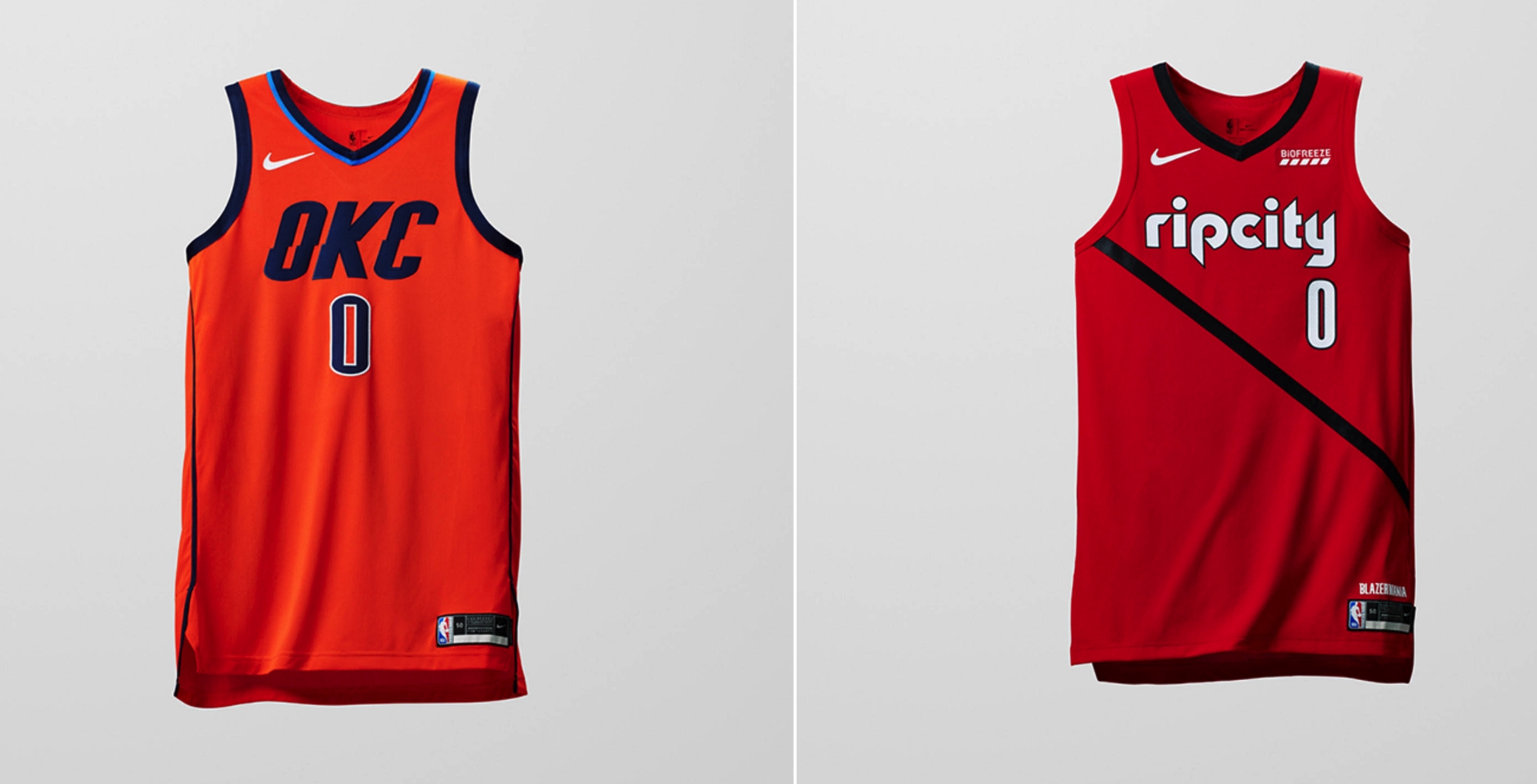
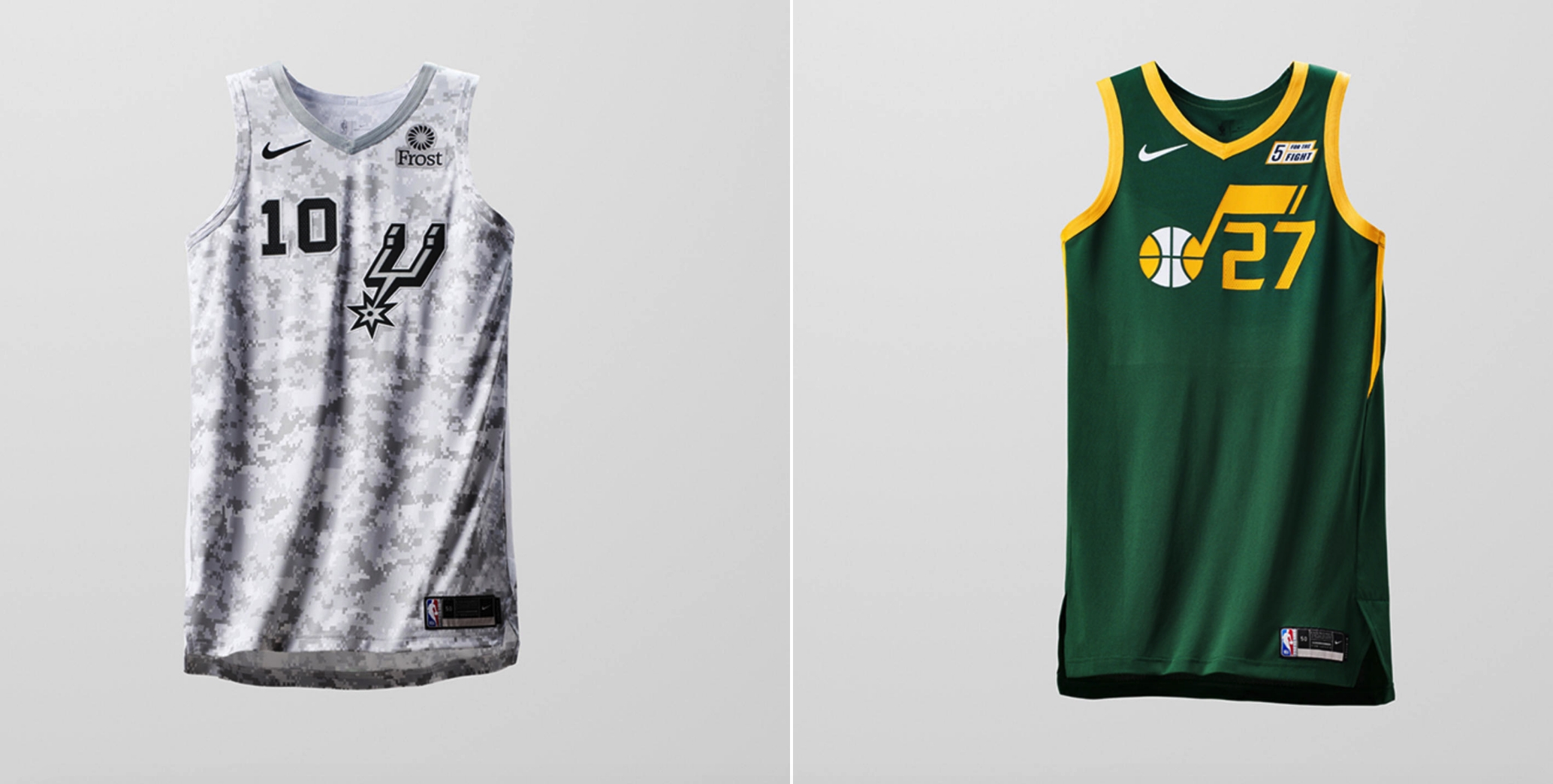
Again, none of these jerseys really stand out from previous designs. The Trail Blazers already have a jersey with this shade of red. Oklahoma City just needed a reason to bring its orange jerseys back into the fold, which, alright I guess. At least the lettering font is slightly different. The Jazz have a cool color design, but nowhere near enough is done with it. The less that’s said about the Spurs the better.
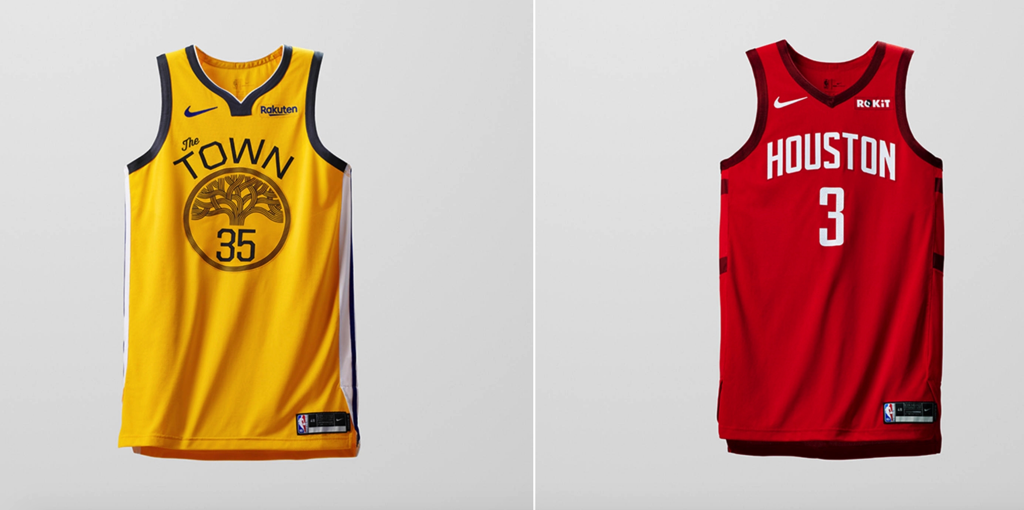
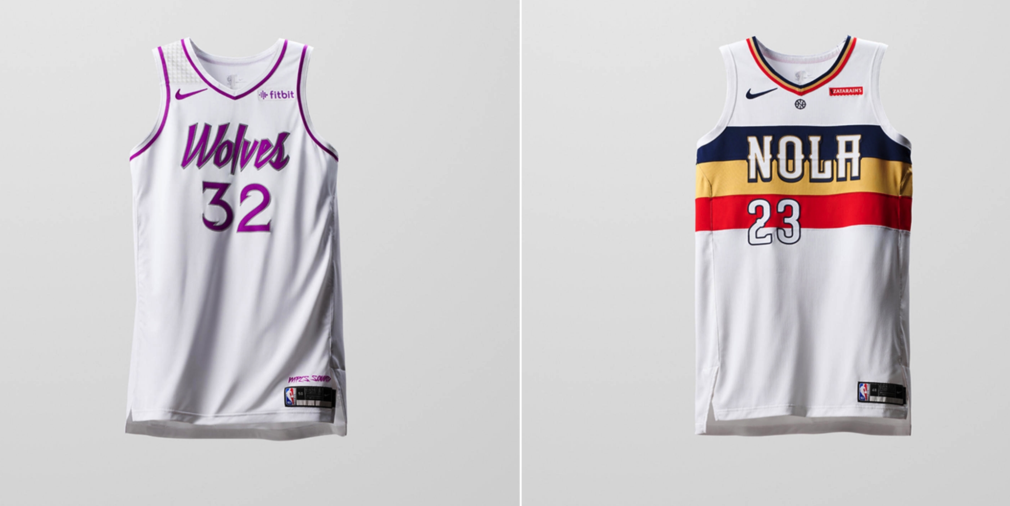
The Warriors are just a palette swap of jerseys they’ve worn in the past. I’ve never been a fan of this design though so I’m not the person to properly judge that one. The Rockets just went with a deeper shade of red and added some black trimming to the side. They exist. The Wolves jerseys are excellent because now they can wear the Prince inspired design more often, but it’s still just a palette swap of jerseys they already wear. The Pelicans tried to re-create the beautiful simplicity of their Mardi Gras jerseys, but the more muted and darker color palette doesn’t work as well. I’m not a fan.
None of these jerseys are bad, except for the Spurs, but it would have been nice to see Nike try to be a little more creative with jerseys that only 16 teams are going to be wearing.