Soccer jerseys are extremely good. For my money, they’re the best jerseys you can wear out and in public — NBA jerseys don’t have sleeves, hockey jerseys have sleeves that are far too long, NFL jerseys can be a bit heavy during the summer months, and baseball jerseys are heavy, require you to button up and make you look like you belong in a Nelly video from 2003.
But soccer jerseys are light, breathable, and wear like a nice t-shirt, plus they don’t look weird without a name and number on the back. Apparently, Mitchell and Ness agrees that this look is good as hell, and the famous sportswear company decided to make some special soccer jerseys.
The catch: These shirts are all inspired by old NBA jerseys, which makes it content for our website. They’re all varying degrees of sharp, but because it’s the summer, we decided to rank them from “eh” to “wear this in public.”
6. Chicago Bulls
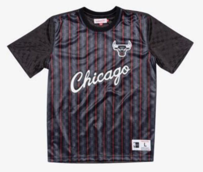
The Bulls’ logo and real life jerseys are iconic. These aren’t *bad*, necessarily, but they could be a lot better. Black with red and stripes makes you look like either someone who is going out to watch Frank Sinatra perform at a club filled with cigarette smoke or someone who wishes they were Silky Johnson. It wouldn’t be a bad addition to a wardrobe, but if you have $100 to spend, there are better ways to do it.
5. Toronto Raptors
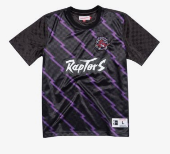
Again, I don’t think these are all that bad, it’s just this is a design that’s hard to pull off without going completely over the top. The purple thunder bolts or whatever they’re supposed to be would have looked way cooler if it looked like a raptor swiped at the shirt and left purple scratches, and the 90s Raptors logo should be highlighted more, because it rules.
4. Atlanta Hawks
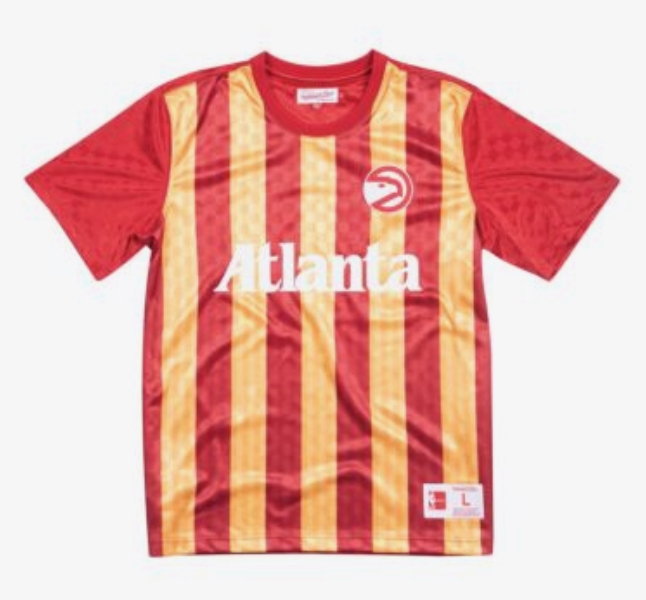
Here’s where the jerseys start getting awesome. My ranking these lower than the rest probably stems from the fact that Atlanta United’s jerseys are tremendous, but these are still fantastic. The letters are a little hard to read against the vibrant yellow stripes, but otherwise, it works out swimmingly.
3. San Antonio Spurs
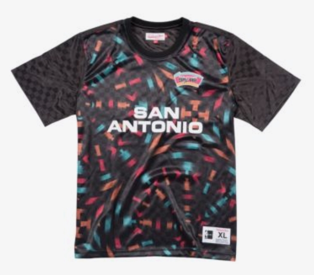
These are easily the best of the jerseys that are put on a black shirt. San Antonio’s color scheme in 2018 is a bit bland, even if silver and black work. But back in the day, when the logo mixed in hints of light blue, orange, and pink, they were truly outstanding. I wish that was embraced a little more in the soccer jerseys, but the fun, round pattern on a black shirt is pretty cool, too.
2. Charlotte Hornets
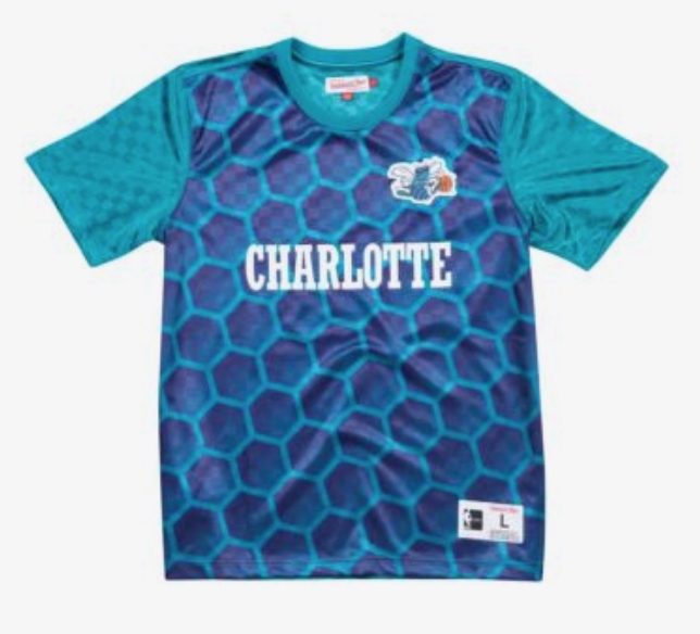
The best thing about the Hornets was when their color scheme was oh so slightly different from what they have now. The differences are small, and the team’s current color scheme is pretty great, but back in the 1990s, the franchise hit a home run. Mitchell and Ness hit a home run here, too, as the color scheme and the use of hexagons are aces. Also, while we’re here: The Hornets should bring back their old court for next season and then for every season after that.
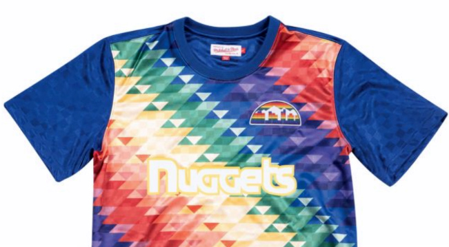
1. Denver Nuggets
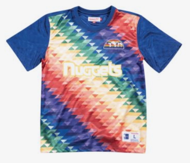
YEAAAAAAAAAAAAH. The Nuggets’ old rainbow color scheme ruled, and for how great it looked on a basketball jersey, going all-out with it on a soccer jersey like this is even better. It’s so vibrant, it’s eye-catching, and it just works despite the fact that it could be a bit much. I can imagine some obscure third-division European side wearing these — in fact, it makes me upset that there is no third-division European side wearing these. They’re the best.