The MLB All-Star Game is the only one that “counts” in the sense that it impacts the real baseball season in a significant way. While home field advantage in the World Series is interesting, the mid-summer showcase also provides baseball an opportunity to switch up its style for a bit.
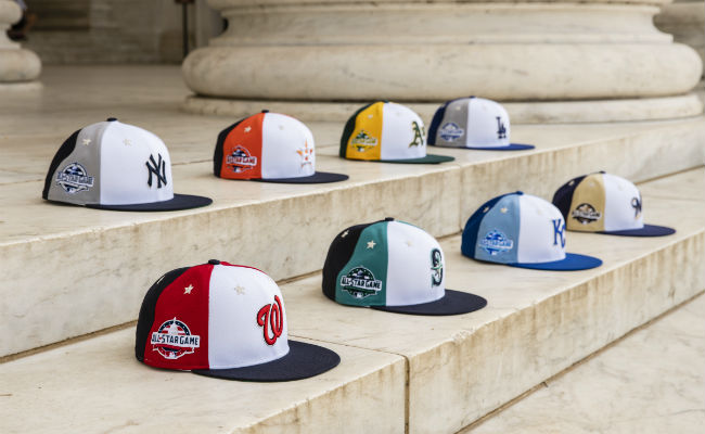
In recent years, special uniforms have given way to Home Run Derby (or “training”) hats and special headgear for the All-Star Game itself. This year’s game is in Washington with the Nationals hosting, so get ready for a lot of stars and a red, white and blue theme in general.
Here’s the thing about the Home Run Derby hats: A lot of them look pretty similar, but some are certainly better than others. So let’s take a look at some of the highlights and talk about what makes them good or bad.
Los Angeles Dodgers
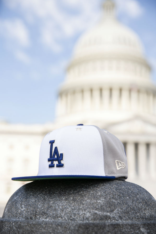
This is a strong look, and good on them for using gray and not blue as the color on the side panels. L.A. has always had a great color scheme, and they didn’t mess around at all here. The logo looks good on the white front, which as you’ll see isn’t always the case with these hats.
Washington Nationals
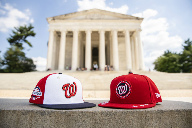
It makes sense that the host team gets to make sure it looks the best in the color scheme, and that’s certainly the case here. Both the training hats and the All-Star Game hat looks good, and the stars don’t look too busy on the blue hat. These might be the best of the bunch on both styles.
Boston Red Sox
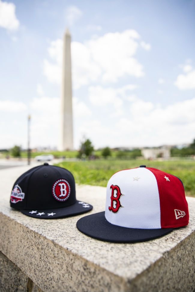
Given that the Sox have the same color scheme as the Nationals, this is a no-brainer as well. Though the Red Sox “B” does look kind of strange on the training hat surrounded by stars. It’s not my favorite look overall, but the game cap looks solid.
St. Louis Cardinals
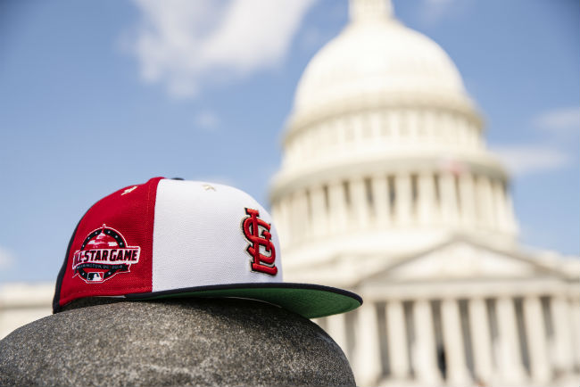
This is another case of the logo being perfect for the palate of the hat itself. Red logo, white background. Perfect.
New York Yankees
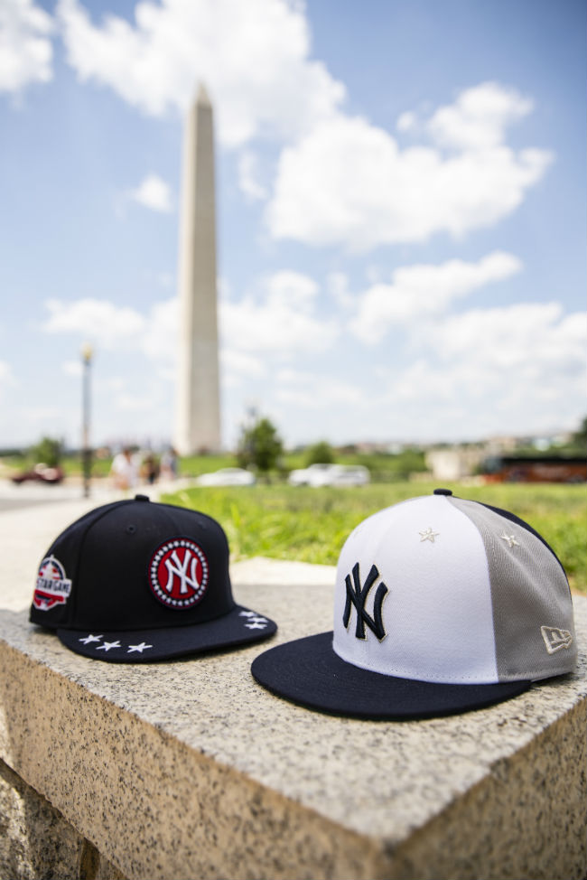
This is where the weirdness creeps in for me. The Yankees logo with a red button surrounded by stars just looks so off — like a knockoff hat you’d buy on a street corner somewhere in Battery Park. The game hat looks fine, and again the gray is a nice contrast. I’m just thrown by the red in the training hat. Flummoxed, even.
Houston Astros
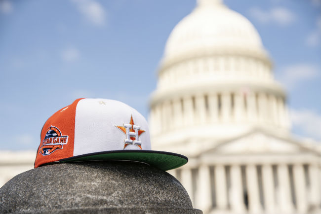
This one looks good in orange, but the white H in the Astros logo kind of fades out on the white backdrop of the front panel. That’s the hazard of using white on the front of a hat. The orange side panel with a white front and blue back also trends into a similar pitfall with this style: The brighter colors on the side panel sort of remind me of those goofy multi-colored propeller hats you only see in absurd movies about children in a distant past.
Chicago Cubs
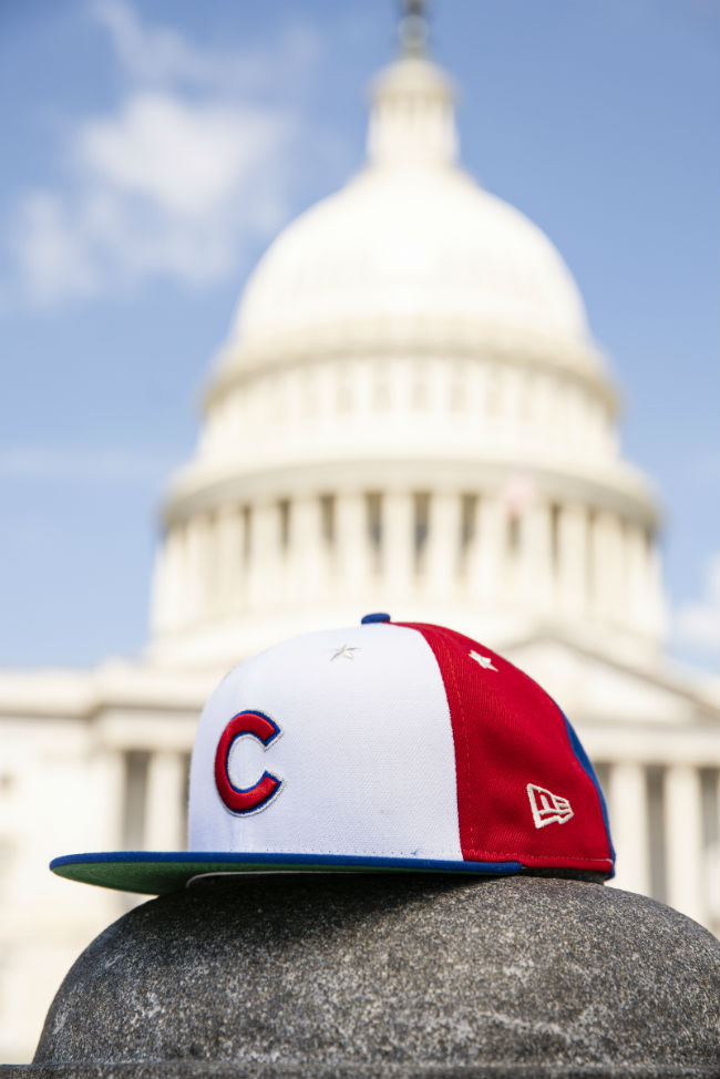
These look fine, but it’s mostly an opportunity to talk about something that’s always bothered me about Cubs hats: Sometimes the logo just looks a bit too small. Doesn’t it? Look closely, I’m begging you. Sometimes there’s just something ever so slightly off about the proportions of the logo to the rest of the hat, and other times it looks completely fine.

