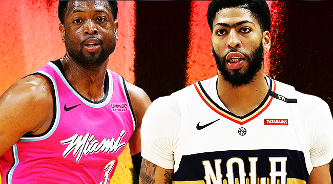
The NBA’s declassifying of franchise home and away jerseys is a wonderful opportunity to give teams more jerseys to pawn off on their fans. But it’s also an opportunity for teams to come up with very creative ways to honor their history and, hopefully, churn out a great Nike jersey in the process.
The Association jersey is basically the white “home” version of a uniform. The Icon jersey is the darker color, traditionally a team’s away look. And the Statement jerseys have replaced what was colloqually termed the “third” jersey. These three designs join the always-fun City versions of jerseys, which are a unique honor for teams that make the playoffs the previous season.
But the Earned edition of jerseys mean exactly that: you earn the right to get an extra jersey if you qualified for the postseason. That means only 16 of the league’s 30 teams get to have one, and the resulting jerseys range from truly inspired to completely washed out. Which means, of course, that we have to put each and every one of these bad boys in order of how good and not good they are.
Let’s get to it.
16. San Antonio Spurs
LOOK: Spurs 'Earned Edition' jersey revealed https://t.co/SyKULTBXbs #GoSpursGo pic.twitter.com/NfCacKZIkE
— News 4 San Antonio (@News4SA) December 12, 2018
Would you look at that, they went with digital camo again. Stop it.
Debuting the Earned Edition Jerseys tonight 👀#GoSpursGo pic.twitter.com/WScgHw8sGm
— San Antonio Spurs (@spurs) December 27, 2018
Please click through here. Every single reply to this tweet is some form of “PLEASE BRING BACK THE FIESTA SPURS UNIFORM I WILL BUY ONE FOR EVERY MEMBER OF MY FAMILY LIVING AND DEAD.” And all those tweets are right. You only need, at most, one uniform with digital camo on it. Look it up: it’s in the constitution.
15. Indiana Pacers
As part of the new Nike NBA Earned Program, Teams that made the NBA Playoffs will now be rewarded with an exclusive new on-court look. The @Pacers Earned jerseys will be available for purchase Dec. 19th at the Team Store and will make their debut on Dec. 28th. pic.twitter.com/vVZf5lsnOq
— Pacers Team Store (@PacersTeamStore) December 12, 2018
I have similar complaints about basically all of Indiana’s jerseys this year: the lines are all a bit much. Consistency is nice, but that highway to the armpit just isn’t doing it for me.
14. Oklahoma City Thunder
Oklahoma City Thunder Nike NBA Earned Edition Jersey ⚡️| Dropping at Lids 12.19.18
📸 (@BR_NBA ) pic.twitter.com/f6PlwGfSgr
— Lids (@lids) December 12, 2018
These were teased as the return of the “sunset” Thunder jerseys, but it’s just … orange. The Thunder so desperately need a color scheme reboot I want to start a GoFundMe for them to hire a graphic designer who has played NBA2K so they know when to avoid looks they’ve seen in any sports video game’s create a franchise mode.
13. Boston Celtics
Featuring the first-ever Earned Edition as this week's Item of the Week.
Preorder yours today: https://t.co/vvJkC5vSKm pic.twitter.com/p0hq9UNm36
— Boston Celtics (@celtics) December 23, 2018
This will undoubtedly be the favorite clothing item of dudes who want to scream about Ben Simmons being a coward in Southie on St. Patrick’s Day. But I long for the day the Celtics truly try something different with their alternate uniforms. Go for it, you guys.
12. Washington Wizards
Washington's Earned Edition uniform features the team’s classic red as a base and brings back the marble-inspired side paneling that references the Washington Monument.#DCFamily pic.twitter.com/qEvWomiTXB
— NBA UK (@NBAUK) December 12, 2018
The side panel is supposed to look like marble and reference the Washington Monument, which is neat. But it’s just another red Wizards uniform. Not the most inspiring of looks.
11. Houston Rockets
https://twitter.com/houstonrockets/status/1072913049298837505?lang=en
The same goes for Houston here with its Earned jersey. Which is not to say it looks bad. It does not. But it’s not particularly unique. In fact it looks very similar to the Zards’ and …
10. Portland Trail Blazers
Portland Trail Blazers Nike NBA Earned Edition Jersey 🛫| Dropping at Lids 12.19.18
📸 (@BR_NBA ) pic.twitter.com/l12q54fhNP
— Lids (@lids) December 12, 2018
… this Rip City (un)original, which has the lone defining characteristic of a horizontal sash of black. Did Washington, Houston, and Portland all call each other one the phone to coordinate before they took the bus to school today?
9. Toronto Raptors
New Raptors "earned" edition Nike Jersey 🔥
Thoughts ? pic.twitter.com/m2cof2X5dG
— Raptors Nation™ (@WeTheNorth__) December 12, 2018
I’m not including the Six in the group chat because their logic here is very clearly “let’s do the OVO jersey, but red.” That doesn’t necessarily make it original, but it is more aesthetically pleasing for sure.
8. Utah Jazz
— Utah Jazz (@utahjazz) December 12, 2018
Maybe it’s just the color scheme that does it, but I feel no particular way about these uniforms. And yet they’re significantly better than the mess of red above.
7. Cleveland Cavaliers
The Cavaliers new “Earned” jersey. These are 🔥🔥🔥 pic.twitter.com/gWWVAKAY76
— Legion Hoops (@LegionHoops) December 12, 2018
These are very, very white. And pretty plain, honestly. But Ziggy Stardust Lite works. It reminds me of the emptiness Cavs fans are probably feeling without LeBron on the roster. Sorry. You guys won a title and the Browns have Baker Mayfield now, you’ll be fine.
6. Philadelphia 76ers
Team Reveals New Earned Edition Jerseys
via @brianseltzer, https://t.co/Ik4acB6DJT pic.twitter.com/7x4IZI2aIq
— Philadelphia 76ers (@sixers) December 12, 2018
This is where we see the subtle difference between the “very white” the Cavs jersey gets and the label of “clean” I’ll apply to the Sixers pullover. It fits the franchise theme and is simple enough to make sense, but given how prevalent the segmented snake design was for Philly last postseason it’s a bit disappointing that it does not make an appearance on this design. They should bring it back this postseason and then, with next year’s Earned jerseys, claim a much higher spot.
5. New Orleans Pelicans
Earned edition uniforms tonight 🔥 pic.twitter.com/j7NcL6pYnl
— New Orleans Pelicans (@PelicansNBA) December 29, 2018
Much like the similarly-themed City jerseys, these are excellent. But much like other City uniforms from other teams, there are better designs out there. But definitely not better cities.
4. Golden State Warriors
Town Gold
Introducing the Nike NBA Earned Edition Jersey pic.twitter.com/kyw2I5PmVL
— Golden State Warriors (@warriors) December 12, 2018
Golden State’s The Town jerseys always please the eye. I think it’s the subtle but effective difference in typeface between the “the” and “town” on the design. These are, as usual, good. Just like the Warriors. But unlike what will likely happen in June, they aren’t the best of the bunch. Not this year.
3. Milwaukee Bucks
Milwaukee Bucks earned city jersey
Antetokounmpo
Talla s-xxl disponibles pic.twitter.com/Ml47CDfRkL— Store29113406 (@store2901345) December 23, 2018
Like a talented composer recapitulating on the theme of their symphony, the Bucks only deviate the palate from a winning design and come up with similarly great results.
2. Minnesota Timberwolves
#Twolves unveil Nike NBA Earned Edition uniform. The uniform, which will be worn once at home (Dec. 28) and five times on the road, is a variation of the popular Prince-inspired City Edition uniforms. Minnesota 'earned' the jersey by making the 2018 NBA Playoffs. pic.twitter.com/pWOkcBv0O8
— Timberwolves PR (@Twolves_PR) December 12, 2018
The Prince-themed jerseys are absolute gems, so it’s no surprise that they appear near the top of the list of the Earned jerseys. But Minnesota running it back with a white jersey is a bit disappointing. The people demand color. Give them the purple they deserve, Wolves.
1. Miami Heat
Miami Heat unveil new "Sunset Vice" earned edition uniform.
The team will wear them Dec. 26, 28 and 30. On sale online Dec. 19. pic.twitter.com/3ALGXczOje
— Locked On Heat | Miami Heat Podcast (@LockedOnHeat) December 12, 2018
At this point it might be cliche to praise Miami for its Vice Night jerseys, but these continue to be absolutely gorgeous. And going neon pink here is, admittedly, pretty bold. But good on Miami for going all-in, and for fans embracing the bold palate. These are excellent, and hopefully Miami stops thinking they’re bad luck and switches to Miami Vice-themed full-time. Perhaps that’s only in our wildest, most pastel dreams. But it’s nice to think about, for a bit.

